Linear marketing design research
A study of 27 captured public pages on linear.app (out of 1,031 public URLs, all listed in public-pages.md), built to answer one question: how do you make a landing page with the same craft?
- Captured: 2026-11-17, Chromium, 1440 × 900 viewport, dark theme (the only theme the marketing site ships), plus 390 × 844 mobile heroes.
- Every number comes from the live DOM (
getComputedStyle, CSS custom properties, document.getAnimations()). Values estimated from pixels are marked "≈".
- Local research only. Not committed.
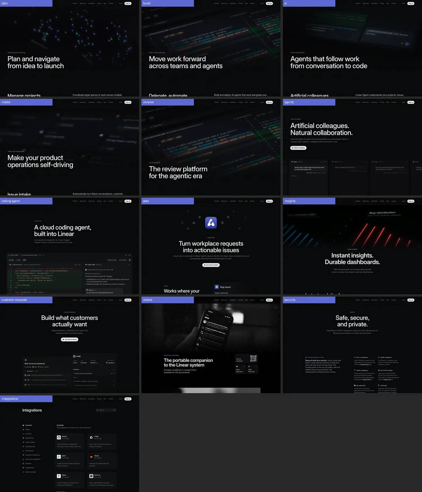
Read in this order
| # |
File |
What it answers |
| 01 |
Design principles |
Why the pages look this way: the 9 principles behind every decision |
| 02 |
Color system |
Surfaces, 4 text grays, hairlines, accent, where color is allowed, tokens |
| 03 |
Typography |
Font, weights (400/510/590), full type scale, tracking and leading rules, heading + subheading pairings, mobile sizes |
| 04 |
Layout, grid and spacing |
The two templates, 1344/1024 containers, 50/50 grid, 128px sections, radii |
| 05 |
Hero patterns |
9 hero types with when to use each |
| 06 |
Section patterns |
The 16-block library: split header, feature frame, bento 2×2, mono tabs, 3-up cards, testimonials, CTA … |
| 07 |
Copywriting |
H1/H2 formulas, paragraph structure, two-tone sentences, CTA and proof copy, checklist |
| 08 |
Components and chrome |
Buttons, links, header, footer, chips, tiles |
| 09 |
Visuals and motion |
How product UI is staged; measured durations, easings, stagger |
| 10 |
Glossary |
The exact terms to use, plus a paste-ready design brief |
| 11 |
Build recipe |
Step-by-step + starter CSS/HTML + review checklist |
| 12 |
Art direction |
Imagery worlds, photography, illustration, 3D, gradients, iconography, logo usage |
| 13 |
Brand assets |
Inventory of every graphic type with crops and how to rebuild it |
| — |
Public pages |
All 1,031 public URLs from the sitemap, grouped |
Per-page deep dives
Every section of every page: crop image, layout, exact type values, color, visual, copy, why it works, reuse recipe.
| Page |
URL |
Template |
Height |
Doc |
| Plan |
/plan |
product |
14,801px |
pages/plan.md |
| Build |
/build |
product |
15,325px |
pages/build.md |
| AI |
/ai |
product |
12,915px |
pages/ai.md |
| Intake |
/intake |
product |
11,456px |
pages/intake.md |
| Reviews |
/reviews |
product |
9,117px |
pages/reviews.md |
| Agents |
/agents |
product (hybrid) |
6,059px |
pages/agents.md |
| Coding agent |
/coding-agent |
scroll story |
7,902px |
pages/coding-agent.md |
| Asks |
/asks |
feature |
7,152px |
pages/asks.md |
| Insights |
/insights |
feature |
6,099px |
pages/insights.md |
| Customer requests |
/customer-requests |
feature |
6,459px |
pages/customer-requests.md |
| Mobile |
/mobile |
feature |
9,767px |
pages/mobile.md |
| Security |
/security |
feature |
3,261px |
pages/security.md |
| Integrations |
/integrations |
directory |
11,121px |
pages/integrations.md |
| Home |
/ |
overview |
9,990px |
pages/home.md |
| Now + Changelog |
/now, /changelog, entries, essays |
publication |
24,288px (changelog) |
pages/now-changelog.md |
| Customers |
/customers, /customers/alan |
directory + story |
4,471px |
pages/customers.md |
| Docs, Method, Pricing, Brand, Resource kit |
/docs/…, /method/…, /pricing, /brand, /resource-kit |
various |
— |
pages/docs-method-pricing-brand.md |
| Header + footer |
all |
— |
— |
pages/_shared-header-footer.md |
(/customer-requests was listed twice in the request; it is captured once.)
Folder map
linear_design/
├── README.md                 this index
├── 01 … 11-*.md              cross-page system research
├── pages/<page>.md           per-page, per-section deep dives
├── images/
│   ├── full/<page>.png       full-page screenshots, 1440px wide
│   ├── <page>/NN-<slug>.png  every section cropped
│   ├── patterns/*.png        isolated pattern crops (testimonials, CTA, cross-links …)
│   ├── responsive/*.png      390px mobile heroes
│   ├── hero-contact-sheet.png
│   └── sections.json         crop index (y offset, height, title)
└── data/<page>.json          raw measured styles: headings, every text node, colors, buttons, media
The style in one paragraph
Near-black canvas (#08090a) with panels only 2-3% lighter, separated by 1px translucent white hairlines. One typeface (Inter Variable with cv01/ss03) at weights 400/510/590, display sizes at line-height 1.0 and -0.022em tracking, and hierarchy carried by four grays instead of color. The real product UI is the only illustration: staged in spotlit 8px frames and ruled 2×2 bento grids with 15px captions. Copy is short, declarative and parallel ("Instant insights. Durable dashboards."). Sections are 128px apart. Color appears only as product semantics, partner cards and one light testimonial card. Motion is 100ms on hover and 700ms blur-in on reveal.
How to use this for a Kortix page
- Read 01, then 11.
- Pick the hero type from 05 and the blocks from 06.
- Write the copy with the checklist in 07.
- Map the values to Kortix tokens. The Kortix brand rules (
.agents/skills/kortix-brand/) still govern Kortix surfaces: the font, the spacing scale and the color tokens. This folder is a reference for structure, rhythm and craft. It is not a set of values to paste over Kortix tokens.
Public pages · every public URL on linear.app
1031 public pages, taken from robots.txt → sitemap.xml (and every nested sitemap) on 2026-11-21. Localized copies of the same page (for example /ja/…, /de/…) are left out; English only. Titles are each page's <title> tag, fetched live.
Machine-readable copy: data/public-pages.json. Research site: https://linear-design-research.sutharjay3635.workers.dev
| Group |
Pages |
| Core marketing |
30 |
| Integrations |
384 |
| Changelog |
256 |
| Now (editorial) |
104 |
| Docs |
101 |
| Customers |
44 |
| Careers |
33 |
| Developers |
27 |
| Method |
12 |
| Quality |
11 |
| Enablement |
10 |
| Learn |
7 |
| Releases |
4 |
| Contact |
3 |
| Switch |
3 |
| Security |
2 |
Core marketing
30 pages.
Integrations
384 pages.
Changelog
256 pages.
- Changelog ·
/changelog
- Option to display usernames or real names – Changelog ·
/changelog/2019-04-11-option-to-display-usernames-or-real-names
- Linear desktop app – Changelog ·
/changelog/2019-04-25-linear-desktop-app
- Creating new issues via email – Changelog ·
/changelog/2019-05-02-creating-new-issues-via-email
- First-time user experience – Changelog ·
/changelog/2019-05-09-first-time-user-experience
- New sidebar design – Changelog ·
/changelog/2019-05-19-new-sidebar-design
- Grouping headers – Changelog ·
/changelog/2019-05-26-grouping-headers
- International keyboard shortcut improvements – Changelog ·
/changelog/2019-06-20-international-keyboard-shortcut-improvements
- Backlog and Active Issues – Changelog ·
/changelog/2019-06-27-backlog-and-active-issues
- Cycles – Changelog ·
/changelog/2019-07-04-cycles
- GitHub workflow configuration – Changelog ·
/changelog/2019-07-11-github-workflow-configuration
- Cycles are here! – Changelog ·
/changelog/2019-07-18-cycles-are-here
- Projects – Changelog ·
/changelog/2019-07-28-projects
- Filters – Changelog ·
/changelog/2019-08-04-filters
- 2019-08-13 – Changelog ·
/changelog/2019-08-13
- New search – Changelog ·
/changelog/2019-08-18-new-search
- GitHub Pull Request improvements – Changelog ·
/changelog/2019-08-25-github-pull-request-improvements
- Video uploads and player – Changelog ·
/changelog/2019-09-02-video-uploads-and-player
- Cycle cooldown – Changelog ·
/changelog/2019-09-09-cycle-cooldown
- Favorite projects – Changelog ·
/changelog/2019-09-17-favorite-projects
- Improved peek – Changelog ·
/changelog/2019-09-23-improved-peek
- Figma integration – Changelog ·
/changelog/2019-09-30-figma-integration
- Contextual command menu – Changelog ·
/changelog/2019-10-07-contextual-command-menu
- Improved comments – Changelog ·
/changelog/2019-10-14-improved-comments
- Zapier integration – Changelog ·
/changelog/2019-10-21-zapier-integration
- Responsive web application – Changelog ·
/changelog/2019-10-28-responsive-web-application
- Better Slack notifications – Changelog ·
/changelog/2019-11-04-better-slack-notifications
- New sidebar – Changelog ·
/changelog/2019-11-11-new-sidebar
- Secured a USD 4.2M Seed Round – Changelog ·
/changelog/2019-11-20-secured-a-usd-4-2m-seed-round
- API improvements – Changelog ·
/changelog/2019-11-26-api-improvements
- GitHub workflow – Changelog ·
/changelog/2019-12-05
- Onboarding: Join Teams – Changelog ·
/changelog/2019-12-12-onboarding-join-teams
- New command menu – Changelog ·
/changelog/2019-12-18-new-command-menu
- Issue templates – Changelog ·
/changelog/2020-01-07-issue-templates
- Copy team settings – Changelog ·
/changelog/2020-01-14-copy-team-settings
- Improved Search – Changelog ·
/changelog/2020-01-21-improved-search
- Webhooks – Changelog ·
/changelog/2020-01-28-webhooks
- Automated Google Sheets export – Changelog ·
/changelog/2020-02-03-automated-google-sheets-export
- Issue archive – Changelog ·
/changelog/2020-02-11-issue-archive
- 2020-02-20 – Changelog ·
/changelog/2020-02-20
- 2020-03-04 – Changelog ·
/changelog/2020-03-04
- Issue relations – Changelog ·
/changelog/2020-03-11-issue-relations
- Desktop app improvements: multi-window support – Changelog ·
/changelog/2020-03-19-desktop-app-improvements-multi-window-support
- Cross-team projects – Changelog ·
/changelog/2020-03-27
- Project links – Changelog ·
/changelog/2020-04-02-project-links
- Branch naming – Changelog ·
/changelog/2020-04-13-branch-naming
- Improved My Issues view – Changelog ·
/changelog/2020-04-27-improved-my-issues-view
- GitHub draft pull requests, CSV export and team/project notifications – Changelog ·
/changelog/2020-05-05
- Login with email magic links – Changelog ·
/changelog/2020-05-18-login-with-email-magic-links
- Setting an issue's status – Changelog ·
/changelog/2020-05-26-setting-an-issue-s-status
- Support for multiple workspaces – Changelog ·
/changelog/2020-06-09
- Added support to hide board columns – Changelog ·
/changelog/2020-06-17
- Improvements and fixes – Changelog ·
/changelog/2020-06-24
- GitLab support and public launch – Changelog ·
/changelog/2020-06-30
- Emoji reactions and notifications for closed issues – Changelog ·
/changelog/2020-07-08-emoji-reactions
- Project visualizations and in-app changelog – Changelog ·
/changelog/2020-07-14-project-visualizations-and-in-app-changelog
- Linear.new, upcoming cycle count setting and workspace deletion – Changelog ·
/changelog/2020-07-22-linear-new-cycle-settings
- Filter improvements – Changelog ·
/changelog/2020-07-29-filter-improvements
- Linear Preview: Auto-closing issues – Changelog ·
/changelog/2020-08-06-linear-preview-auto-closing-issues
- Linear Preview: View options – Changelog ·
/changelog/2020-08-13-linear-preview-view-options
- Auto-close and auto-archive – Changelog ·
/changelog/2020-08-19-auto-close-and-auto-archive
- Better menus and view options – Changelog ·
/changelog/2020-08-26-better-menus-and-view-options
- Sentry Integration – Changelog ·
/changelog/2020-09-02-sentry-integration
- Custom emoji and a new billing page – Changelog ·
/changelog/2020-09-18-custom-emoji-and-a-new-billing-page
- Slack notifications for projects – Changelog ·
/changelog/2020-09-30-project-slack-notifications
- Favorite ordering, content search and Zapier updates – Changelog ·
/changelog/2020-11-11-favorite-ordering-content-search-and-zapier-updates
- Notification settings – Changelog ·
/changelog/2020-11-19-notification-settings
- New sub-issue editing and SAML – Changelog ·
/changelog/2020-11-25-new-sub-issue-editing-and-saml
- Custom Themes – Changelog ·
/changelog/2020-12-04-themes
- Series A, Roadmap, OAuth2 and Big Sur logo – Changelog ·
/changelog/2020-12-08-series-a-roadmap-oauth2-and-big-sur-logo
- Bug fixes – Changelog ·
/changelog/2020-12-17-bugfixes
- Authentication restriction options + Bug fixes – Changelog ·
/changelog/2021-01-14-authentication-restriction-options
- Search notifications using Cmd + F – Changelog ·
/changelog/2021-01-21-search-notifications-using-cmd-f
- GitHub notification improvements – Changelog ·
/changelog/2021-01-28-github-notification-improvements
- New webhook types – Changelog ·
/changelog/2021-02-04-new-webhook-types
- Issue grouping – Changelog ·
/changelog/2021-02-12-issue-grouping
- Linear Preview: Import Issues – Changelog ·
/changelog/2021-02-18-importer-preview
- Linear Preview: New issue creation UI – Changelog ·
/changelog/2021-02-25-new-issue-creation-ui
- Linear SDK – Changelog ·
/changelog/2021-03-05-linear-sdk
- New issue creation UI – Changelog ·
/changelog/2021-03-10-new-issue-creation-ui
- Apple M1 & Windows support – Changelog ·
/changelog/2021-03-18-apple-m1-and-windows-desktop
- Keyboard shortcuts help – Changelog ·
/changelog/2021-03-25-keyboard-shortcuts-help
- Startup performance improvements – Changelog ·
/changelog/2021-03-31-startup-performance-improvements
- Private teams & migration assistant – Changelog ·
/changelog/2021-04-08-private-teams-and-migration-assistant
- Auto-archive cycles and projects & deleting issues – Changelog ·
/changelog/2021-04-15-auto-archive-cycles-and-projects-and-deleting-issues
- Smaller improvements and April 22 outage – Changelog ·
/changelog/2021-04-23-smaller-improvements-and-april-22-outage
- Zendesk integration – Changelog ·
/changelog/2021-04-30-zendesk-integration
- Fixes – Changelog ·
/changelog/2021-05-07-just-fixes
- New issue search – Changelog ·
/changelog/2021-05-13-new-issue-search
- Improving performance at scale – Changelog ·
/changelog/2021-05-20-improving-performance-for-large-workspaces
- Linear Preview: Roadmap Timeline – Changelog ·
/changelog/2021-05-27-linear-preview-roadmap-timeline
- Issue view layout – Changelog ·
/changelog/2021-06-03-issue-view-layout
- New setting for team priority ordering – Changelog ·
/changelog/2021-06-11-new-setting-for-team-priority-ordering
- Inbox snooze and easier issue merge – Changelog ·
/changelog/2021-06-17-inbox-snooze-and-easier-issue-merge
- Intercom integration – Changelog ·
/changelog/2021-06-23-intercom-integration
- Linear Release 2021.06 and Issue Triage – Changelog ·
/changelog/2021-06-29-linear-release-and-issue-triage
- Summer time – Changelog ·
/changelog/2021-07-26-summer
- GitHub Secret Scanning – Changelog ·
/changelog/2021-08-19-github-secret-scanning
- /changelog/2021-08-27-multi-team-boards-and-manual-ordering ·
/changelog/2021-08-27-multi-team-boards-and-manual-ordering
- Easier invites & Webhook improvements – Changelog ·
/changelog/2021-09-03-easier-invites-and-webhook-improvements
- Small fixes & improvements – Changelog ·
/changelog/2021-09-13-small-fixes-and-improvements
- GraphQL Filters – Changelog ·
/changelog/2021-09-16-graphql-filters
- Desktop Navigation – Changelog ·
/changelog/2021-09-23-desktop-navigation
- Slack notification actions – Changelog ·
/changelog/2021-09-29-slack-notification-actions
- Audit log – Changelog ·
/changelog/2021-10-07-audit-log
- SOC 2 – Changelog ·
/changelog/2021-10-21-soc-2
- Linear Preview: New filters – Changelog ·
/changelog/2021-11-08-linear-preview-new-filters
- Front integration and universal links – Changelog ·
/changelog/2021-11-18-front-integration-and-universal-links
- Split Inbox Preview – Changelog ·
/changelog/2021-12-02-workspace-templates
- Roadmap filters – Changelog ·
/changelog/2021-12-16-filters-projects-roadmap
- Link with Jira – Changelog ·
/changelog/2022-01-12-link-with-jira
- Linear preview: New sidebar & team icons – Changelog ·
/changelog/2022-01-20-linear-preview-new-sidebar-and-team-icons
- Github commit linking – Changelog ·
/changelog/2022-02-03-github-commit-linking
- Sidebar update – Changelog ·
/changelog/2022-02-11-sidebar-update
- New desktop app – Changelog ·
/changelog/2022-03-15-new-desktop-app
- Favorite folders – Changelog ·
/changelog/2022-03-24-favorite-folders
- Hackweek – Changelog ·
/changelog/2022-04-07-hackweek
- Project backlog & grouping – Changelog ·
/changelog/2022-04-21-project-backlog-and-grouping
- Search – Changelog ·
/changelog/2022-04-28-search
- Discord integration – Changelog ·
/changelog/2022-05-05-discord-integration
- Combined Board and Issue view – Changelog ·
/changelog/2022-05-26-combined-board-and-issue-view
- Inline editing – Changelog ·
/changelog/2022-06-09-inline-editing
- Integration directory – Changelog ·
/changelog/2022-06-16-integration-directory
- Sub-issues Improvements – Changelog ·
/changelog/2022-06-30-sub-issues-improvements
- Project Updates Preview – Changelog ·
/changelog/2022-07-07-project-updates-preview
- Guest accounts – Changelog ·
/changelog/2022-07-14-guest-accounts
- Project Updates – Changelog ·
/changelog/2022-08-04-project-updates
- Board Ordering – Changelog ·
/changelog/2022-08-18-board-ordering
- Third-party Application Approvals – Changelog ·
/changelog/2022-08-25-third-party-application-approvals
- Fixes & Improvements – Changelog ·
/changelog/2022-09-09-fixes-and-improvements
- Graph improvements & Cycle capacity – Changelog ·
/changelog/2022-09-22-cycles-and-graph-improvements
- Faster sub-issue creation – Changelog ·
/changelog/2022-10-13-faster-sub-issue-creation
- 2022 Release: Built for Scale – Changelog ·
/changelog/2022-10-19-2022-release
- Label Groups – Changelog ·
/changelog/2022-11-10-label-groups
- Arc Integration – Changelog ·
/changelog/2022-11-22-arc
- Polishing Season 2022 – Changelog ·
/changelog/2022-12-01-polishing-season-2022
- Issue Reminders – Changelog ·
/changelog/2023-01-31-issue-reminders
- Threaded Comments – Changelog ·
/changelog/2023-02-09-threaded-comments
- SLAs – Changelog ·
/changelog/2023-03-16-slas
- Linear Insights – Changelog ·
/changelog/2023-03-23-linear-insights
- Improved Drag & Drop – Changelog ·
/changelog/2023-04-27-improved-drag-and-drop
- Issue Drafts – Changelog ·
/changelog/2023-05-11-issue-drafts
- Project Views – Changelog ·
/changelog/2023-05-25-project-views
- AI Filters – Changelog ·
/changelog/2023-06-01-ai-filters
- Burn-up charts – Changelog ·
/changelog/2023-06-15-burn-up-charts
- Figma x Linear – Changelog ·
/changelog/2023-06-21-figma-plugin-config
- Slack Sync – Changelog ·
/changelog/2023-07-06-slack-sync
- Templates for Slack, Intercom & Zendesk – Changelog ·
/changelog/2023-07-20-templates-for-slack-intercom-and-zendesk
- Similar Issues – Changelog ·
/changelog/2023-08-03-similar-issues
- Project progress reports – Changelog ·
/changelog/2023-08-16-project-progress-reports
- Mentions – Changelog ·
/changelog/2023-08-30-mentions
- Project templates – Changelog ·
/changelog/2023-09-21-project-templates
- Resize images – Changelog ·
/changelog/2023-09-28-resize-images
- Triage responsibility – Changelog ·
/changelog/2023-10-12-triage-responsibility
- Linear Asks – Changelog ·
/changelog/2023-10-25-linear-asks
- Resolve comments – Changelog ·
/changelog/2023-11-08-resolve-comments
- New Git automation: Ready for merge – Changelog ·
/changelog/2023-11-15-github-workflow-updates
- Inline comments – Changelog ·
/changelog/2023-12-06-editor-improvements
- GitHub Issues Sync – Changelog ·
/changelog/2023-12-14-github-issues-sync
- Jira Sync – Changelog ·
/changelog/2023-12-20-jira-sync
- Project timeframes – Changelog ·
/changelog/2024-01-17-project-timeframes
- Project update comments – Changelog ·
/changelog/2024-02-01-project-update-comments
- Create issues via email – Changelog ·
/changelog/2024-02-15-create-issues-via-email
- A new era for the timeline – Changelog ·
/changelog/2024-02-29-milestones-on-the-timeline
- Custom statuses for projects – Changelog ·
/changelog/2024-03-19-custom-statuses-for-projects
- Welcome to the new Linear – Changelog ·
/changelog/2024-03-20-new-linear-ui
- Swimlanes – Changelog ·
/changelog/2024-04-03-swimlanes
- Editor improvements – Changelog ·
/changelog/2024-04-24-editor-improvements
- The next generation of Linear projects – Changelog ·
/changelog/2024-05-02-the-next-generation-of-linear-projects
- European Union data hosting – Changelog ·
/changelog/2024-05-23-european-union-data-hosting
- Passkeys: A fast and secure way to log in to Linear – Changelog ·
/changelog/2024-05-30-passkeys-a-fast-and-secure-way-to-log-in-to-linear
- A new home for your projects – Changelog ·
/changelog/2024-06-17-a-new-home-for-your-projects
- Introducing Initiatives – Changelog ·
/changelog/2024-06-25-introducing-initiatives
- Priority for projects – Changelog ·
/changelog/2024-07-25-priority-for-projects-and-micro-adjust
- Project dependencies – Changelog ·
/changelog/2024-08-08-project-dependencies
- Slack channel notifications for custom views – Changelog ·
/changelog/2024-08-23-slack-channel-notifications-for-custom-views
- Auto-close parent and sub-issues – Changelog ·
/changelog/2024-09-06-auto-close-parent-and-sub-issues
- Introducing Linear Mobile – Changelog ·
/changelog/2024-09-19-introducing-linear-mobile
- Document subscriptions – Changelog ·
/changelog/2024-10-10-document-subscriptions
- New team issues page – Changelog ·
/changelog/2024-10-24-new-team-issues-page
- /changelog/2024-11-13-improvements-for-slas-templates-and-jira-and-github-issues-sync ·
/changelog/2024-11-13-improvements-for-slas-templates-and-jira-and-github-issues-sync
- Recurring Issues – Changelog ·
/changelog/2024-12-05-recurring-issues
- Customer Requests – Changelog ·
/changelog/2024-12-09-customer-requests
- Personalized sidebar and new settings pages – Changelog ·
/changelog/2024-12-18-personalized-sidebar
- Pull Request reviews (alpha) – Changelog ·
/changelog/2025-01-23-pull-request-reviews
- Initiative updates – Changelog ·
/changelog/2025-02-13-initiative-updates
- Sub-teams – Changelog ·
/changelog/2025-03-06-sub-teams
- Collapsible sections – Changelog ·
/changelog/2025-03-19-collapsible-sections
- Collapsed issue history – Changelog ·
/changelog/2025-04-03-collapsed-issue-history
- New search – Changelog ·
/changelog/2025-04-10-new-search
- Introducing Pulse — your personalized feed for what’s happening across your company – Changelog ·
/changelog/2025-04-16-pulse
- Customer Requests on projects – Changelog ·
/changelog/2025-04-30-customer-requests-on-projects
- Linear MCP server – Changelog ·
/changelog/2025-05-01-mcp
- Custom feeds in Pulse – Changelog ·
/changelog/2025-05-15-custom-feeds-in-pulse
- Linear for Agents – Changelog ·
/changelog/2025-05-20-linear-for-agents
- Asks fields and Triage routing – Changelog ·
/changelog/2025-06-05-asks-fields-and-triage-routing
- Project labels – Changelog ·
/changelog/2025-06-12-project-labels
- Sub-initiatives – Changelog ·
/changelog/2025-07-10-sub-initiatives
- Email intake for Linear Asks – Changelog ·
/changelog/2025-07-17-email-intake-for-asks
- Dashboards – Changelog ·
/changelog/2025-07-24-dashboards
- Agent Interaction Guidelines and SDK – Changelog ·
/changelog/2025-07-30-agent-interaction-guidelines-and-sdk
- Product Intelligence (Technology Preview) – Changelog ·
/changelog/2025-08-14-product-intelligence-technology-preview
- Cursor background agents – Changelog ·
/changelog/2025-08-21-cursor-agent
- Salesforce integration – Changelog ·
/changelog/2025-09-04-salesforce
- New to Product Intelligence: Auto-apply triage suggestions – Changelog ·
/changelog/2025-09-19-auto-apply-triage-suggestions
- Issue discussion summaries – Changelog ·
/changelog/2025-10-02-issue-discussion-summaries
- Label descriptions and archiving – Changelog ·
/changelog/2025-10-09-label-descriptions-and-archiving
- Mobile app redesign – Changelog ·
/changelog/2025-10-16-mobile-app-redesign
- Linear agent for Slack – Changelog ·
/changelog/2025-10-23-linear-agent-for-slack
- GitHub Copilot agent – Changelog ·
/changelog/2025-10-28-github-copilot-agent
- /changelog/2025-11-13-pulse-on-mobile ·
/changelog/2025-11-13-pulse-on-mobile
- Form templates – Changelog ·
/changelog/2025-11-20-form-templates
- OpenAI Codex agent – Changelog ·
/changelog/2025-12-04-openai-codex-agent
- Linear agent for Intercom, Zendesk, Gong – Changelog ·
/changelog/2025-12-11-linear-agent-for-intercom-zendesk-gong
- Team owners – Changelog ·
/changelog/2025-12-17-team-owners
- Customize your navigation in Linear Mobile – Changelog ·
/changelog/2026-01-22-customize-your-navigation-in-linear-mobile
- Time in status – Changelog ·
/changelog/2026-01-29-time-in-status
- Linear MCP for product management – Changelog ·
/changelog/2026-02-05-linear-mcp-for-product-management
- Advanced filters and share issues in private teams – Changelog ·
/changelog/2026-02-13-advanced-filters-and-share-issues-in-private-teams
- Deeplink to AI coding tools – Changelog ·
/changelog/2026-02-26-deeplink-to-ai-coding-tools
- UI refresh – Changelog ·
/changelog/2026-03-12-ui-refresh
- Introducing Linear Agent – Changelog ·
/changelog/2026-03-24-introducing-linear-agent
- Web forms for Linear Asks – Changelog ·
/changelog/2026-04-02-web-forms-for-linear-asks
- Multi-level sub-teams – Changelog ·
/changelog/2026-04-09-multi-level-sub-teams
- Linear for Microsoft Teams – Changelog ·
/changelog/2026-04-16-linear-for-microsoft-teams
- Linear Agent MCP support – Changelog ·
/changelog/2026-04-23-linear-agent-mcp-support
- Releases – Changelog ·
/changelog/2026-04-30-releases
- Code Intelligence – Changelog ·
/changelog/2026-05-14-code-intelligence
- Project Slack channels – Changelog ·
/changelog/2026-05-21-project-slack-channels
- Linear Diffs – Changelog ·
/changelog/2026-05-27-linear-diffs
- Team documents – Changelog ·
/changelog/2026-06-04-team-documents
- Coding sessions in Linear – Changelog ·
/changelog/2026-06-11-coding-sessions
- Agent assisted project updates – Changelog ·
/changelog/2026-06-18-agent-assisted-project-updates
- Initiative properties – Changelog ·
/changelog/2026-07-02-initiative-properties
- Introducing Loops – Changelog ·
/changelog/2026-07-20-introducing-loops
- Text attribution and agent-assisted editing – Changelog ·
/changelog/2026-07-23-agent-assisted-editing
- Coding sessions on mobile – Changelog ·
/changelog/2026-07-30-coding-sessions-on-mobile
- Team initiatives – Changelog ·
/changelog/2026-08-13-team-initiatives
- Coding sessions: environments, browser use, and updated pricing – Changelog ·
/changelog/2026-08-20-coding-environments
- Priority inbox – Changelog ·
/changelog/2026-09-03-priority-inbox
- Loops for product management – Changelog ·
/changelog/2026-09-14-loops-for-product-management
- New controls for Linear coding agent – Changelog ·
/changelog/2026-09-24-new-controls-for-linear-coding-agent
- Stacked pull requests – Changelog ·
/changelog/2026-10-08-stacked-pull-requests
- More ways to run and share Loops – Changelog ·
/changelog/2026-10-22-slack-and-github-loops
- Mobile Diffs – Changelog ·
/changelog/2026-11-04-mobile-diffs
- Bring your own key (BYOK) – Changelog ·
/changelog/2026-11-12-bring-your-own-key
- Due dates – Changelog ·
/changelog/due-dates
- Issue selection – Changelog ·
/changelog/issue-selection
- OpenAI in-app Help – Changelog ·
/changelog/openai-help
- Personal Slack notifications – Changelog ·
/changelog/personal-slack-notifications
- Linear Preview: Views – Changelog ·
/changelog/pre-views
- Project Milestones – Changelog ·
/changelog/project-milestones
- Rewind 2022 – Changelog ·
/changelog/rewind-2022
- Streamlined issue extensions – Changelog ·
/changelog/streamlined-issue-extensions
- Undo actions – Changelog ·
/changelog/undo-actions
- Collapsible Sidebar – Changelog ·
/changelog/unpublished-collapsible-sidebar
Now (editorial)
104 pages.
Docs
101 pages.
Customers
44 pages.
Careers
33 pages.
Developers
27 pages.
Method
12 pages.
Quality
11 pages.
Enablement
10 pages.
Learn
7 pages.
Releases
4 pages.
Contact
3 pages.
Switch
3 pages.
Security
2 pages.
01 · Design principles: why the pages look this way
Source: 13 public marketing pages on linear.app, captured 2026-11-17 at a 1440 × 900 viewport (dark theme, the only theme the marketing site ships). All numbers below come from getComputedStyle on the live DOM (data/*.json) unless marked "≈ measured from screenshot".
Linear's marketing site is not a "marketing site" in the usual sense. It is the product's own design system, turned outward. Every decision below follows from one idea: the product is the hero, and the page is a quiet frame around it.
P1 · The product UI is the illustration
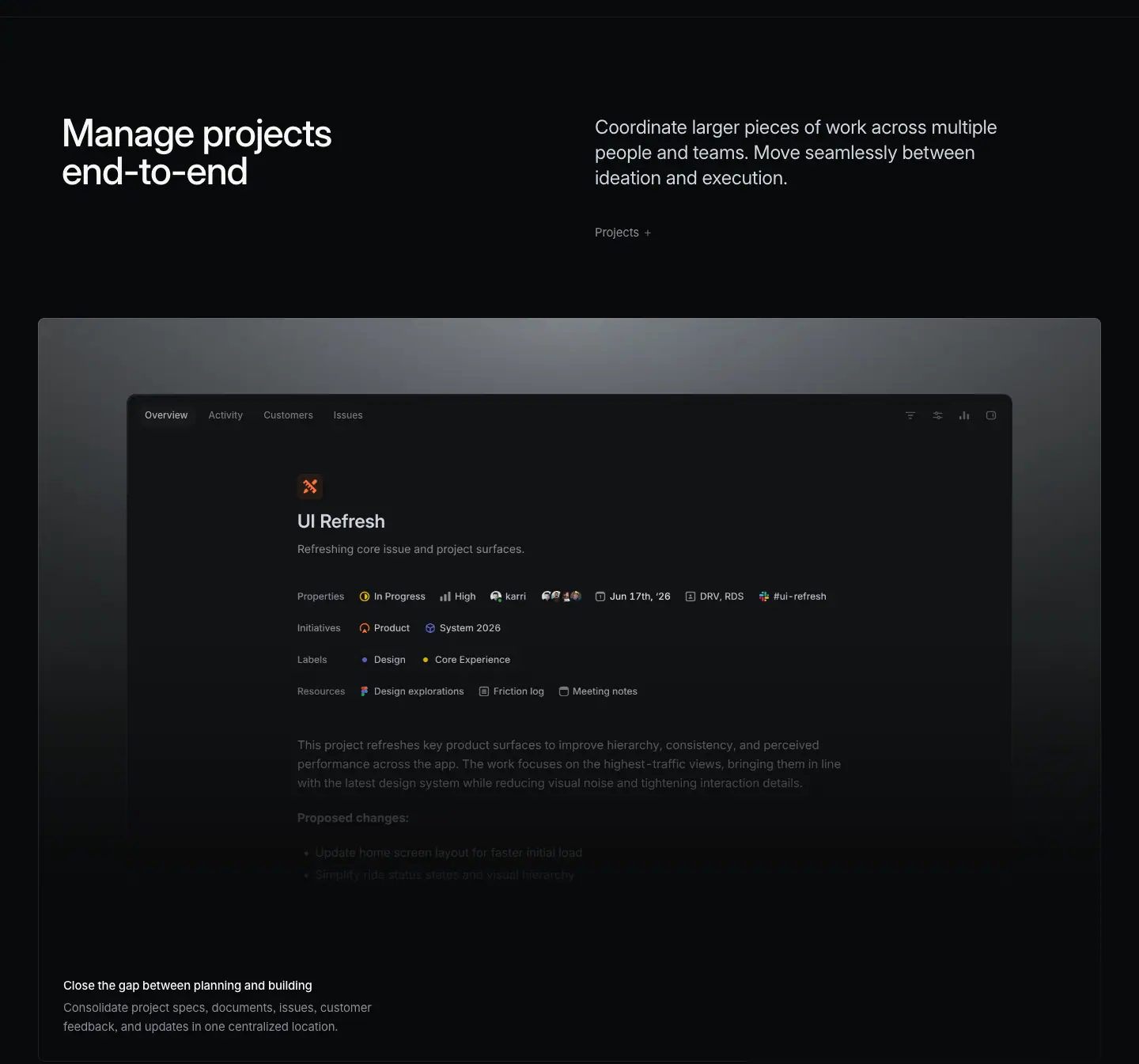
- No stock photos. No abstract 3D blobs. No mascots. About 90% of the visual area on product pages is a recreation of Linear's own interface: issue views, diffs, inboxes, charts.
- The UI is rendered at true 1:1 scale with real-looking data ("DRV-5428 App freezes on splash screen", "ENG-2498 Dimmed Status Cards").
- Why: the buyer is a product/engineering team that will live in this tool for 8 hours a day. Showing the real interface proves the product exists and is polished. It also lets the marketing page share components with the app, so the two never drift apart in style.
P2 · Darkness as a canvas, not a mood
- Page background
#08090a (--color-bg-primary), not #000. Panels step up in tiny increments: #0f1011 → #141516 → #191a1b.
- Why: near-black lets the product screenshots (which are themselves dark UI) sit in the page instead of on it. Pure black would make the panels look grey and flat. The 1-3% steps create depth without visible boxes.
P3 · Hierarchy from gray, not from color
- Four text colors carry the entire hierarchy:
#f7f8f8 (primary), #d0d6e0 (secondary), #8a8f98 (tertiary), #62666d (quaternary).
- Brand indigo (
#5e6ad2 / #7170ff) is almost absent from marketing chrome. It appears inside the product UI (selection, charts) and in the "Skip to content" link only.
- Why: when nothing is colored, the one colored thing (a green "On Track" status, a red diff line, a lime testimonial card) gets all the attention. Color becomes information, not decoration.
P4 · One typeface, three weights, tight tracking
- Inter Variable everywhere, with
font-feature-settings: "cv01", "ss03" (alternate 1 and a rounder a-family look). Berkeley Mono for labels and code. Tiempos Headline (serif) exists as a token but does not appear on these 13 pages.
- Weights are custom variable values: 400, 510, 590. Not 500/600.
- Why: 510 reads as "medium" but stays lighter than a typical 500 at display size on dark backgrounds, where text blooms (light text on dark looks heavier). Negative tracking (-0.022em) makes large Inter look like a custom display face.
P5 · Restraint in layout: few elements, large gaps
- Sections are
padding: 128px 0 (measured on /plan). The H2 block → visual gap is ≈ 200px.
- One idea per section: a heading, one paragraph, one link, one visual.
- Why: density lives inside the product UI screenshots (which are information-dense by nature). The page around them is sparse, so the eye has a calm place to rest between dense visuals. Dense-inside, sparse-outside.
P6 · Show, then tell, then prove
Every product page follows the same narrative order:
1. Promise (hero H1, no subhead on newer pages)
2. Capability blocks (H2 + paragraph + framed product UI + 2×2 bento of sub-features)
3. Cross-links to sibling product pages
4. Proof (two testimonial cards + "Linear powers over 50,000 product teams")
5. Close (centered "Built for the future. Available today." + 2 buttons)
Why: the visitor already knows what Linear is (they arrived from the homepage or search). The page does not sell the category. It shows the specific capability, and then lets peers vouch for it.
P7 · System over pages
- Two templates cover 13 pages (see 04-layout-grid-spacing.md).
- The same blocks repeat with different content: section header split, feature frame, 2×2 bento, 3-up colored cards, mono-label tabs, testimonial pair, final CTA, footer.
- Why: a small team ships many pages. A strict block library means each new page is assembly, not design. It also builds recognition: after one page, the visitor knows how to read the next.
P8 · Copy is short, declarative, and parallel
- H1s are 5-8 words. H2s are 2-7 words. Many headings use a two-sentence parallel structure: "Artificial colleagues. Natural collaboration." / "Instant insights. Durable dashboards." / "Built for the future. Available today."
- Why: parallel noun phrases read like a design principle, not a sales claim. They are quotable and fit on 2 lines at 72px.
See 07-copywriting.md for the full analysis.
P9 · Motion is evidence, not decoration
- Animations show the product doing something: a diff streaming in, a triage suggestion appearing, a carousel of agent windows. Text scramble effects appear on mono labels ("IDENTIFY URGENT TASKS").
- No parallax for its own sake, no bouncing icons.
- Why: each animation answers "what does this feature do?" faster than a sentence could.
The Linear look in one sentence
A near-black canvas, Inter at 510 weight with tight tracking, four grays for hierarchy, the real product UI as the only illustration, 1px hairline borders at 5-8% white, and very large vertical gaps.
02 · Color system
All values read from CSS custom properties on body (data/*.json → vars) and from computed background-color / border-color counts across all 13 pages (bg, bd).
1. Surfaces (backgrounds)
| Token |
Value |
Use |
Count across pages |
--color-bg-marketing |
#010102 |
deepest black: page background of /mobile only, so black-edged photos and phone renders blend in with no visible frame |
— |
--color-bg-primary / --color-bg-level-0 |
#08090a |
page background, caption strips under frames |
98 elements |
--color-bg-level-1 / --color-bg-panel |
#0f1011 |
panels, product windows, bento cells |
209 elements (most used) |
--color-bg-level-2 / --color-bg-tint |
#141516 |
raised panel, hovered row |
— |
--color-bg-level-3 |
#191a1b |
inner chips, inputs |
— |
--color-bg-secondary |
#1c1c1f |
menus, popovers in UI |
— |
--color-bg-tertiary |
#232326 |
selected state inside UI |
— |
--color-bg-quaternary |
#28282c |
strongest neutral fill |
— |
--color-bg-translucent |
#ffffff0d (5% white) |
secondary button, glass chips |
47 elements |
| — |
rgba(255,255,255,.03) |
very faint fills on cards |
42 elements |
--header-bg |
#0b0b0bcc (80% opacity) + backdrop-filter: blur(20px) |
sticky header |
— |
The step size is tiny: level-0 → level-1 is +7 in each RGB channel (#08 → #0f). That is about 2.7% lightness. You see the panel because of the hairline border, not the fill.
Why
- On a dark canvas, big jumps between surface levels look like boxes pasted on the page. Tiny steps + hairline borders look like one continuous material.
- Product screenshots are rendered on
#0f1011, so they merge into the page.
2. Text (foreground)
| Token |
Value |
Role |
Contrast on #08090a |
--color-text-primary |
#f7f8f8 |
headings, card titles, emphasized lead-ins |
18.7:1 |
--color-text-secondary |
#d0d6e0 |
24px section paragraphs, hero lead, UI body |
13.6:1 |
--color-text-tertiary |
#8a8f98 |
descriptions, footer links, 17px intros, captions |
6.1:1 |
--color-text-quaternary |
#62666d |
legal links, mono kicker labels, placeholders, disabled |
3.5:1 (fails AA for body text; used only for non-essential text) |
(Contrast ratios computed with the WCAG 2 formula from the hex values.)
The most used style on all pages is 13px / 400 / #8a8f98 (463 elements), then 15px / 400 / #8a8f98 (169). Grey text is the default; white text is the exception.
Note the secondary text #d0d6e0 has a cool blue tint (B channel is +16 over R). Primary #f7f8f8 is neutral. The slight blue in the secondary gives a "screen" feel without visible color.
The two-tone sentence
A signature move: one paragraph, two colors.
<p style="color:#8a8f98">          <!-- tertiary -->
  <span style="color:#f7f8f8">Start from anywhere.</span>   <!-- primary -->
  Kick off a session from an issue, a chat, a comment, or a Slack thread.
</p>
Measured on /coding-agent: 24px / 31.92px, weight 400 for both parts, only the color changes. On /asks and /insights the lead-in is also bolder (17px, 590 white lead + 510 grey continuation). See 03-typography.md.
3. Borders and lines
| Value |
Use |
Count |
rgba(255,255,255,.05) 1px (--color-border-translucent) |
default hairline: card edges, dividers |
147 |
rgba(255,255,255,.08) 1px (--color-border-translucent-strong) |
bento grid outer border, header border |
92 |
#23252a 1px (--color-border-primary) |
solid borders inside product UI |
51 |
rgba(255,255,255,.12) 1px |
emphasized edges (feature frame gradient border top) |
36 |
#34343a, #3e3e44 |
secondary / tertiary solid borders |
— |
--color-line-* #37393a … #141515 |
rules and separators |
— |
All borders are 1px (--border-hairline: 1px). No 2px borders on marketing chrome.
Why translucent white instead of solid grey? A translucent border picks up the surface beneath it. The same token works on #08090a, on #0f1011, and on a gradient spotlight, and always reads as "edge".
4. Accent and brand
| Token |
Value |
Where it shows on marketing pages |
--color-brand-bg / --color-indigo |
#5e6ad2 |
"Skip to content" link, selection, chart bars in product UI |
--color-accent |
#7170ff |
product UI accents |
--color-accent-hover / --color-link-primary |
#828fff |
"Browse all →" links (15px 510) |
--focus-ring-color |
#5e69d1 |
1px focus outline, offset 2px |
--color-selection-bg |
color-mix(in lch, #5e6ad2, black 10%) |
text selection |
Indigo is never used for a primary CTA button. The primary button is light grey #e5e5e6 with near-black text. See 08-components-and-chrome.md.
Product-line colors
Each product pillar has its own color token, used as a tiny accent (an icon, a dot, an eyebrow), never as a fill:
| Token |
Value |
Pillar |
--color-linear-plan |
#68cc58 green |
Plan |
--color-linear-build |
#d4b144 gold |
Build |
--color-linear-security |
#7a7fad dusty violet |
Security (the /security H2 category labels use it) |
Status colors (inside product UI only)
--color-green #27a644 (On Track, diff additions, with an 8% green row tint rgba(39,166,68,.08)), --color-red #eb5757 (diff deletions, tint rgba(243,78,82,.08)), --color-orange #fc7840, --color-yellow #f0bf00, --color-blue #4ea7fc, --color-teal #00b8cc.
These appear only where the product would show them. That is why they carry meaning.
5. The color exceptions (and why they work)
The page is 99% grayscale. Color appears in exactly four places:
- Product UI semantics (status dots, diff lines, chart bars).
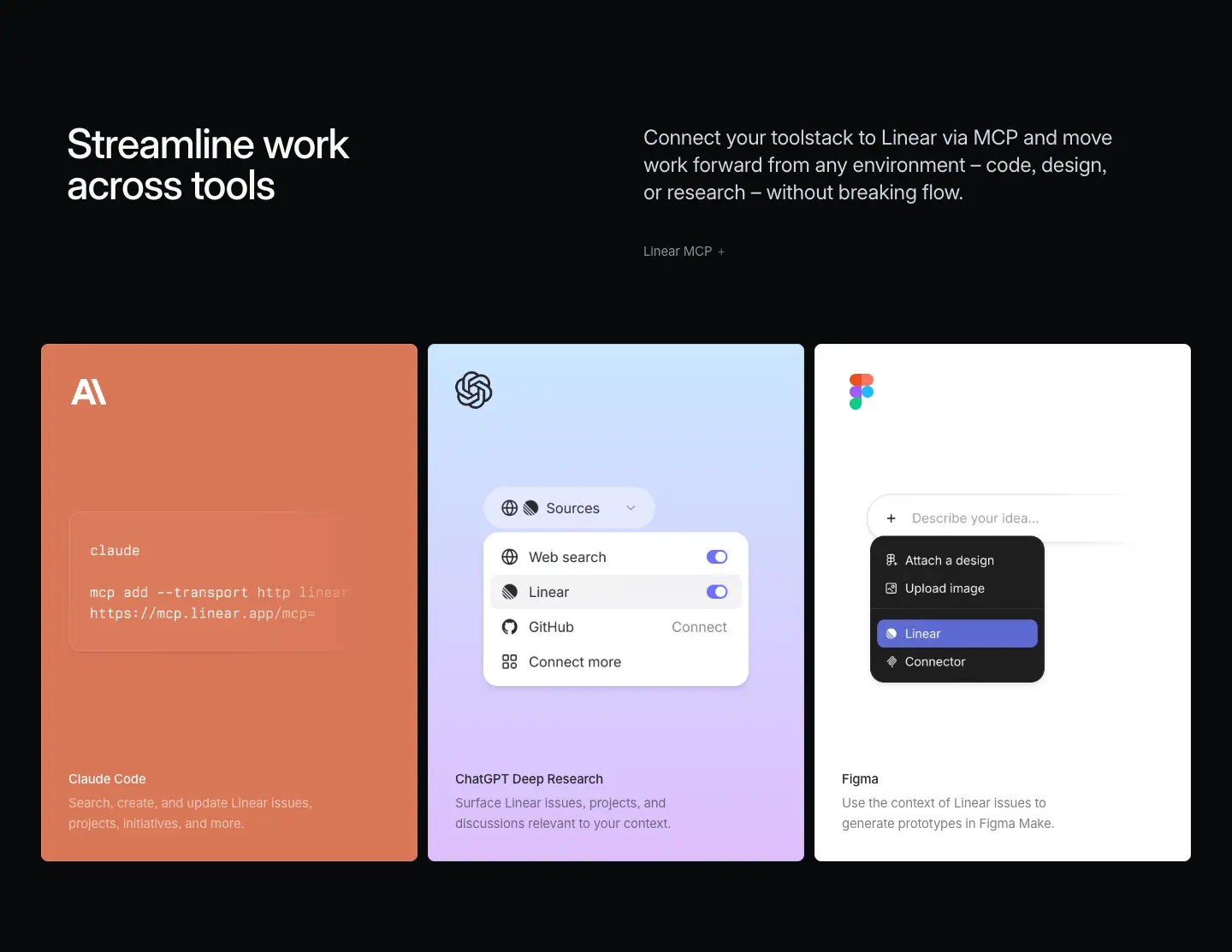
- Partner cards on
/build "Streamline work across tools": each card is filled with the partner's brand color (Claude orange ≈ #d97757, ChatGPT blue-to-lilac gradient, Figma white). ≈ measured from screenshot.
- Testimonial cards: one off-white
#f7f8f8 card and one saturated card (lime rgb(228,242,34) on /ai), both with dark text #08090a. These are the only light surfaces on product pages.
- Ambient hero visuals: blurred, glowing dots or streaks (blue/green on
/plan, red/blue streaks on /insights) behind the H1.
Why: a light card in a dark page is the strongest possible contrast. It is reserved for social proof, so the customer quote is the brightest thing on the page after the hero.
6. Gradients
Gradients are structural, never decorative fills:
- Spotlight on feature frames: a background image (kmKW8a_card uses a CDN image) that creates a grey radial light at the top center, fading to #0f1011. Paired with a "gradient border" wrapper (Fzcv4W_gradientBorder), the frame edge is brighter at the top.
- Card sheen: linear-gradient(rgba(255,255,255,.03), rgba(255,255,255,.03)), linear-gradient(#0f1011, #0f1011), linear-gradient(13x deg, …) stacked fills.
- Edge fades: linear-gradient(to right, transparent, #08090a) masks carousels and long UI at the page edge.
- Border sheen: linear-gradient(135deg, rgba(255,255,255,.08), rgba(255,255,255,.05) 50%, …) used as a border-image.
7. Copy-paste token set
:root {
  /* surfaces */
  --bg-0: #08090a;  --bg-1: #0f1011;  --bg-2: #141516;  --bg-3: #191a1b;
  --bg-glass: rgba(255,255,255,.05);
  /* text */
  --fg-1: #f7f8f8;  --fg-2: #d0d6e0;  --fg-3: #8a8f98;  --fg-4: #62666d;
  /* lines */
  --line-1: rgba(255,255,255,.05); --line-2: rgba(255,255,255,.08); --line-3: rgba(255,255,255,.12);
  --line-solid: #23252a;
  /* accent */
  --accent: #5e6ad2; --accent-bright: #7170ff; --link: #828fff;
  /* buttons */
  --btn-primary-bg: #e5e5e6; --btn-primary-bg-hover: #fff; --btn-primary-fg: #08090a;
  /* status */
  --green: #27a644; --red: #eb5757; --orange: #fc7840; --yellow: #f0bf00; --blue: #4ea7fc;
}
Rules to reuse
- Pick one near-black page color and step panels up by 2-3% lightness only.
- Define 4 text grays; make the third gray the default body color.
- Use translucent white hairlines (5% / 8% / 12%) instead of solid grey borders.
- Keep the brand color out of buttons and headings. Let it live inside the product visuals.
- Spend color only on meaning (status, partner identity) and on one light testimonial card.
03 · Typography
Every value is a computed style read from the live pages (data/*.json → heads, texts, hist). Format: size / line-height · weight · letter-spacing · color.
1. Families
| Role |
Family |
Fallbacks |
Where |
| Sans (everything) |
Inter Variable |
"SF Pro Display", -apple-system, BlinkMacSystemFont, "Segoe UI", Roboto… |
headings, body, buttons, UI |
| Mono |
Berkeley Mono |
ui-monospace, "SF Mono", Menlo |
uppercase kicker labels, tab labels, code, issue IDs |
| Serif display |
Tiempos Headline |
ui-serif, Georgia |
defined as a token (--font-serif-display); not on the 13 product pages, but loaded on /method/* essay titles (see Sourcing below) |
Global settings on body (measured):
font-feature-settings: "cv01", "ss03";   /* Inter: alternate 1, open digits/letterforms */
font-variation-settings: "opsz" auto;     /* optical size follows font-size */
-webkit-font-smoothing: antialiased;
text-rendering: optimizeLegibility;
Why cv01 + ss03: these Inter alternates make the face look less "default Inter" and more like a custom brand font. opsz auto makes the 72px headings use Inter's display optical size (tighter, sharper) and the 13px text use the text optical size (wider, more open). One family covers both jobs.
2. Weights
--font-weight-light: 300;
--font-weight-normal: 400;
--font-weight-medium: 510;     /* headings, card titles, buttons */
--font-weight-semibold: 590;   /* rare: some older-template H1s, lead-ins */
--font-weight-bold: 680;       /* not seen on these pages */
- Newer-template H1s use 500 (
/plan, /build, /ai, /intake, /reviews). Every H2 and card title uses 510.
- Older-template pages use 510 or 590 for H1 (
/insights H1 = 590, /mobile H1 = 590).
- Body copy is always 400.
- Nothing is bold (700). The heaviest marketing text is 590.
Why 510 instead of 500/600: light text on a dark background looks heavier than the same weight on white (irradiation). 510 is a hair above regular in perceived weight. Headings feel confident but never shout. Contrast between heading and body comes from size and color, not weight.
3. The scale (as used on the pages)
Display and headings
| Role |
Size / LH |
Weight |
Letter-spacing |
Color |
Seen on |
| H1 product hero |
72 / 72 (1.0) |
500 |
-1.584px (-0.022em) |
#f7f8f8 |
plan, build, ai, intake, reviews |
| H1 / final CTA |
72 / 72 |
510 |
-1.584px |
#f7f8f8 |
agents, "Built for the future. Available today." |
| H1 feature hero |
64 / 67.84 (1.06) |
510 |
-1.408px (-0.022em) |
#f7f8f8 |
asks, security, coding-agent, customer-requests |
| H1 feature hero (semibold) |
64 / 67.84 |
590 |
-1.408px |
#f7f8f8 |
insights |
| H2 section |
48 / 48 (1.0) |
510 |
-1.056px (-0.022em) |
#f7f8f8 |
all product pages (37 uses) |
| H1 mobile page |
48 / 48 |
590 |
-1.056px |
#f7f8f8 |
mobile |
| H2/H3 closing / sub-section |
40 / 44 (1.1) |
510 |
-0.88px (-0.022em) |
#f7f8f8 |
asks, insights, customer-requests, mobile, integrations |
| H2 side-heading |
32 / 36 (1.125) |
510 |
-0.704px (-0.022em) |
#f7f8f8 |
"How teams use Linear Asks", "Tech specs" |
| Testimonial quote |
32 / 36 |
400 |
-0.704px |
#08090a (dark on light card) |
all product pages |
| Section lead paragraph |
24 / 31.92 (1.33) |
400 |
-0.288px (-0.012em) |
#d0d6e0 |
right column of every H2 split |
| Cross-link title |
24 / 31.92 |
510 |
-0.288px |
#f7f8f8 |
"Make your product operations self-driving" cards |
| Card title (feature template) |
20 / 26.6 (1.33) |
510 |
-0.24px (-0.012em) |
#f7f8f8 |
asks, insights, mobile |
| Intro paragraph (feature template) |
17 / 27.2 (1.6) |
400 |
normal |
#8a8f98 |
asks, insights, customer-requests, agents |
| Lead-in (two-tone) |
17 / 27.2 |
590 white + 510 grey |
normal |
#f7f8f8 + #8a8f98 |
asks, insights |
Body and UI
| Role |
Size / LH |
Weight |
Letter-spacing |
Color |
| Card title (product template) |
15 / 24 (1.6) |
510 |
-0.165px (-0.011em) |
#f7f8f8 |
| Card description |
15 / 24 |
400 |
-0.165px |
#8a8f98 |
| "Learn more" link (e.g. "Projects →") |
15 / 24 |
400 |
-0.165px |
#8a8f98 |
| Accent link ("Browse all →") |
15 / 24 |
510 |
-0.165px |
#828fff |
| Hero eyebrow ("Planning and monitoring") |
16 / 24 |
400 |
normal |
#f7f8f8 |
| Spec-list item / small title |
14 / 21 |
510 |
-0.182px (-0.013em) |
#d0d6e0 |
| Small description |
14 / 21 |
400 |
-0.182px |
#8a8f98 |
| Nav links, footer links |
13 / 19.5 (1.5) |
400 |
-0.13px (-0.01em) |
#8a8f98 (most used style: 463 uses) |
| Footer column title |
13 / 19.5 |
510 |
-0.13px |
#f7f8f8 |
| Legal links |
13 / 19.5 |
400 |
-0.13px |
#62666d |
| Button (header) |
13 / 32 (= height) |
510 |
normal |
#08090a on #e5e5e6 |
| Button (hero / CTA) |
15 / 40 or 16 / 44 |
510 |
normal |
— |
| Micro UI text |
12 / 16 or 11 / 14 |
400 |
normal |
#8a8f98 |
Mono labels (Berkeley Mono, uppercase)
| Role |
Size / LH |
Weight |
Color |
Example |
| Kicker under a visual |
12 / 16.8 |
400 |
#62666d |
"IDENTIFY URGENT TASKS", "LINEAR AGENT WORKS WHERE YOU WORK" |
| Tab label (active) |
12 / 20 |
510 |
#d0d6e0 |
"COLLABORATIVE EDITING", "AUTO-ASSIGN AND UPDATE" |
| Tab description |
12 / 20 |
400 |
#8a8f98 |
"WORK TOGETHER ON PRDS, SPECS, AND DOCS…" |
| Numbered list |
12 |
400 |
active #d0d6e0, rest #62666d |
"01. CHAT 02. ISSUES 03. REVIEWS" |
| Diagram label |
11 / 20 |
400 |
#62666d / #d0d6e0 |
"DELEGATE", "AUTOMATE", "ENG-2498" |
| Code (diff) |
14.54 / 24.61 |
400 |
syntax colors (#f7bf8b, #e391cf, #83dcdc) |
coding-agent hero |
Why mono for labels: it signals "system / machine" (agents, IDs, automations) and creates a second texture next to Inter without adding a second sans. Uppercase mono at 11-12px reads like an annotation on a technical drawing.
4. Letter-spacing rule
Linear uses two em-based tracking values, not one per size:
| Size range |
Tracking |
In px |
| ≥ 32px (display) |
-0.022em |
72 → -1.584, 64 → -1.408, 48 → -1.056, 40 → -0.88, 32 → -0.704 |
| 20-24px (lead) |
-0.012em |
24 → -0.288, 20 → -0.24 |
| 13-15px (body) |
-0.010 to -0.013em |
15 → -0.165, 14 → -0.182, 13 → -0.13 |
| ≤ 12px, 16-17px intro, mono |
normal (0) |
— |
The design-system tokens state the same thing (--title-4..9-letter-spacing: -.022em, --title-1..3: -.012em, --text-regular: -.011em).
Why: Inter is drawn for text sizes. At 48-72px its default spacing looks loose. -0.022em closes the gaps so the heading reads as one shape. Small text keeps near-normal spacing for legibility.
5. Line-height rule
| Size |
LH ratio |
| 48-72px headings |
1.0 (solid) |
| 64px feature H1 |
1.06 |
| 40px |
1.1 |
| 32px |
1.125 |
| 20-24px |
1.33 |
| 15-17px body |
1.6 |
| 13-14px |
1.5 |
Why solid (1.0) display leading: two-line headings ("Plan and navigate / from idea to launch") become a compact block. Descenders of line 1 nearly touch ascenders of line 2. That density makes them look set, not typed. Body text at 1.6 is generous for reading grey-on-black text.
6. Measure (line length)
| Element |
Max width |
≈ characters per line |
| Product H1 |
582-795px (/plan 582, /ai 795) |
18-25 chars, always 2 lines |
| H2 section heading |
542px (fixed column) |
15-20 chars, 2 lines |
| 24px lead paragraph |
566px (right column) |
≈ 50 chars, 3 lines |
| 15px card description |
624px max (max-width: 624px) |
in practice 35-45 chars because of manual breaks |
| 17px intro (centered template) |
≈ 560-640px |
≈ 70 chars |
Headings are deliberately broken into two balanced lines. Card descriptions often have a manual line break so each line is a phrase ("Communicate health and progress / with built-in project updates.").
7. Heading + subheading pairings
Linear has five distinct ways to pair a heading with its supporting text. This is the core of the "Linear look".
A · Split header (heading left, paragraph right)
- H2 48/48 · 510 · #f7f8f8 at x=78, width 542.
- Paragraph 24/31.92 · 400 · #d0d6e0 at x=752 (starts at the 50% line of the 1344 container), width 566.
- Below paragraph: 15px #8a8f98 link "Linear MCP →", ≈ 130px under the top.
- Both columns top-aligned (H2 y=973, P y=975).
- Mobile: link moves above the heading as an eyebrow, paragraph stacks below.
Why: the heading is a 2-4 word label you can scan; the paragraph is the actual explanation. Putting them side by side lets a scanner read only the left column and a reader read both. It also creates a strong horizontal rhythm across the very tall page.
B · Eyebrow + H1 (no subhead)
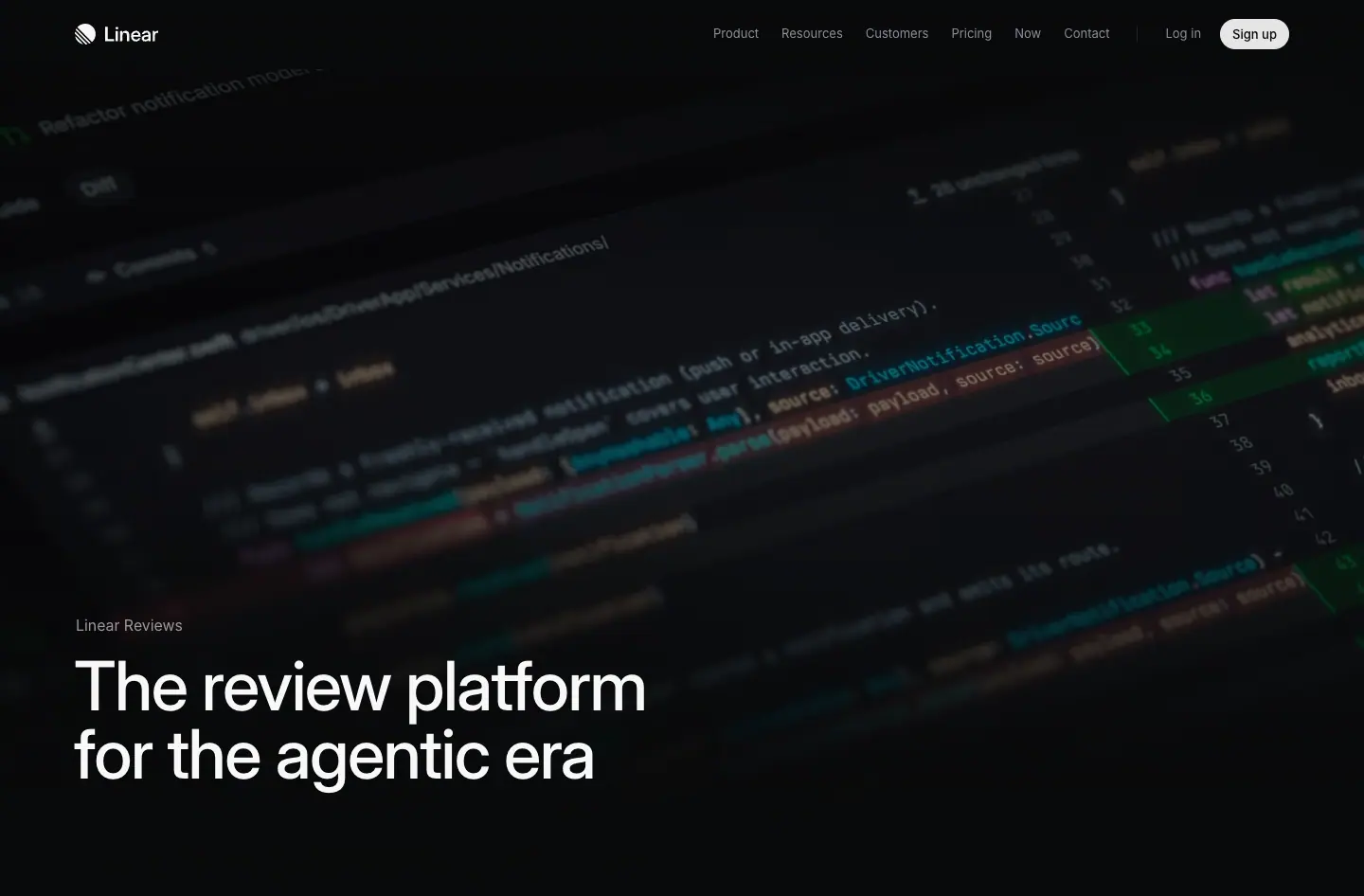 - Eyebrow 16/24 · 400 ·
#f7f8f8 (white, not grey), 40px above the H1 baseline area (y 532 → 572).
- H1 72/72 · 500.
- No paragraph, no button. The first H2 split below acts as the explanation.
Why: the hero only has one job: name the outcome. Everything else waits.
C · Two-tone paragraph (white lead + grey continuation)
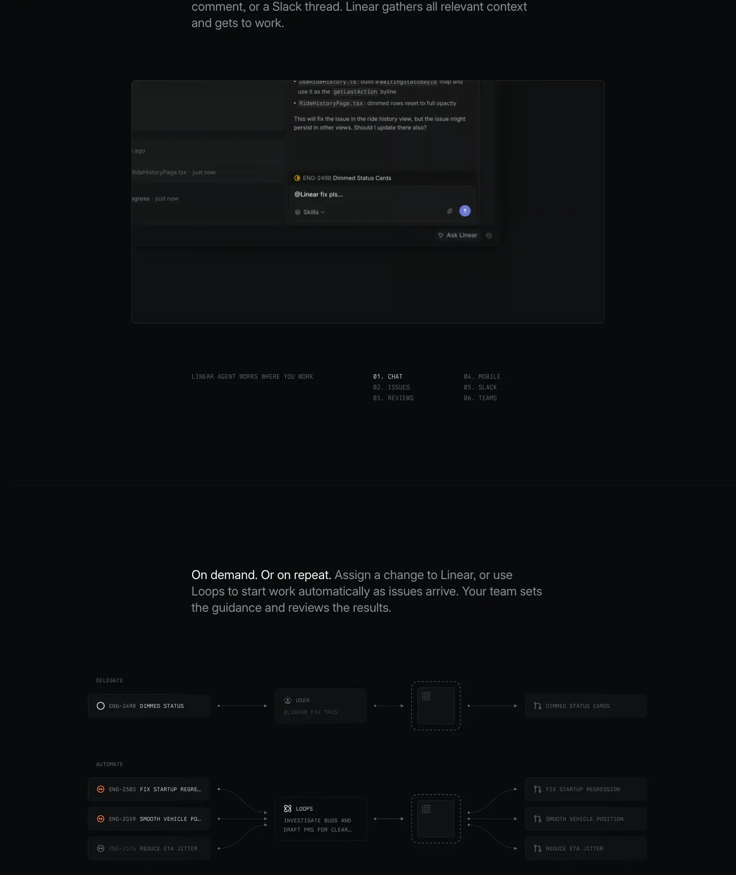 -
/coding-agent: one <p> at 24/31.92 · 400 · #8a8f98, with a <span> in #f7f8f8 for the first sentence. Width 754px. Centered column.
- /asks, /insights: 17/27.2, lead-in at 590 white, rest at 510 or 400 grey.
Why: the white phrase works as a heading, the grey part as body, but they read as one sentence. It removes a heading level and shortens the page while keeping hierarchy. Readers who only skim read 3-4 words.
D · Centered H1 + grey intro + button (older template)
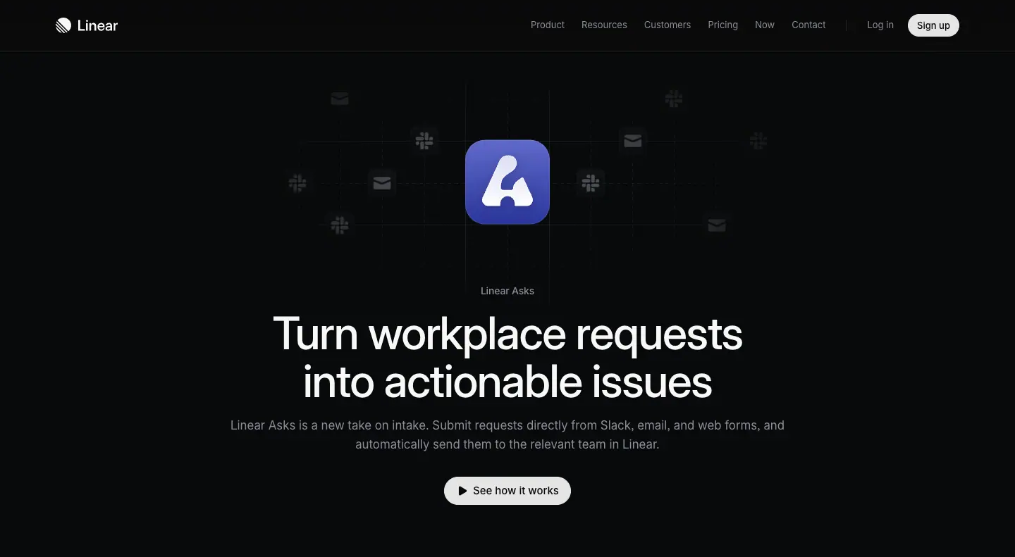 - Small label 13-14px
#8a8f98 → H1 64/67.84 centered, width 832 → 17/27.2 #8a8f98 intro → pill button.
E · Side heading + list (spec-list)
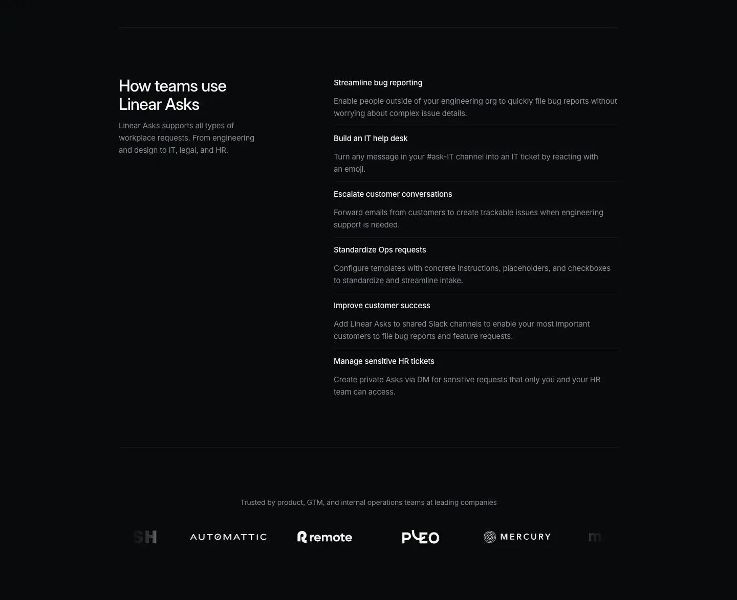 - H2 32/36 left (x=232, width 304) + 14px grey description; list on the right (x=652, width 556) with 15/24 · 510 white item titles and 14px grey descriptions, separated by 1px hairlines.
8. Responsive type (measured at 390px viewport on /plan)
| Role |
1440px |
390px |
| H1 |
72/72, ls -1.584 |
40/44, ls -0.88 |
| H2 |
48/48 |
24/31.92, ls -0.288 |
| Lead paragraph |
24/31.92 |
≈ 17px (≈ measured from screenshot) |
| Page gutter |
x=78 |
x=23 |
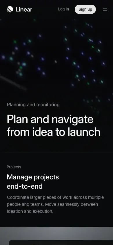
The H2 drops two steps (48 → 24), more than the H1 (72 → 40). On mobile the hero keeps its dominance while section headings become compact labels.
9. Copy-paste type tokens
:root {
  --font-sans: "Inter Variable", "SF Pro Display", -apple-system, BlinkMacSystemFont, "Segoe UI", Roboto, sans-serif;
  --font-mono: "Berkeley Mono", ui-monospace, "SF Mono", Menlo, monospace;
  --w-regular: 400; --w-medium: 510; --w-semibold: 590;

  --t-display-xl: 500 72px/1 var(--font-sans);   /* letter-spacing: -0.022em */
  --t-display-l:  510 64px/1.06 var(--font-sans); /* -0.022em */
  --t-h2:         510 48px/1 var(--font-sans);    /* -0.022em */
  --t-h3:         510 40px/1.1 var(--font-sans);  /* -0.022em */
  --t-h4:         510 32px/1.125 var(--font-sans);/* -0.022em */
  --t-lead:       400 24px/1.33 var(--font-sans); /* -0.012em */
  --t-title:      510 20px/1.33 var(--font-sans); /* -0.012em */
  --t-intro:      400 17px/1.6 var(--font-sans);  /* 0 */
  --t-body:       400 15px/1.6 var(--font-sans);  /* -0.011em */
  --t-small:      400 14px/1.5 var(--font-sans);  /* -0.013em */
  --t-mini:       400 13px/1.5 var(--font-sans);  /* -0.01em */
  --t-label:      400 12px/1.4 var(--font-mono);  /* uppercase, 0 */
}
body { font-feature-settings: "cv01","ss03"; font-variation-settings: "opsz" auto; -webkit-font-smoothing: antialiased; }
h1,h2,h3 { text-wrap: balance; }
Rules to reuse
- One sans + one mono. Medium weight is 510, not 600. Never bold.
- Display tracking -0.022em; body -0.011em; small and mono 0.
- Display line-height 1.0; body 1.6.
- Hierarchy = size jump (72 → 48 → 24 → 15) + gray step (
#f7f8f8 → #d0d6e0 → #8a8f98).
- Headings always 2 balanced lines. Keep the H2 column fixed (≈ 540px) so every section breaks the same way.
- Use the two-tone sentence instead of a separate heading when a block needs only a short lead.
Sourcing: foundry, licence, where to get it, free substitutes
Read from each font file's own name table (fontTools) and the live @font-face rules on 2026-11-21. "Seen on" lists the captured pages that load the file.
| Family |
File served |
Foundry / designer |
Licence |
Axes |
Seen on |
Free substitute |
| Inter Variable 4.001 (+ Italic) |
static.linear.app/fonts/InterVariable.woff2 |
rsms · Rasmus Andersson |
SIL Open Font License 1.1, free; download at rsms.me/inter or Google Fonts |
opsz 14–32, wght 100–900 |
every page |
it is free. Turn on "cv01","ss03" as Linear does. |
| Berkeley Mono Variable 2.002 |
static.linear.app/fonts/Berkeley-Mono-Variable.woff2 |
U.S. Graphics Company · Neil Panchal |
commercial ("Enterprise Business License"), buy at usgraphics.com |
wght 100–900, wdth 60–100, slnt −16–0 |
code blocks, mono labels, /resource-kit |
JetBrains Mono, Geist Mono, IBM Plex Mono (all OFL). Geist Mono is closest in width and tone. |
| Tiempos Headline 1.012 (Regular 400 only) |
static.linear.app/fonts/Tiempos/tiempos-headline-regular.woff2 |
Klim Type Foundry · Kris Sowersby |
commercial, Klim Font Licence, buy at klim.co.nz |
none (static) |
/method/* titles only |
Newsreader Display, Source Serif 4 Display, Instrument Serif (all OFL). Newsreader at opsz 72 is closest. |
Why this mix: Inter is free, neutral and extremely complete (2,937 glyphs), so it carries 99% of text at zero licence risk. The two paid faces are each used for one genre only (essays get Tiempos, systems and code get Berkeley Mono), so their licence cost buys a distinct voice, not body copy.
Where each family appears (measured)
| Family |
Role |
Measured style |
| Inter Variable |
all UI and marketing text |
400 / 510 / 590 weights; see scale above |
| Tiempos Headline |
Method essay H1 |
72px / 72px, weight 400, -1.584px (−0.022em), #f7f8f8 |
| Berkeley Mono |
code, resource kit |
code 14px / 24px; resource-kit menu 15px / 24px, uppercase, weight 400/510 |
New templates measured in this pass
| Template |
H1 |
Section H2 |
Body |
Meta |
| Now / Changelog index |
"Now" 48/48 · 510 · −1.056px |
entry title 32/36 · 590 · −0.704px |
17/27.2 · 400 · #d0d6e0 |
date 14/21 · #f7f8f8 in a left rail at x=104 |
| Changelog sub-feature |
— |
24/31.92 · 590 · −0.288px |
17/27.2 |
"Fixes / Improvements / API" 15/24 · 510 accordion rows |
| Now article |
48/48 · 590 · −1.056px, centred 900px |
24/31.92 · 590 |
17/27.2 · #d0d6e0, 624px column |
author 15/24 #8a8f98 |
| Customer story |
48/48 · 590 |
lead 24/31.92 · 590 |
17/27.2 |
facts "Founded / Switched" 15/24 510 + 400 grey |
| Docs |
32/36 · 590 · −0.704px |
24/31.92 · 590 |
15/24 · #d0d6e0 (smaller than marketing) |
sidebar group 12/16.8 · 510 #8a8f98 |
| Pricing |
"Pricing" 48/48 |
plan name 24/31.92 · 590 |
feature rows 13/19.5 · #d0d6e0 |
price 16/24 |
| Brand |
40/44 · 590 · −0.88px |
24/31.92 · 590 |
15/24 #8a8f98 |
swatch label 13.33px 510 |
04 · Layout, grid and spacing
Values from computed styles on /plan (product template) and the heads / texts x-y positions in data/*.json. "≈" marks values measured from screenshots.
1. Two page templates
The 13 pages use two templates. Knowing which one you are building decides almost every number below.
|
Product template (newer) |
Feature template (older) |
| Pages |
plan, build, ai, intake, reviews (and agents, partly) |
asks, insights, customer-requests, mobile, security, coding-agent (hero), integrations |
| Content width |
1344px (--homepage-max-width: calc(1344px + 46px*2)) |
1024px container (--page-max-width: 1024px), content 976px |
| Left edge at 1440 |
frames at x=48, text at x=78-80 (48 + 32px inset) |
text at x=232 (1440 − 976) / 2 |
| Alignment |
left-aligned, asymmetric |
centered heroes, symmetric |
| Hero |
eyebrow + H1 72px, bottom-left, over an ambient visual |
label + H1 64px centered + 17px intro + pill button |
| Section header |
split: H2 left (542px) / paragraph right (566px from x=752) |
H2 48px left over 2 columns, or centered 40px |
| Card titles |
15px / 510 |
20px / 510 |
| Proof |
2 testimonial cards (light) |
inline quote 20-24px, logo marquee |
| Close |
"Built for the future. Available today." 72px |
40px left-aligned CTA ("Streamline your internal request workflows") |
Full-page comparison:
Product template (/plan) |
Feature template (/asks) |
 |
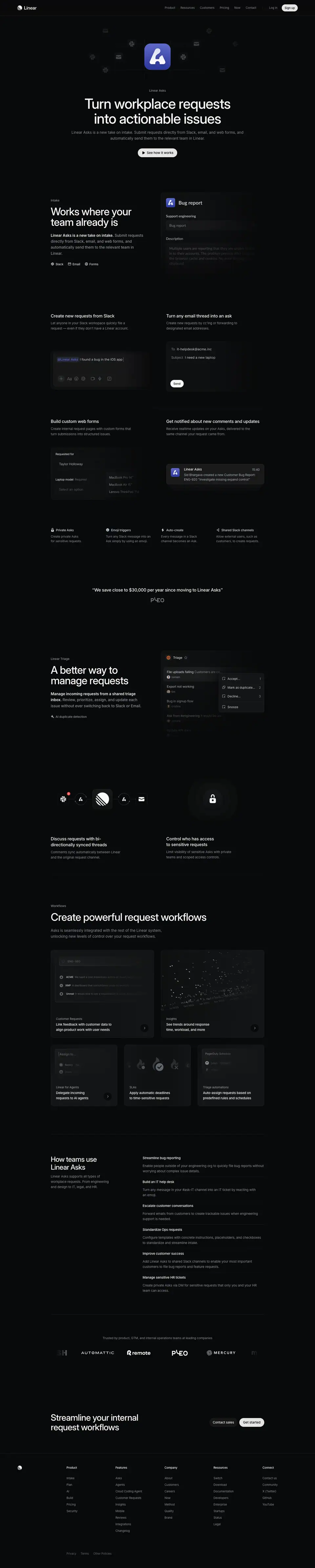 |
Why two templates: the product template is for the four big product pillars (Plan, Build, AI, Intake) plus Reviews. They are wide, cinematic and long (11k-15k px). The feature template is for single features (Asks, Insights, Mobile). They are narrower, shorter (3k-9k px) and centered, like a product announcement.
2. The grid
Product template: a 2-column 50/50 grid inside 1344px
--grid-columns: 12, but the visible structure is two halves: x=48-720 and x=720-1392.- Left text column starts at x=78 (48 + 30-32 inset). Right text column starts at x=752 (720 + 32).
- Bento cells are exactly 671 + 671 = 1342px + 2px border (
grid-template-columns: 671px 671px; gap: 0).
- The H2 split header uses the same two columns as the bento below it. Heading text and the cell captions line up on x=78 and x=752 through the whole page.
Why: one vertical line (x=752) runs through every section: the right paragraph, the right bento cell caption, the right half of the cross-link row. The eye finds a stable rhythm in a 15,000px page.
Feature template: a 976px column with 2- and 4-up grids
- 2-up: cells at x=232 (w 472) and x=760 (w 448). Gutter ≈ 56px.
- 4-up: cells at x=232, 484, 736, 988 (w 220, gutter 32).
- 3-up: x=256, 592, 928 (w 196-256).
- Side heading + list: heading x=232 (w 304), list x=652 (w 556).
3. Vertical rhythm (product template, /plan)
| Gap |
Value |
Source |
| Section padding |
128px top and bottom |
section { padding: 128px 0 } computed |
| Section-to-section (H2 → next H2) |
2691px for a section with frame + 2×2 bento |
y 973 → 3664 |
| H2 top → feature frame top |
252px with a "Feature →" link, 189px without |
measured from screenshot pixels |
| Feature frame bottom → bento top |
48px |
measured from screenshot pixels |
| Module end → next H2 |
257px (plan, build), 219-231px (reviews) |
measured |
| Header height |
72px (--header-height) |
token |
| Hero eyebrow → H1 |
40px (y 532 → 572) |
data |
| Hero H1 → first H2 |
≈ 257px after the H1 bottom (H1 bottom 716, H2 973) |
data |
| Frame caption padding |
32px all sides |
figcaption { padding: 32px } |
| Caption title → description |
4px gap |
gap: 4px |
| Bento cell visual padding |
32px top, 0 sides |
figure { padding: 32px 0 0 } |
| Bento cell height |
597px (visual ≈ 457 + caption 140) |
computed |
| Final CTA block |
≈ 400px tall, H2 centered |
≈ measured |
The repeating unit per capability:
[ H2 split header ]            ~150px
        ↓ ~100px
[ Feature frame 1344 × 940 ]   one large product UI, caption bottom-left
        ↓ 48px
[ Bento 2 × 2 ]                4 cells × 597px, shared 1px borders
        ↓ 128 + 128px
Each of /plan, /build, /ai, /intake repeats this unit 3-6 times. The tall unit (≈ 2,700px) is why those pages are 11k-15k px long.
4. Containers and frames
| Element |
Width |
Radius |
Border |
Fill |
| Feature frame (hero UI) |
1344 |
8px |
gradient border, brighter at top |
spotlight image + #0f1011 |
| Bento grid wrapper |
1344 |
8px |
1px rgba(255,255,255,.08) outer; inner 1px dividers |
transparent |
| Caption strip |
full cell width |
0 |
none |
#08090a |
| Product window inside a frame |
≈ 1120 (≈ 83% of frame) |
≈ 8-12px |
1px #23252a |
#0f1011 |
| Partner cards (3-up) |
≈ 440 each |
≈ 8px |
none |
brand color |
| Testimonial cards |
880 + 432 |
8px (border-radius: 8px) |
none |
#f7f8f8 / lime |
| Integration tiles |
≈ 300 × 200 |
≈ 12px |
1px translucent |
#0f1011 |
| Feature-template link cards (asks, insights) |
varies |
12px |
none |
#0f1011 |
| Feature-template role cards (customer-requests) |
varies |
20px |
none |
#101012 |
| Feature-template feature grid |
976 |
0 |
1px dividers #18191a / #151616, vertical divider at x=720 |
transparent |
Radius tokens available: 4, 6, 8, 12, 16, 24, 32, 9999 (pill), 50% (circle). The product template uses 8px for big surfaces and 9999px for buttons, almost nothing in between. The older feature template also uses 12px (link cards) and 20px (role cards).
Why only 8px: large surfaces with small radii look architectural and precise. Big radii (24px+) read as "friendly consumer app". Linear sells precision.
5. Horizontal composition patterns
- Asymmetric split (product template): text never centered; heading block on the left half, explanation on the right half.
- Centered stack (feature template hero and final CTA only).
- Full-bleed visual, contained text: ambient hero visuals and the agent-window carousel run edge to edge (x=0 to 1440), while text stays in the container. The carousel even bleeds off both edges to suggest "more".
- Inset visual: product windows sit inside a larger frame with ≈ 110px margin on each side, so the UI floats on the spotlight.
6. Section separators
- No colored bands. Sections are separated by space (256px total), and on a few pages by a full-width 1px hairline (
rgba(255,255,255,.05)) above the cross-link row.
- The cross-link row (4 columns) uses vertical 1px dividers between columns.
7. Responsive (measured at 390px on /plan)
- Gutter: 23-24px (
--page-padding-inline: 24px).
- H1 72 → 40px, H2 48 → 24px.
- The split header stacks: link label → H2 → paragraph.
- A full-width hairline separates the hero from the first section.
- Bento 2×2 becomes 1 column (standard).
Rules to reuse
- Choose one content width (1344 for cinematic pages, 976-1024 for focused pages) and keep text inset 32px from frame edges.
- Use a 50/50 two-column grid and align heading, paragraph and bento captions to the same two x-lines.
- Section padding 128px. Large gaps between sections, small gaps (4px) inside text groups.
- 8px radius on every large surface, pill on buttons, nothing else.
- Separate sections with space, not with background color changes.
05 · Hero patterns
13 pages, 9 hero types. All captured at 1440 × 900. Overview sheet:
The fold is at y=900. Note which heroes put the first section heading at the fold (a scroll cue) and which keep the fold clean.
H1 · Ambient bottom-left (product template)
Pages: plan, build, ai, intake, reviews
| plan |
reviews |
 |
|
Structure
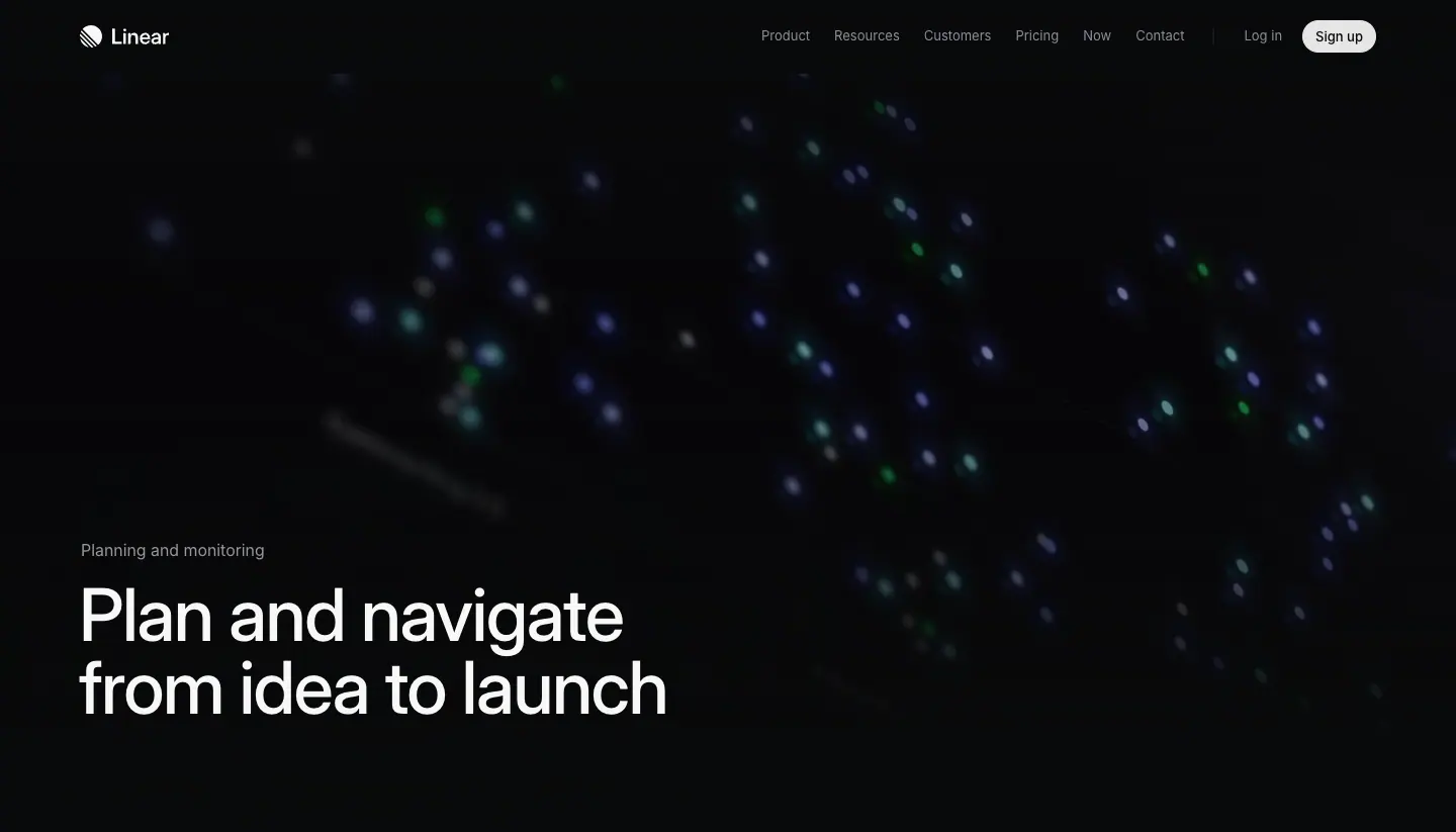
- Full-bleed background visual, very dark, blurred and tilted: glowing dots (/plan), a perspective code editor (/build, /reviews), floating UI cards (/intake, /ai).
- Text anchored bottom-left: eyebrow at y=532, H1 at y=572 (on /reviews 648 / 688).
- Eyebrow: 16/24 · 400 · #f7f8f8. Names the product area ("Planning and monitoring", "Build, review and ship", "AI and automations", "Intake and integrations", "Linear Reviews").
- H1: 72/72 · 500 · -0.022em · #f7f8f8. Two lines, 582-795px wide.
- No subhead. No button. The first section's split header starts at y=973, just below the fold.
Why it works
- The visual is a texture of the product (code, issues, data), not a readable screenshot. It sets the topic in under a second without competing with the headline.
- Bottom-left text follows the reading path: the eye enters at top-left (logo), slides down the empty dark area, and lands on the H1.
- Dropping the subhead and CTA is confident. The header already holds "Sign up". The page assumes the visitor came to learn, not to convert in the first viewport.
- The blur and darkening keep the H1 above 15:1 contrast even over a busy image.
Recipe
- Hero height ≈ 900px. Background: product screenshot at 3D tilt, filter: blur(2-6px), opacity ≈ 30-50%, radial vignette to #08090a at all edges.
- Eyebrow 16px white, 40px above the H1.
- H1 72px / 1.0 / 500 / -0.022em, text-wrap: balance, max 2 lines.
- Bottom padding ≈ 180px before the first section.
H2 · Statement + live product carousel
Page: agents
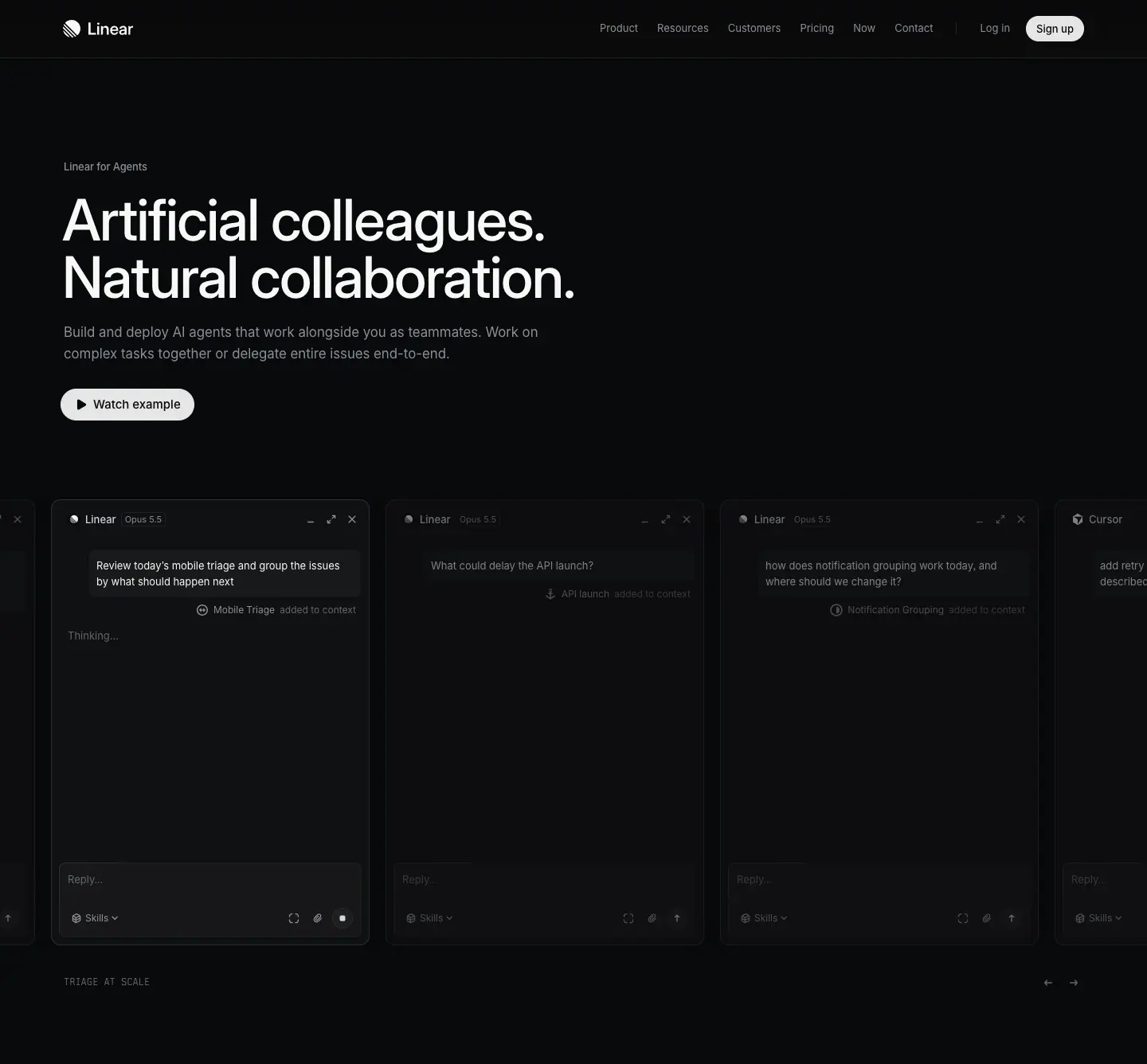
- Small label "Linear for Agents" (13px grey) → H1 72px/510 in two parallel sentences: "Artificial colleagues. / Natural collaboration." → 17/27.2 grey intro (2 lines) → pill button "▶ Watch example" (light
#e5e5e6, 32-40px high).
- Below: a full-bleed horizontal carousel of agent chat windows (Linear, Cursor, …), each a faux app window with title bar, model chip ("Opus 5.5"), a prompt, and a reply composer. Windows bleed off both screen edges.
- Under the carousel: an uppercase mono kicker ("IDENTIFY URGENT TASKS", 12px
#62666d, with a text-scramble animation) and ← → arrows on the right.
- In the capture the windows are mid-animation (reply areas empty). The live page types the conversation in.
Why: the agents page sells many agents in one place. A row of identical windows from different vendors shows "plurality + equal citizenship" in one picture. The mono kicker narrates which task each window shows.
H3 · Narrow left column + full product window
Page: coding-agent
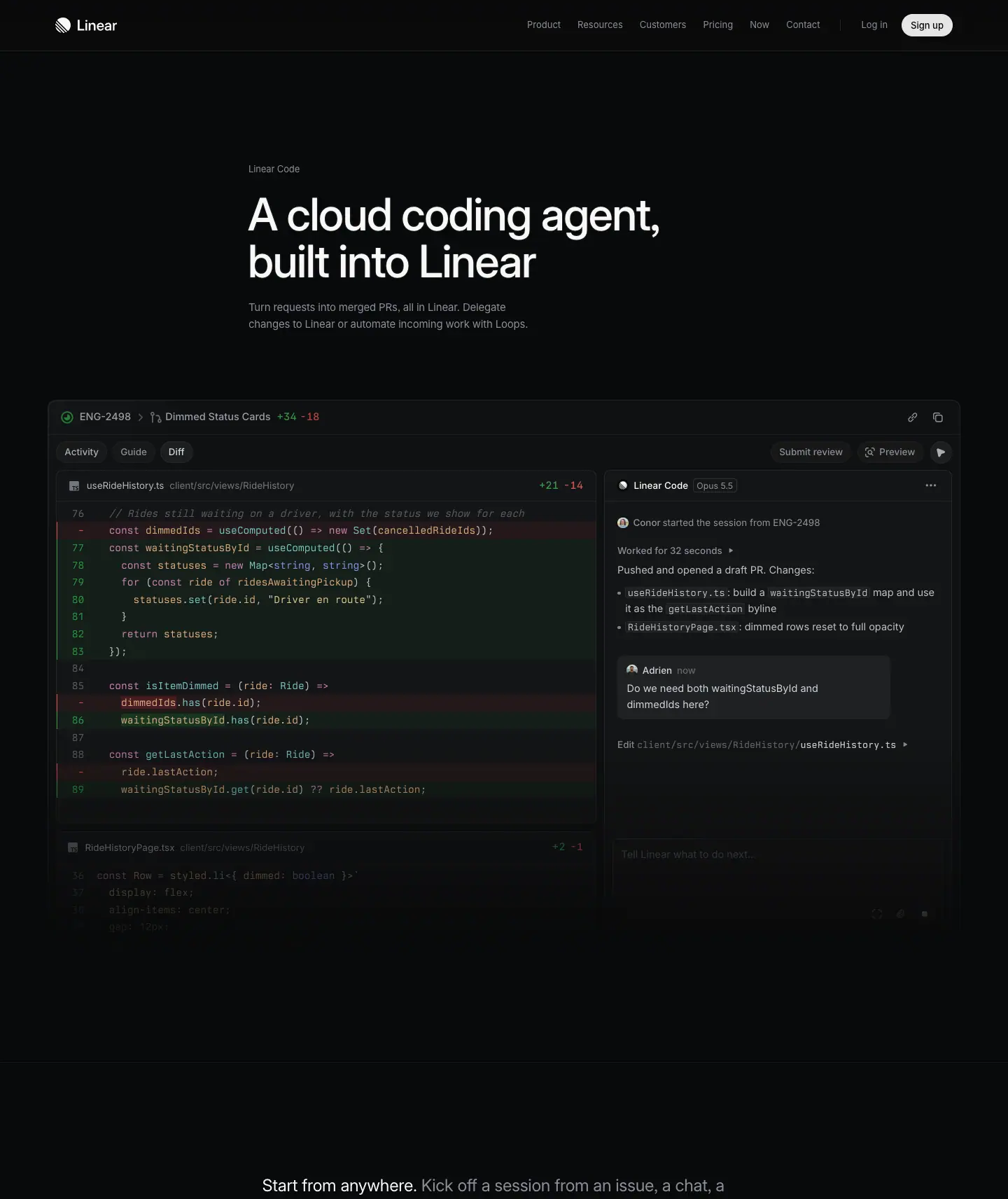
- Text column inset (x=322), left-aligned: label "Linear Code" → H1 64/67.84 · 510 → 15-16px grey intro (2 lines).
- Directly under it: a huge, crisp, unblurred product window (≈ 1300px wide): issue header "ENG-2498 > Dimmed Status Cards +34 −18", tabs Activity / Guide / Diff, a real diff with red/green rows, and the agent's side panel ("Worked for 32 seconds", "Pushed and opened a draft PR").
- Bottom of the window fades into the page.
Why: for a coding agent, the proof is the diff. The window is the hero; the text is a caption above it. A developer reads real code and decides in five seconds.
H4 · Product icon on a constellation grid (centered)
Page: asks
- Centered app icon (indigo squircle with an "A") at the center of a faint dotted grid. Around it float dim monochrome glyphs of the input channels (Slack, email).
- Label "Linear Asks" (13px grey) → H1 64px centered, 2 lines → 17px grey intro (2 lines, ≈ 720px) → pill button "▶ See how it works".
Why: Asks is an input hub. The composition literally shows many channels converging on one icon. Centering suits an announcement-style feature page.
H5 · Abstract data visual on top, centered text below
Page: insights
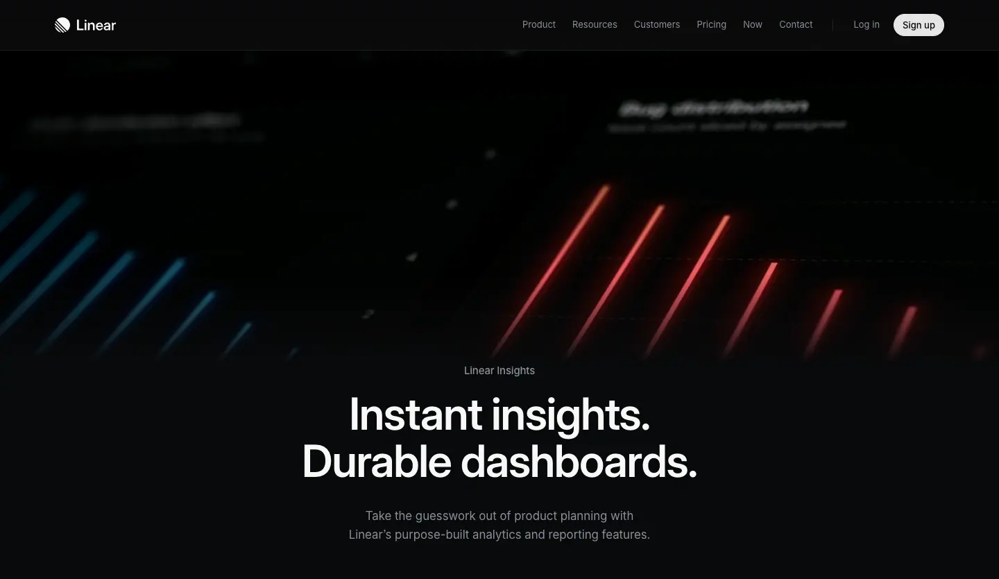
- Top 60% of the fold: blurred red and blue diagonal light streaks (an abstracted bar chart) with ghosted chart titles ("Bug distribution").
- Label "Linear Insights" → H1 64/67.84 · 590 · "Instant insights. / Durable dashboards." → 17px grey intro.
Why: the streaks suggest charts in motion without showing a specific chart that would need explaining. The two-sentence H1 has the same parallel rhythm as the agents hero.
H6 · Centered text + product UI preview below
Page: customer-requests
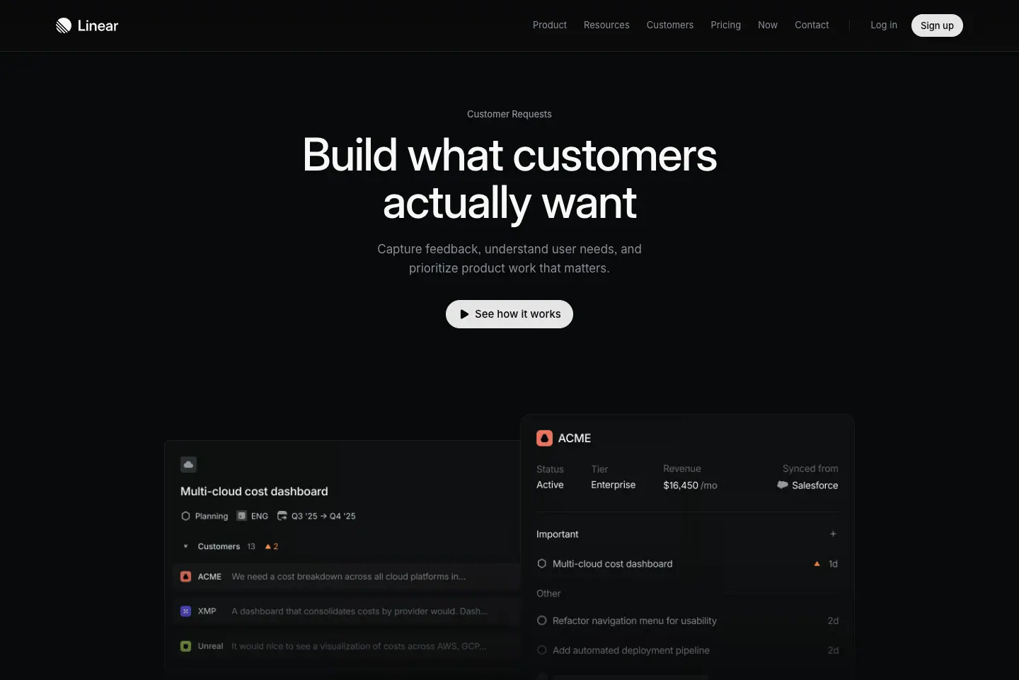
- Label "Customer Requests" → H1 64px centered "Build what customers / actually want" → 17px grey intro → pill "▶ See how it works".
- Below the fold line: a pair of overlapping product panels (a customer list "Multi-cloud cost dashboard" and a customer detail "ACME" with revenue/tier fields).
Why: the classic SaaS hero (headline → button → product shot) executed with restraint: the product shot starts at the fold so it pulls the visitor into the scroll.
H7 · Photographic hero
Page: mobile
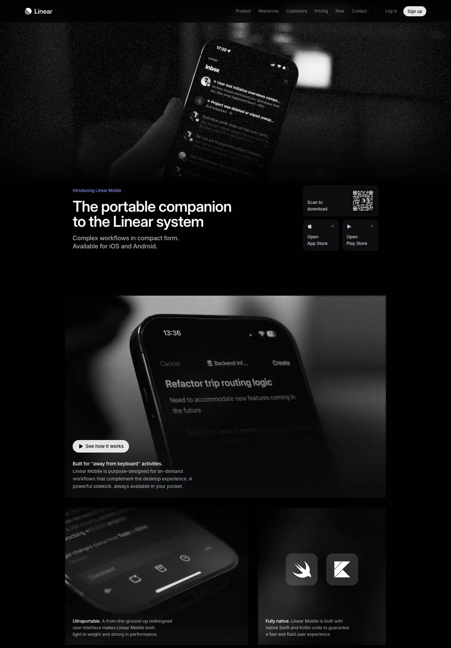
- The only photography on the 13 pages: a black-and-white photo of a hand holding a phone showing the Linear inbox, with heavy grain and darkened edges.
- Text bottom-left (x=232): blue-indigo micro label "Introducing Linear Mobile" → H1 48/48 · 590 → 2-line grey intro.
- Right side: download tiles: "Scan to download" QR card and two small cards "Open App Store" / "Open Play Store", each a 1px-bordered dark tile.
Why: mobile is about context of use (away from the desk). A real hand in a real room says that faster than a device render. Desaturating the photo keeps it inside the monochrome brand.
H8 · Text-only centered statement
Page: security
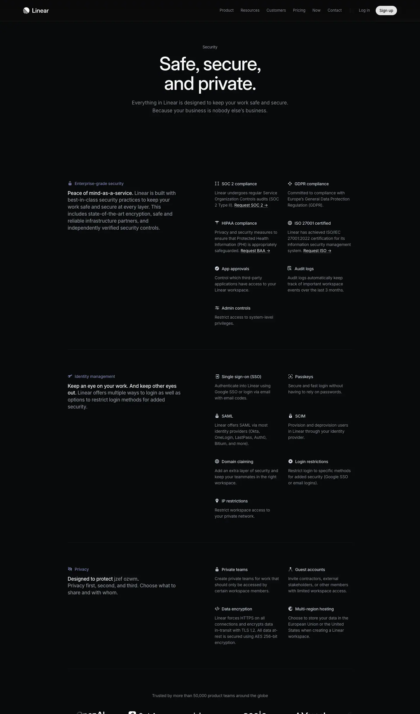
- Label "Security" → H1 64px "Safe, secure, / and private." → 17px grey 2-line intro: "Everything in Linear is designed to keep your work safe and secure. Because your business is nobody else's business."
- No visual. The spec grid starts directly below.
Why: security buyers want facts, not mood. The page goes straight from promise to the list of certifications. The tricolon H1 ("Safe, secure, and private.") is a promise in three words.
H9 · Directory header
Page: integrations
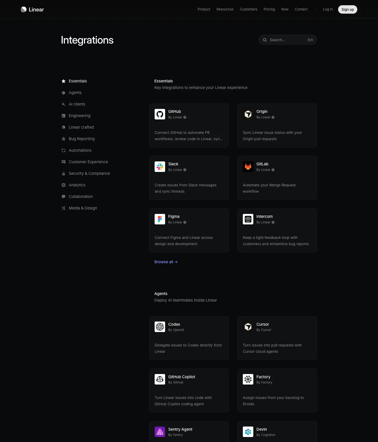
- Small H1 40/44 "Integrations" at x=232 with a search input on the right (⌘K style hint).
- Then a left sidebar of categories (icons + 13px labels) and a 2-column card grid.
Why: a directory is a tool, not a story. The hero shrinks to a page title so the content starts above the fold.
Hero comparison table
| Type |
Align |
H1 size/weight |
Sub |
CTA |
Visual |
Visual position |
| H1 Ambient |
left, bottom |
72 / 500 |
none |
none |
blurred product texture |
full-bleed behind |
| H2 Carousel |
left, top |
72 / 510 |
17px grey |
pill "Watch example" |
live app windows |
full-bleed below |
| H3 Window |
left, inset |
64 / 510 |
15px grey |
none |
crisp product window |
below, contained |
| H4 Icon |
center |
64 / 510 |
17px grey |
pill "See how it works" |
app icon + glyph grid |
above |
| H5 Abstract |
center |
64 / 590 |
17px grey |
none |
light streaks |
above |
| H6 Classic |
center |
64 / 510 |
17px grey |
pill |
product panels |
below, at fold |
| H7 Photo |
left, bottom |
48 / 590 |
17px grey |
QR + store tiles |
B/W photograph |
full-bleed above |
| H8 Text |
center |
64 / 510 |
17px grey |
none |
none |
— |
| H9 Directory |
left |
40 / 510 |
— |
search |
— |
— |
Rules to reuse
- One H1, two lines, parallel structure if possible.
- A small label above the H1 always names the product area. It replaces a logo lockup or a breadcrumb.
- Pick the hero type by the job: cinematic pillar page → H1 Ambient; announce a feature → H4/H6 centered; proof is the artifact → H3 Window; context of use → H7 Photo; facts → H8 Text.
- If the hero has a button, use one light pill with a play icon ("Watch example", "See how it works"). It promises a demo, not a sign-up.
- Darken and blur any background visual until the H1 keeps more than 15:1 contrast.
06 · Section patterns (the block library)
Linear builds 13 pages from about 16 reusable blocks. Each block below has: what it is, where it appears, exact values, why it works, and a build recipe. Per-page detail lives in pages/.
| # |
Pattern |
Template |
Seen on |
| S1 |
Split section header |
product |
plan, build, ai, intake, reviews, agents |
| S2 |
Feature frame (spotlight + product window + caption) |
product |
plan, build, ai, intake, reviews |
| S3 |
Bento 2×2 with shared hairlines |
both |
plan, build, ai, intake, agents, reviews, asks |
| S4 |
Mono-label tabs + product panel |
product |
plan, build, ai |
| S5 |
Isometric diagram with mono callouts |
product |
build ("Powerful Git automations") |
| S6 |
Brand-colored 3-up cards |
product |
build, agents |
| S7 |
Two-tone paragraph + full-width visual (scroll story) |
feature |
coding-agent |
| S8 |
Flow diagram in mono |
feature |
coding-agent |
| S9 |
Feature split (text left, UI right) + 2×2 grid + 4-up mini features |
feature |
asks |
| S10 |
Side heading + divided list (use cases, specs) |
feature |
asks, insights |
| S11 |
Spec grid (category left, 2×N facts right) |
feature |
security |
| S12 |
Device showcase |
feature |
mobile, reviews |
| S13 |
Cross-link row (sibling pages) |
product |
plan, build, ai, intake |
| S14 |
Testimonial pair (light cards) + stat line |
product |
plan, build, ai, intake, reviews |
| S15 |
Inline quote + logo / logo marquee |
feature |
asks, customer-requests, security |
| S16 |
Final CTA (centered) |
both |
all |
| — |
Directory (sidebar + grid) |
— |
integrations, see pages/integrations.md |
| — |
Header and footer |
— |
see pages/_shared-header-footer.md |
S1 · Split section header
Values
- H2 48/48 · 510 · -0.022em · #f7f8f8, left column x=78, width 542 → always 2 lines.
- Paragraph 24/31.92 · 400 · -0.012em · #d0d6e0, right column x=752, width 566 → 3 lines.
- Link 15/24 · 400 · #8a8f98 + "→" (e.g. "Projects →", "Triage →", "Linear MCP →"), ≈ 130px below the paragraph top.
- Top edges aligned (H2 y=973, P y=975).
Why it works: heading = label, paragraph = argument, link = depth. Three reading speeds in one block. The left column is skimmable top-to-bottom down the whole page like a table of contents.
Recipe: display:grid; grid-template-columns: 1fr 1fr; inside the 1344 container, 32px inset. Do not center anything. Keep H2s to 2-5 words.
S2 · Feature frame
Values (measured on /plan)
- figure 1344 × 940, border-radius: 8px, background = a spotlight image (grey radial light from the top center fading to #0f1011), wrapped in a gradient-border element (top edge brighter).
- Product window inside: ≈ 1120px wide, centered, starts ≈ 100px below the frame top, fades to the frame color at the bottom (no visible bottom edge).
- figcaption under the window: padding: 32px, background #08090a, grid with gap: 4px.
- Caption title 15/24 · 510 · #f7f8f8 ("Close the gap between planning and building").
- Caption body 15/24 · 400 · #8a8f98, max-width: 624px ("Consolidate project specs, documents, issues, customer feedback, and updates in one centralized location.").
Why it works: the spotlight acts like studio lighting on a product shot. It separates the UI from the page without a box. The caption sits under the image like a museum label: small, factual, bottom-left. Fading the window bottom suggests "the product continues" and avoids cropping a hard UI edge.
Recipe
.frame { position:relative; border-radius:8px; overflow:hidden;
  background: radial-gradient(60% 50% at 50% 0%, rgba(255,255,255,.18), transparent 70%), #0f1011; }
.frame::before { /* gradient border */ content:""; position:absolute; inset:0; border-radius:inherit; padding:1px;
  background: linear-gradient(180deg, rgba(255,255,255,.12), rgba(255,255,255,.03));
  -webkit-mask: linear-gradient(#000 0 0) content-box, linear-gradient(#000 0 0); -webkit-mask-composite: xor; mask-composite: exclude; }
.frame .window { width:83%; margin:100px auto 0; mask-image: linear-gradient(#000 70%, transparent); }
.frame figcaption { padding:32px; background:#08090a; display:grid; gap:4px; }
S3 · Bento 2×2 with shared hairlines
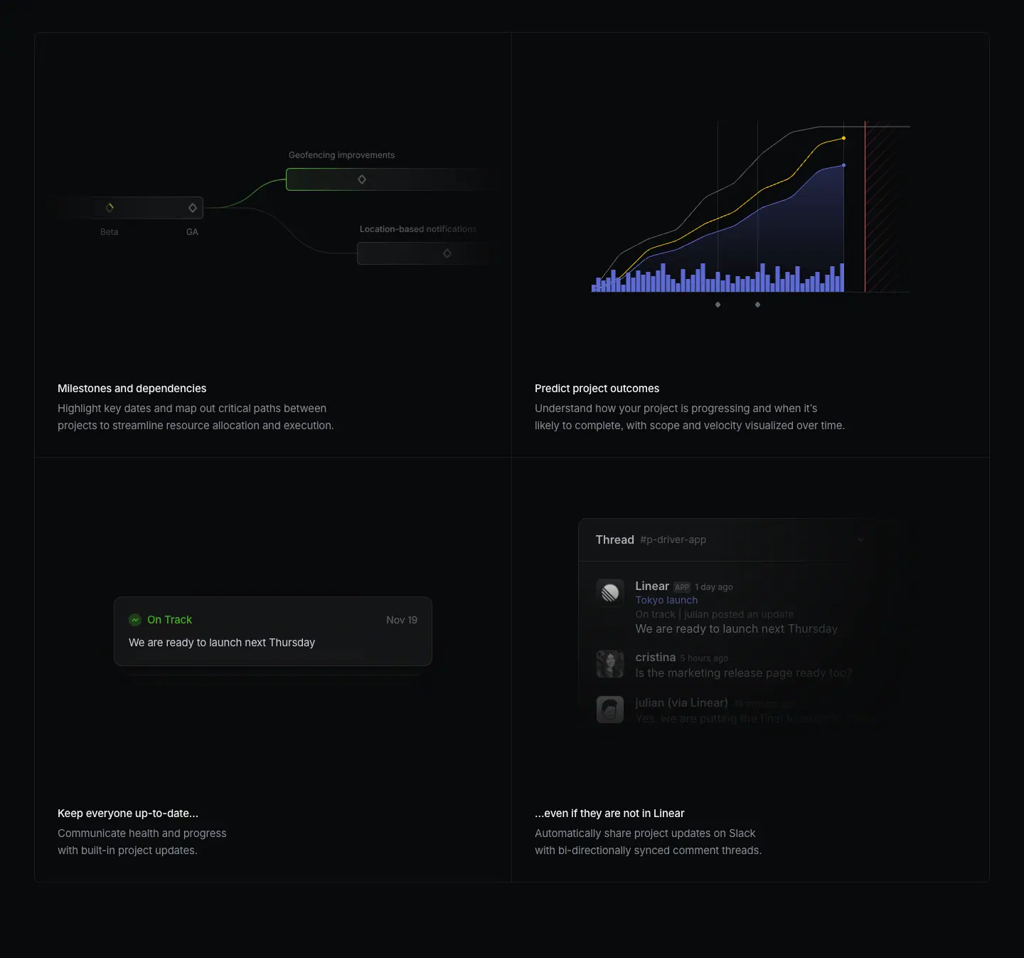
Values (measured on /plan)
- Wrapper 1344 wide, border: 1px solid rgba(255,255,255,.08), border-radius: 8px.
- grid-template-columns: 671px 671px; gap: 0. Cells are separated by 1px internal lines, not by gaps.
- Cell 671 × 597: visual area with padding: 32px 0 0, caption padding: 32px, title/description gap 4px.
- Visuals are small, isolated UI fragments (one status card "On Track · We are ready to launch next Thursday", one Slack thread, one chart, one milestone graph), centered in the cell, with lots of empty dark space around them.
- Card titles are often a pair that continues across cells: "Keep everyone up-to-date…" / "…even if they are not in Linear".
Why it works: shared borders make four features read as one system (one table), not four separate cards. Each visual shows exactly one UI element, so each cell has one idea. Empty space inside the cell is what makes it "premium": the fragment is presented, not crammed.
Recipe
- One outer border + internal dividers (border-right on column 1, border-top on row 2).
- Visual area ≈ 450px tall, the fragment ≤ 60% of the cell width, vertically centered.
- Caption bottom-left: 15px white title + 15px grey description, 2 lines max each.
- Optional: use ellipsis pairs across cells to tell a mini story.
Feature-template variant (/asks, /insights): the same 2×2 but titles are 20/26.6 · 510, cells sit in the 976 container, and the dividers are full-bleed hairlines. Below it, a 4-up mini-feature row (icon + 14px title + 13px grey text, x = 232/484/736/988).
S4 · Mono-label tabs + product panel
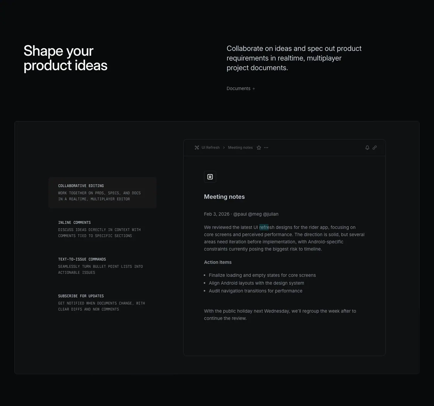
Values
- Frame 1344 wide, 1px translucent border, 8px radius, #0f1011-ish fill.
- Left: a vertical list of 4 tabs, each padding: 20px 32px; border-radius: 8px, 106px tall.
- Tab title: Berkeley Mono 12/20 · 510 · uppercase · #d0d6e0 ("COLLABORATIVE EDITING").
- Tab description: Berkeley Mono 12/20 · 400 · uppercase · #8a8f98 ("WORK TOGETHER ON PRDS, SPECS, AND DOCS IN A REALTIME, MULTIPLAYER EDITOR").
- Active tab: a slightly lighter fill (≈ rgba(255,255,255,.03-.05)).
- Right: a product panel that changes with the active tab (a "Meeting notes" document).
Why it works: tabs compress 4 features into one viewport. Mono uppercase makes them read like a spec sheet or a control panel, which fits a tool for engineers. The visual on the right proves each claim.
Recipe: auto-advance tabs every ≈ 4-6 s with a progress indicator; pause on hover. Keep each description under 12 words.
S5 · Isometric diagram with mono callouts
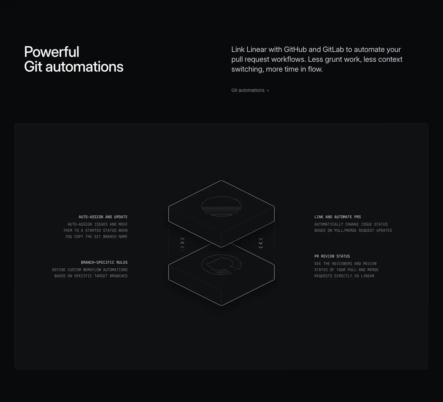
- A line-drawn isometric stack (two layers, Linear above Git) in thin grey strokes, centered in a large dark frame.
- Four mono callouts left and right ("AUTO-ASSIGN AND UPDATE", "LINK AND AUTOMATE PRS", "PR REVIEW STATUS", "BRANCH-SPECIFIC RULES"), title 12px 510
#d0d6e0, body 12px 400 #8a8f98, right-aligned on the left side, left-aligned on the right side.
Why: an integration is invisible plumbing. A technical drawing shows "two systems, synced" without a screenshot of settings pages. The line art matches the mono labels: both look like engineering documentation.
S6 · Brand-colored 3-up cards
- 3 cards ≈ 440px wide, 8px radius, each filled with a partner's brand color (Claude Code orange, ChatGPT blue→lilac gradient, Figma white).
- Inside: partner logo top-left, a small UI fragment (terminal command "mcp add --transport http linear https://mcp.linear.app/mcp", a sources menu, a Figma prompt menu), and a caption bottom-left (15px title + 15px description, in white or dark depending on the fill).
Why: the only full-color block on a monochrome page, so it reads instantly as "other tools". Using each partner's own color is a courtesy and a recognition shortcut. The UI fragment shows the actual integration step, not just a logo.
S7 · Two-tone paragraph + visual (scroll story)

- Centered 754px column. One paragraph at 24/31.92 · 400. First sentence
#f7f8f8, rest #8a8f98.
- Examples: "Start from anywhere. Kick off a session from an issue, a chat, a comment, or a Slack thread. Linear gathers all relevant context and gets to work." / "On demand. Or on repeat. Assign a change to Linear, or use Loops…" / "Keep fixes moving alongside planned work." / "Give the whole team a way to build."
- Each paragraph is followed by a full-width visual and a mono kicker ("DELEGATE AN ISSUE FROM YOUR BACKLOG AND GET BACK A DIFF FOR REVIEW").
Why: removes the H2 entirely. The page reads like an essay with illustrations: calmer, more editorial, and very fast to skim (read only the white words).
S8 · Flow diagram in mono
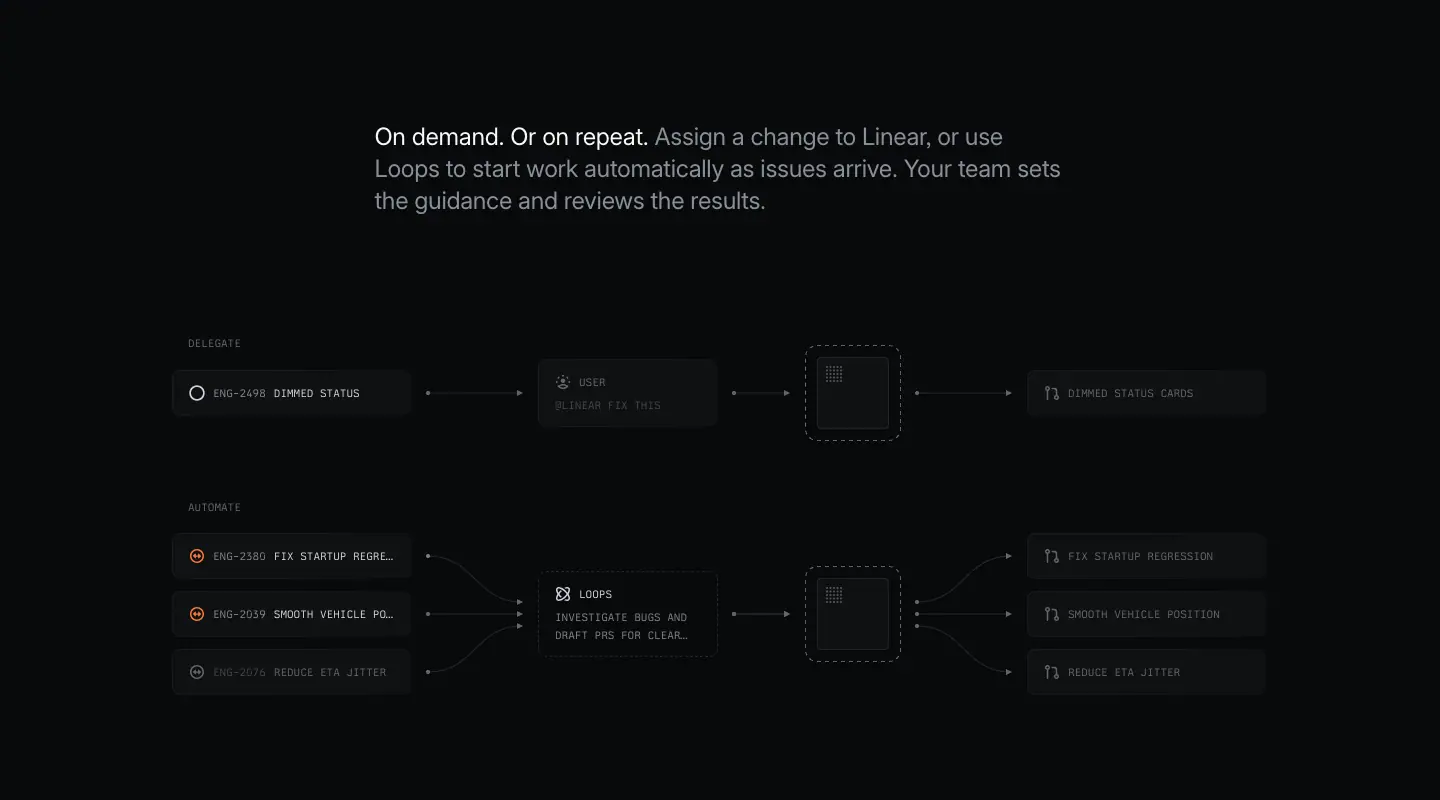
- Rows of small dark chips (issue IDs + titles in 11px mono uppercase) connected by thin arrows to a central node ("LOOPS · INVESTIGATE BUGS AND DRAFT PRS FOR CLEAR FIXES") and out to result chips (PR icons).
- Row labels "DELEGATE" / "AUTOMATE" in 11px
#62666d. Dimmed rows use #62666d, active rows #d0d6e0.
- A dashed-outline square marks "the agent working".
Why: a system diagram made from the product's own atoms (issue chips). It explains one-to-one (delegate) vs many-to-many (automate) without words.
S9 · Feature split + 2×2 + mini features (feature template)
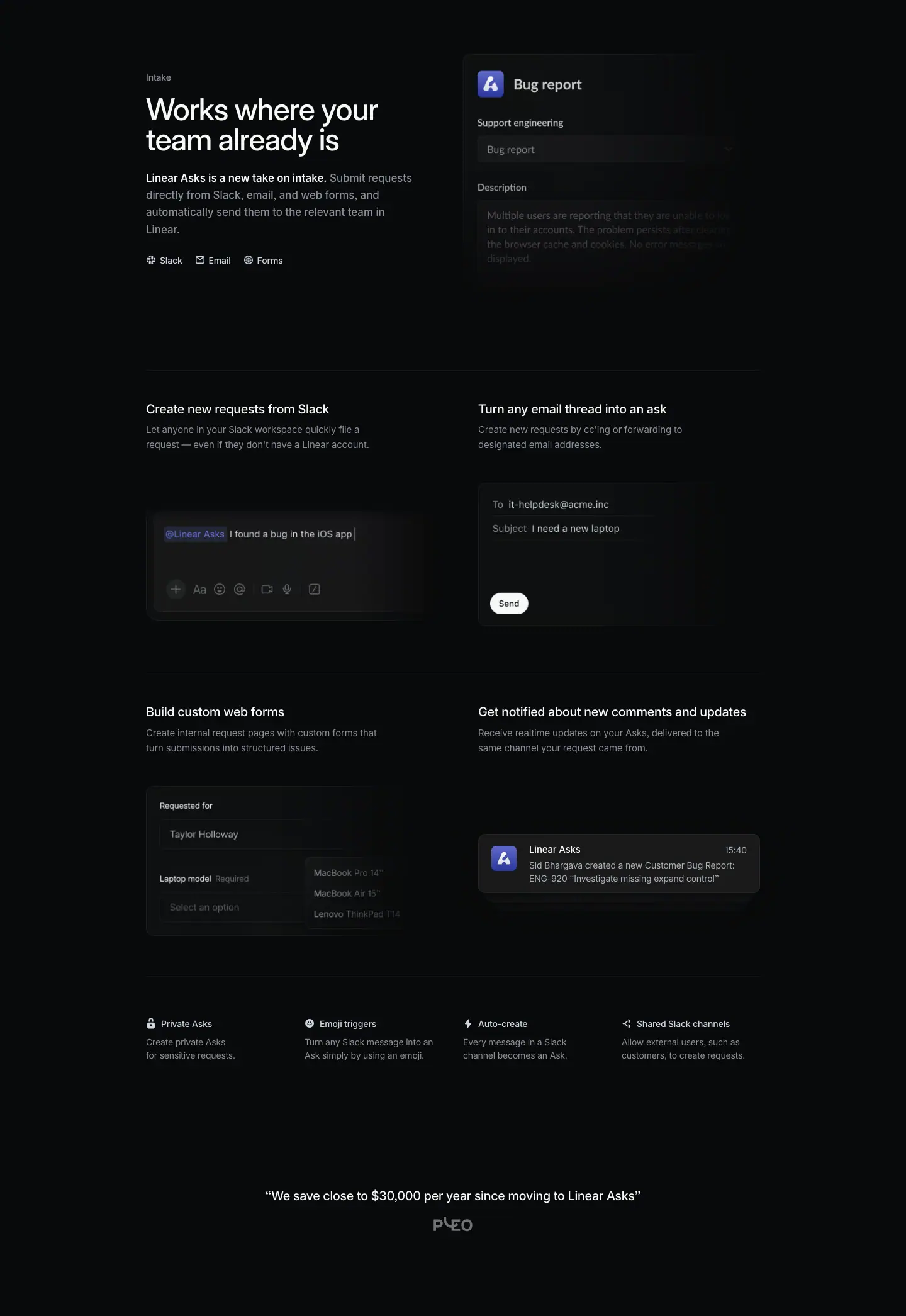
- Top: text left (label "Intake", H2 48px "Works where your team already is", two-tone 17px paragraph, three inline channel chips "Slack · Email · Forms"), UI right (a "Bug report" form panel).
- Middle: 2×2 grid with 20px titles and live-looking UI fragments (a Slack composer "@Linear Asks I found a bug in the iOS app", an email draft, a web form, a notification).
- Bottom: 4-up row of mini features with icons ("Private Asks", "Emoji triggers", "Auto-create", "Shared Slack channels").
- Then a centered one-line customer quote + customer logo ("We save close to $30,000 per year since moving to Linear Asks").
Why: a complete feature argument in one screen-and-a-half: claim → 4 proofs → 4 extras → 1 customer number.
S10 · Side heading + divided list
- Left: H2 32/36 · 510 (x=232, width 304) + 14px grey description.
- Right: list at x=652 (width 556). Each row: 15/24 · 510 white title + 14/21 grey description, separated by 1px hairlines, ≈ 109px per row.
/insights "Tech specs" variant: rows are single 15px labels with a chevron "›" on the right, like an accordion.
Why: a list is more honest than six fake cards when items are text-only. The hairline list reads like documentation, which builds trust.
S11 · Spec grid (security)
- Three bands ("Enterprise-grade security", "Identity management", "Privacy"), each: left column (x=256) with a small
#7a7fad category H2 (14px 510) + a two-tone 17px paragraph ("Peace of mind-as-a-service. Linear is built with…"); right two columns (x=736 and x=986, width 222) of facts: icon + 14/24 · 510 #d0d6e0 title + 13px grey description + an inline link ("Request SOC 2 →").
- Bands separated by full-width hairlines.
Why: security reviewers scan for specific words (SOC 2, SAML, SCIM). A grid of short labeled facts is the fastest format for that.
S12 · Device showcase
- Monochrome phone render (dark, glossy, angled, or flat-on with a notification), text block beside it: H2 48px "Available 24/7. / Or just 9-5." + 2-line grey paragraph + two icon-led mini features ("Realtime notifications. Stay up-to-date…", "Notification schedule. Configure…").
/reviews variant: an angled phone showing a diff, inside a large dark frame.
Why: the humor in "Or just 9-5." makes a feature (notification schedules) feel human. The device is shown in grayscale so it never fights the type.
S13 · Cross-link row
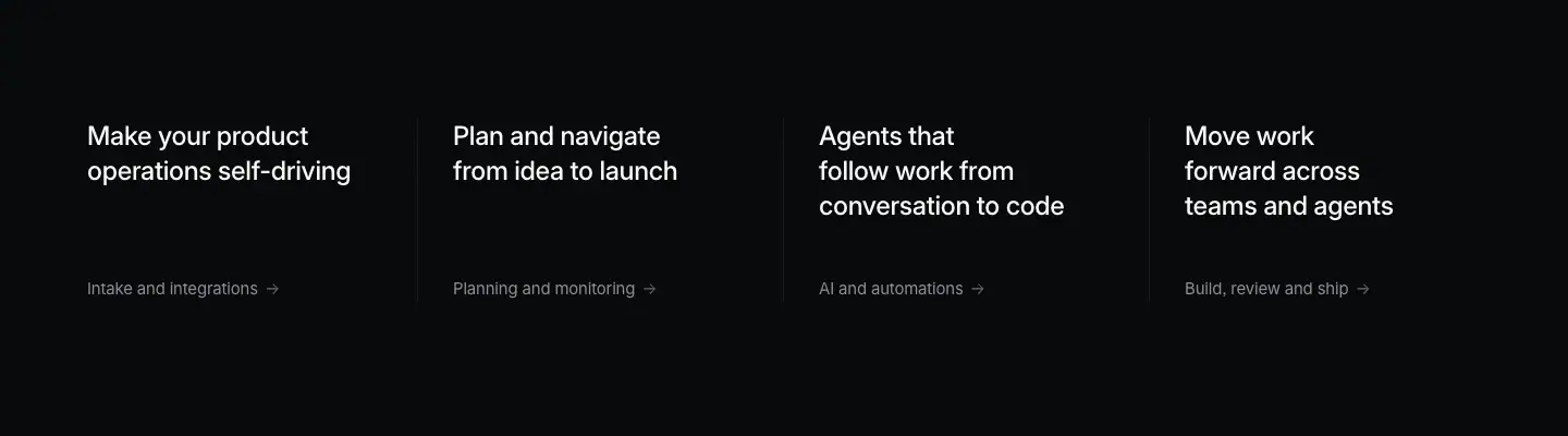
- 4 equal columns separated by 1px vertical hairlines, preceded by a full-width hairline.
- Each: title 24/31.92 · 510 ·
#f7f8f8 (the sibling page's H1 text: "Make your product operations self-driving", "Plan and navigate from idea to launch", "Agents that follow work from conversation to code", "Move work forward across teams and agents") + bottom link 13-15px grey with "→" ("Intake and integrations →").
Why: reusing each sibling page's H1 as the link text makes navigation feel like a table of contents of the whole product. The four pillars appear on every pillar page, so a visitor never reaches a dead end.
S14 · Testimonial pair + stat line
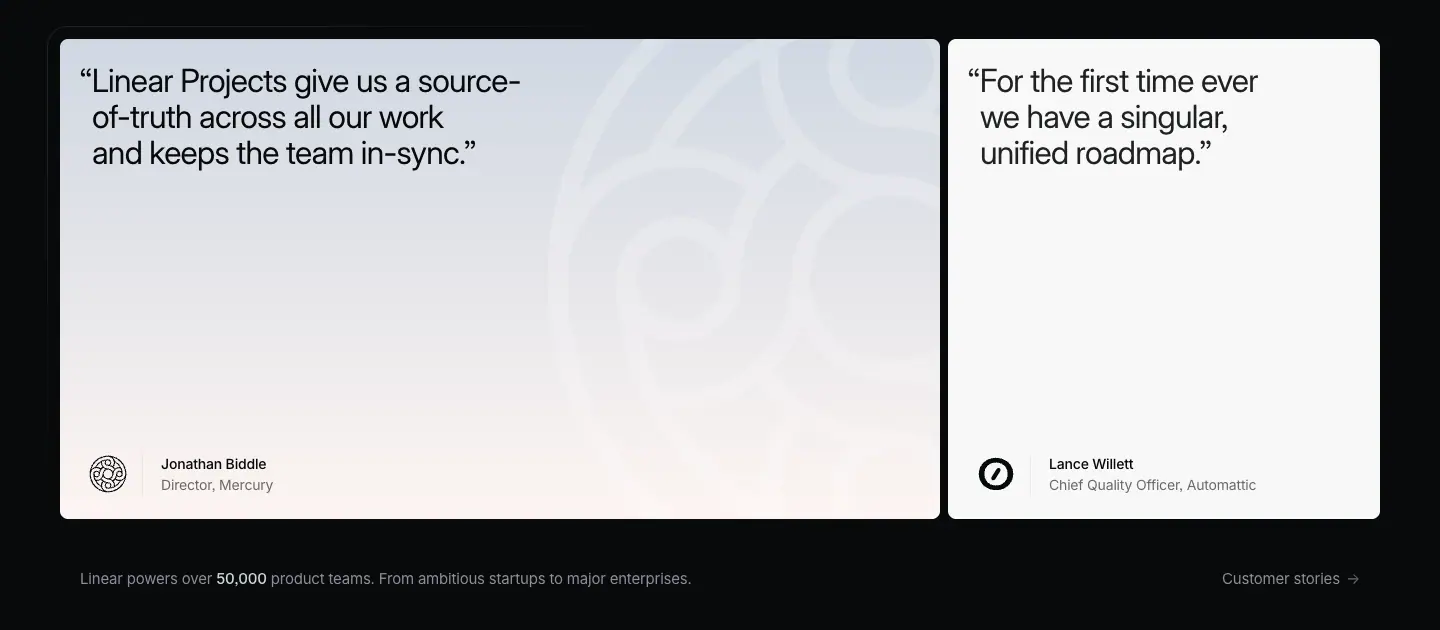
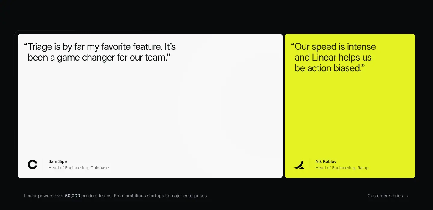
Values (measured on /ai)
- Two cards side by side: wide card 880px + narrow card 432px, both 480px tall, border-radius: 8px, padding: 24px 32px.
- Card fills: off-white #f7f8f8 (with a faint large customer-logo watermark), or a light gradient (lilac/peach), or a saturated lime rgb(228,242,34).
- Quote: 32/36 · 400 · -0.704px · #08090a, with hanging punctuation (the opening " sits outside the text block, so the letters align).
- Author bottom-left: customer logo (black, ≈ 32px) + name 14/21 · 510 + role 14/21 · 400 ("Head of Engineering, Coinbase").
- Below the cards: a line "Linear powers over 50,000 product teams. From ambitious startups to major enterprises." 13px grey with the number in white, and "Customer stories →" on the right.
Why: the only light surfaces on the page create maximum contrast, so the quote is impossible to skip. 32px regular weight (not medium) makes the quote feel spoken, not shouted. Short quotes (10-20 words) fit 3-4 lines. The unequal widths (2:1) avoid a static symmetrical layout.
Recipe: grid-template-columns: 2fr 1fr; gap: 8px. Use text-indent: -0.4em (or hanging-punctuation: first) for the opening quote mark.
S15 · Inline quote / logo marquee (feature template)
- Centered one-line quote 20/26.6 · 510 white with a monochrome customer logo under it (
/asks).
- Logo marquee: "Trusted by product, GTM, and internal operations teams at leading companies" (13px grey) + a row of white monochrome logos that scrolls horizontally with faded edges (
linear-gradient(to right, transparent, #08090a)).
S16 · Final CTA
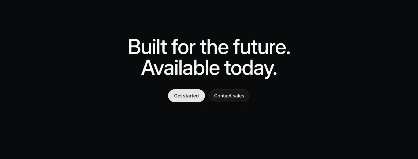
- Centered H2 72/72 · 510 "Built for the future. / Available today." (product template, identical on plan, build, ai, intake). Other pages: "Experience the diff" (reviews), "Start
tracking issues building" (coding-agent: "tracking issues" in grey #8a8f98, a visual strike-through joke), "Create your own agents" (agents).
- Buttons: primary pill "Get started" (
#e5e5e6 bg, #08090a text, 16px · 510, 44px tall, padding: 0 20px, radius 9999px) + secondary pill "Contact sales" (rgba(255,255,255,.05) bg, #f7f8f8 text, same size).
- Feature-template pages: left-aligned 40/44 H3 ("Streamline your internal request workflows", "Plan the present. Build the future.") with the buttons on the right.
Why: the closing line repeats the confident parallel rhythm one last time. Two buttons serve the two buyers: self-serve ("Get started") and enterprise ("Contact sales").
Rules to reuse
- Build a block library first; pages are assembly.
- Each block makes exactly one claim and has exactly one visual.
- Prefer shared hairlines over separate cards.
- Spend color only on partner cards and testimonial cards.
- Close every page with the same CTA block so the brand line becomes memorable.
07 · Copywriting
All quotes are verbatim from the 13 pages (data/*.json → heads, texts). Word counts are exact.
1. The voice in five rules
- Declarative, not persuasive. Sentences state what the product does. No "revolutionary", "unlock the power of", "supercharge". No exclamation marks on any page.
- Short. H1 5-8 words. H2 2-7 words. Section paragraph 18-25 words. Card description 10-20 words.
- Parallel. Two short sentences with the same grammar: "Artificial colleagues. Natural collaboration."
- Concrete nouns from the product. Issues, cycles, triage, diffs, PRs, projects, initiatives, roadmaps. The words a user sees in the app.
- Dry wit, used once per page. "Available 24/7. Or just 9-5." · "Start
tracking issues building" · "Peace of mind-as-a-service." · "Because your business is nobody else's business."
2. H1 formulas
| Formula |
Examples |
Words |
| Verb + object + range ("from X to Y") |
"Plan and navigate from idea to launch" · "Agents that follow work from conversation to code" |
7 · 8 |
| Verb + object + scope |
"Move work forward across teams and agents" · "Turn workplace requests into actionable issues" |
7 · 6 |
| Outcome claim |
"Make your product operations self-driving" · "Build what customers actually want" |
6 · 5 |
| Category definition |
"The review platform for the agentic era" · "A cloud coding agent, built into Linear" · "The portable companion to the Linear system" |
7 · 7 · 7 |
| Parallel pair (Adj noun. Adj noun.) |
"Artificial colleagues. Natural collaboration." · "Instant insights. Durable dashboards." |
4 · 4 |
| Tricolon |
"Safe, secure, and private." |
4 |
Why "from X to Y" works: it claims the entire workflow in 4 words and implies replacing several tools. "From idea to launch", "from conversation to code".
Why parallel pairs work: the second phrase answers the first. "Artificial colleagues." (surprising) → "Natural collaboration." (reassuring). The contrast of artificial/natural, instant/durable makes them memorable.
3. Eyebrows (labels above the H1)
"Planning and monitoring" · "Build, review and ship" · "AI and automations" · "Intake and integrations" · "Linear Reviews" · "Linear for Agents" · "Linear Code" · "Linear Asks" · "Linear Insights" · "Customer Requests" · "Introducing Linear Mobile" · "Security"
- Pillar pages: a 2-3 item noun list describing the area ("Build, review and ship").
- Feature pages: the product name ("Linear Asks").
- The eyebrow names the thing; the H1 says what it does. They never repeat each other.
4. Section headings (H2)
Four grammatical shapes, in order of frequency:
| Shape |
Examples |
| Imperative verb phrase |
"Manage projects end-to-end" · "Shape your product ideas" · "Coordinate strategic product initiatives" · "Map out your product journey" · "Keep a pulse on product progress" · "Build momentum with Cycles" · "Streamline work across tools" · "Manage incoming work with Triage" · "Iterate with coding agents" · "Create your own agents" |
| Noun phrase |
"Powerful Git automations" · "Release management" · "Reviews with direction" · "Issue intake, fully automated" · "A cloud coding agent, built into Linear" · "Tech specs" |
| Claim / benefit |
"Faster reviews, fewer bottlenecks" · "Data to enhance your intuition" · "Open, by design" · "Stay ahead of incoming work" |
| Two-sentence parallel |
"Keep reviews moving. Wherever you are." · "Available 24/7. Or just 9-5." · "Move product work forward. No matter where you are." |
Note the pattern "Verb + feature name" ("Build momentum with Cycles", "Manage incoming work with Triage"): the job comes first, the product noun comes last, capitalized.
5. Section paragraph (the 24px right column)
Structure: [what it is/does]. [the benefit or the how]. Two sentences, 18-25 words.
"Coordinate larger pieces of work across multiple people and teams. Move seamlessly between ideation and execution." (17 words)
"Cycles focus your team on what work should happen next. A healthy routine to maintain velocity and make meaningful progress." (20 words)
"Link Linear with GitHub and GitLab to automate your pull request workflows. Less grunt work, less context switching, more time in flow." (23 words; ends with a tricolon)
"Triage runs itself. Agent workflows refine, route, and follow up on new issues automatically, so nothing sits waiting on you." (20 words; 3-word opener)
"Every agent action leaves a record in Linear, so teams can follow progress, review outcomes, and step in when needed." (20 words)
Patterns:
- Tricolons of verbs: "refine, route, and follow up" · "Review, prioritize, and assign" · "Review, discuss, and merge".
- "Less X, less Y, more Z."
- A short punchy first sentence followed by a longer explanation.
6. Card titles and descriptions
Card title: a 3-8 word phrase, sentence case, no period. Description: one sentence, 10-20 words, period.
| Title |
Description |
| Milestones and dependencies |
Highlight key dates and map out critical paths between projects to streamline resource allocation and execution. |
| Predict project outcomes |
Understand how your project is progressing and when it's likely to complete, with scope and velocity visualized over time. |
| Keep everyone up-to-date… |
Communicate health and progress with built-in project updates. |
| …even if they are not in Linear |
Automatically share project updates on Slack with bi-directionally synced comment threads. |
| Close the gap between planning and building |
Consolidate project specs, documents, issues, customer feedback, and updates in one centralized location. |
The ellipsis pair ("Keep everyone up-to-date…" / "…even if they are not in Linear", "React to what matters most…" / "…snooze the rest for later") turns two bento cells into one sentence. Reading across the grid becomes a small story.
7. The two-tone sentence
"Start from anywhere. Kick off a session from an issue, a chat, a comment, or a Slack thread. Linear gathers all relevant context and gets to work."
"Peace of mind-as-a-service. Linear is built with best-in-class security practices to keep your work safe and secure at every layer."
"Realtime notifications. Stay up-to-date on important work streams and instantly take action wherever and whenever necessary."
Formula: [2-6 word headline sentence in white]. [1-2 explanation sentences in grey]. The white part must stand alone as a heading.
8. Mono labels
Uppercase, imperative or descriptive, no punctuation:
- Kickers: "IDENTIFY URGENT TASKS" · "LINEAR AGENT WORKS WHERE YOU WORK" · "DELEGATE AN ISSUE FROM YOUR BACKLOG AND GET BACK A DIFF FOR REVIEW" · "STEER THE SESSION WHILE IT RUNS, OR ITERATE FROM THE DIFF"
- Tab titles: "COLLABORATIVE EDITING" · "INLINE COMMENTS" · "TEXT-TO-ISSUE COMMANDS" · "SUBSCRIBE FOR UPDATES"
- Numbered lists: "01. CHAT 02. ISSUES 03. REVIEWS 04. MOBILE 05. SLACK 06. TEAMS"
They read like system log lines, which matches the "agent" theme.
9. Fake data inside the UI is copy too
The product screenshots are written as carefully as the headlines:
- Issue IDs and titles: "ENG-2498 Dimmed Status Cards", "DRV-5428 App freezes on splash screen", "ENG-2039 Smooth vehicle position updates during slow networks".
- Project content: "UI Refresh · Refreshing core issue and project surfaces."
- Status updates: "On Track · We are ready to launch next Thursday".
- One consistent fictional company (a ride-sharing app: "driver en route", "rides awaiting pickup", "ETA jitter", "#p-driver-app") runs across pages.
Why: consistent believable data makes the product feel used. A visitor who reads the UI sees a real team's week, not "Lorem ipsum" or "Task 1".
10. CTA copy
| Position |
Text |
| Header |
"Log in" · "Sign up" |
| Hero (feature template) |
"▶ Watch example" · "▶ See how it works" |
| Final CTA |
"Get started" + "Contact sales" (or "Talk to sales") |
| Inline links |
"Projects →" · "Triage →" · "Linear MCP →" · "Customer stories →" · "Browse all →" · "Request SOC 2 →" · "Download Linear Mobile →" |
| Closing lines |
"Built for the future. Available today." · "Plan the present. Build the future." · "Experience the diff" · "Start tracking issues building" |
Inline links always end with "→" and name the destination with a single noun. The arrow promises depth, not conversion.
11. Proof copy
- Testimonials are one or two sentences, 10-25 words, personal and specific: "Triage is by far my favorite feature. It's been a game changer for our team." · "For the first time ever we have a singular, unified roadmap." · "You have a choice between moving fast and moving with care. Linear helps us have both."
- Attribution: name + role + company, always a senior engineering/product role.
- Scale line: "Linear powers over 50,000 product teams. From ambitious startups to major enterprises."
- Quantified quote on feature pages: "We save close to $30,000 per year since moving to Linear Asks".
12. Meta descriptions (SEO)
Pattern: one or two sentences that restate the H1 benefit with concrete nouns.
- "Align your team around a unified product timeline with projects, initiatives, and roadmaps, then monitor progress with analytics, dashboards, and a personalized feed." (/plan)
- "Turn requests into merged PRs, all in Linear. Delegate changes to Linear or automate incoming work with Loops." (/coding-agent)
- "Everything in Linear is designed to keep your work safe and secure. Because your business is nobody else's business." (/security)
Copy checklist (to write a page in this style)
- Eyebrow = area name (2-3 nouns). H1 = verb + object + "from X to Y", ≤ 8 words.
- Each H2 = verb phrase ending in the feature's proper noun, ≤ 6 words.
- Each section paragraph = 2 sentences, ≤ 25 words, one tricolon allowed.
- Card title = phrase without period; description = one sentence with period.
- Use one ellipsis pair in a bento to connect two cells.
- One joke per page, never in the H1.
- Write the fake UI data as a consistent fictional team.
- No exclamation marks, no superlatives except "easiest"/"fastest" backed by a fact.
08 · Components and chrome
Buttons, links, header, footer, chips and tiles. Values from data/*.json → btns and the CSS tokens on :root. Full header/footer write-up: pages/_shared-header-footer.md.
1. Buttons
| Variant |
Height |
Padding |
Font |
Background |
Text |
Radius |
Where |
| Header primary |
32px |
0 12px |
13px · 510 |
#e5e5e6 (--color-button-invert-bg), hover #fff |
#08090a |
9999px |
"Sign up" |
| Header ghost |
32px |
0 12px |
13px · 400-510 |
transparent |
#8a8f98 → #f7f8f8 on hover |
9999px |
"Log in" |
| Hero pill (with ▶) |
40px |
≈ 0 16px |
15px · 510 |
#e5e5e6 |
#08090a |
9999px |
"Watch example", "See how it works" |
| CTA primary |
44px |
0 20px |
16px · 510 |
#e5e5e6 |
#08090a |
9999px |
"Get started" |
| CTA secondary |
44px |
0 20px |
16px · 510 |
rgba(255,255,255,.05) |
#f7f8f8 |
9999px |
"Contact sales", "Talk to sales" |
| Skip link |
32px |
0 16px |
14px · 510 |
#5e6ad2 |
#fff |
0 |
"Skip to content →" (keyboard only) |
Observations
- The primary button is light grey, not brand indigo and not pure white. #e5e5e6 is 15.8:1 against #08090a. Pure white would glare on a dark page; indigo would compete with product colors.
- Hover goes lighter (#fff), not darker.
- Secondary is a 5% white "glass" fill with no border.
- Only pills (9999px). No square buttons on marketing pages.
- Button text is never uppercase, never bold beyond 510.
2. Links
| Variant |
Style |
Example |
| Section "learn more" |
15/24 · 400 · #8a8f98 + " →", hover → #f7f8f8 |
"Projects →" |
| Accent link |
15/24 · 510 · #828fff (--color-link-primary), hover #fff |
"Browse all →" |
| Inline link in text |
13-14px, white or grey, underline offset clamp(2px, .175em, 4px), thickness from-font |
"Request SOC 2 →" |
| Footer link |
13/19.5 · 400 · #8a8f98 |
"Pricing" |
3. Header (72px sticky)
- Height 72px (
--header-height), background #0b0b0bcc (80% opacity) + backdrop-filter: blur(20px), bottom border #ffffff14 (8% white).
- Left: logo mark + wordmark "Linear" (≈ 20px wordmark).
- Right cluster: 13px nav "Product · Resources · Customers · Pricing · Now · Contact" in
#8a8f98, a thin vertical divider, "Log in", and the "Sign up" pill.
- Mobile: logo, "Log in", "Sign up" pill and a 2-line hamburger.
Why so quiet: 13px grey nav links do not compete with a 72px H1. The only light element in the header is "Sign up", so it is findable without being loud.
4. Footer
- 5 columns: Product, Features, Company, Resources, Connect. Column titles 13px · 510 ·
#f7f8f8; links 13px · 400 · #8a8f98; legal 13px #62666d.
- Logo mark on the far left. Lots of empty space. No newsletter box, no big brand block.
5. Chips, tags and small UI
| Element |
Style |
| Channel chip ("Slack", "Email", "Forms") |
13px grey with a 14px monochrome icon, no fill |
| Model chip ("Opus 5.5") |
11/14 #8a8f98 beside a 13px · 500 app name |
| Status pill in UI ("On Track") |
green dot + 13px green text, on #0f1011 card with a 1px border |
| Issue ID (mono) |
Berkeley Mono 11px uppercase, #d0d6e0 active / #62666d dimmed |
| Agent tag ("Agent") |
tiny grey pill beside a name in mention menus |
| Diff counters |
"+34" green #27a644, "−18" red #eb5757, 12-13px |
6. Tiles
- Download tiles (
/mobile): ≈ 120×100 dark tiles, 1px translucent border, 8px radius; icon top-left, 2-line 12px label bottom-left ("Open / App Store"), a small "↗" top-right. QR tile ≈ 2× wide.
- Integration tiles (
/integrations): app icon (≈ 32px, rounded) + name 15px · 510 + "By Linear" 12px grey with a verified dot + 14/23.8 grey description; 1px border, ≈ 12px radius, #0f1011.
7. Focus, selection, scrollbars
--focus-ring-outline: 1px solid #5e69d1;  --focus-ring-offset: 2px;
--color-selection-bg: color-mix(in lch, #5e6ad2, black 10%);
--scrollbar-color: #ffffff1a; --scrollbar-size: 6px;
--min-tap-size: 44px;
Even the scrollbar is styled to stay in the dark palette. Tap targets have a 44px minimum.
8. Layer and z-index scale
header 100 · overlay 500 · popover 600 · command-menu 650 · dialog 700 · toasts 800 · tooltip 1100 · context-menu 1200 · skip-nav 5000. A named scale avoids z-index fights between the many floating UI fragments.
Rules to reuse
- Primary button = light grey pill on dark, hover lighter. Secondary = 5% white pill.
- Three button heights only: 32 (header), 40 (hero), 44 (CTA).
- Links are grey + "→" with one noun. Use the accent color for at most one link type.
- Header 72px, translucent, blurred, hairline bottom border, 13px grey links.
- Footer = columns of 13px links. Nothing else.
09 · Visuals and motion
Motion values come from document.getAnimations() and computed transition values on /agents and /plan (scrolled top to bottom, 2026-11-17).
1. Illustration types (ranked by how often they appear)
| Type |
Example |
Where |
| Framed product window (1:1 UI, real-looking data) |
Project "UI Refresh", issue "App freezes on splash screen" |
every product page, S2 |
| Isolated UI fragment (one card, one menu, one thread) |
"On Track" status card, mention menu "@cha → ChatPRD (Agent)" |
every bento cell, S3 |
| Blurred perspective texture (tilted, out-of-focus UI or code) |
/build, /reviews, /intake, /ai heroes |
product heroes |
| Abstract light (glowing dots, light streaks) |
/plan dot field (a looping video), /insights streaks |
heroes |
| Line art / isometric |
Git automations stack |
/build |
| Mono flow diagram |
Delegate / Automate with Loops |
/coding-agent |
| Device render (grayscale phone) |
mobile, reviews |
/mobile, /reviews |
| B/W photography |
hand holding phone |
/mobile hero only |
| Partner-brand cards |
Claude, ChatGPT, Figma |
/build |
| Icons |
monochrome line icons ≈ 14-16px |
chips, mini features, sidebars |
Never used: stock photos of people, 3D characters, emoji, gradients as decoration, colored icon backgrounds (except the Asks app icon and partner logos).
2. How product UI is staged
- Crop with intent. A window shows only the region that proves the claim (the diff, the triage suggestion). Edges outside the region fade out with a mask (
mask-image: linear-gradient(#000 70%, transparent)) rather than ending at a hard crop.
- Light it. A soft grey radial spotlight from the top of the frame (S2). The UI looks lit from above on a dark stage.
- Dim what is secondary. In fragments, secondary rows are lowered to
#62666d or reduced opacity, so the hero row (the active item) is the brightest. Example: the flow diagram dims "ENG-2076 Reduce ETA jitter".
- Use real states. Hover rows, cursors, selected chips, the mention menu mid-typing ("@cha"). A frozen moment of use, not an idle screen.
- One fictional company across all screenshots (a ride-sharing app team), so the data is consistent.
Why: the visitor reads the screenshot as a story ("someone is typing a mention, the agent appears in the menu"). A static settings screen tells no story.
3. Motion inventory (measured)
| What |
Duration |
Easing |
Notes |
| Hover color on links/buttons |
100ms |
ease / cubic-bezier(.25,.46,.45,.94) (ease-out-quad) |
39+ elements |
| Card/button hover (border, bg, shadow, opacity, filter) |
160ms |
ease-out-quad |
|
| Link underline color |
250ms |
ease |
--speed-regularTransition: .25s |
| Filter (blur) hover/focus |
200ms |
cubic-bezier(.165,.84,.44,1) (ease-out-quart) |
|
Scroll reveal (/plan) |
700ms |
cubic-bezier(.645,.045,.355,1) (ease-in-out-cubic) |
animates transform + opacity + filter (a blur-in) together, 28 elements |
Multiplayer document demo (/plan) |
highlightReveal 500ms, cursorIn 250ms after a 200ms delay |
linear |
text highlight sweeps in, then a collaborator cursor appears |
Hero text / window reveal (/agents) |
1600ms |
a spring encoded as CSS linear(…) |
staggered by 30ms: delays 100, 130, 160 … 640ms (19 steps) |
| Ambient element |
2000ms |
cubic-bezier(.25,.1,.25,1) (ease) |
|
/plan hero background |
loop |
— |
one <video autoplay loop muted> 1440px wide |
| Mono kicker text |
scramble |
— |
"IDENTIFY URGENT TASKS" resolves letter by letter (≈ observed) |
Easing tokens available on :root: the full Penner set (--ease-out-quad … --ease-in-out-circ), --speed-quickTransition: .1s, --speed-regularTransition: .25s, --speed-highlightFadeOut: .15s.
What the numbers say
- Interaction feedback is instant (100-160ms). Hover never feels laggy.
- Entrances are slow and soft (700ms-1.6s), with a blur-to-sharp filter. Content "comes into focus" like a camera, matching the dark, cinematic look.
- Stagger is tight (30ms). Many elements (words or windows) arrive as one wave, not a slideshow.
- Springs, not bounces. The
linear() spring curve has no visible overshoot at 1600ms: it settles smoothly.
4. Why motion is used this way
- Motion as demonstration: cursors, typing, diff streaming and carousel windows show the feature working. Each animation replaces a sentence.
- Blur-in reveals keep the page calm: elements never slide in from far away (no 100px translate). They appear in place, from soft to sharp.
- Background video only in the hero, muted and looping, so it never needs controls or attention.
5. Reduced motion
--speed-highlightFadeIn: 0s exists as a token and matchMedia('(prefers-reduced-motion)') was false in the capture, so reduced-motion behavior was not verified here. When you copy this style, gate the reveals and the video on prefers-reduced-motion: no-preference.
6. Copy-paste motion tokens
:root {
  --dur-hover: 100ms;  --dur-ui: 160ms;  --dur-link: 250ms;  --dur-reveal: 700ms;
  --ease-out-quad: cubic-bezier(.25,.46,.45,.94);
  --ease-out-quart: cubic-bezier(.165,.84,.44,1);
  --ease-in-out-cubic: cubic-bezier(.645,.045,.355,1);
}
.reveal { opacity:0; transform: translateY(16px); filter: blur(8px);
  transition: opacity var(--dur-reveal) var(--ease-in-out-cubic),
              transform var(--dur-reveal) var(--ease-in-out-cubic),
              filter var(--dur-reveal) var(--ease-in-out-cubic); }
.reveal.in { opacity:1; transform:none; filter:none; }
.reveal:nth-child(n) { transition-delay: calc(var(--i, 0) * 30ms); }
@media (prefers-reduced-motion: reduce) { .reveal { opacity:1; transform:none; filter:none; transition:none; } }
(The 16px translate and 8px blur values are estimates; the probe recorded which properties animate, not their start values.)
Rules to reuse
- Illustrate with your own product UI, staged: cropped, lit, faded, one active state.
- Hover 100-160ms ease-out. Entrances 700ms ease-in-out with opacity + small translate + blur.
- Stagger groups by 30ms.
- Animate to demonstrate (typing, cursors, streaming), never to decorate.
- Hero video: muted, looping, dark, behind text only.
10 · Glossary: the words to use
Use these terms to brief a designer, a developer or an AI. Each term names one concept and shows where it appears on the captured pages.
Typography
| Term |
Meaning |
On these pages |
| Display type |
Text set at 32px and larger, for headings |
H1 72px, H2 48px |
| Type scale |
The fixed set of sizes a site uses |
72 / 64 / 48 / 40 / 32 / 24 / 20 / 17 / 15 / 14 / 13 / 12 / 11 |
| Weight |
Stroke thickness of a font (100-900) |
400 regular, 510 medium, 590 semibold |
| Variable font |
One font file with a continuous weight/width axis, so 510 is possible |
Inter Variable |
Optical size (opsz) |
A font axis that redraws letters for small or large sizes |
font-variation-settings: "opsz" auto |
Stylistic set / character variant (ss03, cv01) |
OpenType alternates that change specific glyphs |
font-feature-settings: "cv01","ss03" |
| Tracking (letter-spacing) |
Uniform space added or removed between all letters |
-0.022em on display, -0.011em on body |
| Kerning |
Space between one specific pair of letters (automatic in the font) |
— |
| Leading (line-height) |
Distance between baselines of lines |
1.0 display, 1.6 body |
| Solid leading |
Line-height equal to the font size (1.0) |
H1 72/72, H2 48/48 |
| Measure |
Line length in characters |
H2 column 542px ≈ 15-20 chars |
| Balanced wrap |
Lines of a heading made roughly equal in length |
text-wrap: balance on 2-line H1s |
| Eyebrow |
Small text above a heading that names the area |
"Planning and monitoring" |
| Kicker |
Small label (here in mono uppercase) that introduces or annotates a visual |
"IDENTIFY URGENT TASKS" |
| Lead / lede paragraph |
The larger first paragraph that explains a heading |
24px #d0d6e0 right column |
| Two-tone headline / run-in heading |
A sentence whose first part is bright (acts as heading) and the rest is grey |
"Start from anywhere. Kick off a session…" |
| Hanging punctuation |
Opening quote mark placed outside the text edge so letters align |
testimonial quotes |
| Monospace label |
Fixed-width font used for technical labels |
Berkeley Mono, uppercase |
| Tabular numbers |
Digits of equal width (for tables and counters) |
inside product UI |
Color
| Term |
Meaning |
On these pages |
| Canvas / page background |
The base color behind everything |
#08090a |
| Surface elevation |
Lighter fills for raised layers instead of shadows |
#0f1011 → #141516 → #191a1b |
| Text hierarchy grays |
3-4 gray levels used instead of size or weight for hierarchy |
#f7f8f8, #d0d6e0, #8a8f98, #62666d |
| Hairline |
A 1px border |
rgba(255,255,255,.05/.08) |
| Translucent / alpha border |
A border made of semi-transparent white so it adapts to any surface |
5%, 8%, 12% white |
| Accent color |
The one brand color used sparingly |
indigo #5e6ad2 |
| Semantic color |
Color that carries meaning (status, diff) |
green On Track, red deletions |
| Inverted button |
A light button on a dark page |
#e5e5e6 pill |
| Glass fill |
A low-opacity white fill |
rgba(255,255,255,.05) secondary button |
| Contrast ratio |
WCAG luminance ratio between text and background |
18.7:1 primary, 6.1:1 tertiary |
| Monochrome / grayscale palette |
A palette with no hue except accents |
the whole site |
| Spotlight |
A radial light gradient on a dark surface |
top of feature frames |
| Vignette |
Darkened edges around an image |
hero backgrounds |
Layout
| Term |
Meaning |
On these pages |
| Container / max-width |
The maximum content width |
1344px product, 1024px feature |
| Gutter |
Horizontal space between columns or at the page edge |
24px on mobile |
| Inset |
Padding between a frame edge and its content |
32px |
| Split layout / asymmetric split |
Heading in one column, text in the other |
S1 split header |
| Section padding / vertical rhythm |
Consistent space above and below sections |
128px |
| Full-bleed |
An element that spans the full viewport width |
hero video, carousel |
| Bleed off the edge |
Content cut by the screen edge to imply more |
agent window carousel |
| Bento grid |
A grid of cells of different content, like a bento box |
2×2 feature grids |
| Shared-border grid / ruled grid |
Grid cells separated by 1px lines with no gaps |
Linear's bento |
| Feature frame / showcase frame |
A large rounded container that stages a product screenshot |
S2 |
| Caption |
Title + description placed under a visual |
15px white + 15px grey |
| Cross-link row |
Links to sibling pages near the page end |
4 pillar links |
| Above / below the fold |
Inside / outside the first viewport (900px here) |
first H2 at y=973 |
| Sticky header |
A header fixed to the top while scrolling |
72px, blurred |
| Directory layout |
Sidebar of categories + grid of items |
/integrations |
Section and page vocabulary
| Term |
Meaning |
| Hero |
The first section, holding the H1 |
| Ambient hero |
A hero with a dim atmospheric visual behind text (H1 type) |
| Product-led hero |
A hero where the product screenshot dominates (/coding-agent) |
| Social proof |
Testimonials, logos, user numbers |
| Testimonial card |
A card with a quote, name, role and logo |
| Logo marquee / logo wall |
A row of customer logos, often scrolling |
| Stat line |
One line with a big number ("over 50,000 product teams") |
| Final CTA / closing CTA |
The last call to action before the footer |
| Primary / secondary CTA |
Main action ("Get started") / alternative ("Contact sales") |
| Pill button |
Fully rounded button (border-radius: 9999px) |
| Ghost button |
Button with no fill |
| Tabbed feature / feature tabs |
A list of tabs that switches a visual (S4) |
| Scroll story / scrollytelling |
A section where content changes as you scroll (/coding-agent) |
| Faux UI |
A coded or drawn recreation of product UI for marketing |
| UI fragment |
One isolated piece of product UI (a card, a menu) |
| Narrative arc |
The order of sections: promise → capabilities → proof → close |
Copywriting
| Term |
Meaning |
Example |
| Parallelism |
Repeating the same grammatical shape |
"Instant insights. Durable dashboards." |
| Tricolon |
A list of three |
"Safe, secure, and private." |
| Range claim |
"from X to Y" |
"from idea to launch" |
| Imperative heading |
A heading that starts with a verb |
"Manage projects end-to-end" |
| Sentence case |
Only the first word capitalized |
all headings |
| Microcopy |
Short UI text: labels, buttons, links |
"Projects →" |
| Benefit vs feature |
What the user gains vs what the product has |
"Less grunt work" vs "Git automations" |
| Ellipsis pair |
Two cells whose titles form one sentence |
"Keep everyone up-to-date…" / "…even if they are not in Linear" |
Motion
| Term |
Meaning |
On these pages |
| Scroll reveal |
Elements animate in when scrolled into view |
700ms opacity + transform + blur |
| Blur-in |
Entering from blurred to sharp |
filter animation |
| Stagger |
Successive delays across a group |
30ms steps |
| Easing |
The acceleration curve |
ease-out-quad for hover, ease-in-out-cubic for reveals |
| Spring easing |
Physics-like curve, here encoded with CSS linear() |
1600ms on /agents |
| Text scramble |
Letters cycle randomly before settling |
mono kickers |
| Ambient loop |
A muted background video that loops |
/plan hero |
A brief you can paste
Build a dark marketing page in a restrained, product-led style. Canvas #08090a, panels #0f1011, 1px translucent white hairlines (5-8%). One sans (Inter Variable, cv01/ss03) at weights 400/510/590 and one mono (uppercase 12px kickers). Display type 72/48px at line-height 1.0 and -0.022em tracking; body 15px/1.6 at -0.011em. Hierarchy from four grays (#f7f8f8, #d0d6e0, #8a8f98, #62666d), not from color. Hero: eyebrow + 2-line H1 bottom-left over a dim, blurred product texture, no subhead. Each section: split header (48px H2 left, 24px grey paragraph right, "Name →" link), a feature frame with a spotlight and a real product window, then a 2×2 ruled bento with 15px captions. Close with a 2:1 pair of light testimonial cards (32px quotes, dark text), a 4-column cross-link row, and a centered 72px two-sentence CTA with a light pill "Get started" and a glass pill "Contact sales". 128px section padding. 8px radius on surfaces, pills on buttons. Motion: 100ms hover, 700ms blur-in reveals, 30ms stagger.
11 · Build recipe: a landing page in this style
A step-by-step order and a starter skeleton. All values come from files 02-09.
Step 1 · Write the page outline first
Use the product-template narrative (file 01):
Header (72px, translucent)
Hero            eyebrow + 2-line H1, ambient visual, no subhead
Section × 3-6   split header → feature frame → bento 2×2   (or tabs / 3-up cards / diagram)
Cross-links     4 sibling pages
Proof           testimonial pair (2:1) + stat line
Final CTA       72px two-sentence line + 2 pills
Footer          5 columns of 13px links
Write all copy before design (file 07): eyebrow, H1, each H2 + 2-sentence paragraph + "Noun →" link, each card title + one-sentence description.
Step 2 · Set the tokens
:root {
  /* color */
  --bg-0:#08090a; --bg-1:#0f1011; --bg-2:#141516; --bg-3:#191a1b; --glass:rgba(255,255,255,.05);
  --fg-1:#f7f8f8; --fg-2:#d0d6e0; --fg-3:#8a8f98; --fg-4:#62666d;
  --line-1:rgba(255,255,255,.05); --line-2:rgba(255,255,255,.08); --line-3:rgba(255,255,255,.12);
  --accent:#5e6ad2; --link:#828fff; --btn:#e5e5e6;
  /* type */
  --sans:"Inter Variable","SF Pro Display",-apple-system,BlinkMacSystemFont,"Segoe UI",Roboto,sans-serif;
  --mono:"Berkeley Mono",ui-monospace,"SF Mono",Menlo,monospace;
  /* layout */
  --max:1344px; --inset:32px; --section:128px; --r:8px; --header:72px;
  /* motion */
  --ease-out:cubic-bezier(.25,.46,.45,.94); --ease-io:cubic-bezier(.645,.045,.355,1);
}
html { background:var(--bg-0); color:var(--fg-1); }
body { font:400 15px/1.6 var(--sans); letter-spacing:-.011em;
  font-feature-settings:"cv01","ss03"; font-variation-settings:"opsz" auto;
  -webkit-font-smoothing:antialiased; text-rendering:optimizeLegibility; }
h1,h2,h3 { font-weight:510; letter-spacing:-.022em; text-wrap:balance; margin:0; }
.h1 { font-size:72px; line-height:1; font-weight:500; }
.h2 { font-size:48px; line-height:1; }
.lead { font-size:24px; line-height:1.33; letter-spacing:-.012em; color:var(--fg-2); }
.cap-title { font-weight:510; color:var(--fg-1); }
.cap-text  { color:var(--fg-3); max-width:624px; }
.kicker { font:400 12px/1.4 var(--mono); text-transform:uppercase; letter-spacing:0; color:var(--fg-4); }
.wrap { max-width:var(--max); margin:0 auto; padding:0 24px; }
section { padding:var(--section) 0; }
@media (max-width:640px){ .h1{font-size:40px;line-height:1.1} .h2{font-size:24px;line-height:1.33;letter-spacing:-.012em} }
Step 3 · Build the blocks
<!-- Header -->
<header style="position:sticky;top:0;height:72px;background:#0b0b0bcc;backdrop-filter:blur(20px);border-bottom:1px solid #ffffff14">
  … logo · 13px grey nav · "Log in" · <a class="btn-sm">Sign up</a>
</header>

<!-- Hero (ambient) -->
<section class="hero" style="min-height:900px;position:relative;display:flex;align-items:flex-end">
  <video autoplay muted loop playsinline class="ambient"></video>   <!-- dim, blurred, vignetted -->
  <div class="wrap" style="padding-left:calc(24px + var(--inset))">
    <p style="font-size:16px;color:var(--fg-1);margin:0 0 16px">Planning and monitoring</p>
    <h1 class="h1">Plan and navigate<br>from idea to launch</h1>
  </div>
</section>

<!-- Split header -->
<section><div class="wrap">
  <div style="display:grid;grid-template-columns:1fr 1fr;padding:0 var(--inset)">
    <h2 class="h2" style="max-width:542px">Manage projects end-to-end</h2>
    <div><p class="lead" style="margin:0">Coordinate larger pieces of work across multiple people and teams. Move seamlessly between ideation and execution.</p>
         <a style="display:inline-block;margin-top:24px;color:var(--fg-3)">Projects →</a></div>
  </div>

  <!-- Feature frame -->
  <figure class="frame" style="margin:100px 0 0">
    <img class="window" src="product.png" alt="">
    <figcaption><span class="cap-title">Close the gap between planning and building</span>
      <span class="cap-text">Consolidate project specs, documents, issues, customer feedback, and updates in one centralized location.</span></figcaption>
  </figure>

  <!-- Bento 2×2 (shared hairlines) -->
  <div class="bento">
    <figure><div class="visual">…fragment…</div><figcaption>…</figcaption></figure> × 4
  </div>
</div></section>
.frame{position:relative;border-radius:var(--r);overflow:hidden;
  background:radial-gradient(60% 45% at 50% 0%,rgba(255,255,255,.16),transparent 70%),var(--bg-1);}
.frame .window{display:block;width:83%;margin:100px auto 0;border-radius:var(--r);border:1px solid #23252a;
  -webkit-mask-image:linear-gradient(#000 65%,transparent);mask-image:linear-gradient(#000 65%,transparent);}
figcaption{display:grid;gap:4px;padding:var(--inset);background:var(--bg-0);}
.bento{display:grid;grid-template-columns:1fr 1fr;border:1px solid var(--line-2);border-radius:var(--r);overflow:hidden;margin-top:48px}
.bento>figure{margin:0;border-color:var(--line-2)}
.bento>figure:nth-child(odd){border-right:1px solid var(--line-2)}
.bento>figure:nth-child(n+3){border-top:1px solid var(--line-2)}
.bento .visual{height:425px;display:grid;place-items:center;padding-top:32px}
<!-- Testimonials 2:1 -->
<div style="display:grid;grid-template-columns:2fr 1fr;gap:8px">
  <blockquote class="quote" style="background:#f7f8f8">“For the first time ever we have a singular, unified roadmap.”<footer>…</footer></blockquote>
  <blockquote class="quote" style="background:#e4f222">“…”</blockquote>
</div>
<p style="font-size:13px;color:var(--fg-3)">Powers over <b style="color:var(--fg-1);font-weight:510">50,000</b> teams. …</p>

<!-- Final CTA -->
<section style="text-align:center">
  <h2 class="h1" style="font-weight:510">Built for the future.<br>Available today.</h2>
  <div style="display:flex;gap:12px;justify-content:center;margin-top:40px">
    <a class="btn btn-primary">Get started</a><a class="btn btn-glass">Contact sales</a>
  </div>
</section>
.quote{margin:0;min-height:480px;padding:24px 32px;border-radius:var(--r);color:#08090a;
  font-size:32px;line-height:1.125;letter-spacing:-.022em;font-weight:400;text-indent:-.42em;
  display:flex;flex-direction:column;justify-content:space-between}
.quote footer{font-size:14px;text-indent:0;letter-spacing:-.013em}
.btn{display:inline-flex;align-items:center;height:44px;padding:0 20px;border-radius:9999px;font:510 16px/1 var(--sans);
  transition:background .16s var(--ease-out),color .1s ease}
.btn-primary{background:var(--btn);color:#08090a} .btn-primary:hover{background:#fff}
.btn-glass{background:var(--glass);color:var(--fg-1)}
.btn-sm{height:32px;padding:0 12px;font-size:13px}
Step 4 · Make the product visuals
- Build or screenshot your real UI in its dark theme at 1:1 (2× for retina).
- Fill it with one consistent fictional team and believable data.
- Pick the single region that proves each claim. Crop to it.
- Put large views in feature frames; put single cards/menus in bento cells with ≥ 40% empty space around them.
- For the hero, tilt and blur a dense view (code, list, graph) to ≈ 30-50% opacity with a vignette.
Step 5 · Add motion last
- Hover: 100-160ms color/background.
- Reveal: 700ms opacity + small translate + blur,
--ease-io, stagger 30ms.
- One demonstrating animation per section at most (typing, cursor, streaming diff).
- Respect
prefers-reduced-motion.
Step 6 · Review checklist
- [ ] Only one colored element type per viewport (product semantics, a partner card or a testimonial).
- [ ] Every heading is 2 balanced lines at 1440px.
- [ ] Left text edge and the x=50% line align through all sections.
- [ ] No text below 6:1 contrast except legal/kicker text.
- [ ] Section padding 128px everywhere; caption gap 4px everywhere.
- [ ] All big surfaces radius 8px, all buttons pills.
- [ ] No exclamation marks, no superlatives without a number.
- [ ] Mobile: H1 40px, H2 24px, link becomes an eyebrow above the H2.
12 · Art direction
How Linear decides what the pages look like beyond type and color: what kind of pictures it uses, how it draws, where 3D and gradients appear, how icons and the logo behave. This doc reads like a brand designer's art-direction brief, built from 27 captured pages (the 13 product pages plus home, pricing, changelog, Now, customers, docs, Method, brand and the resource kit).
Measured values come from data/*.json. Crops are in images/assets/. Estimates are marked ≈.
The one-line direction
"The product is the hero; everything else is a quiet diagram." Linear shows its real interface, rendered at near-native size on a near-black stage, and surrounds it with thin, monochrome line work. There is no stock photography, no mascot, no illustrated people, no colourful blobs. When colour appears, it is the product's own status colours or syntax highlighting.
Why: the buyer is a product engineer or designer. They judge a tool by its UI density, keyboard speed and polish. A real screenshot proves craft; an illustration would hide it.
1. Imagery worlds (ranked by area on the page)
| # |
World |
Where |
How it is made |
Crop |
| 1 |
Product UI renders |
every hero, every feature frame |
real app UI, dark theme, rendered as HTML/CSS or high-res PNG inside a frame with a 1px rgba(255,255,255,.08) border and a soft top-left light |
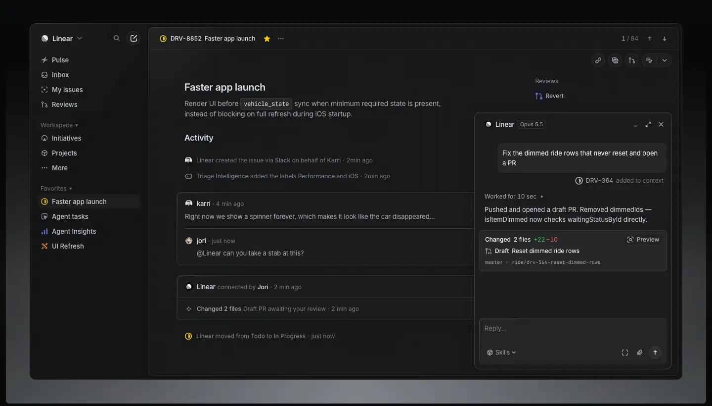 |
| 2 |
Wireframe line illustrations |
home "A new species" 3-up, section intros |
isometric outlines at 1px, grey #62666d–#8a8f98 strokes, no fill, ≈30° projection |
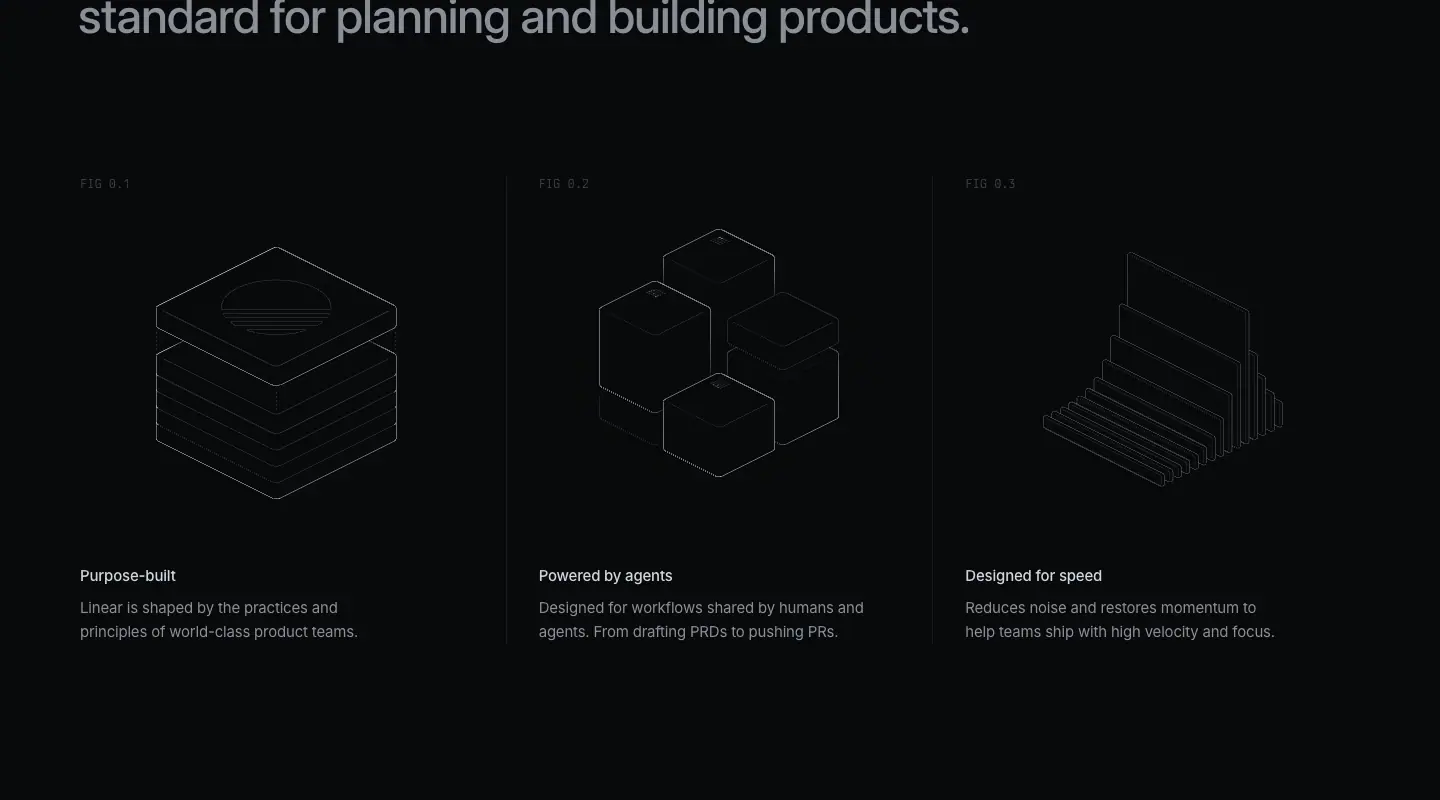 |
| 3 |
Mono diagrams |
changelog, /coding-agent, flows |
labelled boxes in Berkeley Mono uppercase, 1px hairline connectors with curved elbows, tiny status glyphs |
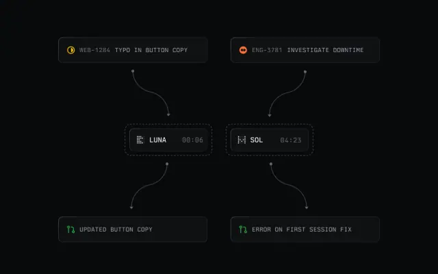 |
| 4 |
Dark product photography of objects |
changelog hero images (BYOK cards) |
3D-rendered or photographed objects on black, single soft rim light, product marks embossed |
 |
| 5 |
Customer photography |
/customers, Now press cards |
black-and-white or desaturated documentary photos with the customer wordmark knocked out in white on top; flat brand-colour tiles when no photo exists (OpenAI lilac, Oscar blue) |
 |
| 6 |
Editorial thumbnails |
/now |
16:9 (384×216) cards: dot-matrix, plotted points, line charts, lattice drawings, all grey-on-black |
 |
| 7 |
Code |
home "Build, review, and ship", /build |
real code in Berkeley Mono 14/24 with a restrained syntax palette (pink #f79ce0 keywords, peach #f7bf8b identifiers) |
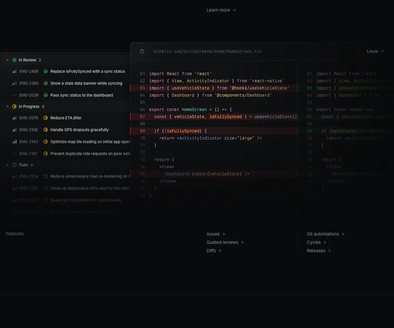 |
What is absent, on purpose: illustrated people, emoji, gradients-as-decoration, glassmorphism, stock photos, 3D mascots. Compare: Devin uses an otter mascot and photo collages; Perplexity uses painted landscapes. Linear's restraint is the differentiator.
2. Photography rules
Measured on /customers (data/customers.json → media): 7 media tiles at 386×218, 6 of them VIDEO (muted loop, poster frame) and 1 IMG.
- Desaturate. Customer photos are grayscale or near-grayscale so they sit inside the
#08090a world. Only the customer's own brand colour is allowed as a flat tile.
- Logo on photo. The customer wordmark sits centred, white, ≈40% of tile width. The photo is context; the wordmark is the subject.
- People are working, not posing. Ramp: a person at a laptop. Cursor: a speaker mid-sentence.
- Video over stills. 6 of 7 customer tiles are videos. Motion signals "real team, real footage".
Why: colour photos would break the near-monochrome system and compete with the product UI. Grayscale makes every customer look like part of one editorial series.
3. Illustration rules
- Line, not fill. Every illustration is 1px strokes. The closest measured stroke colours are the text grays
#62666d and #8a8f98.
- Isometric for concepts, orthographic for flows. Concepts (purpose-built, powered by agents, designed for speed) are isometric objects. Processes (agent runs, review flows) are flat box-and-arrow diagrams.
- Labels are mono. Diagram labels use Berkeley Mono uppercase, 11–12px, tracking ≈+0.05em, in
#8a8f98.
- One accent per diagram at most. Green for "done" (
#00ff05 at 10% alpha appears 15 times as a background on home), orange/red for errors.
Why: line art reads as engineering drawings. It matches the audience and costs no colour budget.
4. 3D
Linear uses 3D in two narrow ways:
- Object renders in changelog heroes: matte black cards, phones or chips with a single top light (the BYOK image shows two black key cards with Anthropic and OpenAI marks).
- Wireframe isometrics (above), which are 2D drawings of 3D forms.
No glossy 3D, no clay renders, no characters. Why: glossy 3D dates fast and looks consumer. Matte black renders feel like hardware and age well.
5. Gradients
Measured gradients (from bg histograms):
| Gradient |
Where |
Purpose |
linear-gradient(rgba(255,255,255,.02), rgba(255,255,255,…)) |
home cards (16 nodes) |
2% white top-light on panels: gives depth without a border change |
repeating-linear-gradient(rgba(255,255,255,.08) 0px …) |
home (11 nodes) |
dashed hairlines and grid rules |
linear-gradient(to top, lab(0 0 0 / .5) 0px, …) |
changelog media |
bottom scrim so captions stay readable |
linear-gradient(rgba(11,11,11,.8) 0%, …) |
sticky header on every page |
blurred, 80% black header backdrop |
linear-gradient(to right, transparent, rgba(255,2…)) |
brand page dividers |
fading hairline |
Every gradient is functional: light, scrim, or rule. None is decorative colour.
6. Iconography
- Product icons are Linear's own 16px set: ≈1.5px strokes with rounded caps (pixel estimate from screenshots), filled only for status glyphs (the in-progress circle, the done check).
- Marketing icons reuse the product set at 16–20px in
#8a8f98. There is no separate "marketing icon" style.
- Arrows are text glyphs:
→ after links ("Read story →", "Watch video →"), ↗ for external ("alan.com ↗"). Measured in data/customers.json.
- Status colours are semantic only: yellow = in progress, green = done, grey = backlog, red = urgent.
Why: one icon set across product and marketing means screenshots and page chrome never clash.
7. Logo and wordmark usage (from linear.app/brand)
Measured from data/brand.json and quoted from the page:
| Asset |
Rule (Linear's own words, shortened) |
Crop |
| Name |
"Linear" is one word, capital L. Not "Linear app", not "LINEAR". |
— |
| Wordmark |
Use in all references "as space allows". Monochrome preferred. |
 |
| Logomark |
For tight layouts and logo-only grids. "Use with good judgment… the wordmark has stronger brand recognition." |
 |
| App icon |
For social or "chip" contexts, with an appropriate corner radius. |
 |
| Space |
"Give them room to breathe. They shouldn't feel cramped." |
— |
| Do not |
Alter, recolour, or rotate the proprietary files. |
— |
| Colours |
Mercury White #F4F5F8 (RGB 244 245 248) and Nordic Gray #222326 (RGB 35 35 38). |
 |
The mark itself: a circle cut by four diagonal parallel bands (a stylised sphere seen through blinds). It works at 16px because the bands stay ≥2px.
Note: the brand-guideline colours (#F4F5F8, #222326) are not the website surface colours (#08090a, #f7f8f8). The website is darker and higher-contrast than the brand sheet. Use the brand sheet for logos and partner material; use 02 · Color for UI.
8. Second typefaces as art direction
Two typefaces appear only on special surfaces, and they are the art direction there:
- Tiempos Headline (serif, weight 400, 72/72,
-1.584px) on /method pages: "Build in public". It turns the Method into a book, not a feature page. 
- Berkeley Mono uppercase, 15/24, on the
/resource-kit page, which is a full-screen terminal menu with a dotted CANVAS (1440×480) underneath. 
Why: the serif signals "essay / philosophy", the mono signals "tool / system". Linear switches typeface to switch genre, instead of switching colour.
9. Art-direction checklist (copy this)
- Put the real product on a near-black stage. Keep it at ≥80% of native scale.
- Draw everything else with 1px grey lines.
- Allow colour only for product status, syntax and customer brand tiles.
- Desaturate photos; put the logo on top.
- Use gradients only for light, scrim or rule.
- Change genre with typeface (serif for essays, mono for systems), not with colour.
- One icon family for product and marketing.
13 · Brand assets and graphics inventory
Every distinct graphic type found across the 27 captured linear.app pages: what it is, where it lives, how it is made, and how to rebuild it. All crops are PNG cuts from the full-page screenshots in images/full/; no asset files were downloaded.
Official downloadable assets live at linear.app/brand ("Download Brand Assets" button, #e5e5e6 pill, 223×44, 16px/510). Use those originals for logos; use this page to understand the system around them.
A. Identity assets
| Asset |
Crop |
Spec (measured) |
How to recreate / use |
| Wordmark, dark + light |
|
shown on #232326 and #ffffff cards, 384×300, radius 8px |
Download from /brand. Monochrome only. Mark + "Linear" in Inter-like geometric sans, mark height ≈ cap height × 1.3. |
| Logomark |
|
same card system |
Circle cut by 4 diagonal bands. Use alone only in tight grids. |
| App icon |
|
mark on a dark rounded square |
For avatars, social, "chip" uses. Keep the corner radius. |
| Brand colours |
|
Mercury White #F4F5F8, Nordic Gray #222326 |
Use for logo backgrounds and partner material, not UI. |
| Resource-kit terminal |
|
Berkeley Mono 15/24 uppercase, #f7f8f8 + #8a8f98, a 1440×480 dotted <canvas> |
A menu that looks like a CLI. Recreate with a mono font, → affordances and a dotted canvas field. |
B. Product imagery
| Asset |
Crop |
Spec |
Rebuild |
| Hero product frame |
|
home IMG 1440×804 at y=491; app panels #0f1011 on #08090a; 1px rgba(255,255,255,.08) borders |
Screenshot your real app in dark mode at 2×. Place it full-bleed with a top-light gradient rgba(255,255,255,.02). |
| Section UI panel |
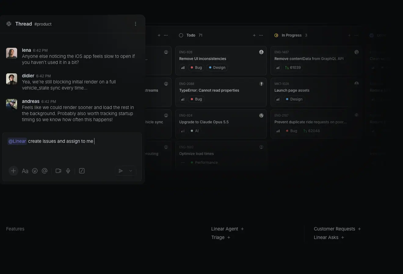 |
thread + board composite, cropped by the frame edge |
Crop the UI so it runs off the frame: it reads as "there is more". |
| Code panel |
|
Berkeley Mono 14/24; keywords #f79ce0, identifiers #f7bf8b; diff rows with red/green tint |
Use a 2-hue syntax theme on near-black. |
| Pricing plan cards |
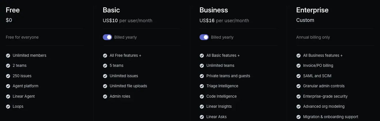 |
4 columns, 272px; plan name 24/31.92 590; rows 13/19.5 #d0d6e0 with check icons; CTA pills rgba(255,255,255,.05) 40px tall |
Columns without card borders; one highlighted CTA (Business) in #e5e5e6. |
C. Diagrams and illustrations
| Asset |
Crop |
Spec |
Rebuild |
| Isometric wireframes |
|
3-up, 1px grey lines, no fill |
Draw in Figma with 1px strokes, colour #62666d, isometric grid 30°. |
| Agent flow diagram |
|
mono uppercase labels in boxes, curved connectors, status dots |
Boxes 1px rgba(255,255,255,.08), radius 6px, Berkeley Mono 11px. |
| Changelog object render |
|
624×416 image, 3600px source; matte black cards, single top light |
3D render (Blender/Spline) or studio photo on black; one light; no reflections. |
| Editorial thumbnails |
|
384×216 (16:9), grey-on-black dot matrices and plots |
Generate from data (plots, point clouds) and keep to the grey ramp. |
D. People and customers
| Asset |
Crop |
Spec |
Rebuild |
| Customer tiles |
|
386×218; 6 of 7 are muted VIDEO; grayscale photo + white wordmark |
Desaturate footage, centre the customer logo in white, ≈40% width. |
| Now press + story cards |
 |
same 16:9 card, title 20/26.6 510, meta 13/19.5 #62666d "Author · Date →" |
Card = image, title, one-line dek, meta. No borders. |
E. Typographic graphics
| Asset |
Crop |
Spec |
| Method serif title |
|
Tiempos Headline 72/72, 400 |
| Closing CTA |
 |
"Built for the future. Available today." 72/72, 510, −1.584px, centred 722px, two pills: #e5e5e6 "Get started" + ghost "Contact sales" |
F. What Linear does not ship
No mascot, no illustrated characters, no emoji, no stickers, no decorative gradients, no patterns behind text, no stock photography. If your brand needs warmth, Linear's answer is customer video and real names, not drawings.
G. Asset production checklist
- Export product screenshots at 2× from the real app in dark mode; crop to 16:9 or let them bleed.
- Keep illustrations to 1px grey line work.
- Make every editorial thumbnail 16:9 and grey-on-black.
- Customer media: grayscale video + white logo.
- Logos: only from /brand originals, monochrome, with generous clear space.
Home · linear.app/

Height 9,990px at 1440 wide. Template: product overview (the same chassis as /plan, /build), compressed to show every product area once. Captured 2026-11-21.
Section map
| # |
Section |
y |
Crop |
| 0 |
Hero + product frame |
0 |
00-hero |
| 1 |
"A new species of product tool" + 3 wireframes |
1,536 |
01 |
| 2 |
Intake and integrations |
2,614 |
02 |
| 3 |
Planning and monitoring |
3,850 |
03 |
| 4 |
AI and automations |
5,089 |
04 |
| 5 |
Build, review, and ship |
6,331 |
05 |
| 6 |
Changelog strip |
7,584 |
06 |
| 7 |
Closing CTA |
8,954 |
07 |
| 8 |
Footer |
9,403 |
08 |
0 · Hero
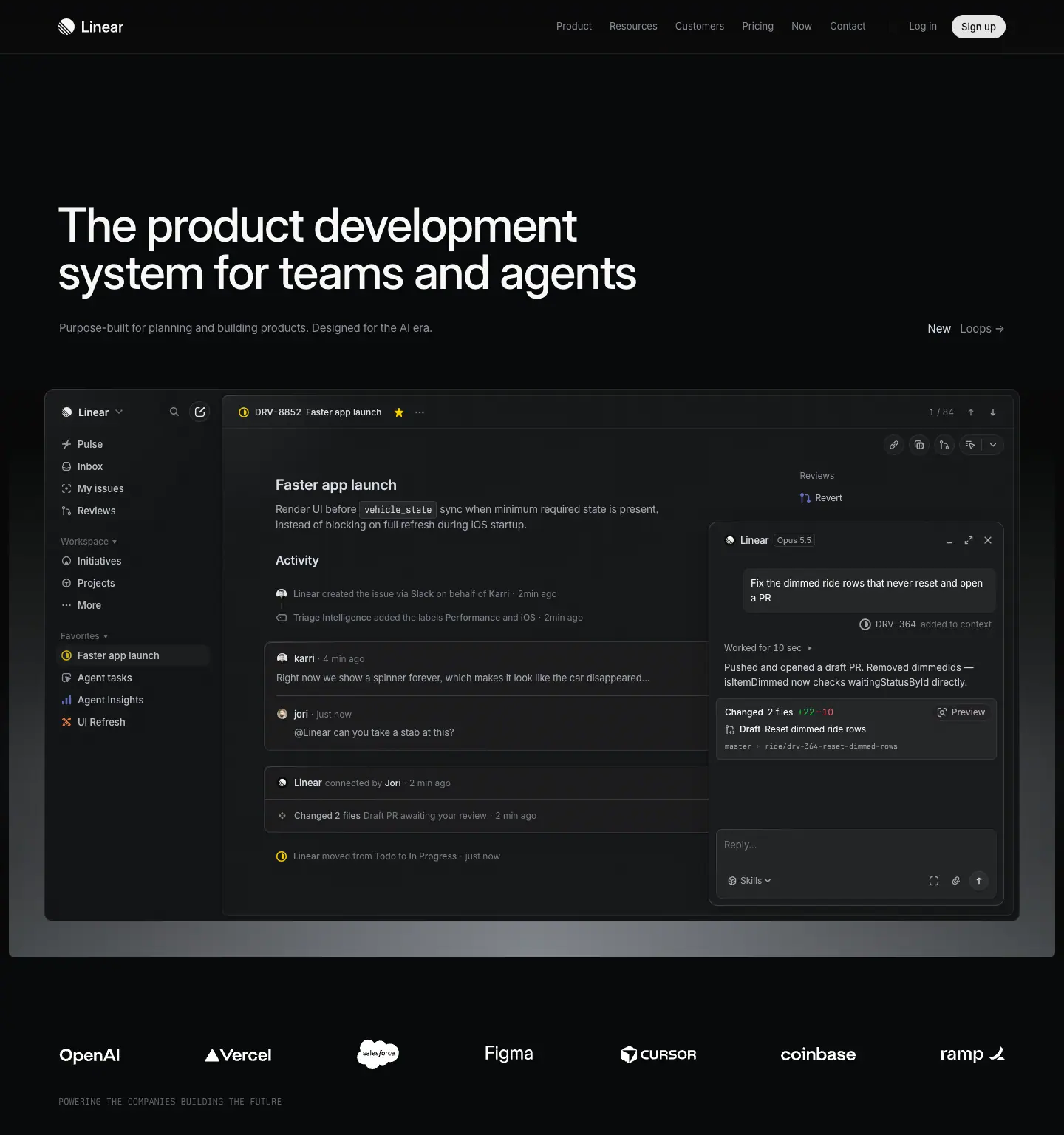
- H1 "The product development system for teams and agents": 64px / 64px, weight 510,
-1.408px (−0.022em), #f7f8f8, left-aligned at x=48, two lines (763 and 844px wide). This is smaller than the 72px H1 on product pages: home has to fit a longer sentence on two lines.
- Sub "Purpose-built for planning and building products. Designed for the AI era.": 15px / 24px, 400,
#8a8f98, at x=80, max 505px.
- Announcement link right-aligned on the same baseline: "New" 15/24 510
#d0d6e0 + "Loops →" #8a8f98. Placing it opposite the sub keeps the H1 block clean while still advertising the latest launch.
- Product frame: one
IMG 1440×804 at y=491, full-bleed. Inside: sidebar (Inbox, My issues, Initiatives, Projects at 13px 510 #d0d6e0), an issue "DRV-8852 Faster app launch", an activity feed, and an agent panel ("Opus 5.5" model chip at 11px). Code tokens inside the UI use Berkeley Mono 12/20.
Why: the home page sells the whole system, so the hero shows the agent working inside an issue. That single frame carries the "teams and agents" claim without a second visual.
1 · "A new species of product tool"
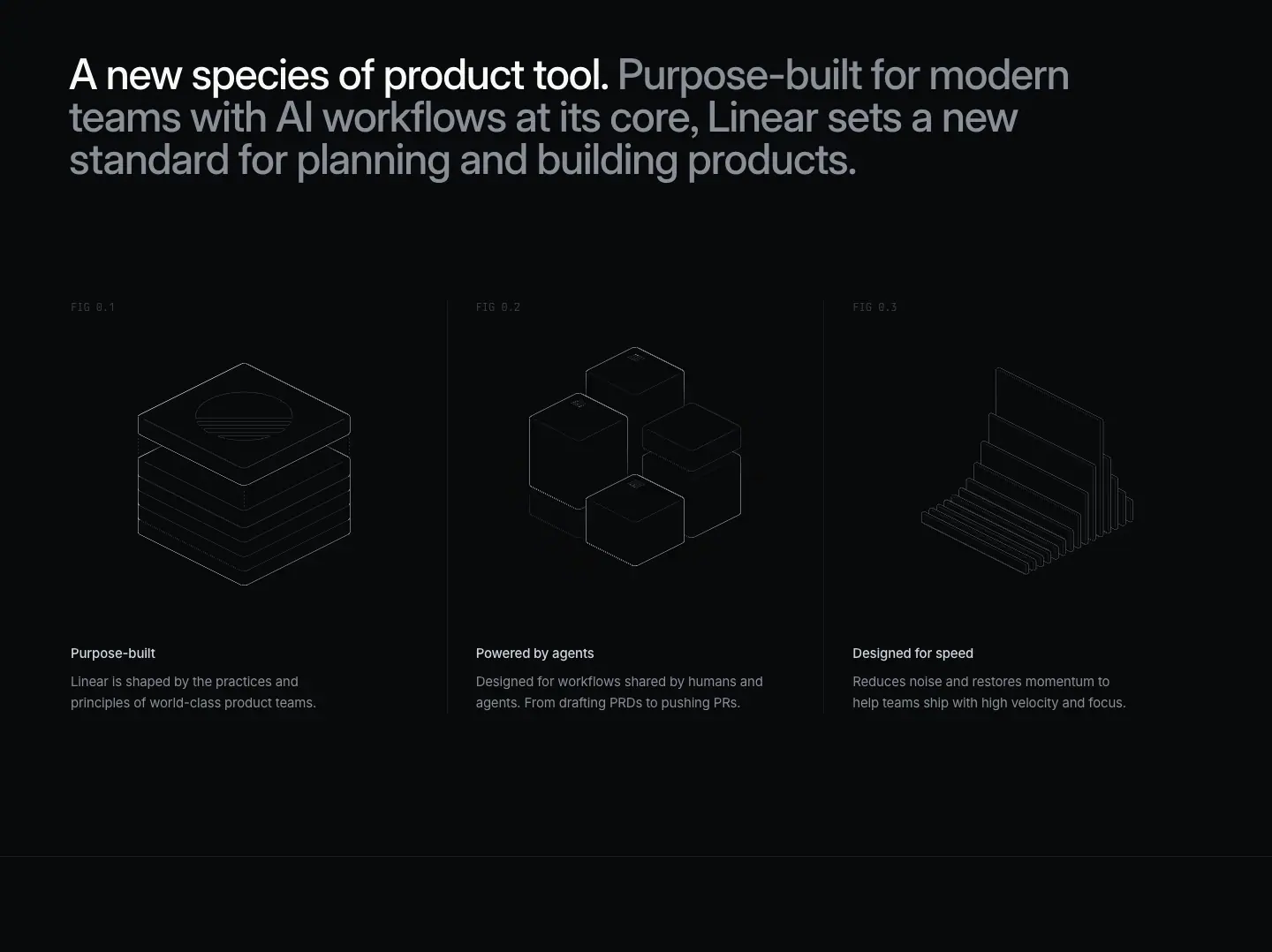
- H2 is a two-tone paragraph: 48/48, 510,
-1.056px, first clause #f7f8f8, the rest #8a8f98 (measured colour on the H2 node is #8a8f98 with a brighter span inside). 1,250px wide.
- Three isometric wireframes below with 13px captions: "Purpose-built", "Powered by agents", "Designed for speed".
Why: a manifesto line needs width; two-tone lets the reader stop after the bright clause.
2–5 · The four product chapters
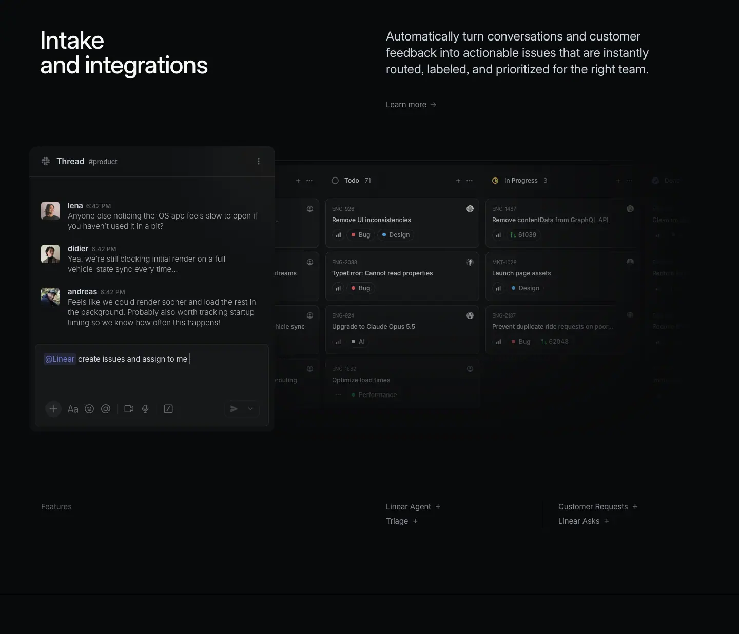
Each chapter repeats the same split header:
- H2 48/48, 510, 542px wide, left (x=78): "Intake and integrations", "Planning and monitoring", "AI and automations", "Build, review, and ship".
- Description 15/24
#8a8f98 on the right half, followed by a "Learn more →" link.
- A large UI panel (1,180–1,250px tall section) with a row of sub-feature links at the bottom (e.g. "Linear Agent →", "Triage →", "Customer Requests →").
Chapter heights are near-identical: 1,236 / 1,239 / 1,242 / 1,253px. Why: identical rhythm makes the page scan like a table of contents; each chapter is a doorway to its product page (/intake, /plan, /ai, /build).
Chapter 5 shows real code (Berkeley Mono 14/24, #f79ce0 keywords, #f7bf8b identifiers; 31 and 22 measured nodes) next to a diff review. See 13 · Brand assets.
6 · Changelog strip
H2 "Changelog" 48/48 left, then the latest entries as cards with dates. Why: shipping velocity is a product feature for Linear's audience; showing the changelog on home proves it.
7 · Closing CTA
"Built for the future. Available today." 72/72, 510, -1.584px, centred, 722px. Two pills: #e5e5e6 "Get started" and ghost "Contact sales". Identical on home, pricing, customers and Now: one sign-off for the whole site.
Reuse recipe
- Hero: 64px two-line H1 left, small grey sub left, announcement link right, full-bleed product frame.
- One manifesto paragraph in two tones.
- N chapters with identical height and split headers; each links to a deeper page.
- Changelog strip as proof of momentum.
- Shared closing CTA.
Now + Changelog · linear.app/now, /changelog, /changelog/<entry>, /now/<post>
Linear merged its blog and changelog into one publication called Now. /changelog is the same page with the "Changelog" tab selected: its H1 still reads "Now". The sitemap lists 256 changelog URLs and 104 Now URLs (public pages).
Captured: /now (6,812px), /changelog (24,288px), two changelog entries (2026-11-12-bring-your-own-key 2,035px, 2026-11-04-mobile-diffs 1,977px) and one Now essay (a-design-reset 4,825px).
| Page |
Full screenshot |
| /now |
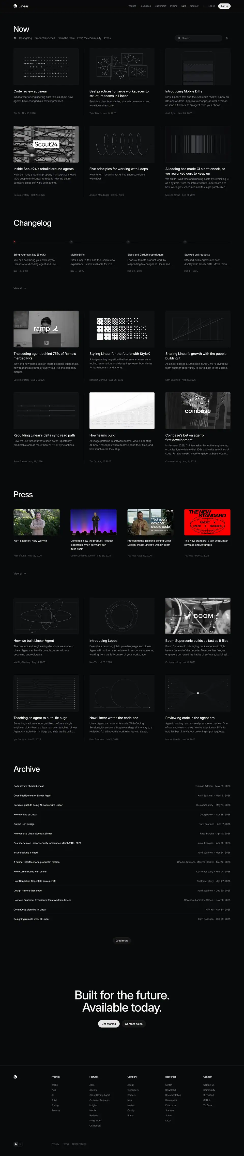 |
| /changelog |
 |
1 · Shared masthead (both indexes)
- H1 "Now": 48/48, 510,
-1.056px, #f7f8f8, x=78.
- Tab row at y=215: All · Changelog · Product launches · From the team · From the community · Press. 15/24, 400. Active tab
#f7f8f8, inactive #8a8f98. No underline, no pill: colour alone marks the state.
- Search pill on the right: 280×40,
#141516, radius 100px, placeholder "Search…" 14px #8a8f98.
Why one publication: a changelog alone looks like release notes; a blog alone looks like marketing. Together, "Now" reads as one stream of a company that ships and thinks. Tabs let each audience filter.
2 · /now index: card grid
- 3 columns of 384px at x=80/528/976 (gutter 64px).
- Card: 384×216 media (16:9), title 20/26.6 510
#f7f8f8, dek 15/24 #8a8f98, meta 13/19.5 #62666d "Tim Qi · Nov 16, 2026 →".
- Sections inside the index: featured (top 6), Changelog (H2 48/48), Press, then Archive, a dense list of title + date rows.
- 26 media elements; 4 are muted looping
VIDEO.
Why: the 4-step grey ramp (#f7f8f8 → #8a8f98 → #62666d) builds hierarchy inside each card without boxes or borders. The archive list ends the page with density for power readers.
3 · /changelog index: dated long-scroll
- Two-column layout: a date rail at x=104 (14/21, 400,
#f7f8f8, e.g. "November 12, 2026") and a 624px content column at x=408.
- Entry title (H2) 32/36, 590,
-0.704px.
- Hero media 624px wide (images from 1800×1200 to 3600×2400 source; 19 media on the page, 3 videos).
- Body 17/27.2, 400,
#d0d6e0. Inline links #f7f8f8 (brighter, not blue).
- Sub-features as H3 24/31.92 590 (e.g. "Slack and GitHub triggers", "Reasoning levels").
- Closing collapsible rows: Fixes · Improvements · Keyboard shortcuts · API · MCP server, 15/24 510, divided by hairlines.
Why: the full entry is on the index (no "read more"), so the page doubles as a scrollable history. 624px keeps lines ≈70 characters at 17px. The date rail gives a timeline without a visual timeline graphic.
4 · Changelog entry page
The entry page is the index entry, isolated: same 32/36 title, same 624px column, same Fixes/Improvements accordions, then the footer. Height ≈2,000px. Why: one template, two contexts; a shared link lands on a page that looks exactly like what the team saw in the feed.
5 · Now essay
- Breadcrumb "Now › …", H1 48/48 590 (heavier than index H1 510), centred in 900px.
- One hero image 717×329.
- Body 17/27.2
#d0d6e0, 624px column at x=408; H2 24/31.92 590 ("Design debt is real", "CEOs & leadership need to be behind the change", "From concept to yes").
- Author line 15/24
#8a8f98 ("Karri Saarinen").
Why heavier H1: an article title must outweigh the image below it; index H1s sit above a grid, so 510 is enough.
Reuse recipe
- Merge blog + changelog into one publication with colour-only tabs.
- Index = 3-up 16:9 cards with a 3-grey text ramp.
- Changelog = date rail + 624px column + full entries inline + collapsible "Fixes / Improvements / API".
- Entry pages reuse the inline template exactly.
- Essays: 900px centred title, 624px body, 17/27.2 text.
Customers · linear.app/customers and /customers/<story>
Index 4,471px; story /customers/alan 1,860px. The sitemap lists 44 customer URLs (public pages).
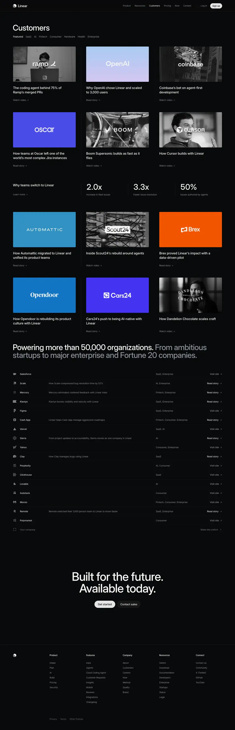
1 · Index masthead + filters
- H1 "Customers" 48/48, 510, x=78.
- Filter tabs at y=215: Featured · SaaS · AI · Fintech · Consumer · Hardware · Health · Enterprise. 15/24; active
#f7f8f8, others #8a8f98. Same pattern as the Now tabs.
2 · Story grid
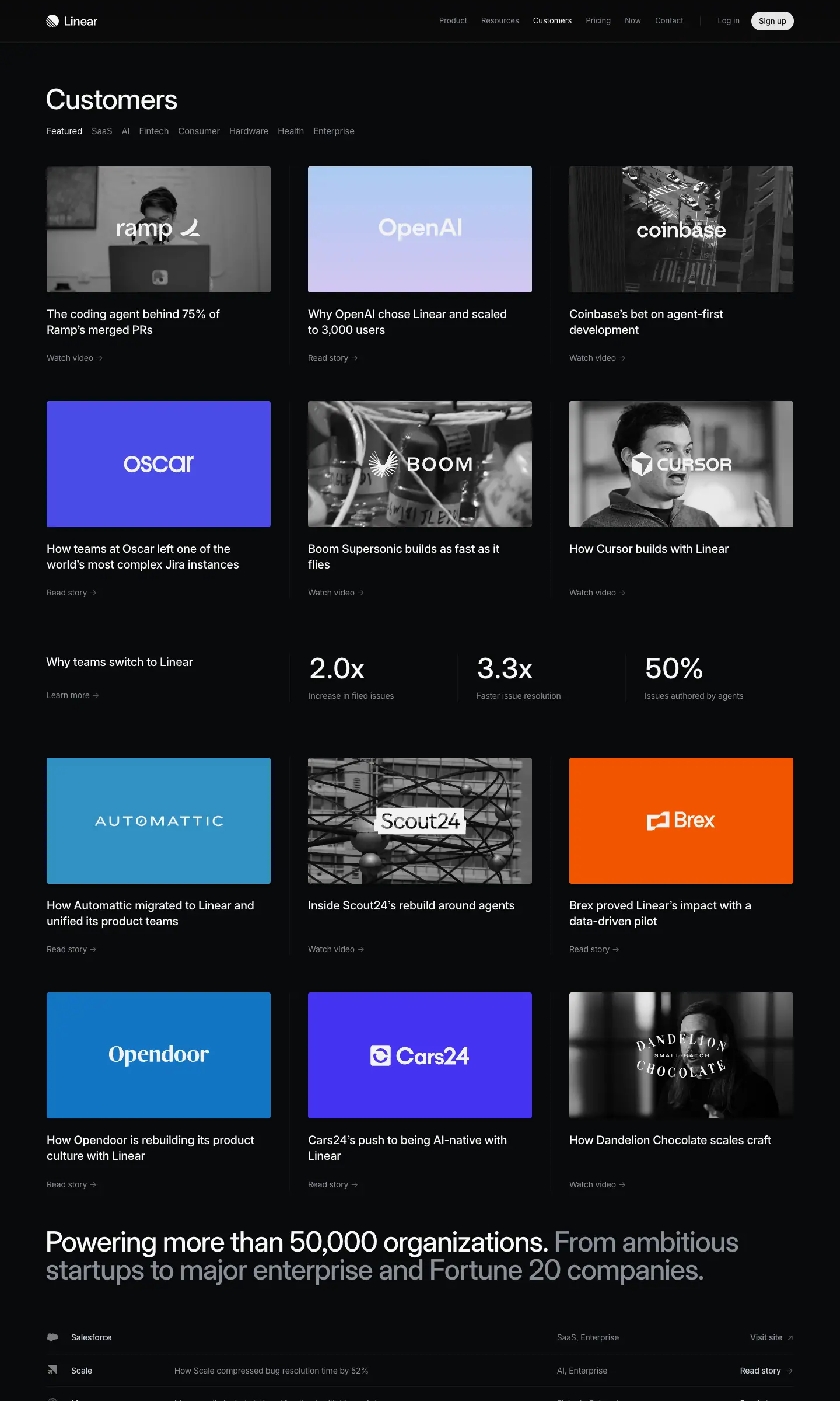
- 3 × 386px columns (x=79/527/975), tiles 386×218 (16:9). 6 of 7 tiles are muted
VIDEO.
- Tile art: grayscale photo + white customer wordmark, or a flat customer-colour tile (OpenAI lilac, Oscar blue).
- Title 20/26.6 510
#f7f8f8 ("The coding agent behind 75% of Ramp's merged PRs"); link 14/21 #8a8f98 "Watch video →" / "Read story →".
Why: headlines are outcomes with numbers ("75% of merged PRs", "scaled to 3,000 users"). The tile is the logo; the title is the proof.
3 · "Why teams switch" stat row
- Left: 20/26.6 510 label "Why teams switch to Linear" + "Learn more →".
- Right: three stats at 48/48 510 ("2.0x", "3.3x", "50%") with 14/21 grey captions ("Increase in filed issues", "Faster issue resolution", "Issues authored by agents").
Why: after anecdotes, aggregate numbers. Stat size equals H2 size (48px), so the numbers read as headlines.
4 · Long customer list
"Powering more than 50,000 organizations. From ambitious startups to major enterprise and Fortune 20 companies." (two-tone), then a dense table of company rows (name 14/21 510 #d0d6e0, category, "Visit site ↗"). Rows are 1280×56 buttons.
5 · Story page
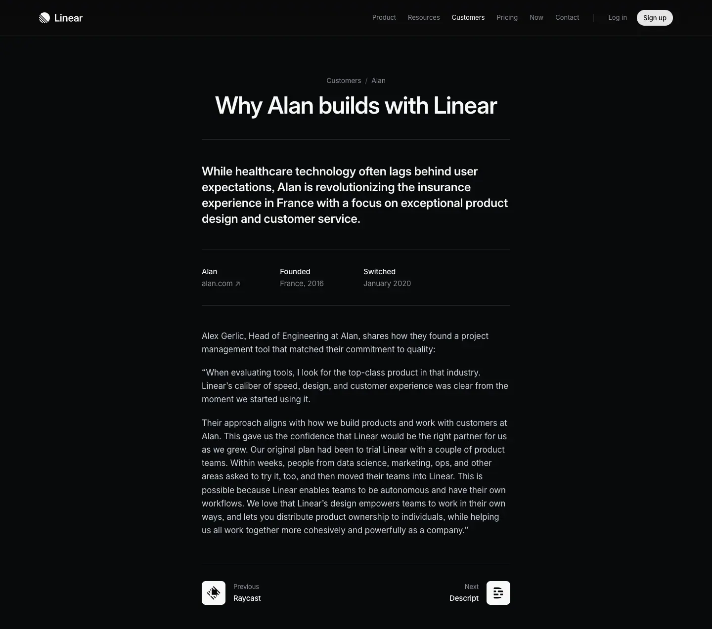
- Breadcrumb "Customers › Alan" 14/21
#8a8f98.
- H1 48/48 590, centred 900px: "Why Alan builds with Linear".
- Lead 24/31.92 590
#f7f8f8, 624px column.
- Fact strip: "alan.com ↗" + "Founded · France, 2016" + "Switched · January 2020" (labels 15/24 510, values 400
#8a8f98).
- Body 17/27.2
#d0d6e0, pull quotes as plain paragraphs in quotes.
- Previous/Next navigation (13/19.5 label + 15/24 510 name: "Raycast", "Descript").
Why: a story page is an article. "Switched: January 2020" is a credibility detail: long tenure proves retention.
Reuse recipe
Filter tabs → 16:9 video tiles with outcome headlines → aggregate stats at H2 size → long logo table → article-style stories with a fact strip and prev/next.
Docs, Method, Pricing, Brand and Resource kit
Five smaller templates captured on 2026-11-21. Each one shows how the core system bends for a different job.
1 · Docs page · /docs/agents-in-linear (3,526px)
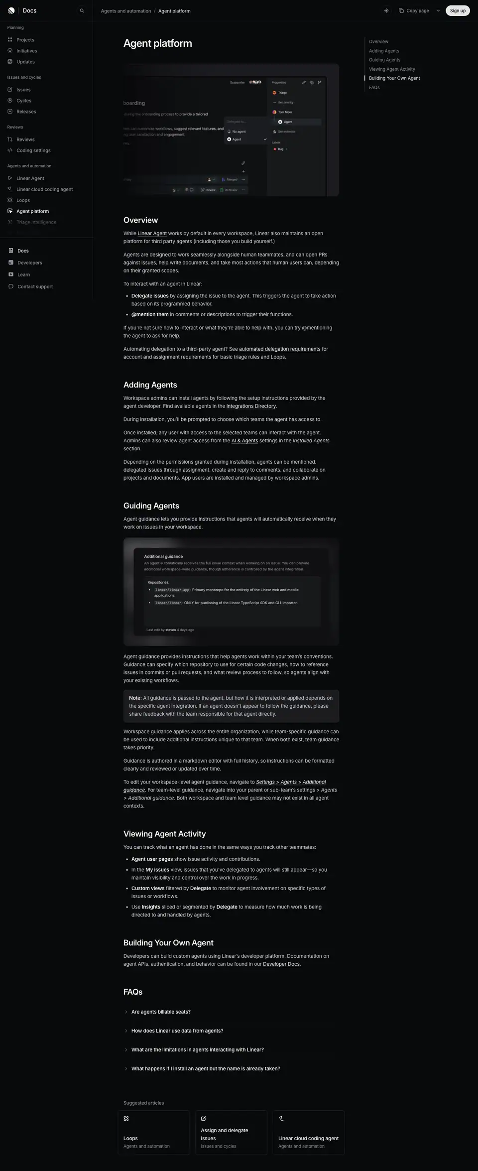
- Three columns: left nav (x=14–265), content 650px at x=372, right "On this page" rail at x=1112.
- Left nav: group labels 12/16.8 510
#8a8f98 ("Planning", "Issues and cycles", "Agents and automation"); items 14px 510 #8a8f98; current item brighter.
- H1 32/36 590
-0.704px (smaller than marketing 48–72px). H2 24/31.92 590.
- Body 15/24
#d0d6e0 (marketing body is 17/27.2). Docs text is denser because readers scan.
- Right rail: 13/19.5, active item
#f7f8f8.
- Bottom: "Suggested articles" cards 217×136, radius 8px.
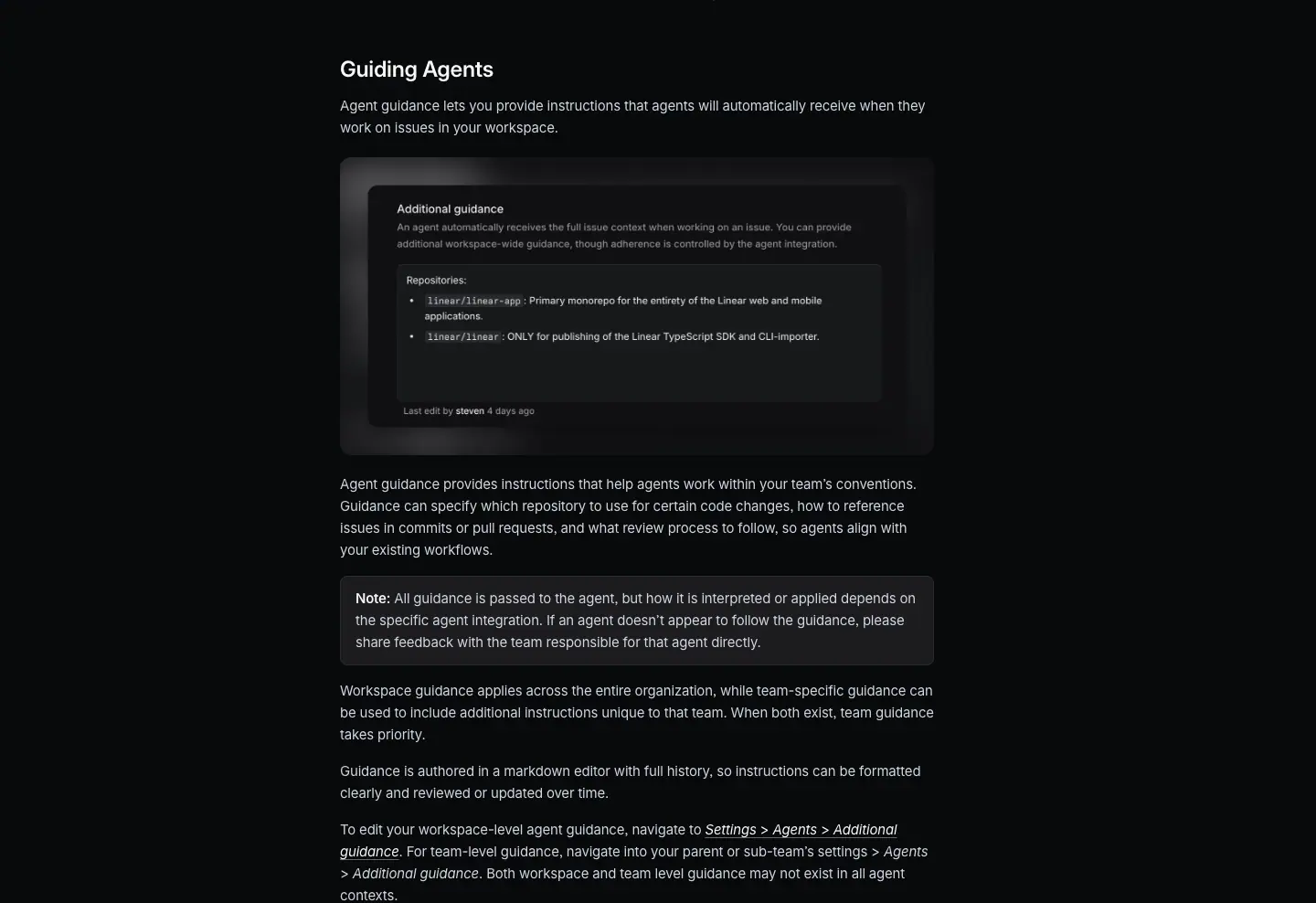
Why: docs use the same tokens one step smaller. A reader moving from marketing to docs feels no brand break.
2 · Method page · /method/build-in-public (1,432px)
- Breadcrumb "Method · Building" 14/21
#8a8f98.
- H1 Tiempos Headline 72/72, 400,
-1.584px. The only serif on the marketing site.
- Body 17/27.2
#d0d6e0, 688px column.
- Next-chapter card at the bottom: "3.5" chapter number 13/19.5 + "Launch and keep launching" 15/24 510, 336×80, radius 8px.
Why: the Method is Linear's book about how to build software. A serif headline switches the genre to essay; chapter numbers (3.5) make it a book.
3 · Pricing · /pricing (6,266px)
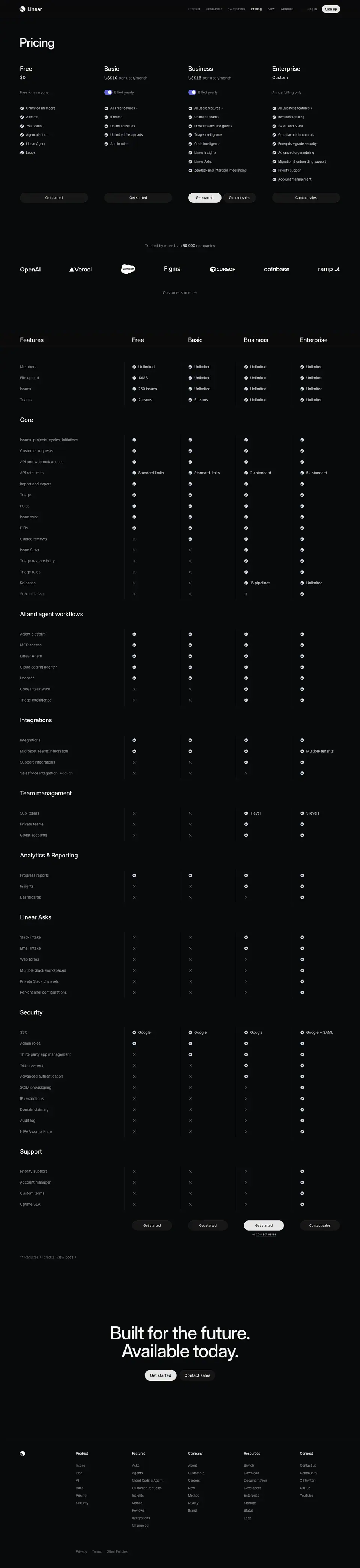
- H1 "Pricing" 48/48 510, left.
- Four plan columns (x=80/417/753/1089, 272px each): name 24/31.92 590, price 17/27.2 510 (
$0, Custom) or 16/24 ("$10 per user/month"), billing note 14/21 #8a8f98 ("Billed yearly"), features 13/19.5 #d0d6e0 led by "All Free features +".
- CTAs: 272×40 pills
rgba(255,255,255,.05); in the crop, one plan's CTA (Business) is the light #e5e5e6 pill.
- Logo row "Trusted by more than 50,000 companies" (15/24
#8a8f98).
- Feature comparison table: 199 rows of 16/24 cells, group headings 24/31.92 510 ("Features", "Core", "AI and agent workflows", "Security"…).
- Shared closing CTA.
Why: no card borders: the plans are columns of the same table that continues below. "All X features +" keeps each list short by inheritance.
4 · Brand guidelines · /brand (4,075px)
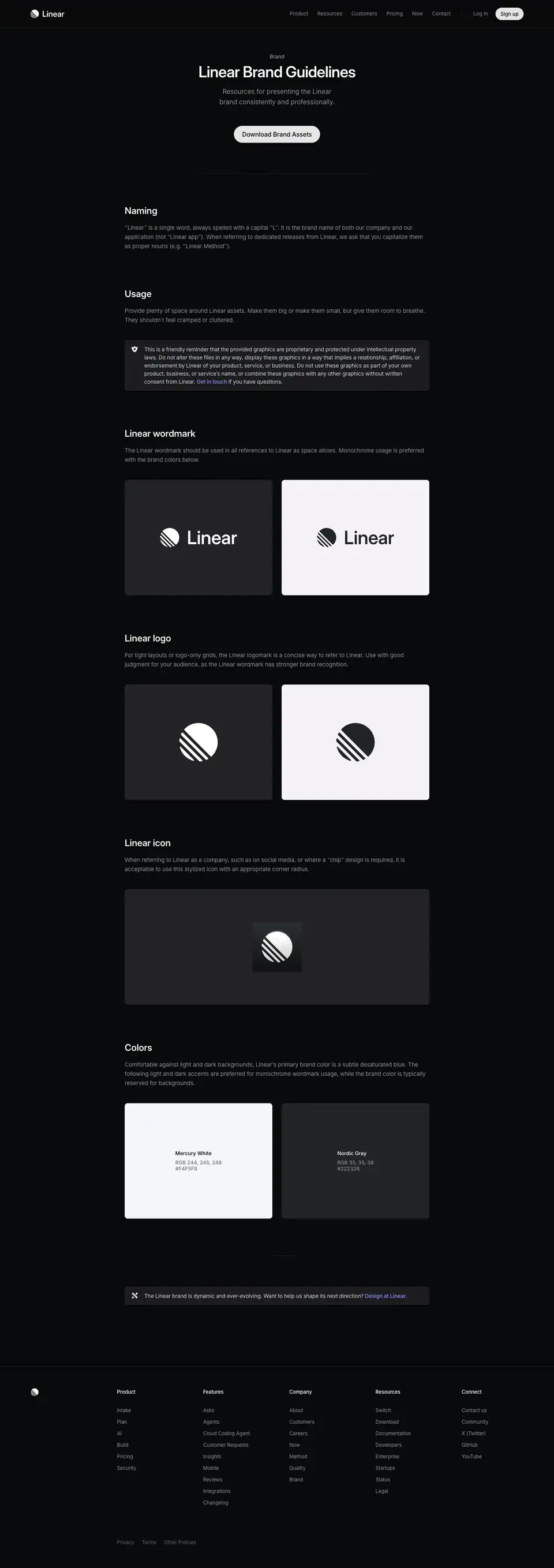
- Centred header: H1 "Linear Brand Guidelines" 40/44 590, sub 17/27.2
#8a8f98, one pill "Download Brand Assets" (#e5e5e6, 223×44, 16px 510).
- 792px column of sections (H3 24/31.92 590): Naming, Usage, Linear wordmark, Linear logo, Linear icon, Colors.
- Each logo section: two 384×300 cards (dark
#232326, light #ffffff), radius 8px, with a "Download" button inside.
- Colour swatches: Mercury White
#F4F5F8, Nordic Gray #222326, each with RGB + HEX and "Copy".
- Footer note: "The Linear brand is dynamic and ever-evolving… Design at Linear."
Full rules and crops: 12 · Art direction and 13 · Brand assets.
Why: the brand page uses the same marketing chassis. It is short, practical and download-first: the goal is that partners use the originals, not redraw them.
5 · Resource kit · /resource-kit (900px, one screen)
- Full-screen terminal: Berkeley Mono 15/24 uppercase, title "LINEAR RESOURCE KIT" 510, sub
#8a8f98 "THE PRODUCT DEVELOPMENT SYSTEM FOR TEAMS AND AGENTS".
- Menu items (SIGN UP, SWITCH TO LINEAR, LINEAR LEARN, AI WORKFLOWS, LIVE ONBOARDING, ENTERPRISE, CONTACT US) each with a
→.
- A 1440×480
<canvas> of dots fills the lower half.
- No header, no footer.
Why: a link hub for events and QR codes. The terminal look says "fast, keyboard-first" in one screen.
Plan · linear.app/plan
- URL: https://linear.app/plan
<title>: Linear – Plan and navigate from idea to launch- Meta description: "Align your team around a unified product timeline with projects, initiatives, and roadmaps, then monitor progress with analytics, dashboards, and a personalized feed."
- Page height: 14,801px at 1440px width
- Template: newer "product" template. Left-aligned 72px H1 at x=78 over a full-bleed hero video, then a repeated module: 48px H2 left + 24px grey-white sub right, a framed product visual, a bordered 2x2 or 2x1 bento below it.
- Page body background:
rgb(8, 9, 10) = #08090a.
Narrative arc. The page follows the planning hierarchy from smallest unit to whole organization, then to measurement. It starts with the single project (Manage projects end-to-end), drops into the document where ideas get shaped (Shape your product ideas), climbs to initiatives that group projects (Coordinate strategic product initiatives), zooms out to the roadmap/timeline (Map out your product journey), then shifts from planning to monitoring: a feed of updates (Keep a pulse on product progress) and analytics (Data to enhance your intuition). Each section is one Linear object, so the scroll reads like a guided tour of the planning stack. It closes with a cross-link strip to the three sibling product areas, two customer quotes, a "50,000 teams" scale line, and a two-button CTA. The order is "plan → align → see → measure → trust → act".
00 · Hero
Layout
- Full-bleed video background: <video> PLANNING-MONITORING (AV1), box x=0 y=0 w=1440 h=772. Content block sits bottom-left over the video.
- Hero block runs y=0 to the full-width 1px hairline at y=844 (rgba(255,255,255,.08), measured pixel #1b1c1d on #08090a). The section crop ends at y=823.
- Top nav (shared on all pages): logo at x≈80, y=20. Text links at x=741 (Product), 813 (Resources), 902 (Customers), 992 (Pricing), 1059 (Now), 1111 (Contact). A thin vertical divider (≈ measured from screenshot, x≈1200), then "Log in" at x=1218 and the "Sign up" pill at x=1288 (73×32).
- Eyebrow at y=532, x=80. H1 at y=572, x=78, w=582, h=144 (two lines). Eyebrow-to-H1 gap: 16px (eyebrow bottom 556 to H1 top 572).
- H1 bottom (716) to hairline (844): 128px.
- No sub-paragraph and no CTA in the hero. The H1 is the only message.
Typography
- Eyebrow "Planning and monitoring": 16px / 24px · 400 · normal · #f7f8f8.
- H1: 72px / 72px · 500 · -1.584px (-0.022em) · #f7f8f8, Inter Variable with "cv01","ss03". Line-height 1.0.
- Nav links: 13px / 19.5px · 400 · normal · #8a8f98.
- Sign up: 13px · 510 · #08090a on #e5e5e6, radius 9999px, padding 0 12px, height 32px, 1px border #e5e5e6.
Color
- Surface is the page black #08090a. The only color comes from the video: a field of soft, blurred dots in indigo/blue, green and a few white points, at low brightness.
- Text is pure primary #f7f8f8 for both eyebrow and H1. No accent color in the type.
Visual / UI illustration
- An abstract particle field: ≈ 60 to 80 out-of-focus circular dots, mostly indigo (#5e6ad2 family) with some green (#68cc58, the --color-linear-plan token), scattered over the right two thirds and the top. A faint blurred label shape sits at left-middle (≈ measured from screenshot, around x 330 to 500, y 400 to 490). It reads as a depth-of-field shot of status dots on a timeline.
- The dots thin out toward bottom-left so the H1 sits on clean black.
- It is a looping video, not real UI. The motion hint: dots drift and pulse (inferred from the asset type, not observed).
Copy
- Eyebrow: "Planning and monitoring" (3 words). It is the product-area name, same string used later in the cross-link strip.
- H1: "Plan and navigate from idea to launch" (7 words). Verb-first, two verbs joined by "and", then a from/to range. The range "idea to launch" names the full lifecycle in 4 words.
- No sub-copy. The page trusts the H1 plus the first section sub to carry detail.
Why it works
- One message, one line pair, bottom-left. The eye lands on the H1 after the nav, with nothing competing.
- The eyebrow is the same white as the H1 but 16px/400, so it reads as a label by size only. This keeps the hero monochrome.
- The dot field is metaphor, not a screenshot. It sets mood ("a sky of work items") without asking the viewer to parse UI in the first 800px.
- 128px of empty black under the H1 before the hairline gives a clear "chapter break" before the first module.
Reuse recipe
- Hero height ≈ 844px; video/canvas 1440×772 behind, content anchored at x=78, H1 top at y≈572.
- Eyebrow 16/24 400 primary color, 16px gap, then H1 72/72 500 -0.022em, max width ≈ 582px to force two lines.
- No buttons in the hero; put the CTA at the end of the page.
- Keep the visual darkest in the bottom-left quadrant where the text sits.
- End the hero with a full-width 1px rgba(255,255,255,.08) hairline.
01 · Manage projects end-to-end (part 1: header + feature frame)
Layout
- Section header split into two columns. H2 left at x=78, w=542, y=973. Sub paragraph right at x=752, w=566, y=975. The right column starts at 720+32, so the split is at the page center.
- Text link "Projects →" under the sub, x=752, y=1105 (34px below the last line of the sub).
- Hairline (y=844) to H2 top: 129px.
- H2 top to frame top: 252px. The framed visual starts at y=1225 and ends with a 1px bottom border at y=2164 (frame height 939px).
- Frame: x=48 to x=1392 (w=1344), 48px side margins. Top has a light "spotlight" gradient: edge pixels rgb(91,93,95) at x=60, rgb(135,140,144) at the center x=720, fading to page black by ≈ y+775 (fully #08090a at y=2000). Sides fade with it.
- Inner product panel: ≈ x=160 to 1280 (1120 wide), top ≈ y=1319 (≈ 94px inside the frame), fill rgb(18,19,20) (≈ #121314). It fades to black toward the bottom; the bottom ≈ 40% of the panel is dissolved.
- Caption block inside the frame, bottom-left: H3 at x=80, y=2057; description at y=2085. H3 is 107px above the frame bottom; description ends 31px above it (≈ 32px inner padding).
- Media: one <img> 720×553 at x=360, y=1422 (the document body of the project). Tab labels are live HTML at y=1334.
Typography
- H2 "Manage projects end-to-end": 48px / 48px · 510 · -1.056px (-0.022em) · #f7f8f8. Two lines.
- Sub: 24px / 31.92px · 400 · -0.288px (-0.012em) · #d0d6e0. Three lines at w=566.
- Link "Projects →": 15px / 24px · 400 · -0.165px · #8a8f98.
- Caption H3 "Close the gap between planning and building": 15px / 24px · 510 · -0.165px · #f7f8f8.
- Caption description: 15px / 24px · 400 · -0.165px · #8a8f98, w=624, wraps to 2 lines.
- In-UI tabs (Overview / Activity / Customers / Issues): 12px / 16.8px · 510 · normal; active #d0d6e0, inactive #8a8f98.
Color
- Surfaces: page #08090a, frame top glow grey (≈ #5b5d5f to #878c90), UI panel ≈ #121314.
- Accents only inside the UI: an orange project icon, a yellow "In Progress" dot, label dots, a blue initiative icon. All are small (≤ 16px).
- Frame bottom border: measured pixel rgb(23,23,24), ≈ rgba(255,255,255,.06).
Visual / UI illustration
- A faithful, simplified Linear project page "UI Refresh": tab bar, project icon, title, one-line summary, a Properties row (In Progress, High, lead, members, date "Jun 17th, '26", teams, Slack channel), Initiatives row, Labels row, Resources row, then body text and "Proposed changes" bullets.
- It is real-looking UI rendered at ≈ 1:1 (12 to 15px text), not a blurred screenshot. Data is synthetic and consistent with other sections (Tokyo launch, rider app).
- Masking: a vertical fade dissolves the body copy so the panel does not need a bottom edge. The gray glow above the panel acts like a studio light.
Copy
- H2: "Manage projects end-to-end" (3 words). Verb-first imperative, object, scope.
- Sub: "Coordinate larger pieces of work across multiple people and teams. Move seamlessly between ideation and execution." (16 words, 2 sentences). Both sentences are verb-first imperatives. Sentence 1 defines a project (scale); sentence 2 states the benefit (no handoff gap).
- Link: "Projects →" names the feature, not an action.
- Caption H3: "Close the gap between planning and building" (7 words). Benefit framed as a problem fixed.
- Caption body: "Consolidate project specs, documents, issues, customer feedback, and updates in one centralized location." (13 words). A list of 5 nouns proves the claim.
Why it works
- The split header puts the claim (left, large) and the explanation (right, smaller, lighter) on one horizontal band. A scanner reads only the left column; a reader reads across.
- #d0d6e0 for the sub sits one step below the H2 white. The contrast drop is small, so the sub still reads as primary content, not fine print.
- The frame's top glow gives the panel depth without a drop shadow, and keeps everything monochrome so the small status colors in the UI pop.
- The caption sits inside the frame at the bottom, so the visual and its explanation read as one card.
Reuse recipe
- Header: H2 48/48 510 -0.022em at x=78 (max 542 wide); sub 24/31.92 400 #d0d6e0 at x=752 (566 wide); both tops aligned.
- Optional feature link 15px #8a8f98 with "→", 34px under the sub.
- Frame top = H2 top + 252px (with link) or + 189px (without). Frame x=48, w=1344, height ≈ 939.
- Frame background: radial/linear light-grey glow from the top edge (center ≈ #878c90, edges ≈ #5b5d5f) fading to page black over ≈ 775px.
- Product panel 1120 wide, centered, top ≈ 94px into the frame; fade its bottom 40% to transparent.
- Caption H3 15/24 510 white + 15/24 400 #8a8f98 body at frame-left+32, bottom padding 32.
02 · Manage projects end-to-end (part 2: 2x2 bento)
Layout
- Bordered 2x2 grid directly under the feature frame. Gap feature frame bottom (2164) to grid top (2213): 49px (48px + 1px).
- Grid lines (all 1px rgba(255,255,255,.08), measured pixel rgb(27,28,29)): horizontals at y=2213, 2810, 3407; verticals at x=48, 719, 1391. Two rows of 597px. Two columns of 671 and 672px.
- Each cell: visual at the top (≈ 424px tall), caption at the bottom. Only the top-left visual is an <img> (672×424 at x=48, y=2246, cell top + 33). The chart, the update card and the Slack thread are live HTML/SVG (their text is in the DOM).
- Caption H3 at cell top + 489 (y=2702 and y=3299). Description 28px below. Bottom padding 32px (desc ends at 2778; line at 2810).
- Caption x: 81 (left cells), 752 (right cells), i.e. cell left + 33.
- Visuals sit in the upper ~70% of each cell and fade out at their edges. No inner card backgrounds.
Typography
- Cell H3: 15px / 24px · 510 · -0.165px · #f7f8f8, w=606.
- Cell body: 15px / 24px · 400 · -0.165px · #8a8f98, 2 lines max (forced by manual line breaks or width ≈ 400px; ≈ from screenshot the lines break near 400px).
- In-visual text (Slack thread): names 16px / 20px · 590 · #d0d6e0; channel and timestamps 14px or 12px · #62666d; "Tokyo launch" link 14px · #828fff (rgb(130,143,255)); message bodies 16px / 20px · 400 · #d0d6e0. Update card: status label 15px / 24px · 510 in red #c52828, orange #f2994a, green #42af22; date 14px / 24px · 400 · #62666d; body 15px · #d0d6e0.
Color
- Cells have no fill; they share the page black. Only the grid lines separate them.
- Color appears only inside visuals: a green connector line (milestones), a yellow and indigo line chart with indigo bars and a red hatched "target" zone (predict outcomes), a green "On Track" check (project update), indigo link text (Slack).
- Body text stays grey everywhere.
Visual / UI illustration
- Top-left "Milestones and dependencies": a mini timeline. Two milestone pills ("Beta", "GA") connected by curved lines to two bars ("Geofencing improvements" in a green outline, "Location-based notifications"). Faux, stylized UI with heavy fade on the right.
- Top-right "Predict project outcomes": a progress chart. Indigo area fill, yellow and indigo lines, a red diagonal-hatched band at the right for the target date, indigo bar histogram below. Stylized chart, no axes text.
- Bottom-left "Keep everyone up-to-date…": a single project update card, On Track · Nov 19 · We are ready to launch next Thursday. The DOM holds three update variants (Off Track Nov 22, At Risk Nov 20, On Track Nov 19) stacked at the same position, so the card cycles between states (animated).
- Bottom-right "…even if they are not in Linear": a Slack-style thread panel, "Thread #p-driver-app", a Linear app post "Tokyo launch / On track | julian posted an update / We are ready to launch next Thursday", followed by two replies that fade out.
Copy
- "Milestones and dependencies" / "Highlight key dates and map out critical paths between projects to streamline resource allocation and execution." (16 words)
- "Predict project outcomes" / "Understand how your project is progressing and when it's likely to complete, with scope and velocity visualized over time." (19 words)
- "Keep everyone up-to-date…" / "Communicate health and progress with built-in project updates." (8 words)
- "…even if they are not in Linear" / "Automatically share project updates on Slack with bi-directionally synced comment threads." (12 words)
- Pattern: noun-phrase titles (2 to 3 words) on the top row; a single sentence split across two cells with ellipses on the bottom row. The split sentence links the two cells and makes the reader move left to right.
- Bodies start with verbs (Highlight, Understand, Communicate, Automatically share).
Why it works
- The grid uses lines, not cards. Four ideas get equal weight without adding four boxes of extra surface.
- Captions sit at a fixed baseline in each row, so the four titles align on two horizontal lines and scan as a list.
- The visuals are crops of one concept each, small and centered, with lots of black around them. This lowers density after the large feature frame above.
- The same three status colors (red/orange/green) recur, which teaches the project-health vocabulary.
Reuse recipe
- 2x2 grid, 1344 wide at x=48, 1px rgba(255,255,255,.08) lines on all edges, no cell fills, rows 597px.
- Visual area 672×424 at cell top + 33; caption H3 at cell top + 489.
- Caption: 15/24 510 white + 15/24 400 #8a8f98, inset 33px, 32px bottom padding, 2 body lines max.
- Place the grid 48px under the feature frame of the same section.
- For a pair of related cells, split one sentence across both titles with "…".
03 · Shape your product ideas
Layout
- Same header split: H2 x=78 y=3664; sub x=752 y=3666; link "Documents →" y=3796.
- Previous grid bottom (3407) to H2: 257px. H2 to frame top (3916): 252px.
- Different frame: a solid panel, not a glow. Frame 3916 to 4755 (839px), x=48 to 1392, fill rgb(15,16,17) = #0f1011 (level-1 panel), 1px border measured rgb(42,43,44) at the top edge (≈ rgba(255,255,255,.08) plus panel), rounded corners (top row starts at x=53, ≈ 6 to 8px radius).
- Two columns inside: a vertical tab list on the left and a document panel on the right.
- Tab list: four buttons, each 360×106 at x=160, y=4100 / 4222 / 4344 / 4466 (122px pitch, 16px gap). Radius 8px, padding 20px 32px. Active tab fill measured rgb(23,23,24) (≈ #171718).
- Document panel: ≈ x=610 to 1278, y≈3978 to 4697 (≈ measured from screenshot), fill #0f1011 with a 1px border, breadcrumb bar at the top ("UI Refresh › Meeting notes", star, more), a doc icon, title, meta, body.
- No caption block at the bottom and no bento after it. This section is one frame only.
Typography
- H2 / sub / link: same as section 01.
- Tab titles: Berkeley Mono 12px / 20px · 510 · normal · #d0d6e0, text-transform: uppercase.
- Tab descriptions: Berkeley Mono 12px / 20px · 400 · normal · #8a8f98, uppercase, 2 lines at w=294.
- Doc title "Meeting notes": 20px / 28px · 590 · #d0d6e0.
- Doc meta "Feb 3, 2026 · @paul @meg @julian": 15px / 24px · 400 · #8a8f98.
- Doc body: 15px / 24px · 400 · #8a8f98; "Action items" 15px · 700.
- Issue chips created from bullets: ID 13px / 13px · 400 · #8a8f98 (ENG-2108), title 13px / 13px · 510 · #d0d6e0.
- Cursor name flags (meg, paul): 12px / 14px · 500, black or white text on a colored flag.
Color
- Surfaces: page #08090a, frame #0f1011, active tab ≈ #171718, doc panel #0f1011.
- Accent: a teal text highlight on "refresh" with a collaborator cursor flag (multiplayer editing hint), and small colored cursor flags. Everything else is greyscale.
Visual / UI illustration
- A faux document editor showing a meeting note. Body: "We reviewed the latest UI refresh designs for the rider app, focusing on core screens and perceived performance. The direction is solid, but several areas need iteration before implementation, with Android-specific constraints currently posing the biggest risk to timeline." Then "Action items" with three bullets that also exist as issue chips (ENG-2108, ENG-2109, ENG-2110) at the same y positions. This implies an animation: bullets turn into issues when the "Text-to-issue commands" tab is active.
- Live cursors (meg, paul) and <mark> highlights on "refresh designs", "solid", "need iteration" map to the "Inline comments" tab.
- The tab list on the left drives which state the doc shows. It is an interactive tab control rendered as <button> elements.
Copy
- H2: "Shape your product ideas" (4 words). Verb-first.
- Sub: "Collaborate on ideas and spec out product requirements in realtime, multiplayer project documents." (13 words, 1 sentence).
- Link: "Documents →".
- Tabs (title / description):
- "Collaborative editing" / "Work together on PRDs, specs, and docs in a realtime, multiplayer editor"
- "Inline comments" / "Discuss ideas directly in context with comments tied to specific sections"
- "Text-to-issue commands" / "Seamlessly turn bullet point lists into actionable issues"
- "Subscribe for updates" / "Get notified when documents change, with clear diffs and new comments"
- Tab copy has no final period, reads like a spec sheet. Titles are 2 to 3 word noun phrases; descriptions start with a verb.
Why it works
- Switching to monospace uppercase for the tab list changes the register from "marketing" to "spec". It signals a feature list without bullets.
- The solid #0f1011 frame (no glow) separates this "interactive demo" from the "hero shot" frames above and below. The rhythm glow / grid / solid / glow avoids monotony.
- Tabs on the left and preview on the right follow the reading order: choose, then see.
- One document carries all four features through state changes, so the viewer learns one artifact instead of four screenshots.
Reuse recipe
- Frame: #0f1011, 1px rgba(255,255,255,.08) border, radius ≈ 8px, 1344×839 at x=48.
- Left tab rail: buttons 360×106, radius 8, padding 20/32, 16px gap; active fill ≈ #171718; mono 12/20 uppercase, title 510 #d0d6e0, desc 400 #8a8f98.
- Right: a single faux document 15/24 body in #8a8f98, 20/28 590 title, highlight and cursor flags for collaboration.
- Animate the doc state per tab; keep the doc the same object across tabs.
- Skip the caption and bento when the tabs already explain the features.
04 · Coordinate strategic product initiatives
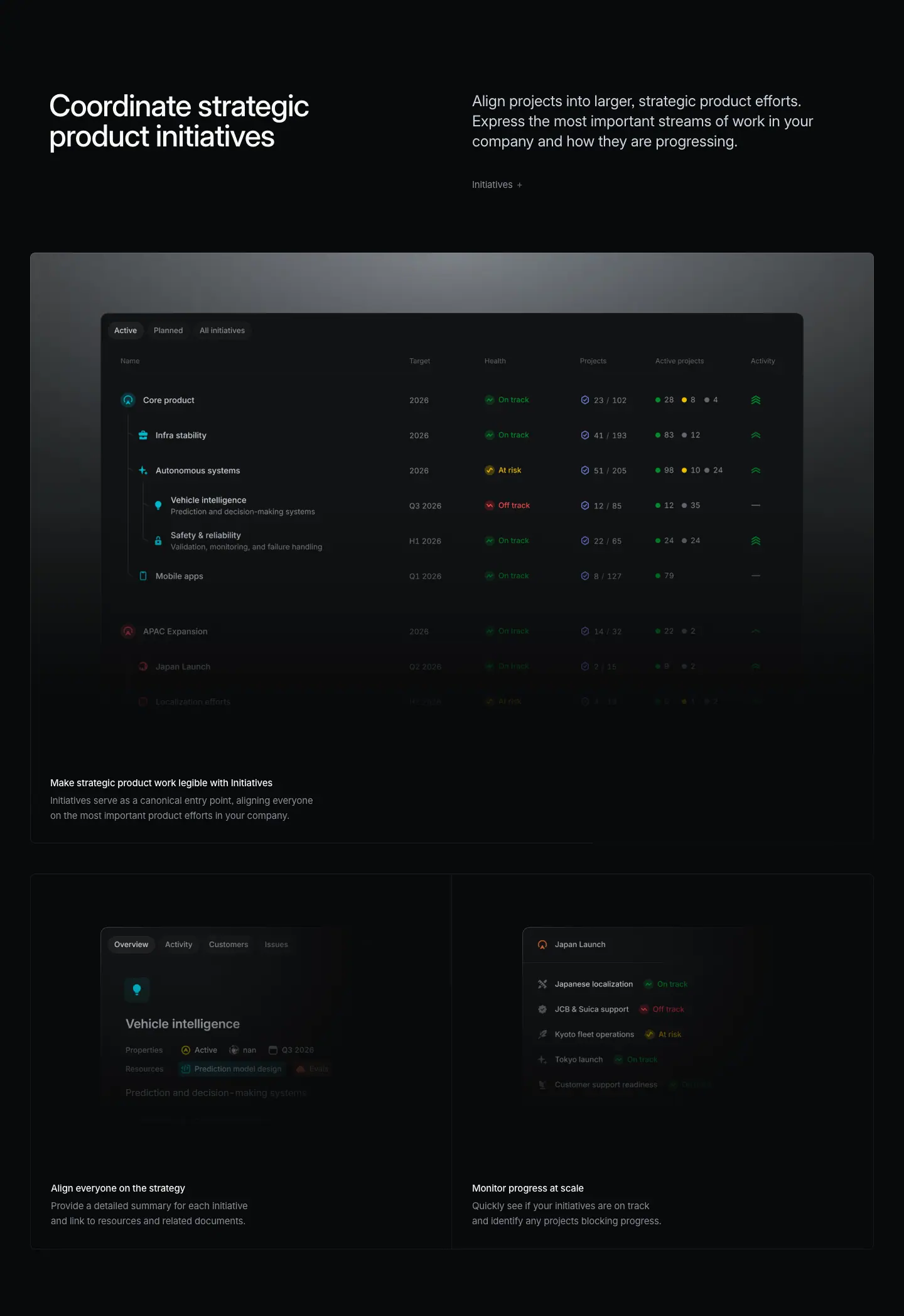
Layout
- Header: H2 x=78 y=5012, sub x=752 y=5013, link "Initiatives →" y=5144. Previous frame bottom (4755) to H2: 257px.
- Glow frame 5264 to 6203 (939px), same spec as section 01. Product image <img> 1120×704 at x=160, y=5360 (frame top + 96).
- Caption H3 at y=6096, desc y=6124 (frame bottom - 107 / - 79).
- Then a 2x1 bento: lines at y=6252 and 6849 (one row, 597px), verticals at 48 / 719 / 1391. Two <img> 672×424 at y=6285 (cell top + 33), x=48 and x=720.
- Bento captions at y=6741 (cell top + 489), x=81 and 752.
Typography
- Header and captions: same scale as section 01/02.
- In-UI table: column headers ≈ 11 to 12px grey; rows ≈ 12px #d0d6e0; health pills ("On track" green, "At risk" yellow, "Off track" red) ≈ 11px (≈ measured from screenshot; this table is an image so no DOM values).
Color
- Same glow frame. Inside the table: green, yellow and red health labels, a teal circular icon for "Core product", red for "APAC Expansion", green activity sparkline icons. Counts use green/yellow/grey dots.
- Bento cells: no fill; only the inner UI cards have a dark #0f1011-like fill (≈ measured from screenshot) with faded edges.
Visual / UI illustration
- Main: an Initiatives list view with tabs "Active / Planned / All initiatives" and columns Name, Target, Health, Projects, Active projects, Activity. A tree of nested initiatives (Core product › Infra stability, Autonomous systems › Vehicle intelligence, Safety & reliability; Mobile apps; APAC Expansion › Japan Launch). Rows below "Mobile apps" fade to near-invisible.
- Bento left "Align everyone on the strategy": an initiative overview card "Vehicle intelligence" with Properties (Active, owner, Q3 2026) and Resources chips, edges faded on all sides.
- Bento right "Monitor progress at scale": "Japan Launch" with child projects and health (Japanese localization On track, JCB & Suica support Off track, Kyoto fleet operations At risk, Tokyo launch On track, Customer support readiness), fading toward the bottom.
Copy
- H2: "Coordinate strategic product initiatives" (4 words). Verb-first.
- Sub: "Align projects into larger, strategic product efforts. Express the most important streams of work in your company and how they are progressing." (22 words, 2 sentences, both verb-first).
- Link: "Initiatives →".
- Caption: "Make strategic product work legible with Initiatives" / "Initiatives serve as a canonical entry point, aligning everyone on the most important product efforts in your company." (18 words). Uses precise vocabulary ("legible", "canonical") that fits an exec/PM reader.
- Bento: "Align everyone on the strategy" / "Provide a detailed summary for each initiative and link to resources and related documents."; "Monitor progress at scale" / "Quickly see if your initiatives are on track and identify any projects blocking progress."
Why it works
- The table is the densest visual on the page; the glow frame and the bottom fade keep it from feeling like a spreadsheet dump.
- The tree indentation plus the fade sells "this goes on" without showing everything.
- The 2x1 bento (not 2x2) is used because there are only two supporting points. The template flexes its row count to the content instead of padding with filler.
Reuse recipe
- Same header + glow frame recipe as section 01; product image 1120×704 at frame top + 96.
- Fade the last ≈ 30% of table rows to near-zero opacity.
- Follow with a single-row 2-column bento (597px tall) when there are two support points.
- Use a consistent 3-state health palette (green/yellow/red) in every visual.
05 · Map out your product journey
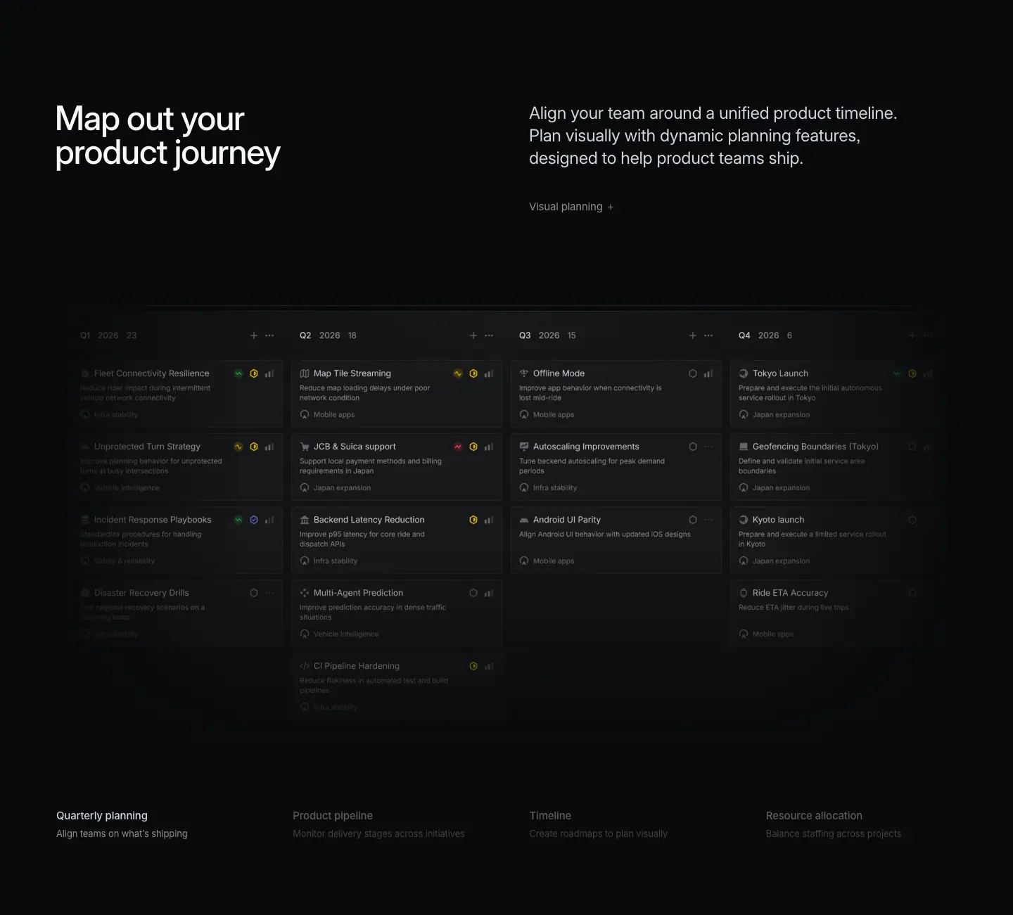
Layout
- Header: H2 x=78 y=7106, sub x=752 y=7107, link "Visual planning →" y=7238. Previous grid bottom (6849) to H2: 257px.
- No frame. The visual is full-bleed: four stacked <img> 1440×724 at x=0, y=7358, one per tab state (crossfade).
- A 1px header line for the board measured at y≈7390 (rgb(34,34,38)).
- Under the image, a 4-column tab row: titles at y=8104, descriptions at y=8132. Columns at x=80, 416, 753, 1089 (w=303, 336px pitch). 1px vertical dividers between columns (≈ measured from screenshot, at x≈383, 719, 1055).
- Section ends at the tab row (8152). Next H2 at 8407 (255px).
Typography
- Tab titles: 15px / 24px · 510 · -0.165px · #d0d6e0.
- Tab descriptions: 13px / 19.5px · 400 · -0.13px · #8a8f98.
- Inactive tabs render dimmer (≈ 40% opacity, measured from screenshot); the active one ("Quarterly planning") is at full value. The DOM color is the same for all four, so the dimming is opacity.
Color
- No frame surface. Board columns ≈ #0f1011 cards on black with faint borders (≈ from screenshot).
- Small accents in the cards: yellow/green status icons, a purple cycle icon. The board edges fade to black on all four sides.
Visual / UI illustration
- A quarterly board: columns "Q1 2026 23", "Q2 2026 16", "Q3 2026 15", "Q4 2026 8", each with project cards (title, one-line description, initiative label, status icons). Example cards: "Fleet Connectivity Resilience", "Map Tile Streaming", "Offline Mode", "Tokyo Launch", "JCB & Suica support", "Autoscaling Improvements", "Geofencing Boundaries (Tokyo)", "Backend Latency Reduction", "Android UI Parity", "Kyoto launch", "Multi-Agent Prediction", "Ride ETA Accuracy", "CI Pipeline Hardening".
- The Q1 column and the Q4 column are dimmed; Q2 and Q3 are brightest (a horizontal vignette).
- Four images = four views (Quarterly planning, Product pipeline, Timeline, Resource allocation). The tab row switches them.
Copy
- H2: "Map out your product journey" (5 words).
- Sub: "Align your team around a unified product timeline. Plan visually with dynamic planning features, designed to help product teams ship." (20 words, 2 sentences). Sentence 1 reuses the meta description's first clause.
- Link: "Visual planning →".
- Tabs: "Quarterly planning / Align teams on what's shipping"; "Product pipeline / Monitor delivery stages across initiatives"; "Timeline / Create roadmaps to plan visually"; "Resource allocation / Balance staffing across projects". Each description is 4 to 6 words, verb-first.
Why it works
- Breaking out of the 1344px frame to full-bleed signals "the roadmap is big". It is the only full-width product visual on the page, so it reads as the climax of the planning half.
- The tab row below the image (not above) keeps the image as the first thing seen; the tabs act like a caption that also controls the view.
- Opacity, not color, marks the active tab. This keeps the monochrome system intact.
Reuse recipe
- Full-bleed 1440×724 image stack; crossfade between states.
- Vignette the image on all sides; dim the outer columns.
- Tab row below: 4 equal columns (336px pitch, starting x=80), 15/24 510 title + 13/19.5 400 desc, inactive at ≈ 40% opacity, 1px vertical dividers.
- No caption block and no bento; the tab row is the caption.
06 · Keep a pulse on product progress
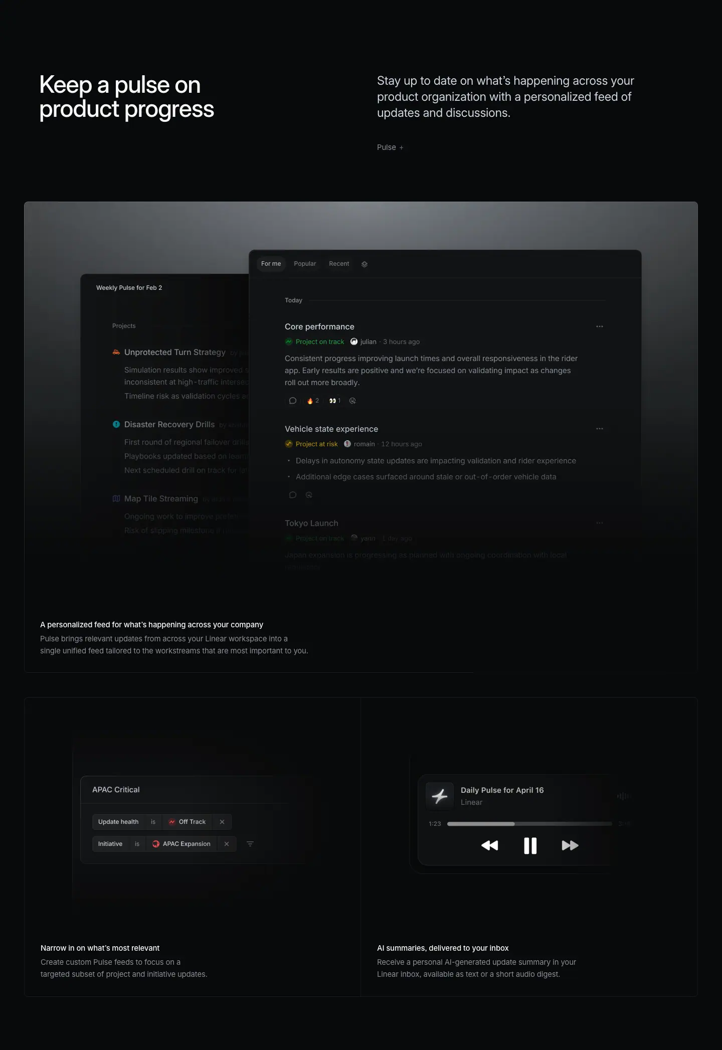
Layout
- Header: H2 x=78 y=8407, sub x=752 y=8409, link "Pulse →" y=8539.
- Glow frame 8659 to 9598 (939px). Two overlapping images: "Weekly Pulse" 560×656 at x=160, y=8803 (back) and the feed 640×611 at x=568, y=8848 (front). HTML tabs "For me / Popular / Recent" at y=8768.
- Caption H3 y=9491, desc y=9519.
- 2x1 bento: lines y=9647 and 10244; captions y=10136. Two <img> 672×424 at y=9680, x=48 and x=720.
Typography
- In-UI tabs: 12px / 16.8px · 510, active "For me" #d0d6e0, others #8a8f98.
- Header, captions: standard.
- Feed items (image, ≈ from screenshot): title ≈ 13px white, status "Project on track" green, "Project at risk" yellow, body ≈ 12px grey.
Color
- Same glow frame. Status chips in green and yellow. A flame emoji reaction. Audio player in the bento uses white controls on dark.
Visual / UI illustration
- Two windows layered with depth: a "Weekly Pulse for Feb 2" summary behind (Projects: Unprotected Turn Strategy, Disaster Recovery Drills, Map Tile Streaming), a feed in front ("Today": Core performance on track, Vehicle state experience at risk, Tokyo Launch). The back window is cut off by the front one; both fade at the bottom.
- Bento left "Narrow in on what's most relevant": a filter card "APAC Critical" with two filter rows (Update health is Off Track; Initiative is APAC Expansion).
- Bento right "AI summaries, delivered to your inbox": an audio player card "Daily Pulse for April 16 / Linear", progress bar at 1:23, rewind/pause/forward.
Copy
- H2: "Keep a pulse on product progress" (6 words). Mild pun: "pulse" is the feature name.
- Sub: "Stay up to date on what's happening across your product organization with a personalized feed of updates and discussions." (19 words, 1 sentence).
- Link: "Pulse →".
- Caption: "A personalized feed for what's happening across your company" / "Pulse brings relevant updates from across your Linear workspace into a single unified feed tailored to the workstreams that are most important to you." (24 words)
- Bento: "Narrow in on what's most relevant" / "Create custom Pulse feeds to focus on a targeted subset of project and initiative updates."; "AI summaries, delivered to your inbox" / "Receive a personal AI-generated update summary in your Linear inbox, available as text or a short audio digest."
- The H2 names the feature by metaphor; the link names it literally.
Why it works
- Overlapping two windows shows "summary + detail" in one shot and adds depth that a single screenshot lacks.
- The audio player is a concrete, unexpected visual for "AI summaries"; it makes the abstract feature tangible.
Reuse recipe
- In a glow frame, stack two panels: back panel 560 wide at x=160, front panel 640 wide at x=568, offset ≈ 45px lower, front overlaps back by ≈ 150px.
- Use live HTML for the tab bar on top of image panels so text stays crisp.
- 2x1 bento with one "control" visual (filter) and one "output" visual (player).
07 · Data to enhance your intuition (part 1: header + feature frame + bento top)
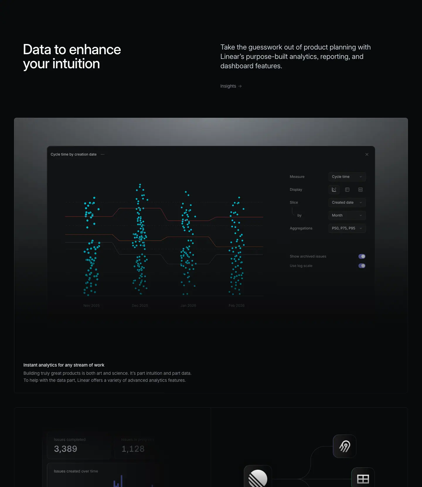
Layout
- Header: H2 x=78 y=10501, sub x=752 y=10503, link "Insights →" y=10633. Previous grid bottom (10244) to H2: 257px.
- Glow frame 10753 to 11692 (939px). Two images: chart 680×440 at x=220, y=10962; settings side panel 320×648 at x=959, y=10906. HTML title "Cycle time by creation date" at y=10870.
- Caption H3 y=11585, desc y=11613.
- 2x1 bento starts at y=11741 (continues in part 2).
Typography
- In-UI title: 12px / 16.8px · 510 · #d0d6e0.
- Caption body is 3 sentences on 2 lines at w=624.
- Bento metric numbers (image, ≈ from screenshot): "3,389" and "1,128" ≈ 22px; labels ≈ 12px grey.
Color
- Scatter plot points in teal #00b8cc family (the --color-teal token), percentile lines in muted red/orange. Toggles in the side panel are indigo. Everything else grey on dark.
Visual / UI illustration
- An Insights chart window: four vertical scatter columns (Nov 2025, Dec 2025, Jan 2026, Feb 2026) with stepped percentile lines crossing them. Right side panel: Measure Cycle time, Display (3 icons), Slice Created date by Month, Aggregations P50, P75, P95, toggles "Show archived issues", "Use log scale".
- Bento left (top visible): dashboard tiles "Issues completed 3,389", "Issues in progress 1,128", a bar chart "Issues created over time" in indigo.
- Bento right (top visible): an integrations graph. A central Linear logo node with curved connectors to app tiles (Fivetran, Google Sheets grid, Airbyte), each a dark rounded square ≈ 40px.
Copy
- H2: "Data to enhance your intuition" (5 words). Noun phrase, not imperative. Frames analytics as support for judgment, not a replacement.
- Sub: "Take the guesswork out of product planning with Linear's purpose-built analytics, reporting, and dashboard features." (16 words).
- Link: "Insights →".
- Caption: "Instant analytics for any stream of work" / "Building truly great products is both art and science. It's part intuition and part data. To help with the data part, Linear offers a variety of advanced analytics features." (30 words, 3 sentences). The longest caption on the page; it uses a balanced "art and science / intuition and data" construction that echoes the H2.
Why it works
- The H2 is the one heading on the page that is not an imperative. It shifts tone from "do" to "know" at the start of the monitoring half.
- Teal is used only here, so the analytics section has its own color identity inside the monochrome page.
- Splitting chart and settings into two images lets each crop and fade independently.
Reuse recipe
- Same glow frame; main chart 680 wide offset left (x=220), side panel 320 wide at x=959, 56px higher than the chart.
- Pick one data color per section (teal here) and keep the rest grey.
- Caption may run 3 short sentences if it carries the section's argument.
08 · Data to enhance your intuition (part 2: bento + product-area strip + testimonials)
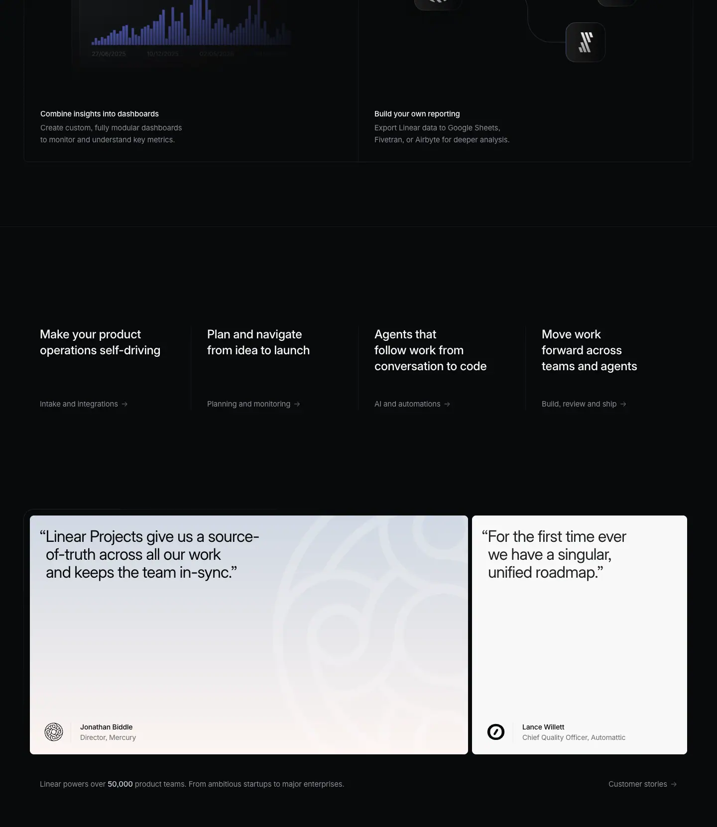
This crop holds four blocks: the bottom of the analytics bento, the cross-link strip, the testimonial pair and the scale line.
08a · Bento bottom (2x1)
Layout
- Bento row 11741 to 12338 (597px). Images 672×424 at y=11774 (x=48 and x=720). Captions y=12230 (cell top + 489), body y=12258.
Copy
- "Combine insights into dashboards" / "Create custom, fully modular dashboards to monitor and understand key metrics." (11 words)
- "Build your own reporting" / "Export Linear data to Google Sheets, Fivetran, or Airbyte for deeper analysis." (12 words). Names three real tools, which doubles as integration proof.
08b · Product-area cross-link strip
Layout
- Full-width 1px hairline at y=12468 (x=0 to 1439), 130px under the bento.
- Four columns: x=80, 416, 752, 1088 (w=263, 336px pitch). Headings at y=12669 (201px below the line). Links at y=12813 (144px below headings, so the link row aligns even when headings wrap to 2 or 3 lines).
- 1px vertical dividers between columns (≈ measured from screenshot at x≈382, 718, 1054; very low contrast).
Typography
- Headings: 24px / 31.92px · 510 · -0.288px · #f7f8f8, w=263, 2 to 3 lines.
- Links: 15px / 24px · 400 · -0.165px · #8a8f98 with "→".
Copy
- "Make your product operations self-driving" → "Intake and integrations →"
- "Plan and navigate from idea to launch" → "Planning and monitoring →" (the current page; its hero H1 repeated)
- "Agents that follow work from conversation to code" → "AI and automations →"
- "Move work forward across teams and agents" → "Build, review and ship →" (the /build hero H1)
- Each heading is the H1 of a sibling page; each link is that page's eyebrow. The strip is a site map built from hero copy.
08c · Testimonial pair
Layout
- Two light cards, 480px tall, top at y≈13049. Left card x=60, w=880; right card x=948, w=432; 8px gap. A dark outer frame with a 1px border starts at x=48 (≈ 12px around the cards; measured top edge at y=13040, rgb(17,19,21)).
- Quote text at card top + 24 (y=13073), inset 32px (x=92 left, 980 right). The opening quote mark hangs left of the text block (≈ 12px), so line 2+ align with the first letter, not the mark.
- Author block at the card bottom: logo ≈ 40px circle at x≈100, name at y=13463, x=161; role at y=13484 (≈ 45px bottom padding).
- Padding from button data: 24px 32px, radius 8px.
Typography
- Quote: 32px / 36px · 400 · -0.704px (-0.022em) · #08090a.
- Name: 14px / 21px · 510 · -0.182px · #08090a. Role: 14px / 21px · 400 · -0.182px · #08090a.
Color
- Left card: linear-gradient(rgb(207,215,226) 0%, rgb(253,245,242) 100%), cool grey-blue to warm peach, with a large faint line-art watermark of the customer logo on the right half.
- Right card: #f7f8f8 solid.
- These are the only light surfaces on the page. Text flips to near-black #08090a.
Copy
- Left: "Linear Projects give us a source-of-truth across all our work and keeps the team in-sync." (16 words) · Jonathan Biddle, Director, Mercury.
- Right: "For the first time ever we have a singular, unified roadmap." (11 words) · Lance Willett, Chief Quality Officer, Automattic.
- Each quote maps to a section on this page (Projects; roadmap). Short, plain, outcome-focused.
08d · Scale line
Layout
- y=13577, 48px under the cards. Left text at x=80 (w=612). Right link "Customer stories →" at x=1222 (right edge 1340).
Typography / Copy
- "Linear powers over 50,000 product teams. From ambitious startups to major enterprises." 15px / 24px · 400 · #8a8f98; "50,000" in <strong> 510 · #d0d6e0.
- "Customer stories →" 15px · #8a8f98.
Why it works (whole crop)
- The strip turns the bottom of every product page into navigation, using copy the reader may have already seen. It adds no new vocabulary.
- Light testimonial cards are a deliberate contrast flip. After ≈ 12,000px of black, two bright cards stop the scroll and mark "social proof" as a different kind of content.
- The 2:1 card width ratio (880 vs 432) gives the longer quote more room and avoids a symmetric, template look.
- The scale line is small and grey. It is a footnote of trust, not a banner.
Reuse recipe
- Hairline + 4-column strip: headings 24/31.92 510 white at 336px pitch from x=80; links 15px #8a8f98 at heading top + 144.
- Testimonials: two cards 880 + 432 with 8px gap, 480 tall, radius 8, padding 24/32, quote 32/36 400 -0.022em #08090a, hanging opening quote.
- One gradient card (cool to warm) + one flat #f7f8f8 card; faint logo watermark in the large card.
- Scale line 48px under: 15px grey sentence with the number in 510 #d0d6e0, link right-aligned at x=1340.
09 · Built for the future. Available today. (final CTA)
Layout
- Section 13675 to 14244 (569px). Centered.
- H2 at y=13825, x=359, w=722, h=144 (two lines). Scale line (13577) to H2: 248px.
- Buttons at y=14009 (40px below the H2 bottom 13969). "Get started" x=579 w=127; "Contact sales" x=718 w=144; 12px gap. Pair centered on x=720.
- Buttons bottom (14053) to footer border (14277): 224px.
Typography
- H2: 72px / 72px · 510 · -1.584px (-0.022em) · #f7f8f8, centered. Note weight 510 here versus 500 on the hero H1.
- Buttons: 16px · 510, height 44px, padding 0 20px, radius 9999px.
Color
- Primary button: bg #e5e5e6, text #08090a, 1px border #e5e5e6, layered near-zero shadows.
- Secondary button: bg rgba(255,255,255,.05), text #f7f8f8, shadow rgba(255,255,255,.03) 0 0 0 1px inset plus a faint rgba(255,255,255,.04) layer (a hairline ring without a border).
- No background art. Pure black.
Visual / UI illustration
- None. Type and two buttons only.
Copy
- H2: "Built for the future. Available today." (6 words, 2 sentences of 3 words each). Parallel construction: participle + "for" + time / adjective + time. It contrasts future and now.
- Buttons: "Get started" (self-serve), "Contact sales" (enterprise). Two paths, primary first.
Why it works
- After a dense page, the CTA is the emptiest block: no image, centered, the largest type since the hero. The change of alignment (left to center) marks the end.
- The light pill is the only near-white filled element on the page besides the nav "Sign up". Its brightness makes it the default action.
- The secondary uses a 5% white fill and an inset ring, so it reads as a button without competing.
Reuse recipe
- Centered H2 72/72 510 -0.022em, max 722px wide (forces 2 lines), ≈ 150px top padding.
- 40px gap to a button pair: 44px pills, 16px 510, padding 0 20; primary #e5e5e6/#08090a, secondary rgba(255,255,255,.05) + inset 1px rgba(255,255,255,.03) ring; 12px gap.
- ≈ 224px space below before the footer border.
10 · Footer
Layout
- Full-width 1px top border at y=14277, color #23252a (measured rgb(35,37,42)).
- Logo mark at x≈80, y≈14334 (≈ from screenshot, ≈ 20px).
- Five columns at x=304, 528, 752, 976, 1200 (224px pitch, w=160). Headings at y=14334 (57px below the border). Links start at y=14377, 30px rhythm.
- Legal row at y=14725: Privacy (x=304), Terms (369), Other Policies (426).
- Footer height ≈ 524px from border to page end.
Typography
- Column headings: 13px / 19.5px · 510 · -0.13px · #f7f8f8.
- Links: 13px / 19.5px · 400 · -0.13px · #8a8f98.
- Legal: 13px / 19.5px · 400 · -0.13px · #62666d.
Color
- Page black. Border #23252a. Three text values only (primary, tertiary, quaternary).
Copy
- Product: Intake, Plan, AI, Build, Pricing, Security.
- Features: Asks, Agents, Cloud Coding Agent, Customer Requests, Insights, Mobile, Reviews, Integrations, Changelog.
- Company: About, Customers, Careers, Now, Method, Quality, Brand.
- Resources: Switch, Download, Documentation, Developers, Enterprise, Startups, Status, Legal.
- Connect: Contact us, Community, X (Twitter), GitHub, YouTube.
- One- or two-word labels. No descriptions, no newsletter form, no social icons.
Why it works
- A 13px, three-tone footer is quiet and dense. The logo sits alone in column 0, so the grid starts at x=304 and leaves the left 224px as negative space.
Reuse recipe
- 1px #23252a top border; 5 columns at 224px pitch starting x=304; logo at x=80.
- Headings 13/19.5 510 white; links 13/19.5 400 #8a8f98 on a 30px rhythm; legal row in #62666d ≈ 390px below the headings.
Page-level takeaways
- One module repeats six times: split header (H2 left x=78, 24px sub right x=752), optional "Feature →" link, a 1344px frame, then a bordered bento. The page is long (14,801px) but predictable, so it reads fast.
- The vertical rhythm is fixed: 257px from the end of one module to the next H2, 252px from H2 to frame, 48px from frame to bento, 597px bento rows, 939px glow frames.
- Three frame types create variety inside one system: glow frame (sections 01, 04, 06, 07), solid #0f1011 panel with tabs (03), full-bleed image with tab row (05).
- Color lives only inside product visuals and status chips. All marketing type is white, #d0d6e0, or #8a8f98. Each section gets at most one data color (teal for analytics, indigo for charts).
- Headings are short imperatives (3 to 6 words) except the analytics H2, which is a noun phrase that changes tone from "do" to "know".
- Subs are 13 to 22 words, usually two sentences: sentence 1 defines the feature, sentence 2 states the benefit.
- Mock data is consistent across sections (rider app, Tokyo/Kyoto launch, APAC Expansion, Feb 2026), which makes the visuals feel like one real workspace.
- Fades replace edges. Panels dissolve at the bottom and sides instead of ending in a border, so screenshots feel like windows into a larger product.
- The ending stack is reusable across pages: cross-link strip (sibling H1s), light testimonial pair, 50,000 scale line, centered CTA, 5-column footer.
- The only light surfaces on the page are the testimonial cards and the primary buttons. Brightness is reserved for proof and action.
Section inventory
| # |
Section |
Pattern name |
Key values |
| 00 |
Hero |
Hero-left-video |
video 1440×772; eyebrow 16/24 400 #f7f8f8 y=532; H1 72/72 500 -1.584px x=78 y=572 w=582; hairline y=844 |
| 01 |
Manage projects end-to-end (p1) |
Section-header-split + Glow-frame-feature |
H2 48/48 510 x=78; sub 24/31.92 400 #d0d6e0 x=752; link 15px #8a8f98; frame x=48 w=1344 h=939; caption 15/24 |
| 02 |
Manage projects end-to-end (p2) |
Bento-2x2 |
lines .08 at y 2213/2810/3407, x 48/719/1391; rows 597; img 672×424 at +33; caption at +489 |
| 03 |
Shape your product ideas |
Section-header-split + Mono-label-tabs |
solid #0f1011 frame h=839; tab buttons 360×106 r8 pad 20/32; Berkeley Mono 12/20 uppercase |
| 04 |
Coordinate strategic product initiatives |
Section-header-split + Glow-frame-feature + Bento-2x1 |
img 1120×704 at frame+96; bento row 597 |
| 05 |
Map out your product journey |
Section-header-split + Full-bleed-image-tabs (Carousel) |
4 imgs 1440×724 crossfade; tabs 15/24 510 + 13/19.5 400, 336px pitch, inactive ≈ 40% opacity |
| 06 |
Keep a pulse on product progress |
Section-header-split + Glow-frame-feature (layered windows) + Bento-2x1 |
back 560×656 x=160, front 640×611 x=568 |
| 07 |
Data to enhance your intuition (p1) |
Section-header-split + Glow-frame-feature |
chart 680×440 x=220; side panel 320×648 x=959; teal data color |
| 08 |
Data to enhance your intuition (p2) + closers |
Bento-2x1 + Product-area-strip-4up + Testimonial-quote (pair) + Stat-line |
strip 24/31.92 510, 336px pitch; cards 880+432, 8px gap, h=480, quote 32/36 400 #08090a |
| 09 |
Built for the future. Available today. |
Final-CTA-centered |
H2 72/72 510 centered w=722; pills 44px, 16px 510, #e5e5e6 / rgba(255,255,255,.05) |
| 10 |
Footer |
Footer-5col |
border #23252a; cols at x 304/528/752/976/1200; 13/19.5; links #8a8f98; legal #62666d |
Build · linear.app/build
- URL: https://linear.app/build
<title>: Linear – Move work forward across teams and agents- Meta description: "Build, review, and ship with AI agents that work alongside your team – from delegating issues and orchestrating work to reviewing diffs and managing releases."
- Page height: 15,325px at 1440px width (the longest of plan / build / reviews)
- Template: newer "product" template. Left-aligned 72px H1 at x=78 over a full-bleed hero video; then repeated modules of split header (48px H2 left, 24px sub right), framed product visual, and bordered bento.
- Page body background: #08090a.
Narrative arc. The page follows one unit of work from assignment to production. It opens with agents taking issues (Delegate, automate, and orchestrate work), sets the team's cadence (Build momentum with Cycles), connects the tools where work happens (Streamline work across tools, via MCP), automates the Git link (Powerful Git automations), moves into code review in two steps (Faster reviews, fewer bottlenecks; Reviews with direction), and ends at release (Release management). The section order is the software delivery pipeline: assign → plan the sprint → code in your tools → open a PR → review → ship. The shared closers follow: product-area strip, two light testimonial cards, the 50,000 scale line, the centered CTA and the footer.

00 · Hero

Layout
- Full-bleed <video> BUILD-REVIEW-SHIP (AV1), x=0 y=0 w=1440 h=772.
- Eyebrow at x=80, y=532. H1 at x=78, y=572, w=761, h=144 (two lines). Eyebrow bottom to H1: 16px.
- Hero ends at the full-width 1px rgba(255,255,255,.08) hairline at y=844 (128px below the H1 bottom at 716).
- Shared top nav: logo x≈80, y=20; links 13px at x=741 to 1111; "Log in" x=1218; "Sign up" pill x=1288, 73×32.
Typography
- Eyebrow "Build, review and ship": 16px / 24px · 400 · normal · #f7f8f8.
- H1: 72px / 72px · 500 · -1.584px (-0.022em) · #f7f8f8. Wider than the plan H1 (761 vs 582) because the line "across teams and agents" is longer.
- Nav: 13px / 19.5px · 400 · #8a8f98. Sign up: 13px · 510 · #08090a on #e5e5e6, radius 9999px.
Color
- Video content: a code editor in dark theme, syntax colors (cyan/teal identifiers, orange strings, purple keywords) and green "added" line backgrounds on the right. Overall luminance is low; the left-bottom quadrant under the H1 is the darkest.
Visual / UI illustration
- A diff view shot at a steep 3D angle (tilted ≈ 15 to 20 degrees, rotating away top-left to bottom-right, ≈ measured from screenshot) with strong depth of field: the middle band is sharp, top and bottom are blurred. Visible text: "Refactor notification", "Commits", Swift code (DriverNotification, payload, source), line numbers 31 to 45, a "+ 38 unchanged lines" label.
- It is real Linear diff UI filmed or rendered as a video, not a static image. The camera likely drifts (inferred from the video asset).
Copy
- Eyebrow: "Build, review and ship" (4 words). Three verbs, no Oxford comma; it is the product-area name.
- H1: "Move work forward across teams and agents" (7 words). Verb-first. "teams and agents" puts humans and AI side by side as equals, the thesis of the page.
Why it works
- The tilted, blurred code gives "engineering" context instantly while staying too soft to read, so it never competes with the H1.
- The H1 states the position (agents are teammates) before any feature appears. Everything below is proof.
Reuse recipe
- 1440×772 video/canvas, perspective-tilted product UI with depth-of-field blur; keep bottom-left dark.
- Eyebrow 16/24 400 white + H1 72/72 500 -0.022em at x=78, top y≈572; no buttons.
- 128px under the H1, a full-width 1px rgba(255,255,255,.08) hairline.
01 · Delegate, automate, and orchestrate work (part 1: header + feature frame)
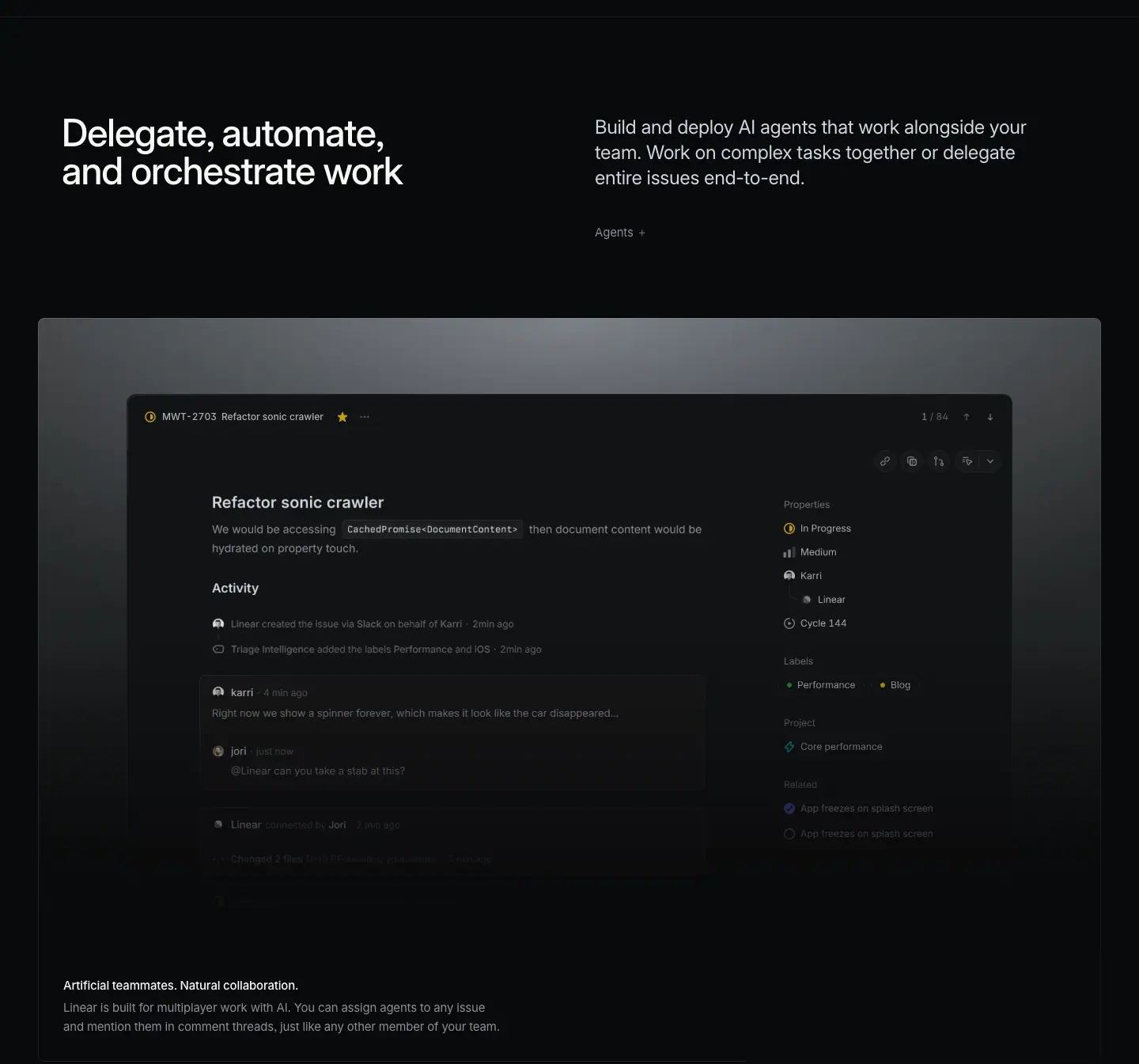
Layout
- Split header: H2 x=78, y=973, w=542; sub x=752, y=975, w=566; link "Agents →" x=752, y=1105.
- Hairline (844) to H2: 129px. H2 to frame top (1225): 252px.
- Glow frame 1225 to 2164 (939px), x=48 to 1392. Top edge pixels rgb(91,93,95) at x=60 and rgb(135,140,144) at x=720; fades to page black ≈ 775px down.
- Product panel ≈ x=160 to 1280, top ≈ y=1319. Built from HTML + two images: the issue body <img> 640×531 at x=252, y=1444, and the properties sidebar <img> 296×579 at x=983, y=1444. The header bar is live HTML at y=1342 ("MWT-2703", "Refactor sonic crawler", pager "1 / 84" at x=1173).
- Caption: H3 y=2057, body y=2085, x=80 (frame + 32). 32px bottom padding.
Typography
- H2 "Delegate, automate, and orchestrate work": 48px / 48px · 510 · -1.056px · #f7f8f8.
- Sub: 24px / 31.92px · 400 · -0.288px · #d0d6e0.
- Link: 15px / 24px · 400 · -0.165px · #8a8f98.
- Panel header: 12px / 16.8px · 510 · #d0d6e0; pager "/ 84" #62666d.
- Caption H3: 15px / 24px · 510 · -0.165px · #f7f8f8; body 15px / 24px · 400 · #8a8f98, w=624.
Color
- Glow frame greys; panel ≈ #121314. Accents in UI: a yellow in-progress issue icon and star, yellow "In Progress" status, label dots (green Performance, orange Blog), an indigo cycle icon, purple related-issue icon.
Visual / UI illustration
- A Linear issue view: title "Refactor sonic crawler", description with an inline code chip CachedPromise<DocumentContent>, an Activity feed ("Linear created the issue via Slack on behalf of Karri", "Triage Intelligence added the labels Performance and iOS"), a comment thread where "jori" writes "@Linear can you take a stab at this?" and the Linear agent replies (faded). Right sidebar: Properties (In Progress, Medium, Karri, Linear as delegate, Cycle 144), Labels, Project "Core performance", Related issues.
- The AI is shown as a participant in a normal thread, not as a separate chat UI. Bottom third fades out.
Copy
- H2: "Delegate, automate, and orchestrate work" (5 words). Three verbs in a list, escalating scope (one task → rules → many tasks).
- Sub: "Build and deploy AI agents that work alongside your team. Work on complex tasks together or delegate entire issues end-to-end." (21 words, 2 sentences, both verb-first).
- Link: "Agents →".
- Caption: "Artificial teammates. Natural collaboration." (4 words, two 2-word fragments, antithesis "artificial / natural") / "Linear is built for multiplayer work with AI. You can assign agents to any issue and mention them in comment threads, just like any other member of your team." (30 words).
Why it works
- The fragment pair "Artificial teammates. Natural collaboration." uses contrast to defuse fear of AI tooling in four words.
- Showing an agent inside the existing issue thread proves "no new workflow" visually; the caption confirms it in text.
- The header uses the same split as every other module, so the first section teaches the reader how to scan the rest of the page.
Reuse recipe
- H2 48/48 510 -0.022em x=78; sub 24/31.92 400 #d0d6e0 x=752; link 15px #8a8f98 "→" 34px under the sub.
- Glow frame x=48 w=1344 h=939 at H2 + 252.
- Panel from HTML header + image body + image sidebar, so the sidebar can fade independently.
- Caption 15/24 510 white + 15/24 400 grey at frame-left + 32, 32px bottom padding.
02 · Delegate, automate, and orchestrate work (part 2: 2x2 bento)
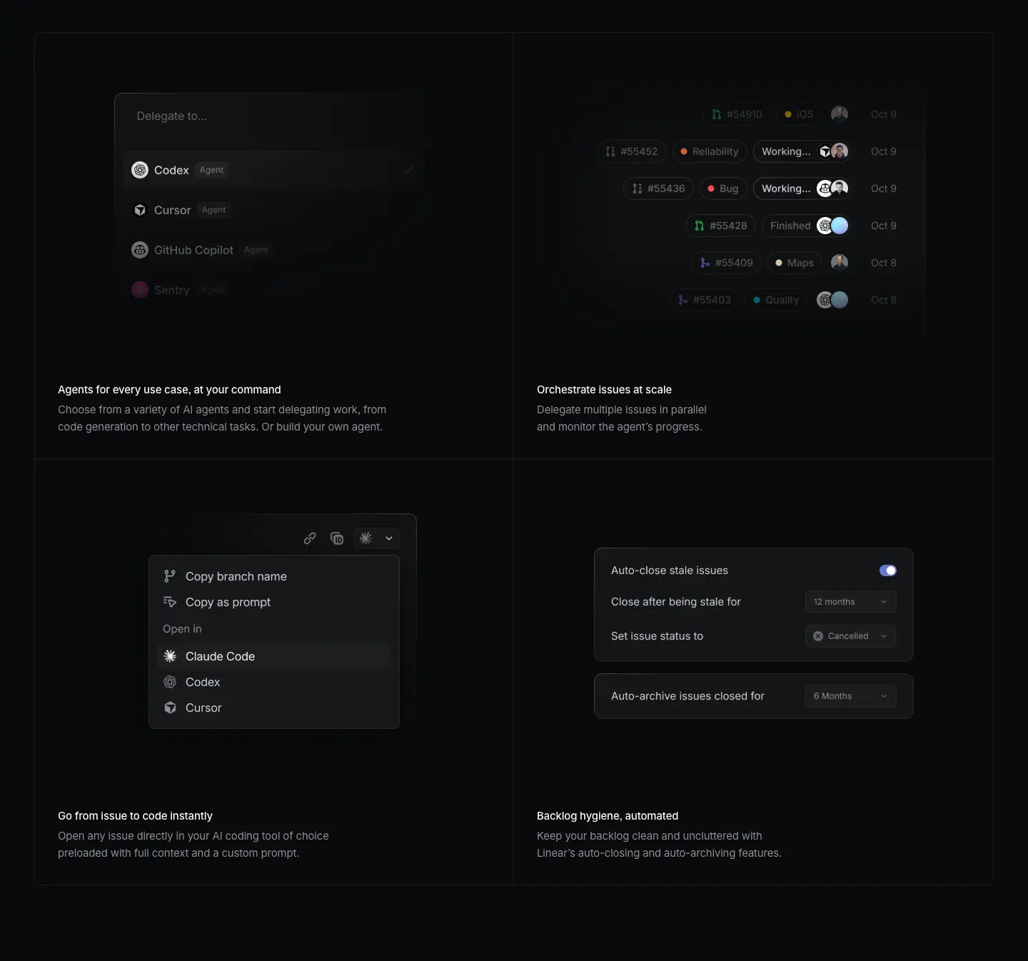
Layout
- 2x2 grid with 1px rgba(255,255,255,.08) lines at y=2213, 2810, 3407 and x=48, 719, 1391. Rows 597px. 49px under the feature frame.
- All four visuals are <img> 672×424: y=2246 and y=2843, x=48 and x=720 (cell top + 33).
- Captions at y=2702 and y=3299 (cell top + 489), x=81 and x=752. Bodies 28px below. 32px bottom padding.
Typography
- Cell H3: 15px / 24px · 510 · -0.165px · #f7f8f8. Body: 15px / 24px · 400 · -0.165px · #8a8f98, 2 lines.
Color
- No cell fills. Inside visuals: indigo toggles, small colored label dots (red Reliability, orange Bug, yellow Maps, blue Quality), green/purple PR icons, avatar photos.
Visual / UI illustration
- "Agents for every use case, at your command": a "Delegate to…" command menu listing Codex (selected, check), Cursor, GitHub Copilot, Sentry, each tagged "Agent". Lower rows fade.
- "Orchestrate issues at scale": six issue rows with PR numbers (#54910 to #55403), labels, status pills ("Working…", "Finished") and avatars, dated Oct 8 to Oct 9. Right-aligned, fading left.
- "Go from issue to code instantly": an issue toolbar dropdown: Copy branch name, Copy as prompt, "Open in" Claude Code (highlighted), Codex, Cursor.
- "Backlog hygiene, automated": two settings cards. "Auto-close stale issues" with an indigo toggle on, "Close after being stale for 12 months", "Set issue status to Cancelled"; "Auto-archive issues closed for 6 Months".
- All four are crisp faux UI at ≈ 1:1 scale, centered in the cell with soft edge fades.
Copy
- "Agents for every use case, at your command" / "Choose from a variety of AI agents and start delegating work, from code generation to other technical tasks. Or build your own agent." (23 words)
- "Orchestrate issues at scale" / "Delegate multiple issues in parallel and monitor the agent's progress." (10 words)
- "Go from issue to code instantly" / "Open any issue directly in your AI coding tool of choice preloaded with full context and a custom prompt." (19 words)
- "Backlog hygiene, automated" / "Keep your backlog clean and uncluttered with Linear's auto-closing and auto-archiving features." (12 words)
- Titles mix forms: a noun phrase with a tagline ("…, at your command"), verb-first imperatives, and the "noun, adjective" inversion ("Backlog hygiene, automated"). Bodies start with verbs.
Why it works
- Each visual shows a real menu or setting a user would click, which proves the feature exists. Naming third-party agents (Codex, Cursor, Copilot, Claude Code) signals openness.
- Four images at identical size and position make the grid feel orderly even though the content shapes differ.
Reuse recipe
- Same 2x2 spec as all product pages: 1344 wide, 597px rows, 672×424 visual at +33, caption at +489, inset 33px.
- Use one real control per cell (menu, list, dropdown, toggle card), centered, edges faded.
- Keep bodies to 2 lines; titles 3 to 8 words.
03 · Build momentum with Cycles
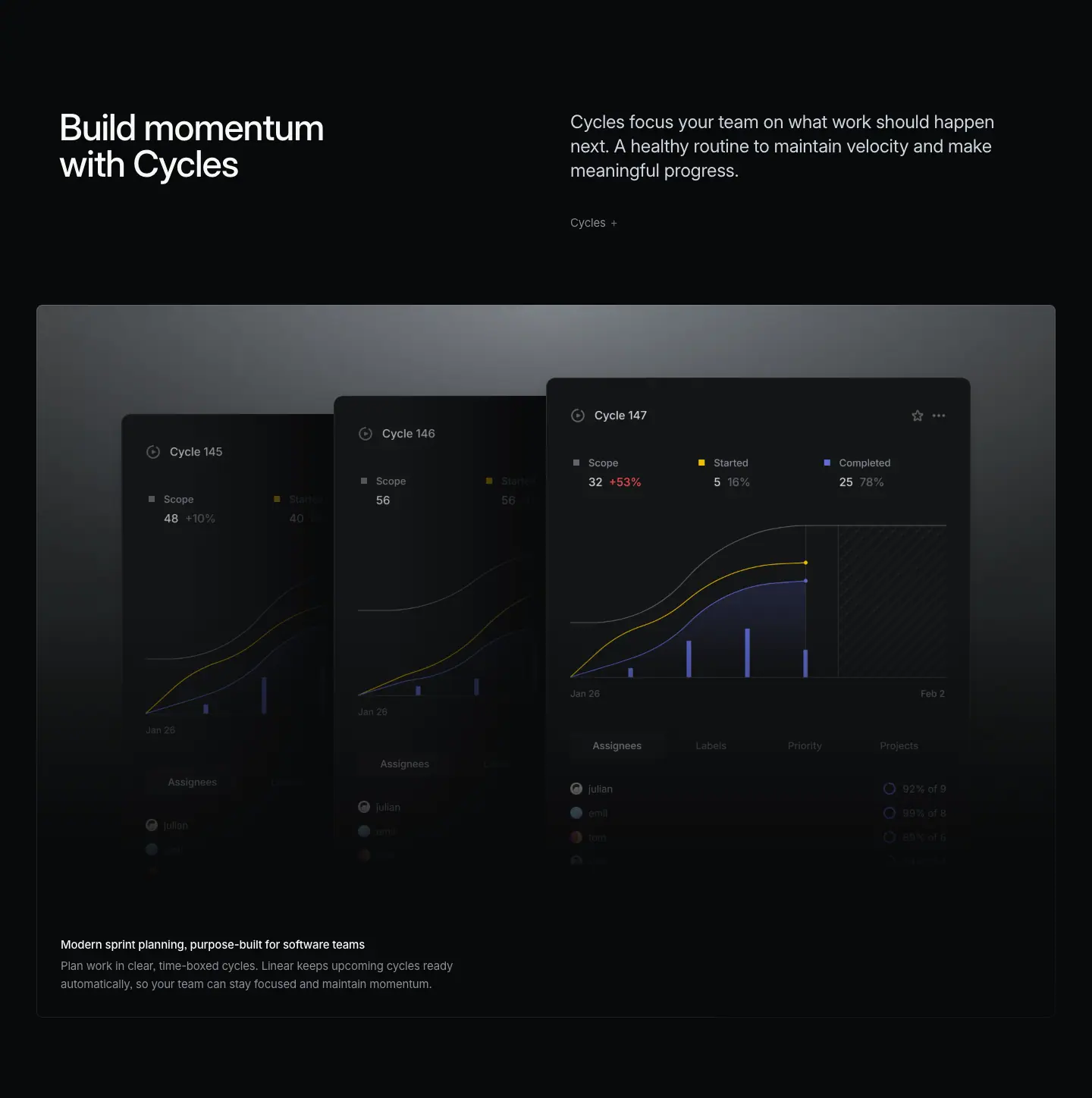
Layout
- Header: H2 y=3664, sub y=3666, link "Cycles →" y=3796. Grid bottom (3407) to H2: 257px.
- Glow frame 3916 to 4855 (939px).
- Three cascading <img> cards: 560×656 at x=160, y=4060; 560×680 at x=440, y=4036; 560×704 at x=720, y=4012. Each card is 280px right, 24px higher and 24px taller than the one behind it, so all three end at the same bottom (y=4716).
- Caption H3 y=4748, body y=4776.
- No bento after this frame. Next H2 at 5112 (257px after the frame bottom).
Typography
- Standard header and caption values.
- Card content (image, ≈ from screenshot): "Cycle 147" ≈ 13px white, metric labels ≈ 11px grey, values "32 +53%", "5 16%", "25 78%" ≈ 13px with "+53%" in red.
Color
- Glow frame. In cards: yellow "Started" line, indigo "Completed" area and bars, a grey "Scope" line, a diagonal hatch for the future part of the cycle, a red "+53%" scope-creep number.
Visual / UI illustration
- Three cycle report windows, Cycle 145, 146 and 147, stacked like cards fanned to the right. Each has a burn-up chart, Assignees / Labels / Priority / Projects tabs and assignee rows with percentage rings. The front card (147) is fully visible; the two behind are cut by the one in front and are dimmer.
- The stack itself shows "cycles repeat" without any extra text.
Copy
- H2: "Build momentum with Cycles" (4 words). "Cycles" is capitalized as a product noun.
- Sub: "Cycles focus your team on what work should happen next. A healthy routine to maintain velocity and make meaningful progress." (20 words). Sentence 2 is a fragment; it defines the habit, not the feature.
- Link: "Cycles →".
- Caption: "Modern sprint planning, purpose-built for software teams" (7 words) / "Plan work in clear, time-boxed cycles. Linear keeps upcoming cycles ready automatically, so your team can stay focused and maintain momentum." (21 words). "Sprint" bridges to the reader's existing vocabulary.
Why it works
- The cascade turns a time series (consecutive cycles) into a spatial series (consecutive cards). The metaphor costs no words.
- Aligning all three card bottoms keeps the fade line straight, so the caption below reads cleanly.
Reuse recipe
- Glow frame with 3 same-width cards (560 wide), offset +280px x and -24px y each, heights +24px each, bottoms aligned.
- Dim the back cards; let the front card carry the detailed data.
- Single caption, no bento, when one visual tells the whole story.
04 · Streamline work across tools
Layout
- Header: H2 y=5112, sub y=5113, link "Linear MCP →" y=5244. H2 to cards: 252px (cards top at 5364).
- Three colored cards in a row: x=48, 500, 952; w=440; 12px gaps; height ≈ 604 (top 5364, bottom ≈ 5968, measured from screenshot). Radius ≈ 8px (≈ from screenshot).
- Visual area: <img> 440×244 at y=5527 in each card (card top + 163), full card width.
- Logo at card top-left ≈ (+32, +32), ≈ 40px.
- Caption H3 at y=5861 (card top + 497), body y=5889, x=80 / 532 / 984 (card + 32), w=376.
- No glow frame, no bento.
Typography
- H3: 15px / 24px · 510 · -0.165px. Body: 15px / 24px · 400 · -0.165px.
- Text color depends on card: Claude card H3 and body both #f7f8f8 (body is white, not grey); ChatGPT and Figma cards use #282a30 for both.
- In-card mono text (Claude): Berkeley Mono ≈ 12px, white at ≈ 80% (≈ from screenshot).
Color
- This is the only section with brand-colored surfaces on the page.
- Claude Code card: solid rgb(217,119,87) = #d97757 (Anthropic orange).
- ChatGPT Deep Research card: vertical gradient from rgb(203,227,254) #cbe3fe (top) to rgb(220,190,252) #dcbefc (bottom), light blue to lavender.
- Figma card: #ffffff.
- Inside the Figma visual, the selected "Linear" row uses indigo #5e6ad2.
Visual / UI illustration
- Claude Code: a translucent terminal panel on orange with claude and mcp add --transport http linear https://mcp.linear.app/mcp.
- ChatGPT: a "Sources" pill and a white menu: Web search (toggle on), Linear (toggle on, highlighted row), GitHub "Connect", "Connect more".
- Figma: a "Describe your idea..." prompt input with a dark menu: Attach a design, Upload image, Linear (selected, indigo), Connector.
- Each visual imitates the partner's own UI style, sitting on the partner's brand color. Not Linear UI.
Copy
- H2: "Streamline work across tools" (4 words).
- Sub: "Connect your toolstack to Linear via MCP and move work forward from any environment – code, design, or research – without breaking flow." (22 words). The en-dash aside lists the three environments that match the three cards.
- Link: "Linear MCP →".
- Cards: "Claude Code" / "Search, create, and update Linear issues, projects, initiatives, and more."; "ChatGPT Deep Research" / "Surface Linear issues, projects, and discussions relevant to your context."; "Figma" / "Use the context of Linear issues to generate prototypes in Figma Make."
- Card titles are the partner product names only. Bodies are verb-first, 11 to 12 words.
Why it works
- Brand-colored cards break 5,000px of black and make the integration story instantly recognizable. Recognition replaces explanation.
- The sub's "code, design, or research" maps 1:1 to the three cards, so the reader can verify the claim by looking right.
- A real install command in the Claude card is proof that the integration is a one-liner.
Reuse recipe
- 3 cards 440 wide, 12px gaps, ≈ 604 tall, radius ≈ 8, starting x=48, top at H2 + 252.
- Partner logo top-left (+32,+32); 440×244 visual at +163; caption at +497, inset 32, 2 lines max.
- Use each partner's brand color (or gradient) as the card fill; switch text to #282a30 on light fills and #f7f8f8 on saturated fills.
- Build each visual in the partner's own UI language.
05 · Powerful Git automations
Layout
- Header: H2 y=6225, sub y=6226, link "Git automations →" y=6357. Previous cards bottom (≈ 5968) to H2: 257px.
- Solid frame 6477 to 7276 (799px), x=48 to 1392, fill rgb(15,16,17) #0f1011, 1px border measured rgb(38,38,39) / rgb(43,44,45) at the top.
- Three-column composition inside the frame:
- Left labels block x=170, w=245, right-aligned text (right edge 415). Items at y=6771 (title), 6795 (desc); y=6919, 6943.
- Center isometric illustration ≈ x=544 to 892, y≈6659 to 7069 (≈ measured from screenshot).
- Right labels block x=1022, w=252, left-aligned. Items at y=6771 / 6795; y=6899 / 6923.
- Labels sit at the vertical middle of the illustration. No caption, no bento.
Typography
- Label titles: Berkeley Mono 12px / 20px · 510 · normal · #d0d6e0, uppercase.
- Label descriptions: Berkeley Mono 12px / 20px · 400 · normal · #8a8f98, uppercase, 2 to 3 lines.
Color
- Strictly greyscale: #0f1011 panel, light grey 1px line art, grey and off-white mono text. No accent color at all.
Visual / UI illustration
- Two isometric slabs stacked vertically, drawn in 1px light-grey strokes. The top slab carries the Linear logo (striped circle), the bottom slab carries the GitHub Octocat. Between them, a column of up-chevrons on the left and down-chevrons on the right shows two-way sync. Thin dashed guide lines connect the slabs.
- It is a technical diagram, not product UI. Animation hint: the chevrons likely pulse in sequence (inferred; the reviews page shows the same motif with chevrons in yellow).
Copy
- H2: "Powerful Git automations" (3 words).
- Sub: "Link Linear with GitHub and GitLab to automate your pull request workflows. Less grunt work, less context switching, more time in flow." (22 words). Sentence 2 is a "less, less, more" tricolon fragment.
- Link: "Git automations →".
- Labels (title / description):
- "Auto-assign and update" / "Auto-assign issues and move them to a started status when you copy the git branch name"
- "Branch-specific rules" / "Define custom workflow automations based on specific target branches"
- "Link and automate PRs" / "Automatically change issue status based on pull/merge request updates"
- "PR review status" / "See the reviewers and review states of your pull and merge requests directly in Linear"
Why it works
- Monospace uppercase plus line art reads like an engineering spec sheet. It fits the developer audience and gives a visual break from screenshots.
- Labels on both sides of a central diagram create a symmetric "annotated figure" layout, which scans in two columns of two.
- Zero color makes this the calmest block on the page, placed right after the loud brand-color cards.
Reuse recipe
- Solid #0f1011 frame, 1344×799, 1px rgba(255,255,255,.08) border.
- Center: 1px-stroke isometric diagram ≈ 350×410.
- Left labels right-aligned ending ≈ 125px left of the diagram; right labels left-aligned starting ≈ 130px right of it.
- Mono 12/20 uppercase: title 510 #d0d6e0, desc 400 #8a8f98; 20 to 40px between items.
06 · Faster reviews, fewer bottlenecks (part 1: header + feature frame)
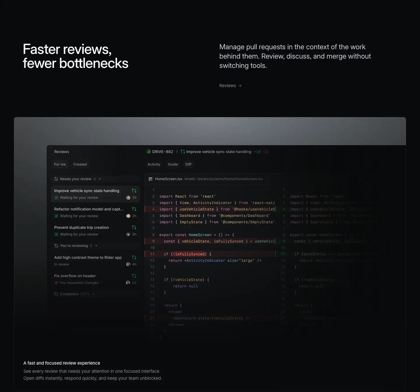
Layout
- Header: H2 y=7533, sub y=7534, link "Reviews →" y=7665. Frame bottom (7276) to H2: 257px.
- Glow frame 7785 to 8724 (939px).
- One <img> 1232×704 at x=160, y=7881 (frame top + 96). Its right edge is x=1392, the frame edge, so the window bleeds out of the frame on the right and is cut off. Only the left side has margin.
- Caption H3 y=8617, body y=8645.
Typography
- Standard header and caption values.
- Code in the image ≈ 12px monospace with syntax color (≈ from screenshot).
Color
- Glow frame. Diff colors: red removed-line gutter, green added-line gutter, green PR status icons, a red "x" for "You requested changes".
Visual / UI illustration
- A review inbox plus split diff: left list "Reviews" with For me / Created tabs, groups "Needs your review 3", "You're reviewing 2", "Completed 1473"; PR rows like "Improve vehicle sync state handling – Waiting for your review – 1h". Right: PR header "DRIVE-882 › Improve vehicle sync state handling +18 -11", tabs Activity / Guide / Diff, a side-by-side diff of HomeScreen.tsx in React Native.
- The right half of the diff (the "after" column) fades into darkness; the image bleeds off the right edge.
Copy
- H2: "Faster reviews, fewer bottlenecks" (4 words). Two comparative noun phrases; "faster / fewer" alliteration.
- Sub: "Manage pull requests in the context of the work behind them. Review, discuss, and merge without switching tools." (18 words). Sentence 2 has three verbs then "without".
- Link: "Reviews →".
- Caption: "A fast and focused review experience" / "See every review that needs your attention in one focused interface. Open diffs instantly, respond quickly, and keep your team unblocked." (21 words).
Why it works
- Letting the window bleed off the right edge suggests a wide, real application and pulls the eye rightward into the code.
- The H2 states two outcomes, not a feature name, so it speaks to the team lead and the engineer together.
Reuse recipe
- Glow frame; image 1232 wide at x=160 so it ends flush with the frame's right edge (asymmetric bleed).
- Fade the far side of a split diff to keep focus on the changed lines.
- Caption 15/24 pair at frame bottom-left.
07 · Faster reviews, fewer bottlenecks (part 2: 2x2 bento)
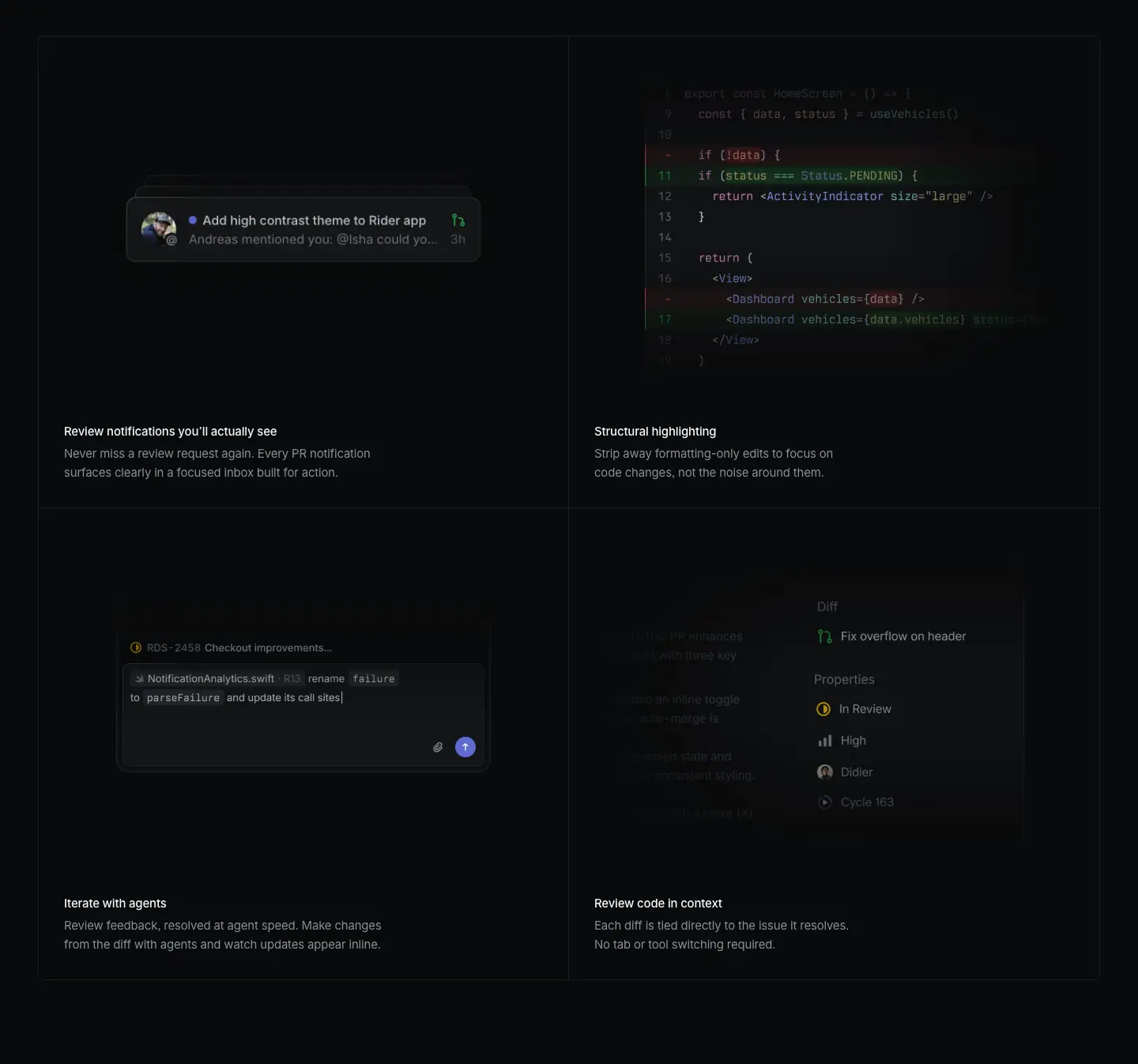
Layout
- 2x2 grid lines at y=8773, 9370, 9967 and x=48, 719, 1391. Rows 597px.
- Visuals: top-left is live HTML (stacked notification cards); top-right <img> 672×424 at x=720, y=8806; bottom row <img> 672×424 at y=9403, x=48 and x=720.
- Captions y=9262 and y=9859 (cell top + 489).
Typography
- Cell H3 / body: standard 15px pair.
- Notification card (HTML): title 16px / 24px · 510 · #d0d6e0; sub-line 16px / 24px · 390 · #8a8f98; time 16px / 24px · 390 · #62666d. Weight 390 is a variable-font step between 400 and 300, used only here.
Color
- Diff red and green in "Structural highlighting". Indigo unread dot and send button in other cells. A yellow in-progress icon.
Visual / UI illustration
- "Review notifications you'll actually see": a notification toast "Add high contrast theme to Rider app / Andreas mentioned you: @Isha could you… / 3h" with an avatar and a PR icon, with two more toasts stacked behind it (offset ≈ 8 to 10px). The DOM holds three notification variants at shifted positions, so the stack animates.
- "Structural highlighting": a code fragment where only the logical change is highlighted (red removed lines, green added), formatting-only changes are left plain.
- "Iterate with agents": a comment composer on "RDS-2458 Checkout improvements…" reading "NotificationAnalytics.swift … rename failure to parseFailure and update its call sites" with an indigo send button.
- "Review code in context": an issue sidebar with "Diff: Fix overflow on header", Properties (In Review, High, Didier, Cycle 163), with the issue description faded on the left.
Copy
- "Review notifications you'll actually see" / "Never miss a review request again. Every PR notification surfaces clearly in a focused inbox built for action." (18 words)
- "Structural highlighting" / "Strip away formatting-only edits to focus on code changes, not the noise around them." (14 words)
- "Iterate with agents" / "Review feedback, resolved at agent speed. Make changes from the diff with agents and watch updates appear inline." (18 words)
- "Review code in context" / "Each diff is tied directly to the issue it resolves. No tab or tool switching required." (16 words)
- Voice: plain, slightly conversational ("you'll actually see"). Bodies pair a claim with a short fragment ("No tab or tool switching required.").
Why it works
- The four cells cover four review pains (missed requests, noisy diffs, slow fixes, lost context). Each title names the fix, each body names the pain.
- The animated toast stack is the one moving element in the grid; it draws the eye to the first cell.
Reuse recipe
- Standard 2x2 grid spec (597px rows, 672×424 visuals at +33, captions at +489).
- For notification features, stack 3 toasts with 8 to 10px offsets and cycle them.
- Use variable-font weight 390 for secondary lines inside UI mocks when 400 looks too heavy at 16px on dark.
08 · Reviews with direction
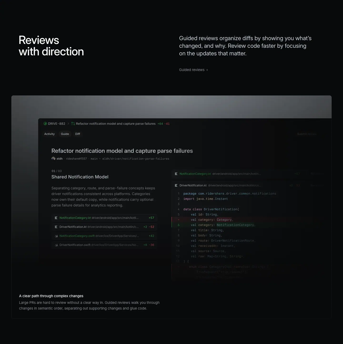
Layout
- Header: H2 y=10224, sub y=10225, link "Guided reviews →" y=10356. Grid bottom (9967) to H2: 257px.
- Glow frame 10476 to 11415 (939px). <img> 1232×704 at x=160, y=10572, bleeding off the right frame edge (same as section 06).
- Caption H3 y=11308, body y=11336. No bento.
Typography
- Standard.
- In image (≈ from screenshot): step counter "01 / 03" ≈ 11px mono grey; step title "Shared Notification Model" ≈ 15px white; explanation ≈ 13px grey; file rows ≈ 12px with "+57", "+2 -52" counts in green/red.
Color
- Glow frame. Green and red diff counts and gutters; green PR icon.
Visual / UI illustration
- The "Guide" tab of a PR: "Refactor notification model and capture parse failures +64 -41". Left column: a guided step "01 / 03 · Shared Notification Model" with a paragraph that explains the change, then four changed files with counts. Right column: the Kotlin diff of DriverNotification.kt. The guided narrative sits next to the code it explains.
Copy
- H2: "Reviews with direction" (3 words). A noun phrase with a double meaning (guidance and orientation).
- Sub: "Guided reviews organize diffs by showing you what's changed, and why. Review code faster by focusing on the updates that matter." (21 words).
- Link: "Guided reviews →".
- Caption: "A clear path through complex changes" (6 words) / "Large PRs are hard to review without a clear way in. Guided reviews walk you through changes in semantic order, separating out supporting changes and glue code." (28 words). It opens by naming the problem, then the mechanism.
Why it works
- The visual shows an explanation beside code, which is the feature itself. No caption is needed to understand it, but the caption gives the "why".
- Repeating the bleed-right frame from section 06 ties the two review sections together.
Reuse recipe
- Same glow frame + bleed-right 1232×704 image.
- Lead the caption with the user's pain in one plain sentence, then the mechanism.
09 · Release management
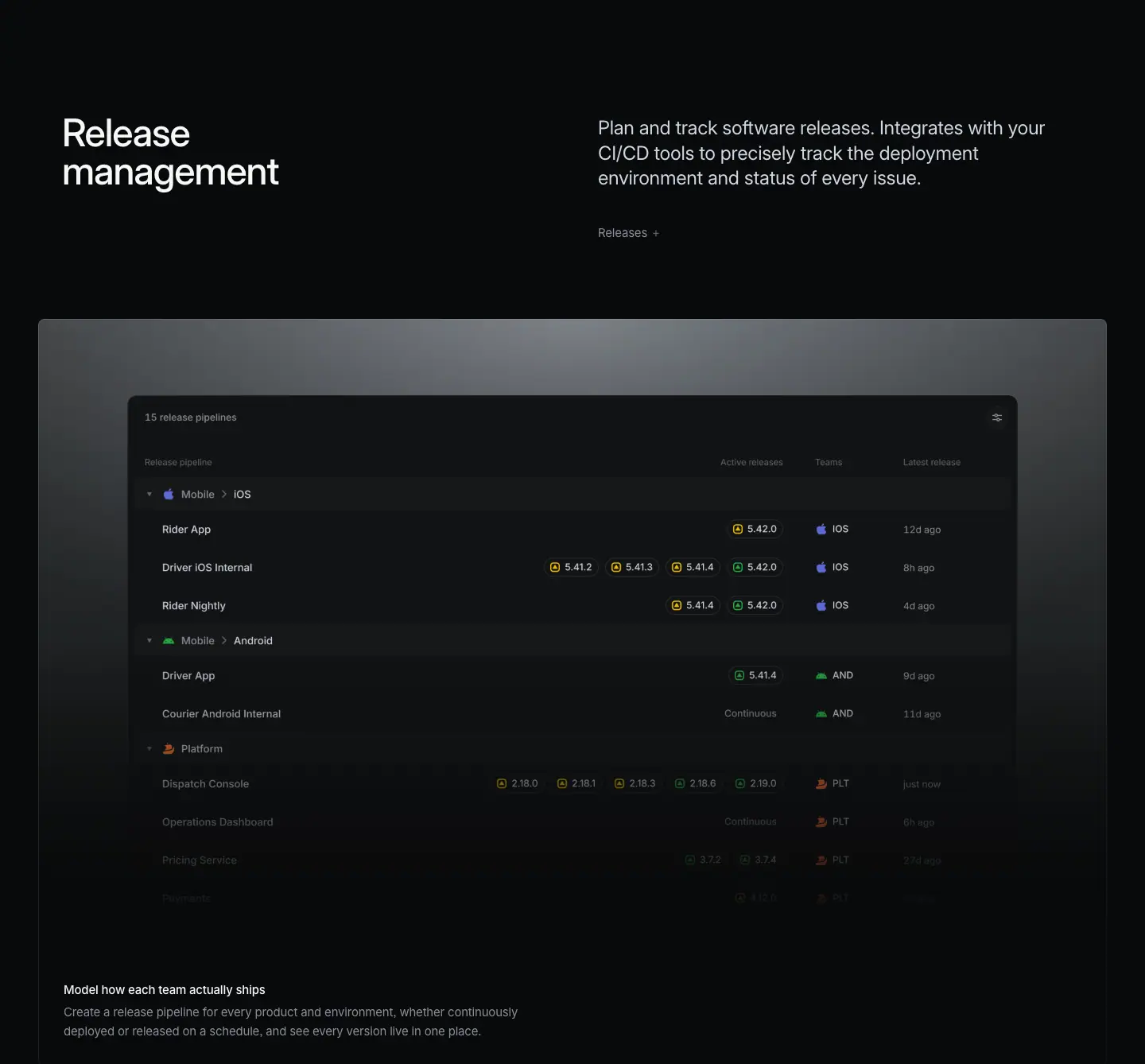
Layout
- Header: H2 y=11672, sub y=11673, link "Releases →" y=11803. Frame bottom (11415) to H2: 257px.
- Glow frame 11923 to 12862 (939px). <img> 1120×704 at x=160, y=12019 (centered, not bleeding).
- Caption H3 y=12755, body y=12783. No bento.
Typography
- Standard. Table text in image ≈ 11 to 12px (≈ from screenshot).
Color
- Glow frame. Version chips with yellow (in progress) and green (released) icons; team badges in purple (iOS), green (Android), orange-red (Platform).
Visual / UI illustration
- "15 release pipelines" table with columns Release pipeline, Active releases, Teams, Latest release. Groups: Mobile › iOS (Rider App 5.42.0; Driver iOS Internal 5.41.2, 5.41.3, 5.41.4, 5.42.0; Rider Nightly), Mobile › Android (Driver App 5.41.4; Courier Android Internal "Continuous"), Platform (Dispatch Console 2.18.0 to 2.19.0; Operations Dashboard; Pricing Service). Rows fade toward the bottom.
Copy
- H2: "Release management" (2 words). The plainest H2 on the page; it names a category buyers search for.
- Sub: "Plan and track software releases. Integrates with your CI/CD tools to precisely track the deployment environment and status of every issue." (22 words).
- Link: "Releases →".
- Caption: "Model how each team actually ships" (6 words) / "Create a release pipeline for every product and environment, whether continuously deployed or released on a schedule, and see every version live in one place." (25 words). "actually" signals respect for different team processes.
Why it works
- Version-number chips are dense, credible detail. They show the product handles real release trains (internal, nightly, continuous).
- A plain category H2 at the end of a technical page helps search and buyer scanning.
Reuse recipe
- Glow frame, 1120×704 centered table image, rows fading after ≈ 60%.
- Use chips with tiny status icons for versions; group rows by platform with disclosure arrows.
10 · Release management (part 2: product-area strip + testimonials + scale line)
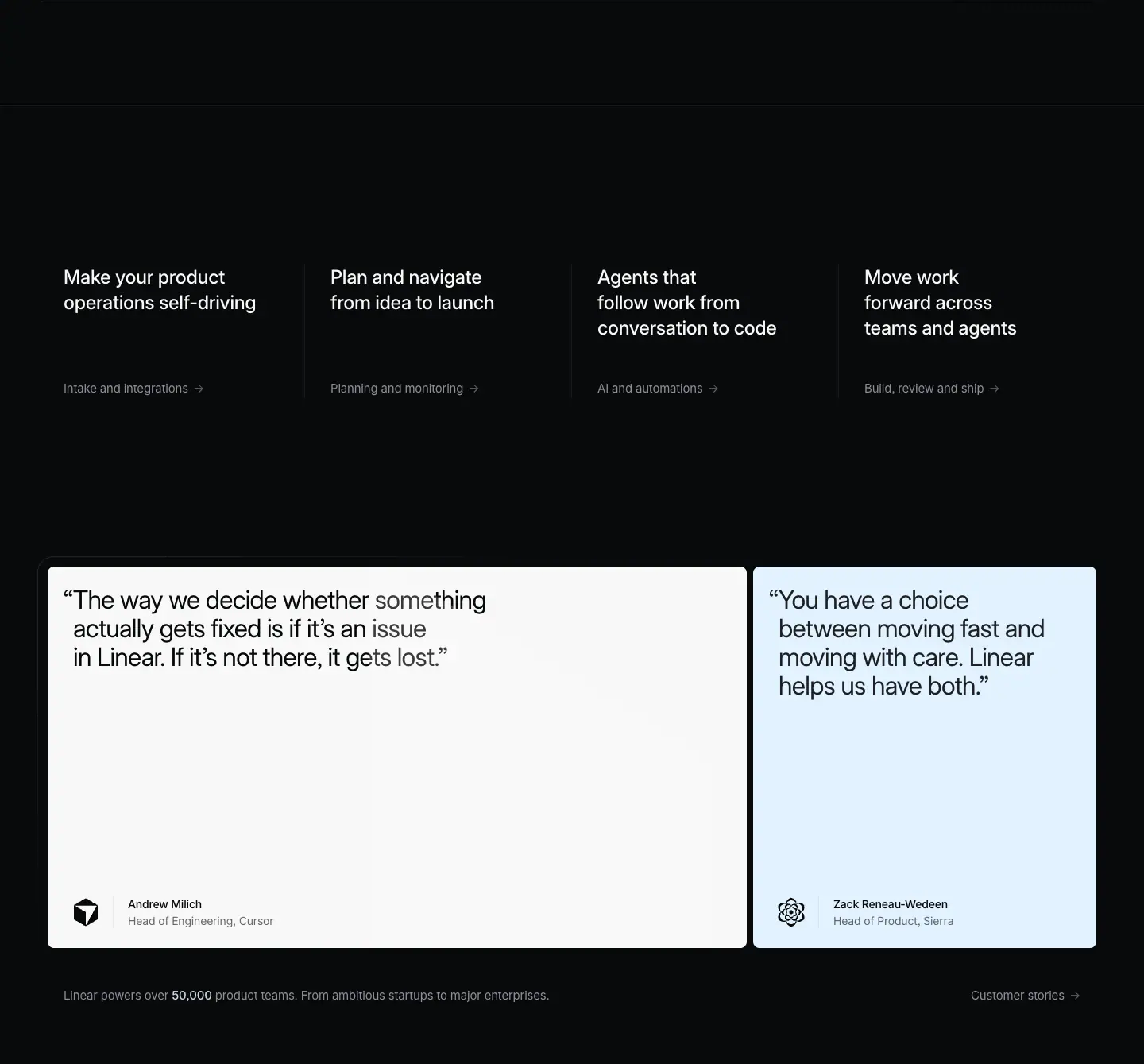
This crop holds the release frame bottom and the shared closers.
Layout
- Release frame bottom border at y=12862.
- Full-width 1px hairline at y=12992 (130px under the frame).
- Product-area strip: 4 columns at x=80, 416, 752, 1088 (w≈263, 336px pitch). Headings y=13193 (201px under the hairline), links y=13337 (144px under headings). Faint 1px vertical dividers between columns (≈ from screenshot).
- Testimonials: left card x=60, w=880; right card x=948, w=432; height 480; top y=13573; 8px gap; padding 24px 32px; radius 8px. Strip links (13337) to cards: 236px.
- Quote text at y=13597, x=92 and x=980. Names y=13987, roles y=14008, x=161 and x=1049; logos at ≈ x=100.
- Scale line y=14101 (48px under the cards); "Customer stories →" right at x=1222.
Typography
- Strip headings: 24px / 31.92px · 510 · -0.288px · #f7f8f8. Links: 15px / 24px · 400 · #8a8f98.
- Quote: 32px / 36px · 400 · -0.704px · #08090a. Name 14px / 21px · 510 · -0.182px · #08090a. Role 14px / 21px · 400.
- Scale line: 15px / 24px · 400 · #8a8f98, "50,000" 510 · #d0d6e0.
Color
- Left card #f7f8f8; right card #e2f2ff (pale blue). Plan uses a gradient left card; build uses two flat fills.
- The left quote, captured mid-animation, shows a character-level light-grey sweep across "something", "issue" and "gets lost". The quote text animates in with a left-to-right gradient reveal (observed in the screenshot).
Copy
- Strip (same on every product page): "Make your product operations self-driving / Intake and integrations →"; "Plan and navigate from idea to launch / Planning and monitoring →"; "Agents that follow work from conversation to code / AI and automations →"; "Move work forward across teams and agents / Build, review and ship →" (the current page).
- Quote left: "The way we decide whether something actually gets fixed is if it's an issue in Linear. If it's not there, it gets lost." (24 words) · Andrew Milich, Head of Engineering, Cursor.
- Quote right: "You have a choice between moving fast and moving with care. Linear helps us have both." (16 words) · Zack Reneau-Wedeen, Head of Product, Sierra.
- Both quotes come from AI-native companies, matching the page's agent thesis. The right quote restates the H1 tension (speed vs care).
- Scale: "Linear powers over 50,000 product teams. From ambitious startups to major enterprises." · "Customer stories →".
Why it works
- Quote choice is page-specific even though the layout is shared. Proof matches the audience (engineering leaders at AI companies).
- The text-reveal animation makes the quote feel spoken and slows the reader at the proof point.
Reuse recipe
- Hairline 130px below the last frame; 4-column strip 201px below it.
- Two light cards (880 + 432, 8px gap, 480 tall) with dark 32px quotes and a hanging open-quote.
- Animate quote text with a left-to-right color sweep from #8a8f98-ish to #08090a.
- Pick quotes whose author profile matches the page's target buyer.
11 · Built for the future. Available today. (final CTA)
Layout
- Section 14199 to 14768 (569px). H2 centered at x=359, w=722, y=14349 (two lines, h=144). Scale line (14101) to H2: 248px.
- Buttons at y=14533 (40px under the H2 bottom 14493): "Get started" x=579 w=127; "Contact sales" x=718 w=144; 12px gap.
- Buttons bottom (14577) to footer border (14801): 224px.
Typography
- H2: 72px / 72px · 510 · -1.584px · #f7f8f8, centered.
- Buttons: 16px / 44px · 510, radius 9999px, padding 0 20px.
Color
- Primary #e5e5e6 fill, #08090a text, 1px #e5e5e6 border. Secondary rgba(255,255,255,.05) fill, #f7f8f8 text, inset 1px rgba(255,255,255,.03) ring.
Copy
- "Built for the future. Available today." (6 words, 2 parallel 3-word sentences). Identical to /plan. "Get started" / "Contact sales".
Why it works
- Same closing on every product page, so the brand promise is consistent and the action is predictable.
Reuse recipe
- Centered 72/72 510 H2 (722 wide), 40px gap, two 44px pills with 12px gap, ≈ 150px top and ≈ 224px bottom space.
12 · Footer
Layout
- 1px #23252a border at y=14801. Logo at x≈80. Five columns at x=304, 528, 752, 976, 1200 (224px pitch). Headings y=14858; links from y=14902 on a 30px rhythm. Legal row (Privacy, Terms, Other Policies) at y=15250.
Typography
- Headings 13px / 19.5px · 510 · -0.13px · #f7f8f8; links 13px / 19.5px · 400 · -0.13px · #8a8f98; legal #62666d.
Copy
- Product: Intake, Plan, AI, Build, Pricing, Security. Features: Asks, Agents, Cloud Coding Agent, Customer Requests, Insights, Mobile, Reviews, Integrations, Changelog. Company: About, Customers, Careers, Now, Method, Quality, Brand. Resources: Switch, Download, Documentation, Developers, Enterprise, Startups, Status, Legal. Connect: Contact us, Community, X (Twitter), GitHub, YouTube.
Why it works / Reuse recipe
- Identical to /plan: a 3-tone, 13px, 5-column footer with the logo alone in the left gutter. Copy the spec unchanged.
Page-level takeaways
- The section order is the delivery pipeline (assign → sprint → tools → Git → review → release). A designer can reuse this "follow one unit of work" arc for any workflow product.
- Seven modules use one header recipe (H2 48px left at x=78, 24px #d0d6e0 sub at x=752, 15px "Feature →" link). Every H2 starts 257px after the previous block and every frame starts 252px after its H2.
- Visual containers rotate to avoid monotony: glow frame (01, 03, 06, 08, 09), 2x2 bento (02, 07), brand-color cards (04), solid mono-spec diagram (05).
- Color is rationed. Marketing text never uses accent color. Product visuals carry small status colors. The one exception is section 04, where partner brand colors fill whole cards, which makes it the most memorable block mid-page.
- Two review frames (06, 08) use the same bleed-right image placement (1232 wide at x=160). Reusing a layout for related sections signals "same topic, deeper".
- Copy pattern: H2 is 2 to 5 words; sub is 18 to 22 words, often "statement. fragment." (e.g. "Less grunt work, less context switching, more time in flow."). Captions open with the user's pain when the feature is a fix.
- Third-party names (Codex, Cursor, Copilot, Claude Code, ChatGPT, Figma, GitHub, GitLab) appear in visuals and copy. Openness to other tools is part of the message.
- Animation hints in the DOM: duplicated text nodes at shifted positions (notification stack), a cascading cycle card stack, and a character-level quote reveal.
- The closing stack (strip, testimonials, scale line, CTA, footer) is identical in structure to /plan; only the quotes change.
Section inventory
| # |
Section |
Pattern name |
Key values |
| 00 |
Hero |
Hero-left-video |
video 1440×772 (tilted blurred diff); eyebrow 16/24 400; H1 72/72 500 -1.584px x=78 y=572 w=761; hairline y=844 |
| 01 |
Delegate, automate, and orchestrate work (p1) |
Section-header-split + Glow-frame-feature |
H2 48/48 510; sub 24/31.92 #d0d6e0 x=752; frame 1344×939; img 640×531 + 296×579 |
| 02 |
Delegate, automate, and orchestrate work (p2) |
Bento-2x2 |
lines .08; rows 597; 4 imgs 672×424 at +33; captions 15/24 at +489 |
| 03 |
Build momentum with Cycles |
Section-header-split + Glow-frame-feature (cascading cards) |
3 cards 560 wide, +280 x / -24 y / +24 h each, bottoms aligned |
| 04 |
Streamline work across tools |
Section-header-split + Logo/integration-cards-3up |
cards 440×≈604, 12px gap; #d97757 / #cbe3fe→#dcbefc / #ffffff; text #f7f8f8 or #282a30 |
| 05 |
Powerful Git automations |
Section-header-split + Spec-list (mono labels around isometric diagram) |
#0f1011 frame 1344×799; Berkeley Mono 12/20 uppercase 510 #d0d6e0 / 400 #8a8f98 |
| 06 |
Faster reviews, fewer bottlenecks (p1) |
Section-header-split + Glow-frame-feature (bleed right) |
img 1232×704 at x=160, flush to frame right edge |
| 07 |
Faster reviews, fewer bottlenecks (p2) |
Bento-2x2 |
HTML toast stack 16/24 510 + 390; 3 imgs 672×424 |
| 08 |
Reviews with direction |
Section-header-split + Glow-frame-feature (bleed right) |
img 1232×704 x=160; caption only |
| 09 |
Release management |
Section-header-split + Glow-frame-feature |
img 1120×704 centered |
| 10 |
Release management (p2) + closers |
Product-area-strip-4up + Testimonial-quote (pair) + Stat-line |
strip 24/31.92 510; cards 880+432 #f7f8f8 / #e2f2ff, quote 32/36 400 #08090a |
| 11 |
Built for the future. Available today. |
Final-CTA-centered |
H2 72/72 510 w=722; pills 44px 16px 510 |
| 12 |
Footer |
Footer-5col |
#23252a border; 224px column pitch from x=304; 13/19.5 |
AI — linear.app/ai
- URL: https://linear.app/ai
<title>: Linear – Agents that follow work from conversation to code- Meta description: Linear Agent understands your projects, issues, customer requests, docs, and code, so every decision is grounded with full context.
- Page height: 12,915 px at 1440 px wide
- Body background:
#08090a
- Template: newer product template. Left-aligned 72px/72px w500 H1 at x=78 over a full-bleed hero video. Each chapter is a split section header (48px H2 left, 24px
#d0d6e0 paragraph right), then a lit feature panel, then a bordered bento grid. The page ends with a 4-up product nav, two testimonial cards, a centered 72px CTA, and the 5-column footer.
Narrative arc. The hero states the promise in one line: agents carry work "from conversation to code". Five chapters then walk that path in order. (1) Conversation: the agent turns a Slack thread into an issue and handles planning chores. (2) Incoming work: loops, Triage Intelligence and rules process new issues without a human. (3) Code: a cloud coding agent writes diffs and supports review. (4) Oversight: a board shows what every agent is doing. (5) Openness: MCP and integrations show that Linear is not a closed system. The order follows one issue through its life: it is born in chat, triaged, coded, monitored, and connected to external tools. Then come the cross-sell nav, social proof, and a two-sentence CTA ("Built for the future. Available today.").

00 · Hero
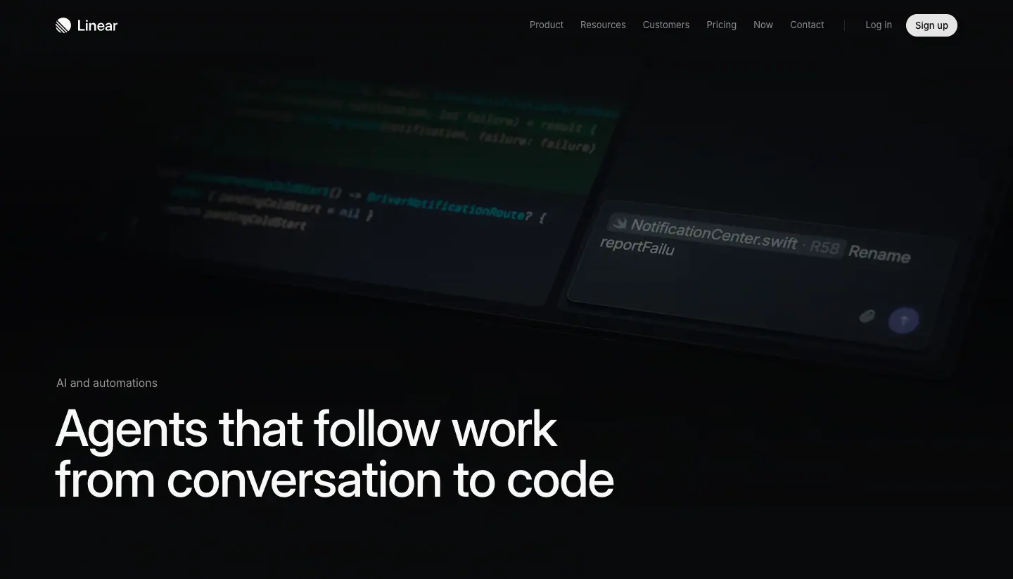
Layout
- Section crop: y=0–823. A full-bleed VIDEO covers x=0, y=0, 1440×772 (AI-v3.output.av1.crf24.mp4).
- Text sits on the lower-left of the video. Eyebrow label at y=532, x=80. H1 at y=572, x=78, w=795, h=144 (2 lines).
- Label bottom (556) to H1 top (572) = 16 px gap.
- H1 bottom (716) to the hero bottom edge (823) = 107 px. A full-width 1 px hairline sits at y=844 (detected from screenshot pixels).
- Top nav: 13px links at x=741–… (Product, Resources, Customers, Pricing, Now, Contact), "Log in", then a "Sign up" pill at x=1288, 73×32.
- No sub-paragraph, no CTA button in the hero. The first supporting sentence appears only in section 01.
Typography
- Eyebrow "AI and automations": 16px / 24px · 400 · normal · #f7f8f8.
- H1: 72px / 72px · 500 · -1.584px (-0.022em) · #f7f8f8, Inter Variable, "cv01","ss03".
- Nav links: 13px / 19.5px · 400 · #8a8f98. Sign up: 13px · 510 · #08090a on #e5e5e6, radius 9999px, padding 0 12px.
Color
- Page #08090a. The video is near-black with dim teal/green syntax highlights and a small indigo send button (≈ #5e6ad2) in the tilted composer.
- The only bright element is the white H1. The eyebrow is also #f7f8f8, not grey. The hierarchy comes from size alone.
Visual / UI illustration
- The video shows a tilted, perspective-projected code editor (Swift code, DriverNotificationRoute) and a composer with a file chip NotificationCenter.swift and the typed text "Rename reportFailu…". The text is being typed live (animation).
- The scene is low-contrast and blurred at the edges. It fades to the page color at the bottom so the H1 reads on near-black.
- It is real product UI, re-staged in 3D, not a flat screenshot.
Copy
- Eyebrow: "AI and automations" (3 words). This is the product-area name used in the nav and the 4-up cross-links.
- H1: "Agents that follow work from conversation to code" (8 words). Noun phrase plus a relative clause. Its "from X to Y" structure names the start and end of the workflow. The verb "follow" makes agents companions of the work, not replacements of people.
Why it works
- One element of text in a 1440×823 frame gives the H1 total focus. The motion in the video carries the "agents are working" idea, so the copy can stay short.
- The left alignment at x=78 matches every following H2 (x=78). The eye learns one reading edge in the first screen.
- The dimmed, blurred video gives atmosphere without competing with the type. Contrast of #f7f8f8 on #08090a is ≈ 19:1.
Reuse recipe
- Full-bleed autoplay video, 1440×772, dark and defocused at the edges, gradient to page bg at the bottom.
- Eyebrow 16/24 w400 primary color, 16 px above the H1.
- H1 72/72, weight 500, letter-spacing -0.022em, max width ≈ 800 px so it breaks into 2 lines.
- Anchor text bottom-left: H1 top ≈ 572 px in an 823 px hero.
- No hero CTA. Put the first explanation in the next section.
01 · Artificial colleagues. Natural collaboration. (header + feature panel)
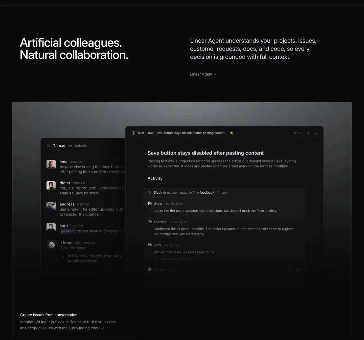
Layout
- Section crop: y=823–2168.
- Section header split. H2 at x=78, y=973, w=542. Paragraph at x=752, y=975, w=566 (3 lines, h=81). The two columns are top-aligned (2 px offset).
- Under the paragraph: a text link at x=752, y=1105. Paragraph bottom (1056) to link = 49 px.
- Section crop top (823) to H2 = 150 px. That is the standard section top padding on this template.
- Feature panel: 1 px bordered box from x=48 to x=1392 (1344 wide), y=1225–2164 (939 tall). Link bottom (1129) to panel top = 96 px.
- Inside the panel: two overlapping app windows. IMG thread window at x=160, y=1369, 560×656. IMG issue window at x=567, y=1414, 642×604. The issue window overlaps the thread window by ≈153 px and sits 45 px lower.
- Caption block inside the panel, bottom-left: H3 at x=80, y=2057 (32 px left padding). Description at y=2085, w=624, 2 lines (h=48). Description bottom (2133) to panel bottom (2164) = 31 px.
Typography
- H2: 48px / 48px · 510 · -1.056px (-0.022em) · #f7f8f8. Two lines, broken at the period.
- Right paragraph: 24px / 31.92px · 400 · -0.288px (-0.012em) · #d0d6e0.
- Link "Linear Agent →": 15px / 24px · 400 · -0.165px · #8a8f98, with a trailing arrow glyph.
- Panel caption title: 15px / 24px · 510 · -0.165px · #f7f8f8.
- Panel caption description: 15px / 24px · 400 · -0.165px · #8a8f98.
- In-UI text (issue header): 12px / 16.8px · 510 · #d0d6e0 ("WEB-1842", issue title), counter "/ 15" in #62666d.
Color
- Panel surface: a grey light falls from the top center. Pixel at (700, 1240) = #777d81. It fades to #08090a by the caption area (pixel (700, 2100) = #08090a) ≈ measured from screenshot. This reads as a stage spotlight.
- Panel border: 1 px rgba(255,255,255,0.08)-class hairline (the page uses 16 borders of .08 and 7 of .05).
- Windows: dark #0f1011 surfaces with 1 px light borders. Small accents only inside the UI: yellow star, the indigo @Linear mention chip, user avatars.
Visual / UI illustration
- Left window: a Slack-style "Thread #m-feedback". Four people report the same bug. Then "@Linear create issue and assign to me". Then a "Linear" reply: "Created issue: WEB-1842 Save button stays …".
- Right window: the created issue "Save button stays disabled after pasting content", with description and an Activity feed. The feed shows "Slack thread connected in #m-feedback" and the synced comments.
- Both windows are cropped. The thread window is cut by the issue window. The bottom of both windows dissolves into the dark lower half of the panel.
- This is real Linear UI with staged data. It tells a before/after story in one frame: conversation (left) → issue (right).
Copy
- H2: "Artificial colleagues. Natural collaboration." 4 words. Two parallel "adjective noun." fragments with antonym pairs (artificial/natural, colleagues/collaboration).
- Paragraph: "Linear Agent understands your projects, issues, customer requests, docs, and code, so every decision is grounded with full context." 19 words. Subject + verb + list of 5 objects + "so" benefit clause.
- Link: "Linear Agent →" (2 words). It names the product feature behind the section.
- Panel caption: "Create issues from conversation" (4 words, verb-first). "Mention @Linear in Slack or Teams to turn discussions into scoped issues with the surrounding context." 16 words. Imperative how-to sentence.
- The H2 is a slogan. The paragraph is the literal claim. The caption is the concrete action. Each level becomes more literal.
Why it works
- The split header gives the slogan and the explanation equal width. A reader who scans only left-column H2s still gets the page story.
- The 96 px gap from header to panel and 150 px section top padding create clear chapter breaks without dividers.
- The spotlight surface puts the UI on a stage. It separates the product shot from the page without a heavy frame or shadow.
- Captions sit inside the panel at bottom-left, so the visual and its label read as one unit.
Reuse recipe
- Header: H2 48/48 w510 at x=78 (w≈542); paragraph 24/31.92 w400 #d0d6e0 at x=752 (w≈566); top-align both.
- Optional 15px #8a8f98 "Feature name →" link 49 px below the paragraph.
- Feature panel: 1344×939, 1 px border, top-down grey light (≈#787d82 → #08090a), 96 px below the header.
- Place two overlapping windows that show "input → result". Let them crop and fade at the bottom.
- Caption at 32 px inset, bottom-left: 15px w510 title + 15px #8a8f98 2-line description, 31 px from the panel bottom.
02 · Artificial colleagues — bento 2×2
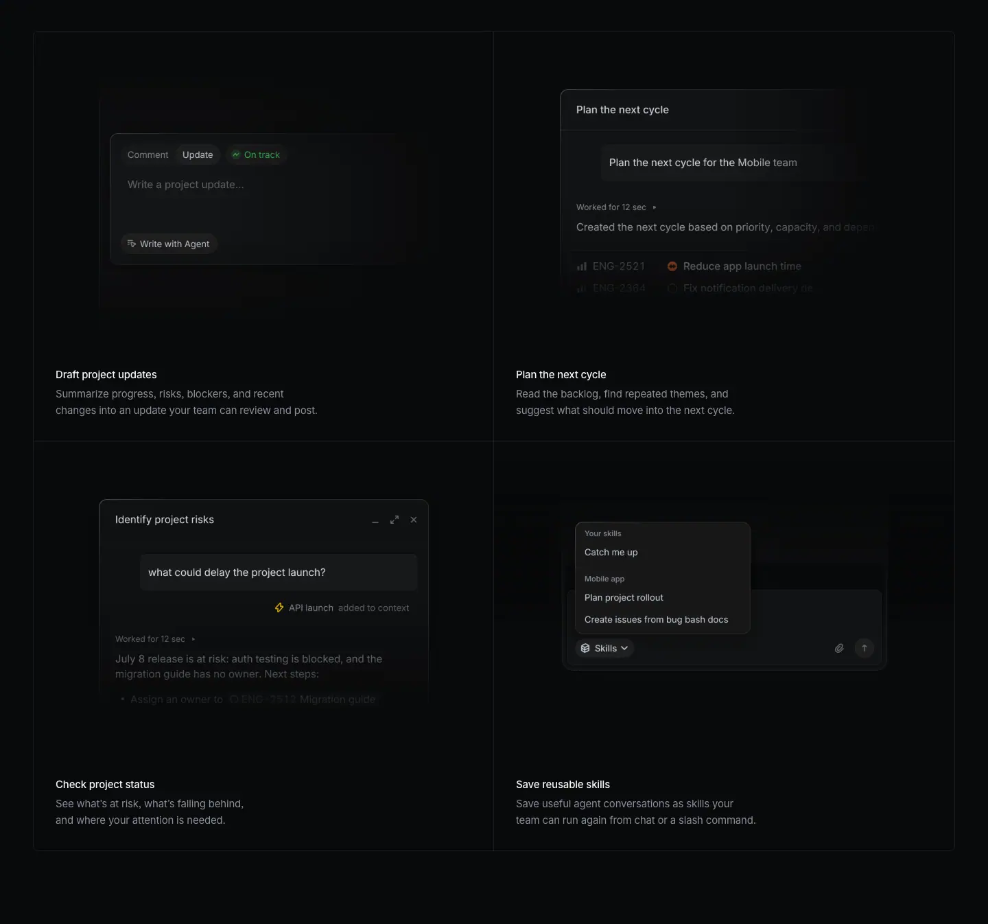
Layout
- Section crop: y=2168–3514.
- Bordered grid box: x=48–1392, y=2213–3407. Feature panel bottom (2164) to grid top (2213) = 49 px (48 + 1 px border).
- 2 columns × 2 rows. Column split at x=720. Row split at y=2810. Each cell is 672 wide × 597 tall.
- Cell anatomy (measured on row 1): image area at y=2246 (33 px below cell top), 672×424. Title at y=2702 (32 px below the image bottom 2670). Description at y=2730 (2 lines, ends 2778). Cell bottom 2810 (32 px below).
- Text left edge: x=81 (left cells), x=752 (right cells). Text widths 606–607.
- All 4 cells have a visual on top and text below. No cell spans.
- Grid bottom (3407) to next H2 (3664) = 257 px.
Typography
- Titles: 15px / 24px · 510 · -0.165px · #f7f8f8.
- Descriptions: 15px / 24px · 400 · -0.165px · #8a8f98, always 2 lines.
Color
- Cell fill ≈ #18191a at (200, 2400) ≈ measured from screenshot. It is a very faint lift above the page (rgba(255,255,255,0.02) gradient overlays appear 6 times in the bg data).
- Inner borders: 1 px hairlines between cells.
- Accents only inside the mini-UIs: green "On track" dot, red/orange priority icons, yellow "API launch" icon.
Visual / UI illustration
- Cell 1 "Draft project updates": a composer card with tabs "Comment / Update", "On track" status, placeholder "Write a project update…", and a "Write with Agent" button.
- Cell 2 "Plan the next cycle": an agent chat. User bubble "Plan the next cycle for the Mobile team", "Worked for 12 sec", answer "Created the next cycle based on priority, capacity, and dep…", and issue rows (ENG-2521 "Reduce app launch time").
- Cell 3 "Check project status": a floating chat window "Identify project risks" with the question "what could delay the project launch?" and an answer about "July 8 release is at risk".
- Cell 4 "Save reusable skills": a skills menu over a composer. Groups "Your skills" (Catch me up) and "Mobile app" (Plan project rollout, Create issues from bug bash docs), opened from a "Skills" button.
- Each mini-UI is a small crop (≈ 230–320 px wide in the 672 px cell). Edges fade out on right and bottom. The UIs are centered in the top 424 px area with generous dark space around them.
Copy
- "Draft project updates" — "Summarize progress, risks, blockers, and recent changes into an update your team can review and post." (17 words)
- "Plan the next cycle" — "Read the backlog, find repeated themes, and suggest what should move into the next cycle." (15 words)
- "Check project status" — "See what's at risk, what's falling behind, and where your attention is needed." (13 words)
- "Save reusable skills" — "Save useful agent conversations as skills your team can run again from chat or a slash command." (17 words)
- All 4 titles are verb-first, 3 words, sentence case, no period. Descriptions start with an imperative verb and contain a 3-item list in 3 of 4 cases.
Why it works
- Equal cells signal "these are peers". The heavy story sits in the feature panel above. The grid holds the long tail of smaller jobs.
- Small UI crops, not full screens, keep each cell legible at a glance. The one key control (e.g. "Write with Agent") is visible.
- Fixed 2-line descriptions keep all titles on the same baseline across the row.
Reuse recipe
- One bordered box, 1344 wide, 2×2 cells of 672×597, 1 px internal hairlines.
- Visual area 424 tall starting 33 px from the cell top. Text 32 px under it, 32 px side padding.
- Title 15/24 w510 white; description 15/24 w400 #8a8f98, exactly 2 lines (≈ 13–17 words at w≈606).
- Visual: one small, focused UI fragment centered in the area, faded at right and bottom.
- Place the grid 48 px under the feature panel. Leave ≈256 px before the next section H2.
03 · Stay ahead of incoming work
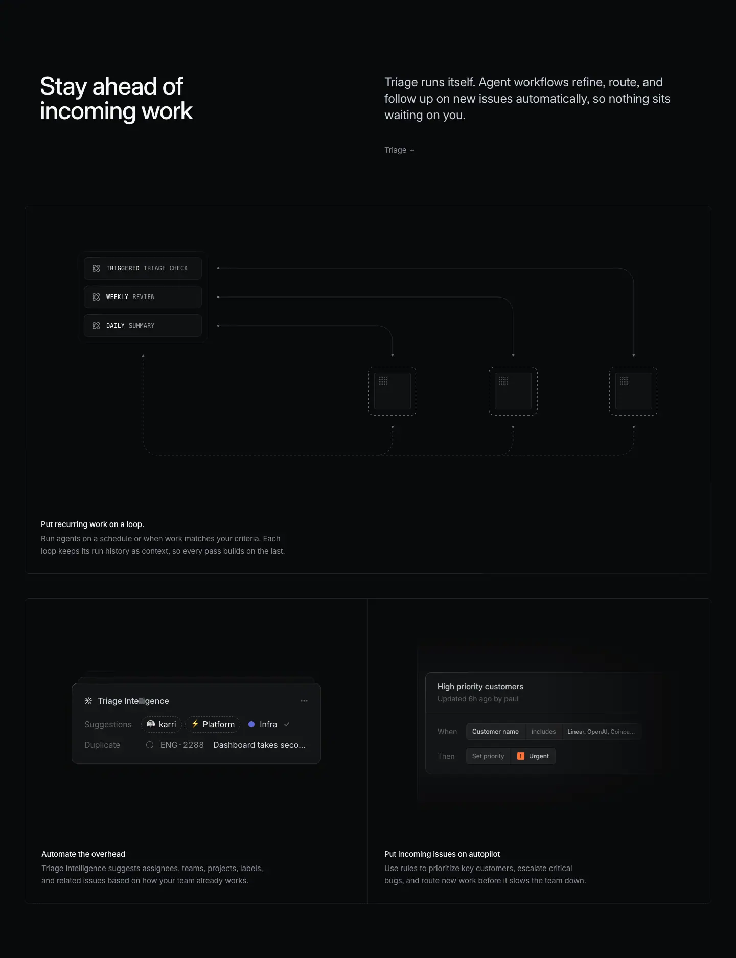
Layout
- Section crop: y=3514–5388.
- Header split: H2 at x=78, y=3664 (2 lines). Paragraph x=752, y=3666, 3 lines. Link "Triage →" at y=3796.
- Full-width diagram panel: x=48–1392, y=3916–4635 (719 tall, shorter than the 939 px feature panels). Caption H3 at x=80, y=4528; description y=4556 (2 lines).
- 1×2 row (two cells in one bordered box): y=4684–5281 (597 tall), split at x=720. Panel bottom (4635) to row top (4684) = 49 px.
- Left cell: Triage Intelligence card. H3 at x=81, y=5173.
- Right cell: IMG rule card at x=720, y=4717, 672×424. H3 at x=752, y=5173.
Typography
- H2, paragraph, link, H3, description: same tokens as section 01/02.
- Diagram labels: Berkeley Mono 12px / 20px · 500 · #f7f8f8. The first word ("TRIGGERED", "WEEKLY", "DAILY") is brighter; the second word ("TRIAGE CHECK", "REVIEW", "SUMMARY") is dimmer ≈ measured from screenshot.
- Triage Intelligence card: header "Triage Intelligence" 16px / 20px · 510 · #d0d6e0; row labels "Suggestions", "Duplicate" 16px / 24px · 400 · #62666d; chip values #f7f8f8; issue ID "ENG-2288" #8a8f98; issue title #d0d6e0.
- Rule card mini-labels: 11.088px / 16.632px · 500 · #d0d6e0 ("Linear, OpenAI, Coinbase, Ramp"). The fractional size means the card is scaled as a unit.
Color
- Diagram panel: no spotlight. Near-black fill with a 1 px border. Connectors are thin grey dotted lines with small arrowheads.
- Agent nodes: three dashed-outline squares, each holding a small dark tile with a dot-grid icon.
- Accents: a blue dot "Infra", an orange "Urgent" icon in the rule card. Everything else is grey.
Visual / UI illustration
- Loop diagram: three trigger chips stacked top-left (TRIGGERED TRIAGE CHECK / WEEKLY REVIEW / DAILY SUMMARY). Each sends a line right and down into one of three dashed agent boxes. Lines return from the agents back to the chips. The geometry draws a literal loop.
- It is a stylized schematic, not a screenshot. Mono uppercase labels mark it as system plumbing.
- Triage Intelligence card: the DOM holds 6 copies of this card (3 contents × 2 scales: "emil / Polish / Website", "paul / Rider app / Bug", "karri / Platform / Infra"). This is a stacked, cycling card deck. The screenshot captured the "karri" card in front with a second card visible behind it.
- Rule card: "High priority customers", "Updated 6h ago by paul", rows "When · Customer name · includes · Linear, OpenAI, Coinbase…" and "Then · Set priority · Urgent".
Copy
- H2: "Stay ahead of incoming work" (5 words). Imperative benefit.
- Paragraph: "Triage runs itself. Agent workflows refine, route, and follow up on new issues automatically, so nothing sits waiting on you." 20 words. A 3-word claim, then a 3-verb proof, then a "so" benefit.
- Link: "Triage →".
- Panel: "Put recurring work on a loop." This title has a trailing period, unlike all others. "Run agents on a schedule or when work matches your criteria. Each loop keeps its run history as context, so every pass builds on the last." (26 words)
- "Automate the overhead" — "Triage Intelligence suggests assignees, teams, projects, labels, and related issues based on how your team already works." (17 words)
- "Put incoming issues on autopilot" — "Use rules to prioritize key customers, escalate critical bugs, and route new work before it slows the team down." (19 words)
Why it works
- A shorter, diagram-only panel changes rhythm after two screenshot-heavy blocks. It also explains an abstract idea (scheduled loops) that a screenshot cannot show.
- Mono labels and dashed boxes use a "system diagram" visual language. That separates automation from the human UI in other cells.
- The 1×2 row shows the concrete outputs of the loop (suggestions, rules) directly under the abstract diagram.
Reuse recipe
- Header split as in §01, with a 1-word feature link.
- Diagram panel 1344×≈720: mono 12px chips, 1 px dotted connectors, dashed-outline target boxes. Keep it monochrome.
- Under it, a 1×2 bordered row (672×597 cells) with concrete UI cards.
- Animate one card as a deck of 3 states that cycle in place.
- Keep the 49 px gap between stacked boxes.
04 · A cloud coding agent, built into Linear (header + feature panel)
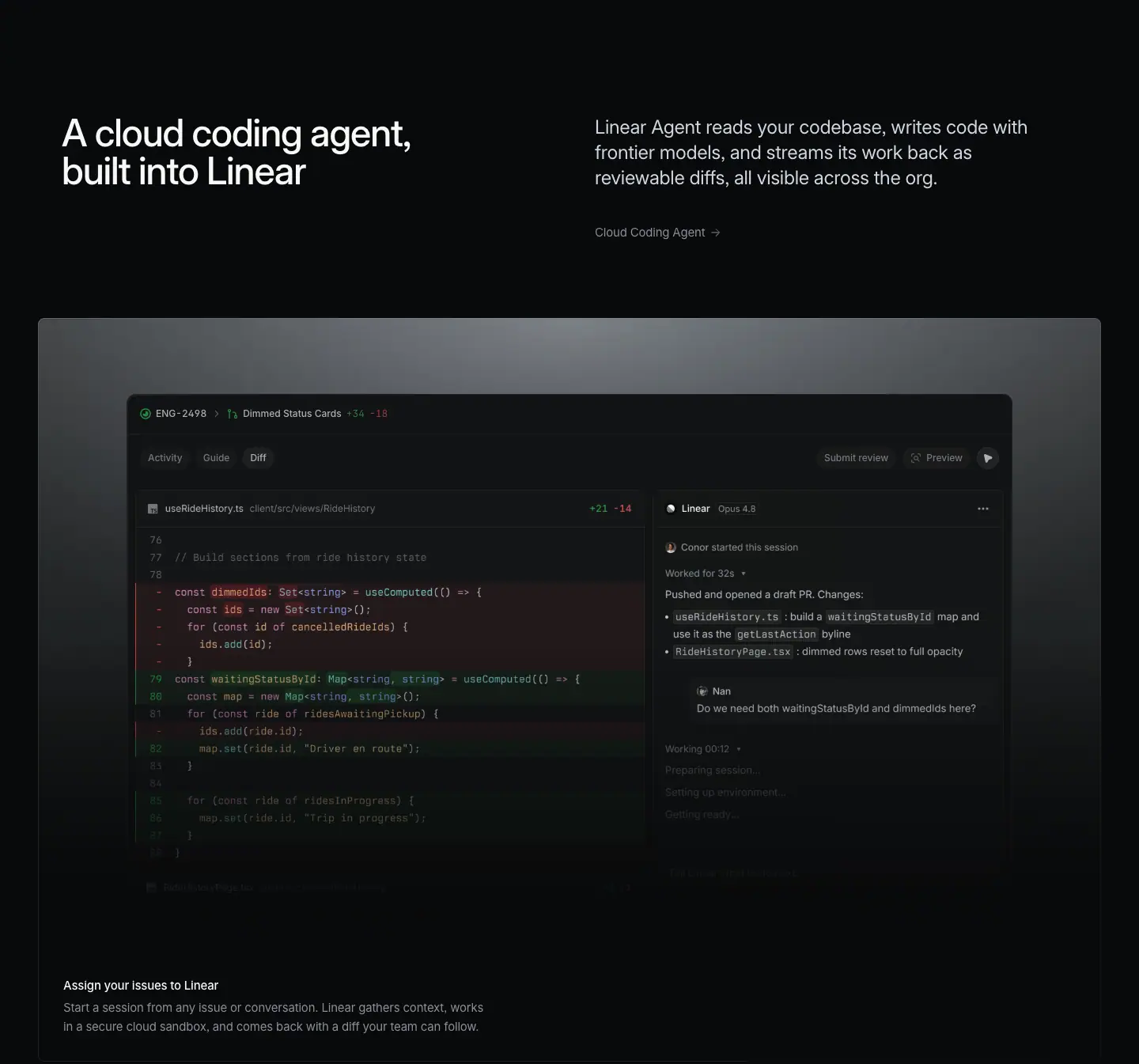
Layout
- Section crop: y=5388–6733.
- Previous row bottom (5281) to H2 (5538) = 257 px.
- Header split: H2 x=78, y=5538. Paragraph x=752, y=5539, 3 lines. Link "Cloud Coding Agent →" at y=5670.
- Feature panel: x=48–1392, y=5790–6729 (939 tall). Same spotlight treatment as §01.
- Inside: one wide composite window. IMG diff pane at x=161, y=6007, 664×602. IMG agent pane at x=825, y=6007, 454×604. Together ≈1118 wide, flush side by side, so they read as one app window.
- Window chrome text at y=5903 (issue bar) and y=5953 (tab bar).
- Caption H3 x=80, y=6622; description y=6650.
Typography
- Header and caption: same tokens as §01.
- In-UI: 12px / 16.8px · 510. "ENG-2498" and "Dimmed Status Cards" #d0d6e0. Diff counts "+34" #369347 and "-18" #bf4044 (weight 400). Tabs "Activity", "Guide" #8a8f98; active tab "Diff" #d0d6e0. "Submit review", "Preview" #8a8f98.
Color
- Spotlight panel as §01 (pixel (700, 1240)-equivalent top ≈ #787d82).
- Diff colors: red removed-line band and green added-line band, both low-saturation, at low alpha over the dark editor. Code syntax in pink, peach, cyan, and blue.
- The agent pane is neutral grey text. The model tag reads "Opus 4.6".
Visual / UI illustration
- Left: a diff of useRideHistory.ts (client/src/views/RideHistory, +11 −14). Lines 76–89: dimmedIds replaced by waitingStatusById.
- Right: agent session "Linear · Opus 4.6". "Conor started this session", "Worked for 32s", "Pushed and opened a draft PR. Changes:" with 3 bullets of inline code chips. Then a reviewer comment from "Nan": "Do we need both waitingStatusById and dimmedIds here?". Then "Working 00:12" with greyed steps "Preparing session…", "Setting up environment…", "Getting ready…".
- The bottom rows fade out. The greyed steps suggest a live-progress animation.
- Real UI with staged data. Code is readable, not lorem.
Copy
- H2: "A cloud coding agent, built into Linear" (7 words). Noun phrase + appositive. Category ("cloud coding agent") first, differentiator ("built into Linear") second.
- Paragraph: "Linear Agent reads your codebase, writes code with frontier models, and streams its work back as reviewable diffs, all visible across the org." 24 words. Three verbs in sequence (reads, writes, streams), then a visibility benefit.
- Link: "Cloud Coding Agent →" (the feature page name).
- Caption: "Assign your issues to Linear" — "Start a session from any issue or conversation. Linear gathers context, works in a secure cloud sandbox, and comes back with a diff your team can follow." (28 words)
Why it works
- The window shows the full loop in one frame: code change (left), agent summary (middle), human review question (right bottom). Viewers see that a human stays in control.
- Real code and a real file path build engineering credibility. Engineers trust readable code more than abstract illustration.
- Repeating the §01 structure (header → spotlight panel → bento) makes this chapter fast to parse.
Reuse recipe
- Same header split and 939 px spotlight panel as §01.
- One composite window ≈1118 wide, built from two flush panes (diff 664 + agent 454).
- Show diff counts in muted green #369347 / red #bf4044, 12px.
- Include one human comment in the agent pane to show oversight.
- Fade the window bottom into the panel; keep the caption 32 px inset.
05 · A cloud coding agent — bento 2×2
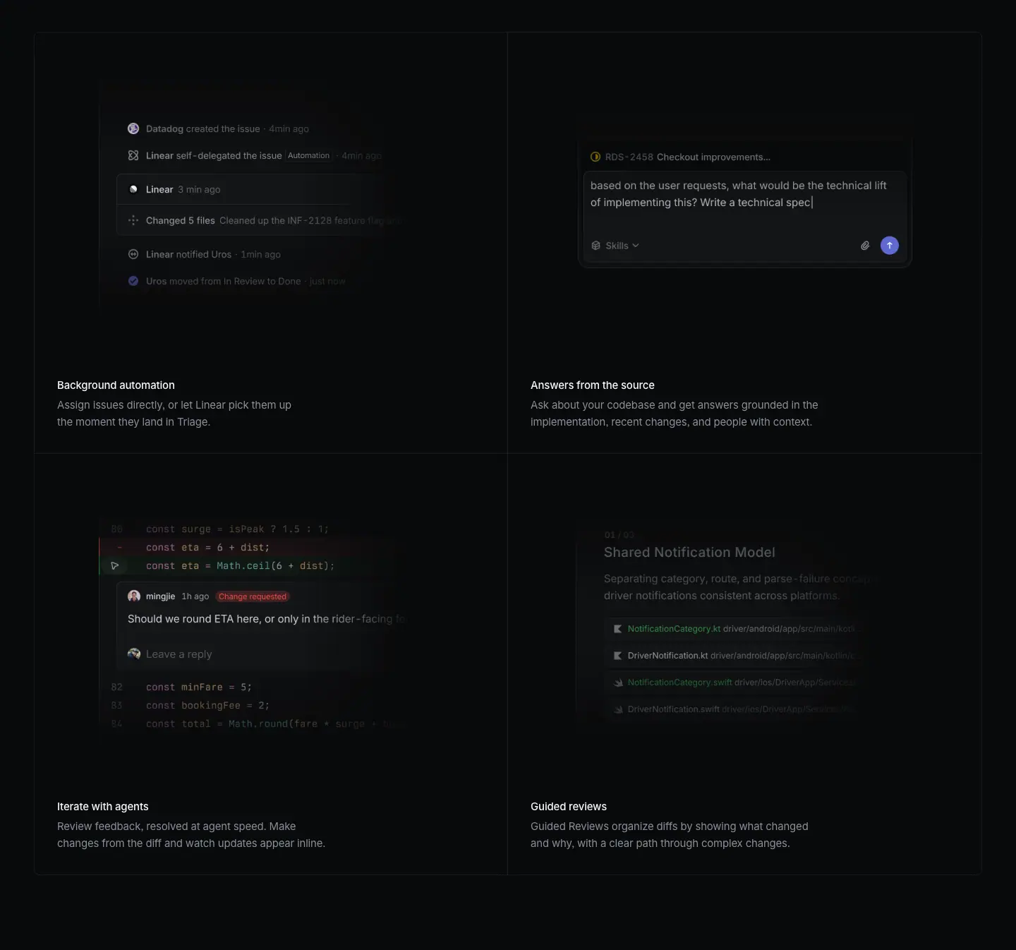
Layout
- Section crop: y=6733–8079.
- Grid box: x=48–1392, y=6778–7972. Row split at y=7375. Cells 672×597.
- Images at y=6811 (left x=48 and right x=720, 672×424). Second row images at y=7408.
- Titles at y=7267 and y=7864. Descriptions 28 px below.
- Identical cell anatomy to §02.
Typography
- Titles 15px / 24px · 510 · -0.165px · #f7f8f8. Descriptions 15px / 24px · 400 · -0.165px · #8a8f98.
- In-UI code: Berkeley Mono at ≈12px; activity rows ≈12px Inter ≈ measured from screenshot.
Color
- Cell fill and borders as §02.
- Accents: green check on "Change requested"-adjacent diff line, red "Change requested" pill, indigo send button, green file names in "Shared Notification Model".
Visual / UI illustration
- Cell 1 "Background automation": an activity log. "Datadog created the issue", "Linear self-delegated the issue · Automation", "Linear 3 min ago", "Changed 5 files", "Linear notified Uros", "Uros moved from In Review to Done". Rows fade from top and bottom (only the middle is bright).
- Cell 2 "Answers from the source": a composer with issue chip "RDS-2458 Checkout improvements…" and the typed question "based on the user requests, what would be the technical lift of implementing this? Write a technical spec|" (text cursor visible).
- Cell 3 "Iterate with agents": a diff with an inline review thread. User "mingjie · 1h ago · Change requested": "Should we round ETA here, or only in the rider-facing fo…". Then "Leave a reply".
- Cell 4 "Guided reviews": a dimmed doc "Shared Notification Model" with a list of changed files (NotificationCategory.kt, DriverNotification.kt, .swift variants). The whole card is low-contrast, as if out of focus.
Copy
- "Background automation" — "Assign issues directly, or let Linear pick them up the moment they land in Triage." (15 words)
- "Answers from the source" — "Ask about your codebase and get answers grounded in the implementation, recent changes, and people with context." (17 words)
- "Iterate with agents" — "Review feedback, resolved at agent speed. Make changes from the diff and watch updates appear inline." (16 words; the first sentence is a fragment for rhythm)
- "Guided reviews" — "Guided Reviews organize diffs by showing what changed and why, with a clear path through complex changes." (17 words)
- Titles here mix noun phrases ("Background automation", "Guided reviews") with verb phrases ("Iterate with agents"). All are 2–3 words.
Why it works
- Each cell shows one moment of the code loop: trigger, question, review, explanation. Together they finish the story the feature panel started.
- Fades and partial blur keep the four cells quiet. No cell competes with the large panel above.
Reuse recipe
- Reuse the §02 grid exactly; change only the visuals and copy.
- Use one micro-interaction per cell (a typed cursor, a status pill, a fading log).
- Fade the top and bottom of logs so only 3–4 rows read at full contrast.
- Keep titles at 2–3 words.
06 · See everything your agents are doing
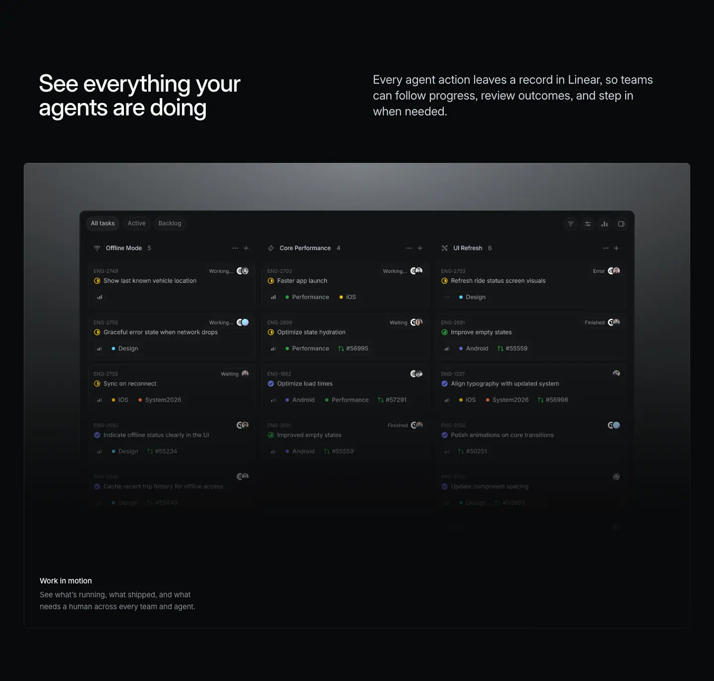
Layout
- Section crop: y=8079–9454.
- Previous grid bottom (7972) to H2 (8229) = 257 px.
- Header split: H2 x=78, y=8229. Paragraph x=752, y=8230 (3 lines, ends 8311). No feature link.
- Panel: x=48–1392, y=8408–9347 (939 tall). Paragraph bottom (8311) to panel = 97 px.
- One board image: IMG x=161, y=8560, 1118×647. Tab bar text at y=8516.
- Caption H3 x=80, y=9240; description y=9268.
- No bento follows. This is the only chapter with a single panel.
Typography
- Header and caption tokens as §01.
- Tabs "All tasks" 12px / 16.8px · 510 · #d0d6e0 (active), "Active", "Backlog" #8a8f98.
Color
- Spotlight panel (pixel (700, 8420) = #787d82).
- Board: dark cards with yellow half-circle "in progress" icons, green check "done" icons, blue/purple dots for labels. Status tags "Working…", "Waiting", "Error", "Finished" at top-right of each card.
Visual / UI illustration
- A 3-column board: "Offline Mode 5", "Core Performance 4", "UI Refresh 6". Each column holds issue cards (e.g. "ENG-2749 Show last known vehicle location", "Faster app launch", "Refresh ride status screen visuals").
- Each card shows an agent state tag and avatar pairs (human + agent). The lower rows fade to transparent.
- It is real Linear board UI. The data is staged to show agents in several states at once.
Copy
- H2: "See everything your agents are doing" (6 words). Imperative + object.
- Paragraph: "Every agent action leaves a record in Linear, so teams can follow progress, review outcomes, and step in when needed." 20 words. Claim + "so" + 3 verbs.
- Caption: "Work in motion" (3 words) — "See what's running, what shipped, and what needs a human across every team and agent." (16 words). Triple "what" parallelism.
Why it works
- A single wide board after two dense grids gives a breather and a "zoom out" moment. That matches the message: oversight across all agents.
- The status tags (Working, Waiting, Error, Finished) answer the buyer's fear ("what are the agents doing?") with direct evidence.
- Dropping the feature link and the bento shortens the chapter, so the page rhythm does not become predictable.
Reuse recipe
- Header split without a link; panel 97 px below the paragraph.
- One full-width board image ≈1118×647 centered in a 1344×939 spotlight panel.
- Use a status tag per card to show agent state; fade the last row.
- Caption "Work in motion"-style: 3-word title, triple-parallel description.
07 · Open, by design (+ product nav + testimonials)
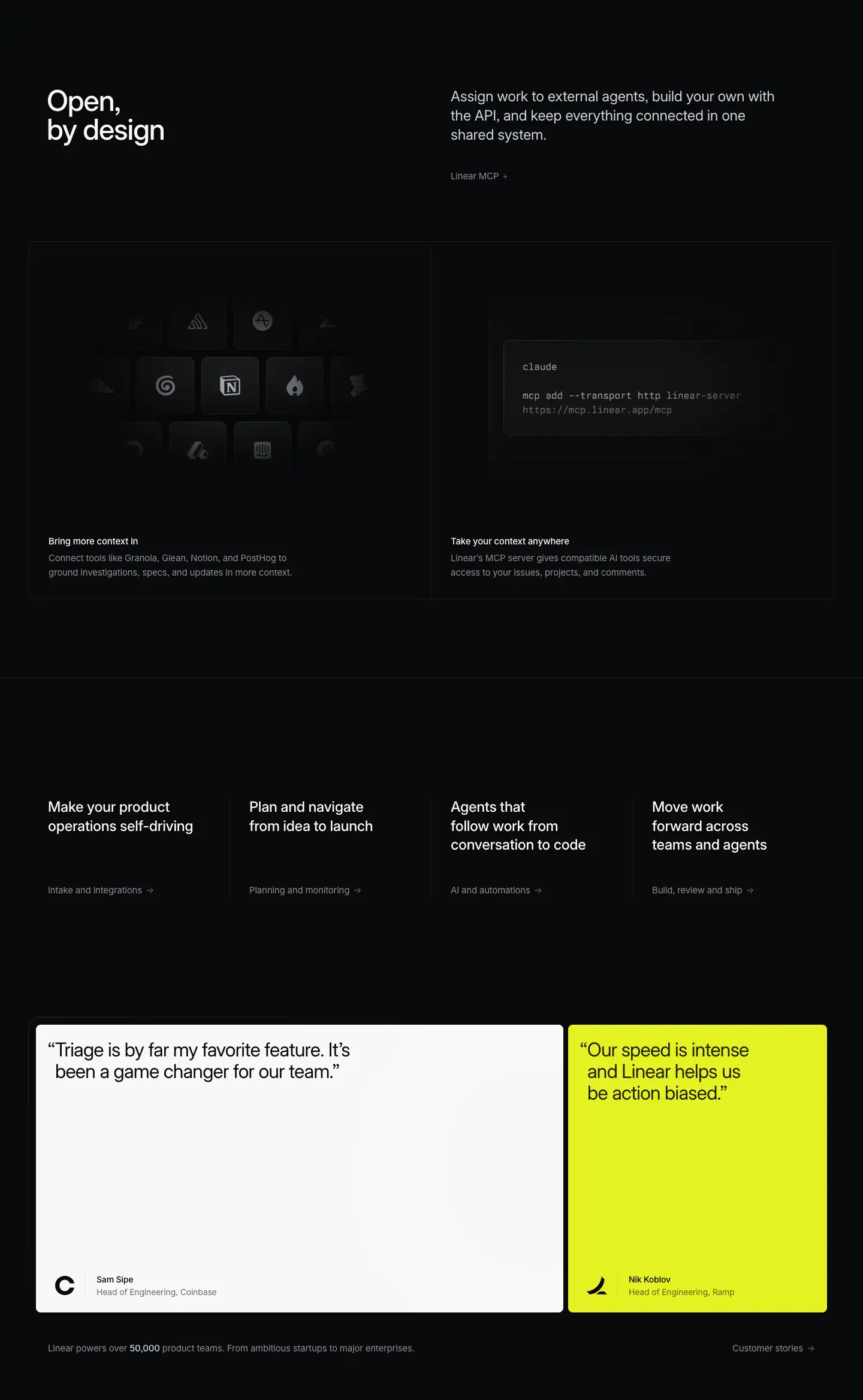
This crop holds three blocks: the "Open, by design" chapter, a 4-up product nav, and the testimonial row.
07a · Open, by design — header + 1×2 row
Layout
- Header split: H2 x=78, y=9604. Paragraph x=752, y=9605. Link "Linear MCP →" at y=9736.
- 1×2 bordered row: x=48–1392, y=9856–10453 (597 tall), split at x=720. Images at y=9889 (672×424 each). Titles at y=10345 (x=81 and x=752).
Typography
- Header and cell tokens as §01/§02.
- Terminal card: Berkeley Mono ≈13px, #d0d6e0 for "claude" and the command, #8a8f98 for the URL ≈ measured from screenshot.
Visual / UI illustration
- Left "Bring more context in": a 3-row grid of app-icon tiles (Notion in the center, plus PostHog, Granola, Glean and others). Center tiles are bright; outer tiles fade and blur toward the edges, like a lens vignette.
- Right "Take your context anywhere": a terminal card with claude and mcp add --transport http linear-server https://mcp.linear.app/mcp.
Copy
- H2: "Open, by design" (3 words). Comma pause for emphasis.
- Paragraph: "Assign work to external agents, build your own with the API, and keep everything connected in one shared system." (19 words, 3 imperatives.)
- "Bring more context in" — "Connect tools like Granola, Glean, Notion, and PostHog to ground investigations, specs, and updates in more context." (17 words)
- "Take your context anywhere" — "Linear's MCP server gives compatible AI tools secure access to your issues, projects, and comments." (15 words)
- The two titles are mirror images: context in vs. context anywhere (out).
07b · Product nav (4-up)
Layout
- A full-width hairline at y=10583 (130 px below the row).
- 4 columns at x=80, 416, 752, 1088 (336 px pitch). Titles at y=10784; links at y=10927.
- Thin vertical dividers between columns ≈ measured from screenshot.
Typography
- Titles: 24px / 31.92px · 510 · -0.288px · #f7f8f8, w=263, 2–3 lines.
- Links: 15px / 24px · 400 · -0.165px · #8a8f98, with "→".
Copy
- "Make your product operations self-driving" → "Intake and integrations"
- "Plan and navigate from idea to launch" → "Planning and monitoring"
- "Agents that follow work from conversation to code" → "AI and automations"
- "Move work forward across teams and agents" → "Build, review and ship"
- Each title is the H1 of a product page. The nav lists the current page too.
07c · Testimonials
Layout
- Two cards at y=11163, height 480: card 1 x=60, w=880; card 2 x=948, w=432 (8 px gap). Radius 8px, padding 24px 32px.
- A thin frame surrounds both cards (a vertical line detected at x=47 from y=11166 to 11596).
- Quote at y=11187 (x=92 and x=980). Author block at y=11577 (name) and y=11598 (title), at x=161 / x=1049, with a company logo to the left.
- Stats line at y=11691: left text at x=80; "Customer stories →" right-aligned at x=1222.
Typography
- Quote: 32px / 36px · 400 · -0.704px (-0.022em) · #08090a, hanging opening quote mark.
- Name: 14px / 21px · 510 · -0.182px · #08090a. Title: 14px / 21px · 400 · -0.182px · #08090a (grey tint ≈ measured from screenshot).
- Stats: 15px / 24px · 400 · #8a8f98 with "50,000" in <strong> 15px · 510 · #d0d6e0.
Color
- Card 1: #f7f8f8 off-white with a soft diagonal light sheen ≈ measured from screenshot.
- Card 2: #e4f222 acid lime. This is the only saturated block of color on the page.
Copy
- "Triage is by far my favorite feature. It's been a game changer for our team." — Head of Engineering, Coinbase.
- "Our speed is intense and Linear helps us be action biased." — Head of Engineering, Ramp.
- "Linear powers over 50,000 product teams. From ambitious startups to major enterprises."
Why it works (07 overall)
- The "open" chapter answers the last objection (lock-in) before the close.
- The 4-up nav turns the end of the page into a hub. Readers who are not convinced by AI can jump to a sibling product page.
- Light testimonial cards invert the page polarity for the first time in 11,000 px. That contrast makes social proof impossible to skip. The one lime card adds the brand's only loud color exactly where trust is built.
Reuse recipe
- 1×2 row: one integrations icon grid with a radial blur vignette; one terminal snippet in mono.
- 4-up cross-nav: 336 px columns, 24/31.92 w510 titles, 15px grey "→" links, hairline above.
- Testimonials: 880 + 432 px cards, 8 px gap, 480 tall, radius 8, padding 24/32; quote 32/36 w400 near-black; one neutral card and one accent card (#e4f222 or #c3b5f8).
- Close with a one-line stat in grey with the number in w510 #d0d6e0.
08 · Built for the future. Available today. (final CTA)
Layout
- Section crop: y=11789–12358 (569 tall).
- H2 centered: x=359, w=722, y=11939 (150 px from crop top), 2 lines (h=144).
- Buttons at y=12123 (40 px below H2 bottom 12083). "Get started" x=579, 127×44. "Contact sales" x=718, 144×44. Gap 12 px.
- Button bottom (12167) to crop end = 191 px. Footer hairline at y=12391.
Typography
- H2: 72px / 72px · 510 · -1.584px (-0.022em) · #f7f8f8, centered. Note weight 510, not the hero's 500.
- Buttons: 16px / 44px · 510.
Color
- Primary: #e5e5e6 fill, #08090a text, 1 px #e5e5e6 border, radius 9999px, padding 0 20px.
- Secondary: rgba(255,255,255,0.05) fill, #f7f8f8 text, no border, same radius and padding.
- No background graphic. Flat #08090a.
Copy
- "Built for the future. Available today." (6 words). Two parallel fragments: future/today. It is the same CTA on every product page.
- Buttons: "Get started", "Contact sales" (2 words each).
Why it works
- After a long dense page, an empty centered block resets attention. The CTA is the only centered layout on the page, so it reads as an ending.
- Pill buttons with a light primary and a ghost secondary give one clear default path and one enterprise path.
Reuse recipe
- 569 px tall block, 150 px top padding, centered 72/72 w510 H2 at max width ≈722.
- Two pill buttons 44 tall, 40 px below the H2, 12 px apart.
- Primary #e5e5e6/#08090a; secondary rgba(255,255,255,.05)/#f7f8f8.
09 · Footer
Layout
- Section crop: y=12358–12915 (557 tall). A 1 px full-width hairline at y=12391.
- Logo mark at x≈80 ≈ measured from screenshot. 5 link columns at x=304, 528, 752, 976, 1200 (224 px pitch), headings at y=12448.
- Links start at y=12492 with a 30 px row pitch.
- Legal row at y=12840: "Privacy", "Terms", "Other Policies".
Typography
- Column headings: 13px / 19.5px · 510 · -0.13px · #f7f8f8.
- Links: 13px / 19.5px · 400 · -0.13px · #8a8f98.
- Legal: 13px / 19.5px · 400 · -0.13px · #62666d.
Copy
- Product: Intake, Plan, AI, Build, Pricing, Security.
- Features: Asks, Agents, Cloud Coding Agent, Customer Requests, Insights, Mobile, Reviews, Integrations, Changelog.
- Company: About, Customers, Careers, Now, Method, Quality, Brand.
- Resources: Switch, Download, Documentation, Developers, Enterprise, Startups, Status, Legal.
- Connect: Contact us, Community, X (Twitter), GitHub, YouTube.
Why it works
- Three grey steps (white heading, #8a8f98 link, #62666d legal) give hierarchy with no other styling.
- A 224 px grid with left-aligned short labels scans fast.
Reuse recipe
- 5 columns at 224 px pitch starting at x=304; logo alone at x=80.
- 13px everywhere; weight and gray value carry the hierarchy.
- 30 px link row pitch; legal row at the bottom in the darkest gray.
Page-level takeaways
- One spacing system repeats on every chapter. 150 px from section start to H2. 96 px from the header link to the panel. 48 px (+1 px border) between stacked boxes. ≈256 px from a box bottom to the next H2.
- Two-tier boxes. A 1344×939 spotlight "feature panel" holds the hero visual of a chapter. A 2×2 or 1×2 grid of 672×597 cells holds the supporting features. The box widths never change.
- Three text sizes do almost all of the work: 48px H2, 24px intro paragraph, 15px card text. The weight steps are 400 / 510 only. All display sizes use -0.022em tracking.
- Color lives inside the product UI, not in the page chrome. The chrome is gray steps on
#08090a. The one exception is the lime testimonial card near the end.
- Each chapter descends from slogan to literal claim to concrete action: H2 slogan → 24px claim → 15px imperative caption.
- Real UI with staged, readable data (real file paths, issue IDs, reviewer comments). Mono uppercase labels mark diagrams of system behavior.
- Rhythm breaks are deliberate: a diagram-only panel (§03), a single-panel chapter without a link or bento (§06), and a light-surface testimonial row (§07c).
- Captions live inside panels at 32 px inset, bottom-left. Visual and text read as one object.
- The page ends as a hub: 4-up cross-links, proof, one centered CTA, a 5-column footer.
Section inventory
| # |
Section |
Pattern name |
Key values |
| 00 |
Hero |
Hero-left-video |
Video 1440×772; eyebrow 16/24 w400; H1 72/72 w500 -0.022em at x=78, y=572 |
| 01 |
Artificial colleagues — header + panel |
Section-header-split + Feature-panel-spotlight |
H2 48/48 w510 x=78; P 24/31.92 #d0d6e0 x=752; panel 1344×939 at x=48 |
| 02 |
Artificial colleagues — grid |
Bento-2x2 |
Cells 672×597; visual 424 tall; 15/24 w510 title + 15/24 #8a8f98 desc |
| 03 |
Stay ahead of incoming work |
Section-header-split + Diagram-panel + Bento-1x2 |
Panel 1344×719; mono 12/20 labels; row 597 tall |
| 04 |
Cloud coding agent — header + panel |
Section-header-split + Feature-panel-spotlight |
Composite window 664+454 px; diff +/− #369347/#bf4044 |
| 05 |
Cloud coding agent — grid |
Bento-2x2 |
Same as 02 |
| 06 |
See everything your agents are doing |
Section-header-split + Feature-panel-spotlight |
No link; board image 1118×647 |
| 07 |
Open, by design + nav + proof |
Section-header-split + Bento-1x2 + Product-nav-4up + Testimonial-quote-2up |
Nav pitch 336; cards 880/432×480, quote 32/36 #08090a, accent #e4f222 |
| 08 |
Built for the future |
Final-CTA-centered |
H2 72/72 w510 centered w=722; pills 44 tall, 12 px gap |
| 09 |
Footer |
Footer-5col |
Columns 224 px pitch from x=304; 13px; #f7f8f8/#8a8f98/#62666d |
Intake — linear.app/intake
- URL: https://linear.app/intake
<title>: Linear Intake – Self-driving product operations- Meta description: Automatically turn conversations and customer feedback into actionable issues that are routed, labeled, and prioritized for the right team.
- Page height: 11,456 px at 1440 px wide
- Body background:
#08090a
- Template: newer product template, identical in skeleton to
/ai (see ai.md). Left-aligned 72px/72px w500 H1 at x=78 over a full-bleed hero video. Five chapters, each a split section header plus a 1344×939 spotlight feature panel, two of them followed by a 2×2 bento. Then a 4-up product nav, two testimonial cards, the shared centered CTA, and the 5-column footer.
Narrative arc. The hero promises "self-driving" product operations. The chapters then follow incoming work from its sources to its owners. (1) Capture: issues are created from Slack, Teams, support tickets, sales calls and any tool. (2) Triage: a shared AI inbox suggests owners, finds duplicates, applies rules, schedules on-call and sets SLAs. (3) Customer requests: feedback is linked to customers so the team builds the right thing. (4) Internal requests: Linear Asks extends the same intake to IT and workplace requests. The arc widens the audience at each step: engineers → triage owners → product managers → the whole company. It ends with cross-links, two testimonials about triage, and the shared CTA.

00 · Hero
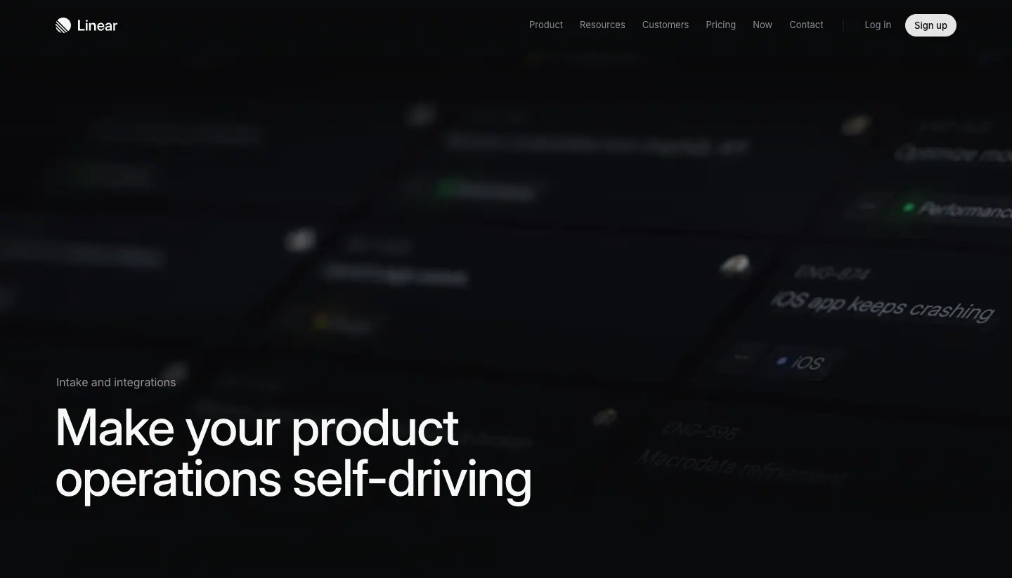
Layout
- Section crop: y=0–823. Full-bleed VIDEO 1440×772 at y=0 (INTAKE-v4.output.av1.crf24.mp4).
- Eyebrow at x=80, y=532. H1 at x=78, y=572, w=679, h=144 (2 lines). Label-to-H1 gap 16 px.
- Full-width hairline at y=844 (detected from screenshot pixels).
- No sub-paragraph and no CTA button in the hero.
Typography
- Eyebrow "Intake and integrations": 16px / 24px · 400 · normal · #f7f8f8.
- H1: 72px / 72px · 500 · -1.584px (-0.022em) · #f7f8f8, Inter Variable with "cv01","ss03".
Color
- Near-black video. Small accents: green dot "Performance", blue dot "iOS", white and yellow avatar blobs. All are defocused.
Visual / UI illustration
- A field of issue rows tilted in 3D perspective with strong depth of field. Readable fragments: "ENG-374 iOS app keeps crashing", "ENG-538 Macrodata refinement", "Optimize m…", label chips "Performance", "iOS".
- Rows near the center-right are sharp; rows to the left and top are blurred. It suggests a stream of issues flowing in.
- Real issue-list UI re-staged as a moving 3D scene.
Copy
- Eyebrow: "Intake and integrations" (3 words) — the product-area name.
- H1: "Make your product operations self-driving" (6 words). Imperative verb "Make" + metaphor "self-driving". The metaphor promises zero manual steering. The rest of the page proves it with automation features.
Why it works
- One headline, no clutter, motion in the background. The video shows volume ("lots of issues arrive") and the headline offers the answer (automation).
- The H1 is shorter than on /ai (w=679 vs 795). It breaks after "product" so "operations self-driving" lands as the second line.
Reuse recipe
- Full-bleed defocused 3D video of your core object (here: issue rows), 1440×772.
- Eyebrow 16/24 w400 white, 16 px above the H1.
- H1 72/72 w500 -0.022em, 6–8 words, 2 lines, at x=78, y≈572.
- No button. Let the next section explain.
01 · Issue intake, fully automated (header + feature panel)
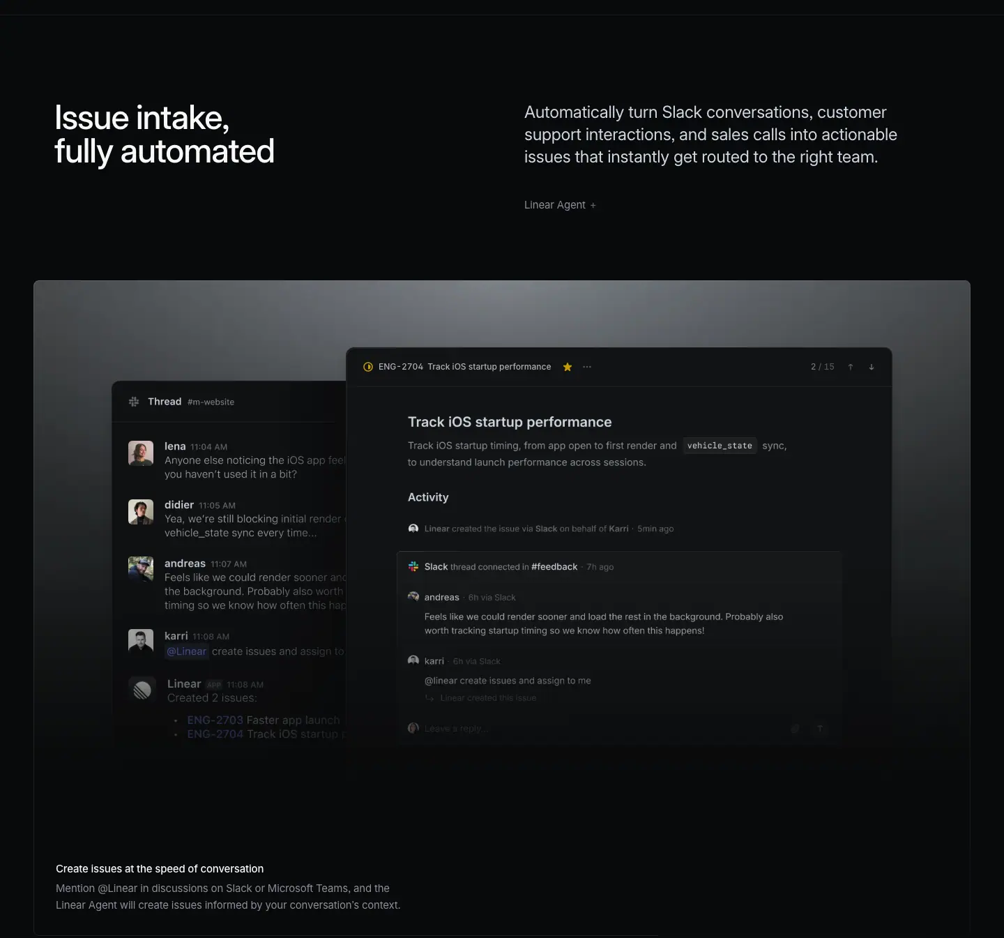
Layout
- Section crop: y=823–2168.
- Header split: H2 x=78, y=973, w=542. Paragraph x=752, y=975, w=566, 3 lines (h=81). Link at y=1105 (49 px below the paragraph).
- Feature panel: x=48–1392, y=1225–2164 (939 tall), 96 px below the link.
- Two windows: thread IMG x=160, y=1369, 560×656; issue IMG x=568, y=1414, 640×479.
- Caption H3 x=80, y=2057; description y=2085, w=624.
Typography
- H2: 48px / 48px · 510 · -1.056px · #f7f8f8.
- Paragraph: 24px / 31.92px · 400 · -0.288px · #d0d6e0.
- Link "Linear Agent →": 15px / 24px · 400 · -0.165px · #8a8f98.
- Caption title 15px / 24px · 510 · #f7f8f8; description 15px / 24px · 400 · #8a8f98.
- In-UI: "ENG-2704", "Track iOS startup performance" 12px / 16.8px · 510 · #d0d6e0; "/ 15" #62666d.
Color
- Spotlight surface: grey light from the top center (≈ #787d82) fading to #08090a ≈ measured from screenshot.
- UI accents: yellow star, indigo "@Linear" mention chip, inline code chip vehicle_state.
Visual / UI illustration
- Same composition as /ai §01 with different data. Left: "Thread #m-website" with four people discussing iOS startup time, then "@Linear create issues and assign to …", then "Linear · Created 2 issues: ENG-2703 Faster app launch, ENG-2704 Track iOS startup …".
- Right: issue "Track iOS startup performance" with an Activity feed: "Linear created the issue via Slack on behalf of Karri", "Slack thread connected in #feedback", synced comments.
- The thread window is cropped by the issue window; both fade at the bottom.
Copy
- H2: "Issue intake, fully automated" (4 words). Noun + adverb-adjective. A label, not a slogan.
- Paragraph: "Automatically turn Slack conversations, customer support interactions, and sales calls into actionable issues that instantly get routed to the right team." (21 words). The 3 named sources preview the 3 bento cells that follow.
- Link: "Linear Agent →".
- Caption: "Create issues at the speed of conversation" (7 words) — "Mention @Linear in discussions on Slack or Microsoft Teams, and the Linear Agent will create issues informed by your conversation's context." (21 words)
Why it works
- Reusing the /ai hero visual (thread → issue) shows the same agent on both pages. It makes the product feel unified.
- The paragraph lists the sources the grid will show. Readers get a table of contents for the chapter.
Reuse recipe
- Header split: H2 48/48 left (w≈542), paragraph 24/31.92 #d0d6e0 right at x=752.
- In the paragraph, name the 3–4 sources or features the grid below will show.
- Spotlight panel 1344×939 with an "input window → output window" pair.
- Caption 15px, 32 px inset, bottom-left.
02 · Issue intake — bento 2×2
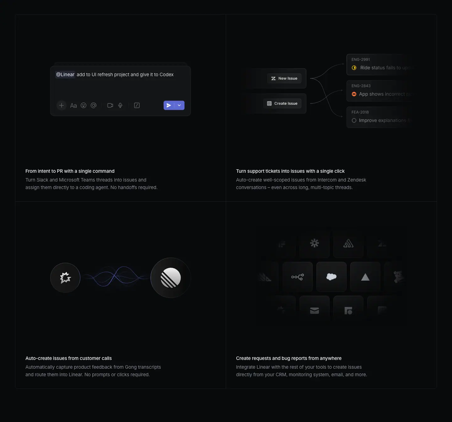
Layout
- Section crop: y=2168–3514.
- Grid box: x=48–1392, y=2213–3407, column split at x=720, row split at y=2810. Cells 672×597.
- Image assets exist only in the right column (IMG x=720 at y=2246 and y=2843, 672×424). The left-column visuals are built in the DOM (live text, animated waveform).
- Titles at y=2702 and y=3299; descriptions 28 px below.
Typography
- Titles 15px / 24px · 510 · -0.165px · #f7f8f8; descriptions 15px / 24px · 400 · -0.165px · #8a8f98.
- Composer text: "@Linear" 15px / 24px · 400 · #f7f8f8; command text 15px / 24px · 400 · -0.165px · #d0d6e0.
Color
- Cell fill: faint white overlay on near-black; 1 px internal hairlines.
- Indigo appears twice: the send button in the composer (≈ #5e6ad2) and the mention chip background (rgba(109,120,213,0.15) appears 3 times in the bg data). A violet/blue waveform glows between the Gong and Linear logos.
- Small status icons: yellow, orange, grey circles in the ticket cell.
Visual / UI illustration
- Cell 1 "From intent to PR with a single command": a composer with "@Linear add to UI refresh project and give it to Codex". The DOM holds 3 stacked copies of the command, offset 10 px right and 13 px up each ("create new issue and delegate to Cursor", "assign to alex and delegate to Copilot", "add to UI refresh project and give it to Codex"). This is a rotating card stack; the screenshot shows the front card.
- Cell 2 "Turn support tickets into issues with a single click": two buttons "New Issue" and "Create Issue" on the left, curved connector lines to three issue cards on the right (ENG-2991 "Ride status fails to upd…", ENG-2843 "App shows incorrect p…", FEA-2018 "Improve explanations f…"). The right cards are cut by the cell edge.
- Cell 3 "Auto-create issues from customer calls": a Gong logo disc on the left, a large Linear logo disc on the right, and an animated sine-wave between them.
- Cell 4 "Create requests and bug reports from anywhere": a 3-row grid of app-icon tiles (Salesforce in the center, others around it). Outer tiles blur and fade.
Copy
- "From intent to PR with a single command" — "Turn Slack and Microsoft Teams threads into issues and assign them directly to a coding agent. No handoffs required." (19 words)
- "Turn support tickets into issues with a single click" — "Auto-create well-scoped issues from Intercom and Zendesk conversations – even across long, multi-topic threads." (14 words)
- "Auto-create issues from customer calls" — "Automatically capture product feedback from Gong transcripts and route them into Linear. No prompts or clicks required." (17 words)
- "Create requests and bug reports from anywhere" — "Integrate Linear with the rest of your tools to create issues directly from your CRM, monitoring system, email, and more." (21 words)
- Titles are long here (5–9 words) compared with /ai (2–4 words). Two titles end with a unit of effort: "single command", "single click".
- Two descriptions end with the same short closer: "No handoffs required." / "No prompts or clicks required." It repeats the zero-effort promise.
Why it works
- Each cell is one intake channel. The visual shows the channel's logo or input surface, so a buyer finds "their" tool quickly.
- Animated elements (rotating commands, a waveform) show "automatic" without words.
- The fade on the icon grid implies "and many more" without a long list.
Reuse recipe
- Same 2×2 grid as /ai (cells 672×597, visual 424, text 32 px below).
- One channel per cell: composer, connector diagram, logo-to-logo flow, icon wall.
- Rotate 3 example commands in the composer as a stacked deck (offset ≈10 px x, ≈13 px y).
- End descriptions with "No X required." where the feature removes effort.
03 · Manage incoming work with Triage (header + feature panel)
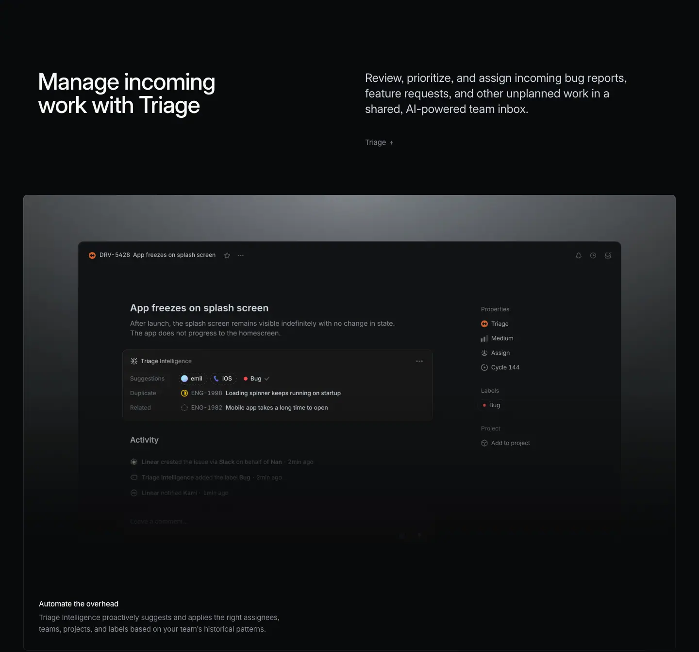
Layout
- Section crop: y=3514–4859.
- Grid bottom (3407) to H2 (3664) = 257 px.
- Header split: H2 x=78, y=3664. Paragraph x=752, y=3666. Link "Triage →" at y=3796.
- Feature panel: x=48–1392, y=3916–4855 (939 tall).
- One issue window built from two images: main pane IMG x=252, y=4135, 640×512; properties sidebar IMG x=983, y=4135, 296×581. Window chrome text at y=4032.
- Caption H3 x=80, y=4748; description y=4776.
Typography
- Header and caption tokens as §01.
- In-UI header: "DRV-5428" and "App freezes on splash screen" 12px / 16.8px · 510 · #d0d6e0.
Color
- Spotlight panel as §01.
- UI accents: orange urgent icon on the issue ID, small colored chips (blue avatar, iOS phone glyph, red "Bug" dot), a yellow half-circle on the duplicate row.
Visual / UI illustration
- Issue "App freezes on splash screen": description, then a bordered "Triage Intelligence" box with three rows: Suggestions (emil, iOS, Bug ✓), Duplicate (ENG-1898 "Loading spinner keeps running on startup"), Related (ENG-1982 "Mobile app takes a long time to open").
- Right sidebar: Properties (Triage, Medium, Assign, Cycle 144), Labels (Bug), Project (Add to project).
- Activity rows below fade out.
- Real issue-detail UI. The Triage Intelligence box is the focal point; it sits in the visual center of the panel.
Copy
- H2: "Manage incoming work with Triage" (5 words). Verb + object + feature name.
- Paragraph: "Review, prioritize, and assign incoming bug reports, feature requests, and other unplanned work in a shared, AI-powered team inbox." (19 words). Three verbs + three objects + one place.
- Link: "Triage →".
- Caption: "Automate the overhead" (3 words) — "Triage Intelligence proactively suggests and applies the right assignees, teams, projects, and labels based on your team's historical patterns." (19 words)
Why it works
- One issue, fully annotated by AI, proves the claim in a single look. The buyer sees suggested owner, labels and duplicates side by side.
- The title "Automate the overhead" reappears on /ai §03. Shared captions keep the product vocabulary consistent across pages.
Reuse recipe
- Same spotlight panel and header split.
- Center one detail view; put the AI-generated block in the middle of it, bordered.
- Show a right properties sidebar to anchor "this is the real app".
- Caption title 3 words, description names 4 objects the AI fills in.
04 · Triage — bento 2×2
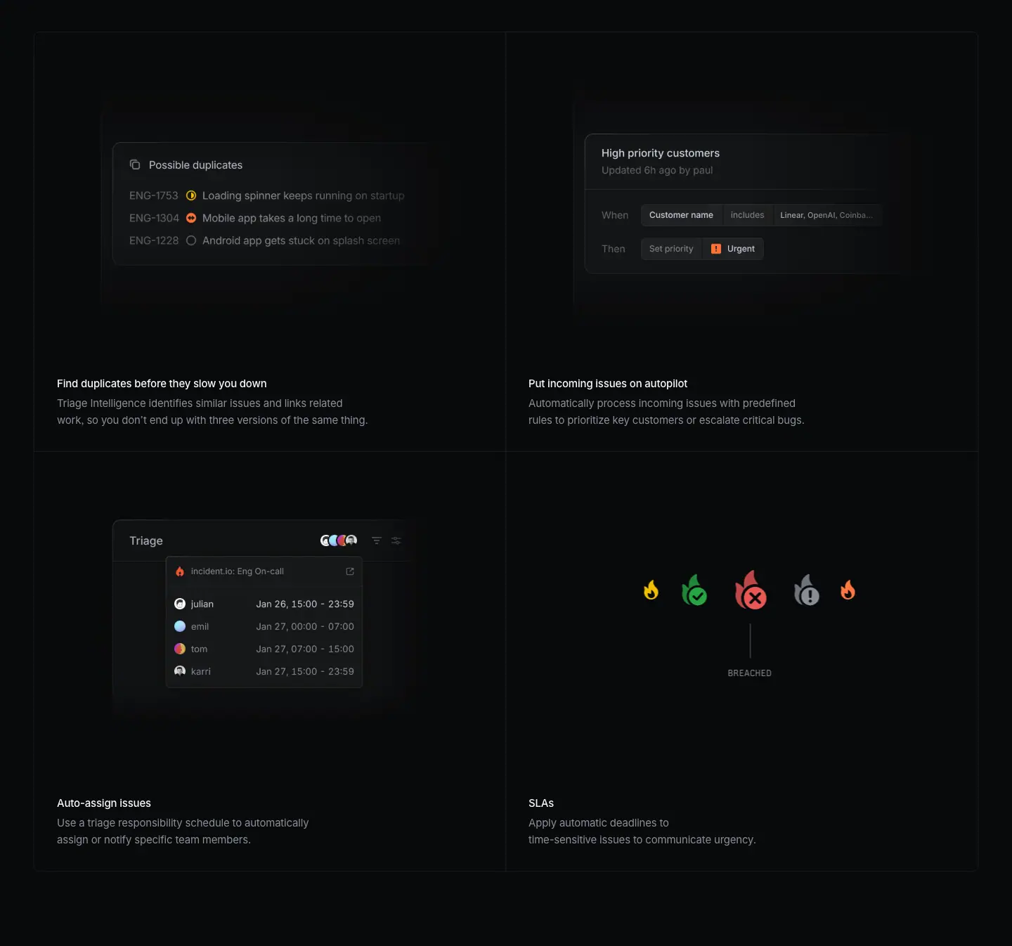
Layout
- Section crop: y=4859–6205.
- Grid box: x=48–1392, y=4904–6098, column split x=720, row split y=5501. Cells 672×597.
- Images: x=48 and x=720 at y=4937; x=48 at y=5534. Cell 4 (SLAs) is DOM-built.
- Titles at y=5393 and y=5990.
Typography
- Titles and descriptions: same tokens as §02.
- SLA status labels: Berkeley Mono 13px / 19.5px · 400 · #8a8f98, uppercase: FAILED, AT RISK, MODERATE, ACHIEVED, BREACHED, FAILED, AT RISK.
- Rule card labels: 11.088px / 16.632px · 500 · #d0d6e0 (scaled card).
Color
- Grid surface as §02.
- SLA cell: flame icons in orange, green (with check), red (with ×), grey (with !). The center red flame is the largest.
Visual / UI illustration
- Cell 1 "Find duplicates before they slow you down": a "Possible duplicates" list with three IDs (ENG-1753, ENG-1304, ENG-1228) and status icons. Text fades to the right.
- Cell 2 "Put incoming issues on autopilot": the rule card "High priority customers · Updated 6h ago by paul", rows "When · Customer name · includes · Linear, OpenAI, Coinbase…" and "Then · Set priority · Urgent". The same asset appears on /ai §03.
- Cell 3 "Auto-assign issues": a "Triage" header with avatar stack and a popover "incident.io: Eng On-call" listing 4 people with time ranges (e.g. "Jan 26, 15:00 – 23:59").
- Cell 4 "SLAs": a horizontal row of 5 flame icons. The center one sits above a thin vertical tick and the mono label "BREACHED". In the DOM, the 7 mono labels sit on an arc (y=5748 → 5767 → 5787 → 5806 → 5787 → 5767 → 5748; x=832 → 1228). This is a rotating dial; only the label at the center is visible in the screenshot.
Copy
- "Find duplicates before they slow you down" — "Triage Intelligence identifies similar issues and links related work, so you don't end up with three versions of the same thing." (22 words)
- "Put incoming issues on autopilot" — "Automatically process incoming issues with predefined rules to prioritize key customers or escalate critical bugs." (15 words)
- "Auto-assign issues" — "Use a triage responsibility schedule to automatically assign or notify specific team members." (13 words)
- "SLAs" — "Apply automatic deadlines to time-sensitive issues to communicate urgency." (9 words)
- Title length ranges from 1 word ("SLAs") to 7 words. Descriptions shrink in the same direction. The copy is as long as the concept needs.
- "three versions of the same thing" is the one moment of humor on the page.
Why it works
- Each cell is one triage chore that the buyer does today by hand. The visual shows the exact object (duplicate list, rule, schedule, deadline).
- The SLA dial is a pure illustration: icons and a mono state label. It explains state transitions with no UI chrome.
Reuse recipe
- Same 2×2 grid geometry.
- Use one icon-only illustration cell to break the run of UI screenshots.
- For state machines, place mono uppercase state labels on an arc and rotate them; show one at a time under a tick mark.
- Let title length follow the concept (1–7 words).
05 · Build what customers actually want
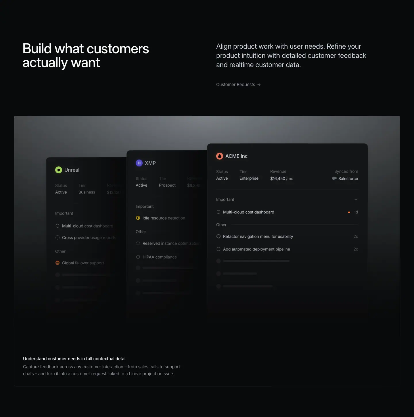
Layout
- Section crop: y=6205–7653.
- Grid bottom (6098) to H2 (6355) = 257 px.
- Header split: H2 x=78, y=6355. Paragraph x=752, y=6356. Link "Customer Requests →" at y=6487.
- Feature panel: x=48–1392, y=6607–7546 (939 tall).
- Three customer cards as a fanned stack: IMG x=160, y=6751, 560×656; x=440, y=6727, 560×680; x=720, y=6703, 560×704. Each card is 280 px further right, 24 px higher and 24 px taller than the one before. The rightmost card is in front.
- Caption H3 x=80, y=7439; description y=7467.
- No bento follows. Panel bottom (7546) to next H2 (7803) = 257 px.
Typography
- Header and caption tokens as §01.
- Card text ≈ 13px; customer names ≈ 15px ≈ measured from screenshot.
Color
- Spotlight panel.
- Each customer card has one colored logo dot: green "Unreal", indigo "XMP", orange-red "ACME Inc". A red-orange urgency triangle appears on one request row.
Visual / UI illustration
- Three customer profile cards: "Unreal" (Active, Business), "XMP" (Active, Prospect), "ACME Inc" (Active, Enterprise, Revenue "$16,450 /mo", "Synced from Salesforce").
- Each card lists requests under "Important" and "Other" (e.g. "Multi-cloud cost dashboard", "Refactor navigation menu for usability", "Add automated deployment pipeline").
- The bottom rows turn into grey skeleton bars, then fade. Rear cards are darker than the front card, which creates depth.
Copy
- H2: "Build what customers actually want" (5 words). "actually" adds a small, honest jab at guesswork.
- Paragraph: "Align product work with user needs. Refine your product intuition with detailed customer feedback and realtime customer data." (18 words). Two imperatives.
- Link: "Customer Requests →".
- Caption: "Understand customer needs in full contextual detail" (7 words) — "Capture feedback across any customer interaction – from sales calls to support chats – and turn it into a customer request linked to a Linear project or issue." (27 words)
Why it works
- Three cards fanned in depth say "many customers" at once. The front card carries revenue and tier, which is the data a PM uses to prioritize.
- Skeleton bars at the bottom imply more rows without inventing more text.
Reuse recipe
- Spotlight panel with 3 copies of one card type, offset +280 px x, −24 px y, +24 px height each; the front card is the rightmost and brightest.
- Put one decision-driving number (revenue) on the front card.
- End lists with 2–3 grey skeleton bars that fade out.
- Single-panel chapter: no bento; keep the 257 px gap to the next H2.
06 · Manage internal workplace requests (header + feature panel)
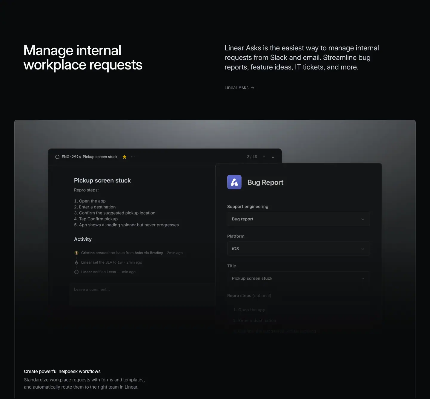
Layout
- Section crop: y=7653–8991.
- Header split: H2 x=78, y=7803. Paragraph x=752, y=7804. Link "Linear Asks →" at y=7935.
- Feature panel: x=48–1392, y=8055–8994 (939 tall).
- Two windows: issue IMG x=232, y=8244, 640×437; form IMG x=721, y=8200, 558×654. The form overlaps the issue and sits 44 px higher. In-UI header text at y=8171.
- Caption H3 x=80, y=8887; description y=8915.
Typography
- Header and caption tokens as §01.
- In-UI: "ENG-2994", "Pickup screen stuck" 12px / 16.8px · 510 · #d0d6e0; "/ 15" #62666d.
Color
- Spotlight panel.
- One indigo app icon on the form header (≈ #5e6ad2 family). A yellow star on the issue.
Visual / UI illustration
- Left: issue "Pickup screen stuck" with "Repro steps:" 1–5 and an Activity feed ("… created the issue from Asks via …", "Linear set the SLA to 2w", "Linear notified …").
- Right: a "Bug Report" form with select fields "Support engineering: Bug report", "Platform: iOS", "Title: Pickup screen stuck", "Repro steps (optional)". The lower fields fade.
- The form (input) and the issue (output) are both visible. Unlike §01, the output is on the left and the input on the right.
Copy
- H2: "Manage internal workplace requests" (4 words).
- Paragraph: "Linear Asks is the easiest way to manage internal requests from Slack and email. Streamline bug reports, feature ideas, IT tickets, and more." (23 words). A superlative claim ("the easiest way"), then an imperative with a 3-item list + "and more".
- Link: "Linear Asks →".
- Caption: "Create powerful helpdesk workflows" (4 words) — "Standardize workplace requests with forms and templates, and automatically route them to the right team in Linear." (17 words)
Why it works
- The form makes "internal requests" concrete for non-engineers. The issue next to it shows the request lands in the same system as engineering work.
- This chapter widens the buyer from product teams to the whole company, which is the last step before proof.
Reuse recipe
- Spotlight panel with a form window overlapping the resulting record window.
- Show 3–4 filled form fields; fade the rest.
- Paragraph: one superlative claim, then a list with "and more".
07 · Product nav + testimonials
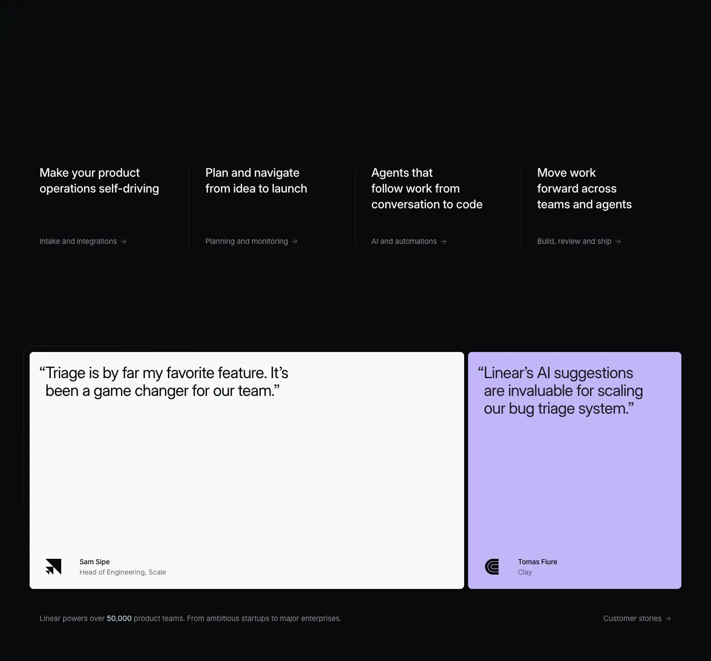
The crop starts with empty space below the §06 panel, then holds the 4-up product nav and the testimonial row.
Layout
- Full-width hairline at y=9124 (130 px below the panel bottom 8994).
- 4-up nav: columns at x=80, 416, 752, 1088 (336 px pitch). Titles y=9325 (201 px below the hairline). Links y=9468. Thin vertical dividers between columns ≈ measured from screenshot.
- Testimonials: two cards at y=9704, 480 tall. Card 1 x=60, w=880. Card 2 x=948, w=432. Gap 8 px. Radius 8px, padding 24px 32px. A thin outer frame (vertical line at x=47, y=9707–10137).
- Quotes at y=9728. Author name y=10118, title y=10139 (x=161 and x=1049), logo left of the name.
- Stats line y=10232; "Customer stories →" at x=1222.
Typography
- Nav titles: 24px / 31.92px · 510 · -0.288px · #f7f8f8, w=263. Nav links: 15px / 24px · 400 · #8a8f98.
- Quotes: 32px / 36px · 400 · -0.704px · #08090a.
- Author: 14px / 21px · 510 · -0.182px (name), 14px / 21px · 400 · -0.182px (title), #08090a base.
- Stats: 15px / 24px · 400 · #8a8f98, "50,000" 510 · #d0d6e0.
Color
- Card 1: #f7f8f8. Card 2: #c3b5f8 lavender. (On /ai the second card is lime #e4f222.) The accent card color changes per page; the layout does not.
Copy
- Nav (same on all product pages): "Make your product operations self-driving / Intake and integrations →", "Plan and navigate from idea to launch / Planning and monitoring →", "Agents that follow work from conversation to code / AI and automations →", "Move work forward across teams and agents / Build, review and ship →".
- Quote 1: "Triage is by far my favorite feature. It's been a game changer for our team." — Head of Engineering, Scale. On /ai the same name and quote carry the attribution "Head of Engineering, Coinbase" with a different logo. One of the two pages has a wrong attribution.
- Quote 2: "Linear's AI suggestions are invaluable for scaling our bug triage system." — attributed to a person at Clay.
- Stats: "Linear powers over 50,000 product teams. From ambitious startups to major enterprises."
Why it works
- Both quotes are about triage, which is the core of this page. The proof matches the chapter the reader just finished.
- The light cards are the only light surfaces on the page. They stop the scroll.
Reuse recipe
- Hairline, 201 px gap, 4-up nav with 24px w510 titles and grey "→" links.
- Two cards (880 + 432) with a neutral card and one per-page accent color.
- Pick quotes that name the page's main feature.
- Check attributions across pages before publishing.
08 · Built for the future. Available today. (final CTA)
Layout
- Section crop: y=10330–10899 (569 tall). H2 centered x=359, w=722, y=10480 (150 px top padding), 2 lines.
- Buttons at y=10664: "Get started" x=579, 127×44; "Contact sales" x=718, 144×44; 12 px gap.
Typography
- H2: 72px / 72px · 510 · -1.584px · #f7f8f8, centered.
- Buttons: 16px / 44px · 510.
Color
- Primary pill #e5e5e6 / #08090a, 1 px #e5e5e6 border, radius 9999px, padding 0 20px. Secondary pill rgba(255,255,255,0.05) / #f7f8f8, no border.
Copy
- "Built for the future. Available today." — identical to /ai.
Why it works
- The shared CTA makes every product page end the same way. Readers who jump between pages get one familiar exit.
Reuse recipe
- Identical to ai.md §08: 569 px block, 150 px top padding, centered 72/72 w510 H2, two 44 px pills 40 px below, 12 px apart.
09 · Footer
Layout
- Section crop: y=10899–11456 (557 tall). Hairline at y=10932.
- Same 5-column footer as /ai: columns at x=304, 528, 752, 976, 1200; headings 13px / 19.5px · 510 · #f7f8f8; links 13px · 400 · #8a8f98 at 30 px pitch; legal 13px · #62666d.
Reuse recipe
- See ai.md §09. Nothing on this page differs.
Page-level takeaways
- Same skeleton as
/ai, different story. Header split → 939 px spotlight panel → optional 2×2 grid, with 150 / 96 / 48 / 257 px spacing. The template carries the page; the visuals and copy carry the product.
- The paragraph previews the grid. §01 lists Slack, support and sales calls; the grid then shows those channels. Readers get a table of contents for each chapter.
- Two panel-only chapters (§05, §06) in a row shorten the second half and speed the reader to proof.
- Visual variety inside a fixed grid: UI crops, a connector diagram, a logo-to-logo waveform, an icon wall, a flame dial, a fanned card stack. The grid never changes; the content type changes per cell.
- Animation is hinted in the DOM: stacked command copies (rotating deck), SLA labels on an arc (rotating dial). Only one state is visible at a time.
- Copy closers repeat a promise: "No handoffs required." / "No prompts or clicks required." Titles name the unit of effort ("single command", "single click").
- Audience widens chapter by chapter: engineers → triage owners → PMs → the whole company.
- Proof matches the page topic: both testimonials talk about triage. The accent card is lavender
#c3b5f8 here, lime on /ai.
- Shared vocabulary across pages: "Automate the overhead" and "Put incoming issues on autopilot" appear on
/ai too, with the same visuals.
Section inventory
| # |
Section |
Pattern name |
Key values |
| 00 |
Hero |
Hero-left-video |
Video 1440×772; eyebrow 16/24; H1 72/72 w500 at x=78, y=572, w=679 |
| 01 |
Issue intake, fully automated |
Section-header-split + Feature-panel-spotlight |
H2 48/48 w510; P 24/31.92 #d0d6e0 at x=752; panel 1344×939 |
| 02 |
Intake channels |
Bento-2x2 |
Cells 672×597; visual 424; rotating composer deck; icon wall |
| 03 |
Manage incoming work with Triage |
Section-header-split + Feature-panel-spotlight |
Issue 640×512 + sidebar 296×581 |
| 04 |
Triage features |
Bento-2x2 |
Mono 13/19.5 #8a8f98 SLA labels on an arc |
| 05 |
Build what customers actually want |
Section-header-split + Feature-panel-spotlight (fanned cards) |
3 cards 560 wide, +280 x / −24 y each |
| 06 |
Manage internal workplace requests |
Section-header-split + Feature-panel-spotlight |
Form 558×654 over issue 640×437 |
| 07 |
Nav + proof |
Product-nav-4up + Testimonial-quote-2up |
Nav pitch 336; cards 880/432×480; accent #c3b5f8 |
| 08 |
Built for the future |
Final-CTA-centered |
H2 72/72 w510 centered; pills 44 tall |
| 09 |
Footer |
Footer-5col |
224 px pitch from x=304; 13px |
Reviews · linear.app/reviews
- URL: https://linear.app/reviews
<title>: Linear Reviews – Linear- Meta description: "A review experience for the agentic era. Review PRs, respond to feedback, iterate with coding agents, and merge approved work."
- Page height: 9,117px at 1440px width (≈ 60% of /plan and /build)
- Template: newer "product" template, used here for a single feature rather than a product area. Same left-aligned 72px H1 hero, same split headers, glow frames and bento. Differences: a taller hero, no "Feature →" links on the first two sections, a 613px bento row, no product-area cross-link strip, and a one-line final CTA.
- Page body background: #08090a.
Narrative arc. The page is a tight feature launch in five beats. It opens with the positioning claim ("The review platform for the agentic era"), then leads with the most novel capability, guided reviews that explain a PR (section 01). It then shows the everyday surface, the review inbox and diff (02), backs it with four supporting features in a bento (stacked PRs, GitHub sync, quick-review detection, code in context, 03). It returns to the agentic thesis with coding agents fixing review feedback (04), extends reach to mobile (05), and closes with two engineer quotes and a three-word CTA, "Experience the diff". The story goes "new idea → daily use → depth → AI loop → anywhere → proof → try it". It is shorter because it sells one feature, not a product area.

00 · Hero
Layout
- Full-bleed <video> DIFFS-v3 (AV1, crf28), x=0 y=0 w=1440 h=895, 123px taller than the plan/build hero video (772).
- Eyebrow at x=80, y=648. H1 at x=78, y=688, w=604, h=144 (two lines). Both sit 116px lower than on /plan and /build (532 / 572).
- Hero ends at the full-width 1px rgba(255,255,255,.08) hairline at y=967. H1 bottom (832) to hairline: 135px.
- Shared top nav: logo x≈80, y=20; links at x=741 to 1111; "Log in" x=1218; "Sign up" pill x=1288 (73×32).
Typography
- Eyebrow "Linear Reviews": 16px / 24px · 400 · normal · #f7f8f8.
- H1 "The review platform for the agentic era": 72px / 72px · 500 · -1.584px (-0.022em) · #f7f8f8.
- Nav 13px / 19.5px · 400 · #8a8f98; Sign up 13px · 510 · #08090a on #e5e5e6, radius 9999px.
Color
- Video: dark diff UI with teal/cyan identifiers, orange strings, purple keywords, green added-line bands and a green line-number gutter on the right. Low overall luminance.
Visual / UI illustration
- The same tilted, depth-of-field code-diff shot family as the /build hero (visible strings "Refactor notification model", "Diff", "Commits", DriverNotification, "+ 38 unchanged lines"), but a different, taller cut (DIFFS-v3). The sharp focal band runs diagonally from the left edge through the center. Real product UI, filmed as video.
Copy
- Eyebrow: "Linear Reviews" (2 words), the feature's product name.
- H1: "The review platform for the agentic era" (7 words). A category claim ("the review platform") plus a time frame ("the agentic era"). It is a noun phrase, not an imperative, unlike /plan and /build. A launch page claims a category; a product-area page describes an action.
- The meta description reuses the phrase "for the agentic era" and adds the four verbs (Review, respond, iterate, merge) that map to sections 01 to 04.
Why it works
- The taller hero (967 vs 844 to the hairline) gives a new feature more stage time and pushes the first section below the fold on a 900px viewport, so the hero reads alone.
- Reusing the diff footage from /build ties Reviews to the Build product area visually.
Reuse recipe
- For a single-feature launch page: hero video 1440×895, eyebrow at y≈648, H1 at y≈688, hairline at y≈967.
- H1 as a category claim: "The [category] for the [era/audience]", 7 words, 2 lines at w≈604.
- No buttons and no sub in the hero.
01 · Guided reviews help you understand PRs faster
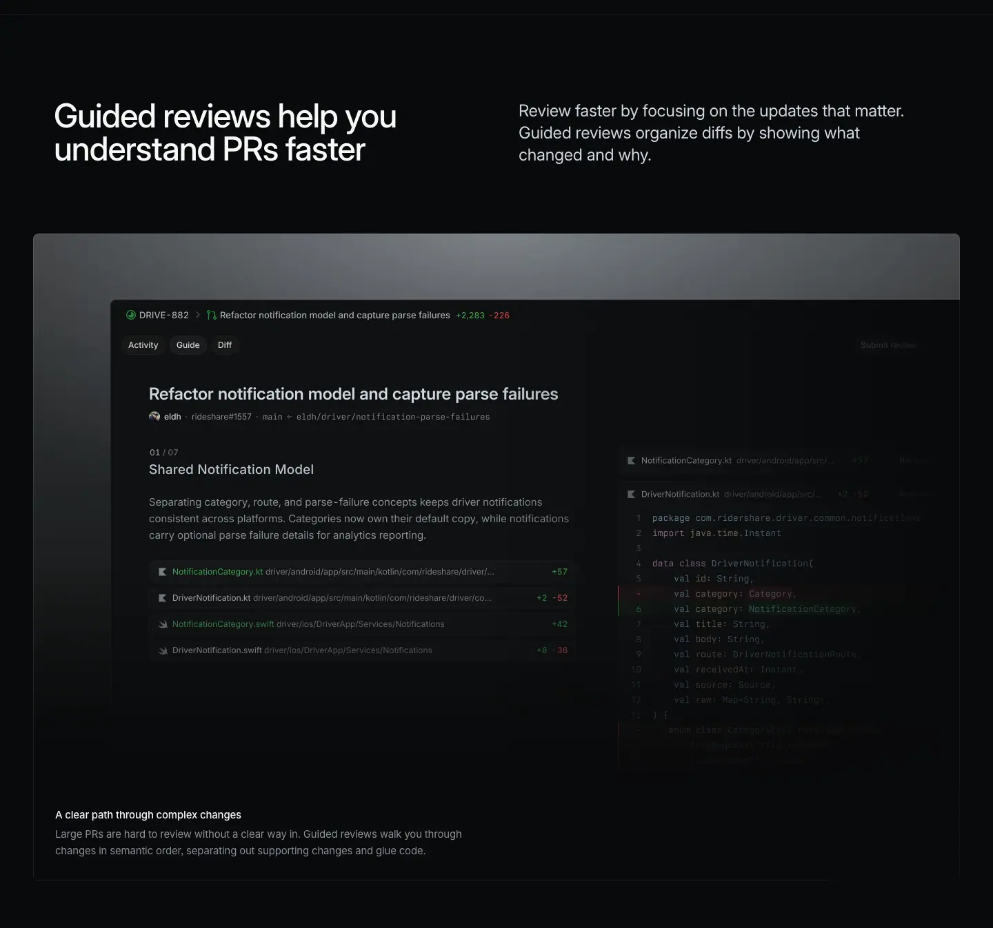
Layout
- Split header: H2 x=78, y=1096, w=542; sub x=752, y=1098, w=566. No "Feature →" link.
- Hairline (967) to H2: 129px. H2 to frame top (1285): 189px. With no link, the frame moves up 63px versus the 252px used when a link is present.
- Glow frame 1285 to 2224 (939px), x=48 to 1392. Top edge pixels rgb(91,93,95) at x=60 and rgb(135,140,144) at x=720, fading to black.
- <img> 1232×704 at x=160, y=1381 (frame top + 96). Right edge x=1392, flush with the frame edge, so the window bleeds out on the right.
- Caption H3 y=2117 (frame bottom - 107), body y=2145, x=80. A 1px frame bottom line measured at y=2224, ≈ rgba(255,255,255,.06).
Typography
- H2: 48px / 48px · 510 · -1.056px · #f7f8f8. Two lines.
- Sub: 24px / 31.92px · 400 · -0.288px · #d0d6e0. Three lines.
- Caption H3: 15px / 24px · 510 · -0.165px · #f7f8f8. Body: 15px / 24px · 400 · -0.165px · #8a8f98, w=624.
Color
- Glow frame greys. Diff accents: green and red line-count chips ("+2,283 -228", "+57", "+2 -52", "+42", "+6 -36"), green and red line gutters, a green PR state icon.
Visual / UI illustration
- The PR "Guide" tab: header "DRIVE-882 › Refactor notification model and capture parse failures +2,283 -228", tabs Activity / Guide / Diff, author line "eldh · rideshare#1557 · main ← eldh/driver/notification-parse-failures". Left: step "01 / 07 · Shared Notification Model", a paragraph that explains the change, four file rows. Right: the Kotlin diff of DriverNotification.kt, fading to the right.
- Same composition as /build section 08, but a different cut: here the step counter is "01 / 07" and the PR is "+2,283 -228" (on /build: "01 / 03", "+64 -41"). The bigger number sells "large PRs" for this page.
Copy
- H2: "Guided reviews help you understand PRs faster" (7 words). Subject, verb, benefit. Longer and more literal than the /build equivalent ("Reviews with direction").
- Sub: "Review faster by focusing on the updates that matter. Guided reviews organize diffs by showing what changed and why." (19 words). Same two ideas as /build, sentence order swapped: benefit first, mechanism second.
- Caption: "A clear path through complex changes" / "Large PRs are hard to review without a clear way in. Guided reviews walk you through changes in semantic order, separating out supporting changes and glue code." (28 words). Identical to /build.
Why it works
- The page opens with its most differentiated feature. A reader who stops after one section still gets the main idea.
- A literal H2 suits a feature page whose visitors arrive from a launch post and want to know exactly what it does.
- Dropping the link tightens the header-to-visual gap, so the visual arrives sooner.
Reuse recipe
- Header split as usual; omit the link and set frame top = H2 top + 189.
- Glow frame 1344×939; 1232×704 image at x=160 bleeding off the right edge.
- Caption pair at frame bottom-left, inset 32px.
- Reuse captions verbatim across pages when the feature is the same; change the H2 to fit the page.
02 · A fast and focused review experience (part 1: header + feature frame)
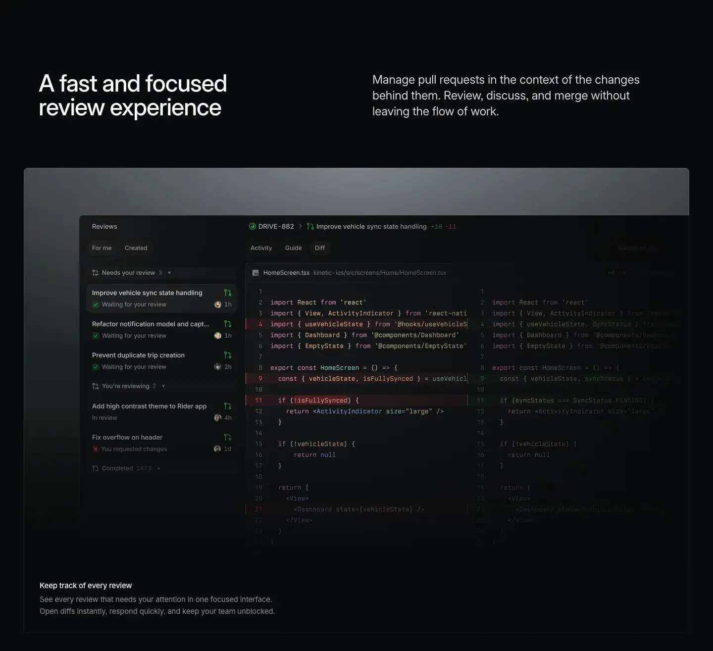
Layout
- Header: H2 y=2443, sub y=2445. No link. Previous frame bottom (2224) to H2: 219px (38px tighter than the 257px used on /plan and /build).
- Glow frame 2632 to 3571 (939px); H2 to frame: 189px.
- <img> 1232×704 at x=160, y=2728, bleeding right.
- Caption H3 y=3464, body y=3492.
Typography
- Standard header and caption values (see section 01).
Color
- Glow frame. Green PR icons, a red "x" for "You requested changes", red and green diff gutters.
Visual / UI illustration
- The review inbox plus split diff: list "Reviews" (For me / Created), "Needs your review 3", "You're reviewing 2", "Completed 1473"; PR "DRIVE-882 › Improve vehicle sync state handling +18 -11"; Activity / Guide / Diff tabs; HomeScreen.tsx side-by-side diff. The same image composition as /build section 06.
Copy
- H2: "A fast and focused review experience" (6 words). On /build this string is the caption H3; here it is promoted to the section H2.
- Sub: "Manage pull requests in the context of the changes behind them. Review, discuss, and merge without leaving the flow of work." (21 words). A variant of the /build sub ("…the work behind them… without switching tools.").
- Caption: "Keep track of every review" (5 words) / "See every review that needs your attention in one focused interface. Open diffs instantly, respond quickly, and keep your team unblocked." (21 words). The body is identical to /build; the title is new because the old title moved up to H2.
Why it works
- Shows the core daily surface right after the novel feature, so a reader sees "new idea" then "where I'll live every day".
- Promoting a caption to an H2 is cheap content reuse that still reads naturally on a narrower page.
Reuse recipe
- Same glow frame + bleed-right image.
- When adapting a section from a broader page to a feature page, promote the caption to H2 and write a new caption title.
03 · A fast and focused review experience (part 2: 2x2 bento)
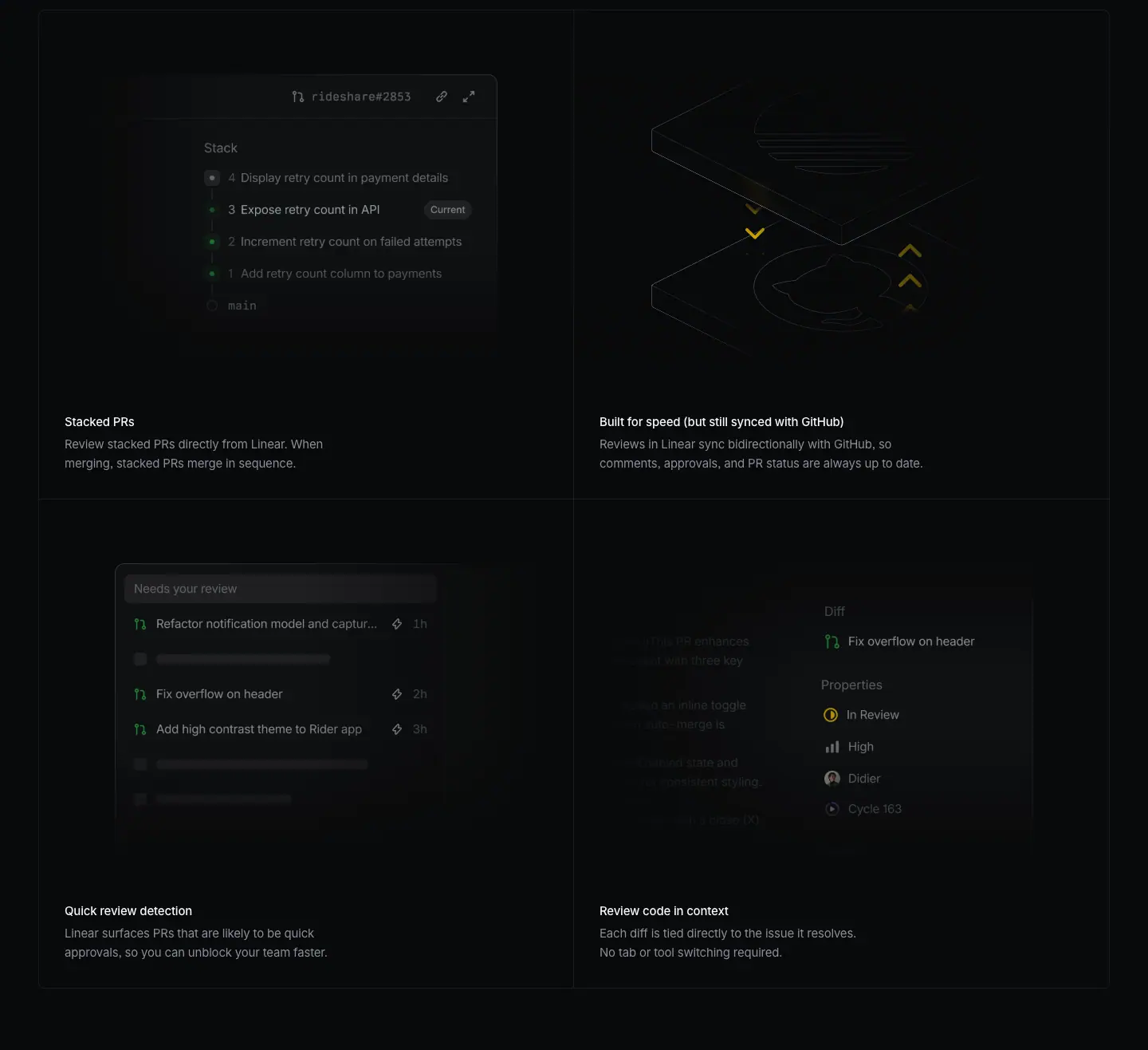
Layout
- 2x2 grid. Horizontal lines at y=3620, 4233, 4846; verticals at x=48, 719, 1391 (1px rgba(255,255,255,.08)). Feature frame bottom (3571) to grid: 49px.
- Rows are 613px, 16px taller than on /plan and /build (597px).
- Visuals at cell top + 49 (16px lower than the +33 on other pages): <img> 672×424 at y=3669 (x=48, Stacked PRs), y=4282 (x=48 and x=720). The top-right cell has no <img>; its isometric drawing is HTML/SVG.
- Captions at cell top + 505: H3 y=4125 and y=4738, body 28px below, x=81 and 752. Bottom padding 32px.
Typography
- H3 15px / 24px · 510 · -0.165px · #f7f8f8; body 15px / 24px · 400 · -0.165px · #8a8f98.
- In-visual (≈ from screenshot): "ridesharе#2853" ≈ 12px mono; stack rows ≈ 13px #d0d6e0; "Current" badge ≈ 11px in a grey pill.
Color
- No cell fills. Green status dots in the stack; yellow chevrons in the GitHub-sync drawing (the only warm accent in the grid); green PR icons and lightning-bolt "quick" icons in the detection list.
Visual / UI illustration
- "Stacked PRs": a stack panel headed by a PR id, list "Stack": 4 Display retry count in payment details, 3 Expose retry count in API (badge "Current"), 2 Increment retry count on failed attempts, 1 Add retry count column to payments, then "main". A vertical rail of dots connects the items.
- "Built for speed (but still synced with GitHub)": the isometric two-slab line drawing from /build section 05 (Linear on top, GitHub Octocat below), cropped large so it fills the cell and runs off its top and right edges. Chevrons are yellow here (down on the left, up on the right) to show two-way sync.
- "Quick review detection": a "Needs your review" list with three PRs marked by a lightning icon (Refactor notification model and captur… 1h; Fix overflow on header 2h; Add high contrast theme to Rider app 3h) between grey skeleton rows. Skeleton bars stand in for non-quick PRs, so the quick ones stand out.
- "Review code in context": the issue sidebar with "Diff · Fix overflow on header" and Properties (In Review, High, Didier, Cycle 163). The same image asset as /build section 07.
Copy
- "Stacked PRs" / "Review stacked PRs directly from Linear. When merging, stacked PRs merge in sequence." (13 words)
- "Built for speed (but still synced with GitHub)" / "Reviews in Linear sync bidirectionally with GitHub, so comments, approvals, and PR status are always up to date." (18 words). The parenthetical answers the reader's first objection inside the title.
- "Quick review detection" / "Linear surfaces PRs that are likely to be quick approvals, so you can unblock your team faster." (17 words)
- "Review code in context" / "Each diff is tied directly to the issue it resolves. No tab or tool switching required." (16 words). Identical to /build.
- Titles are short noun phrases (2 to 3 words) except the one that handles an objection.
Why it works
- Each cell resolves a power-user question (stacks? GitHub source of truth? what can I approve fast? where is the context?). The bento acts as an FAQ in visual form.
- Skeleton rows in "Quick review detection" are a smart contrast device: grey bars make the three real rows read as "filtered for you".
- The yellow chevrons are the single warm accent in the section and mark the most important trust message (GitHub sync).
Reuse recipe
- 2x2 grid, 1px .08 lines, 613px rows, visuals 672×424 at +49, captions at +505.
- Use a parenthetical title to pre-empt one objection.
- Use skeleton placeholder rows to emphasize the items a feature selects.
- Reuse a diagram from a sibling page at a larger crop and with one accent color added.
04 · Iterate with coding agents
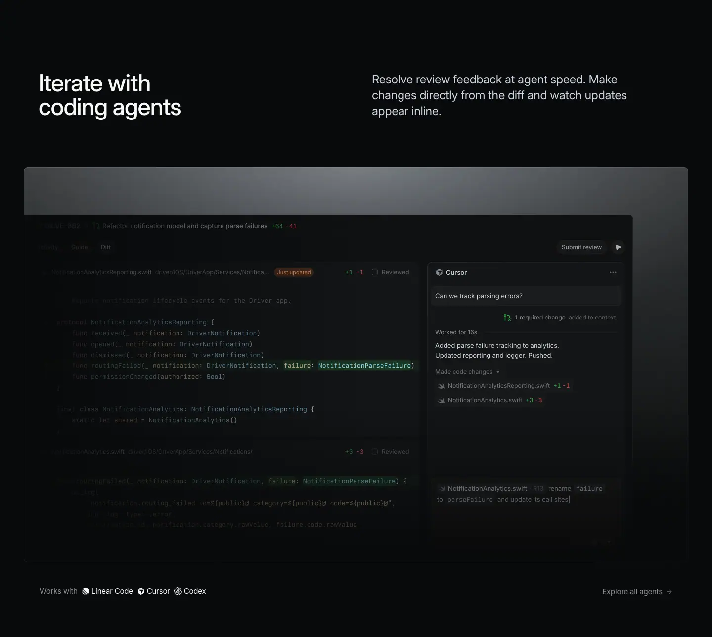
Layout
- Header: H2 y=5074, sub y=5075. No link. Grid bottom (4846) to H2: 228px. H2 to frame top (5263): 189px.
- Glow frame 5263 to 6062 (799px, shorter than the 939px standard). Top edge pixels rgb(84,87,89) at x=60, rgb(132,136,140) at x=720.
- <img> 1232×704 at x=48, y=5359 (frame top + 96). This one is anchored to the frame's left edge (x=48) and ends at x=1280, so it bleeds off the left side, the mirror of sections 01 and 02.
- No caption inside the frame. Instead, a "Works with" row 47px under the frame at y=6109: "Works with" at x=80, then three agent names with icons at x=185, 297, 372; "Explore all agents →" right-aligned at x=1218 (right edge 1340).
- The DOM has linear-gradient(to right, rgba(0,0,0,0), #08090a) and linear-gradient(to left, …) masks, used for horizontal edge fades.
Typography
- H2 / sub: standard.
- "Works with" and "Explore all agents →": 15px / 24px · 400 · -0.165px · #8a8f98.
- Agent names "Linear Code", "Cursor", "Codex": 15px / 24px · 400 · -0.165px · #f7f8f8, each with a ≈ 14px monochrome logo (≈ from screenshot).
Color
- Glow frame. In the visual: an orange "Just updated" badge, green and red line counts, a green highlight on the changed code tokens, a green "1 required change" icon.
Visual / UI illustration
- Left (faded): the diff of NotificationAnalyticsReporting.swift with a "Just updated" badge, "+1 -1", a "Reviewed" checkbox, highlighted failure: NotificationParseFailure. Second file below, faded further.
- Right: a Cursor agent panel. User message "Can we track parsing errors?", "1 required change added to context", "Worked for 18s", reply "Added parse failure tracking to analytics. Updated reporting and logger. Pushed.", "Made code changes" with two file rows (+1 -1, +3 -3). At the bottom, a composer with a file chip and "rename failure to parseFailure and update its call sites". A "Submit review" button and send icon at the top right of the window.
- The visual shows the full loop: review comment → agent change → updated diff.
Copy
- H2: "Iterate with coding agents" (4 words). Verb-first.
- Sub: "Resolve review feedback at agent speed. Make changes directly from the diff and watch updates appear inline." (17 words). A close rewrite of the /build cell "Iterate with agents".
- Works-with row: "Works with · Linear Code · Cursor · Codex" and "Explore all agents →". It names supported agents without a logo wall.
Why it works
- Mirroring the bleed (left instead of right) gives the agent panel, which sits on the right, the focus.
- The "Works with" line replaces a caption with proof of compatibility. It is short enough to read as a footnote, so it does not compete with the visual.
- A shorter frame (799px) speeds up the page toward the close.
Reuse recipe
- Glow frame 1344×799; 1232×704 image anchored at the frame's left edge (bleed left) when the focal panel is on the right.
- Replace the caption with a one-line "Works with" row 47px below the frame: grey label, white names with 14px logos, right-aligned "Explore all →".
- Show the full loop (request → agent work → result) in one window.
05 · Keep reviews moving. Wherever you are. (mobile + testimonials + scale line)
This crop holds three blocks: the mobile section, the testimonial pair and the scale line.
05a · Mobile
Layout
- Header: H2 y=6364, sub y=6365, link "Download Linear Mobile →" y=6496. "Works with" row bottom (6133) to H2: 231px. H2 to frame: 252px (link present).
- Frame 6616 to 7416 (800px), x=48 to 1392. Fill is the page black #08090a, with a 1px border measured rgb(37,38,39) (≈ rgba(255,255,255,.12)). No glow.
- One <img> 1344×800 at x=48, y=6616, filling the frame exactly.
Typography
- H2: 48px / 48px · 510 · -1.056px · #f7f8f8 (two lines, one sentence per line).
- Sub: 24px / 31.92px · 400 · -0.288px · #d0d6e0.
- Link: 15px / 24px · 400 · #8a8f98.
Color
- Black frame, a dark phone, a soft rim light along the phone edge. Inside the phone: green added-code lines, red/green "+1,293 -938" counts.
Visual / UI illustration
- A 3D render of an iPhone, rotated ≈ 30 degrees and tilted back (≈ measured from screenshot), floating in black. The screen shows a PR "iPhone Duo Compatibility" with tabs Overview / Guide / Diffs, the file ButtonTransition.swift, and Swift code with green added lines. The phone's lower part falls off into darkness.
- This is the only device render on the page and the only frame without a glow; the black frame lets the phone's own rim light carry it.
Copy
- H2: "Keep reviews moving. Wherever you are." (6 words, 2 sentences of 3). Same rhythm as "Built for the future. Available today.": imperative, then a place/time fragment.
- Sub: "Get notified, scroll through guided reviews, respond to review agents, and merge approved work. All from your phone." (18 words). A 4-verb list in the order of the review loop, then a 4-word fragment as the payoff.
- Link: "Download Linear Mobile →". The only action-verb link on the page.
05b · Testimonial pair
Layout
- Cards top ≈ y=7556 (quote at 7580 minus 24px padding), height 480, left x=60 w=880, right x=948 w=432, 8px gap, radius 8px, padding 24px 32px. Mobile frame bottom (7416) to cards: ≈ 140px.
- Quote at x=92 and x=980 with a hanging opening quote mark. Names at y=7970, roles at y=7991, x=161 and x=1049; logos at x≈100.
Typography
- Quote: 32px / 36px · 400 · -0.704px · #08090a.
- Name: 14px / 21px · 510 · -0.182px · #08090a. Role: 14px / 21px · 400 · -0.182px · #08090a.
Color
- Left card: linear-gradient(rgb(213,227,248) 0%, rgb(234,242,255) 100%), pale blue, with a large faint logo watermark on its right half.
- Right card: #f7f8f8.
Copy
- Left: "Having the context of an issue, the agents that worked on it, and the diff in a single view is the most ergonomic experience we've ever had." (27 words) · Jake Reynolds, Head of Engineering, Coalition Security.
- Right: "Linear Reviews have actually been life changing. I can't imagine any other way anymore." (14 words) · Armaan Aggarwal, Engineering, Replit.
- The left quote restates the page's thesis (issue + agents + diff in one view) in a customer's words. The right quote is pure emotion. One rational, one emotional.
05c · Scale line
Layout / Typography / Copy
- y=8084 (48px under the cards). "Linear powers over 50,000 product teams. From ambitious startups to major enterprises." 15px / 24px · 400 · #8a8f98, "50,000" 510 · #d0d6e0. "Customer stories →" right at x=1222.
Why it works (whole crop)
- The mobile render is a mood change before the close: one object, lots of black, no UI chrome. It signals "this goes with you".
- The page skips the product-area cross-link strip used on /plan and /build. On a feature page, the next step is "try it", not "browse other areas", so the testimonials follow the last feature directly.
- Pale blue left card ties to the indigo/blue product color without using the saturated accent.
Reuse recipe
- Device section: black frame 1344×800 with a 1px ≈ rgba(255,255,255,.12) border, one full-frame 3D device render, no caption.
- H2 as two 3-word sentences, one per line.
- Testimonial pair 880 + 432, 8px gap, 480 tall; one gradient card (pale blue #d5e3f8 → #eaf2ff) and one #f7f8f8 card; 32/36 near-black quotes.
- Pick one quote that restates the thesis and one that is emotional.
06 · Experience the diff (final CTA)

Layout
- Section 8157 to 8560 (403px, 166px shorter than the 569px CTA on /plan and /build).
- H2 one line, centered: x=436, w=568, y=8307, h=72. Scale line (8084) to H2: 223px.
- Buttons at y=8419 (40px under the H2 bottom 8379): "Get started" x=584 w=127; "Talk to sales" x=723 w=134; 12px gap.
- Buttons bottom (8463) to footer border (8593): 130px (versus 224px on /plan and /build).
Typography
- H2: 72px / 72px · 510 · -1.584px · #f7f8f8, centered, one line.
- Buttons: 16px / 44px · 510, radius 9999px, padding 0 20px.
Color
- Primary: #e5e5e6 fill, #08090a text, 1px #e5e5e6 border. Secondary: rgba(255,255,255,.05) fill, #f7f8f8 text.
Copy
- H2: "Experience the diff" (3 words). A pun: "diff" is the code artifact and short for "difference". It replaces the shared "Built for the future. Available today." with a page-specific line.
- Buttons: "Get started" and "Talk to sales" (not "Contact sales" as on /plan and /build). Same intent, warmer verb.
Why it works
- A one-line, 3-word H2 is the shortest heading on the page; it lands as a punchline after the quotes.
- A custom CTA headline makes the feature page feel like a launch, not a template instance.
Reuse recipe
- Centered 72/72 510 one-line H2 (≤ 4 words, ≈ 568px wide) with a domain pun.
- 40px gap, pill pair 44px tall, 12px apart; ≈ 150px space above, ≈ 130px below.
07 · Footer
Layout
- 1px #23252a border at y=8593. Logo at x≈80. Five columns at x=304, 528, 752, 976, 1200 (224px pitch). Headings ≈ 57px below the border; links on a 30px rhythm; legal row (Privacy, Terms, Other Policies) ≈ 448px below the border.
Typography
- Headings 13px / 19.5px · 510 · -0.13px · #f7f8f8; links 13px / 19.5px · 400 · -0.13px · #8a8f98; legal 13px · #62666d.
Copy
- Same as /plan and /build: Product (Intake, Plan, AI, Build, Pricing, Security), Features (Asks, Agents, Cloud Coding Agent, Customer Requests, Insights, Mobile, Reviews, Integrations, Changelog), Company (About, Customers, Careers, Now, Method, Quality, Brand), Resources (Switch, Download, Documentation, Developers, Enterprise, Startups, Status, Legal), Connect (Contact us, Community, X (Twitter), GitHub, YouTube).
Why it works / Reuse recipe
- Unchanged shared footer. Copy the 5-column, 3-tone, 13px spec.
Page-level takeaways
- A single-feature page uses the product template with small, deliberate changes: taller hero (967 vs 844), no "Feature →" links in the first two sections (frame at H2 + 189 instead of + 252), tighter section gaps (219 to 231px instead of 257), no cross-link strip, and a shorter one-line CTA.
- Content is heavily reused from /build: identical captions ("A clear path through complex changes", "See every review that needs your attention…", "Review code in context"), the same image asset for "Review code in context", the same isometric Git diagram, the same diff hero footage. The page is a re-cut, not a rewrite.
- Re-cut technique: promote a caption to an H2, rewrite the sub with the same ideas in a different order, and swap one number in the visual ("+2,283 -228" instead of "+64 -41") to fit the new angle.
- Image bleed direction follows the focal point: right-bleed for the guided and inbox views (focus on the left list), left-bleed for the agent view (focus on the right panel).
- Headings move from literal (sections 01 to 04) to rhythmic (05 "Keep reviews moving. Wherever you are.") to punning (06 "Experience the diff"). The tone loosens as the reader nears the CTA.
- Accent use stays rationed: yellow chevrons appear once (GitHub sync), orange once ("Just updated"), green/red only in diffs.
- The "Works with" row is a lightweight alternative to a logo wall: one line, grey label, white names, a right-aligned "Explore all agents →".
- The 2x2 bento here uses 613px rows and visuals at +49, a 16px variant of the 597px / +33 grid on the other pages. The grid is not a hard-coded component; spacing flexes per page.
Section inventory
| # |
Section |
Pattern name |
Key values |
| 00 |
Hero |
Hero-left-video (tall) |
video 1440×895; eyebrow 16/24 y=648; H1 72/72 500 -1.584px x=78 y=688 w=604; hairline y=967 |
| 01 |
Guided reviews help you understand PRs faster |
Section-header-split (no link) + Glow-frame-feature (bleed right) |
H2 48/48 510; sub 24/31.92 #d0d6e0 x=752; frame at H2+189, 1344×939; img 1232×704 x=160 |
| 02 |
A fast and focused review experience (p1) |
Section-header-split (no link) + Glow-frame-feature (bleed right) |
same frame; caption 15/24 510 + 400 #8a8f98 |
| 03 |
A fast and focused review experience (p2) |
Bento-2x2 |
rows 613; visuals 672×424 at +49; captions at +505; yellow chevrons in one cell |
| 04 |
Iterate with coding agents |
Section-header-split (no link) + Glow-frame-feature (bleed left) + Works-with row |
frame 1344×799; img 1232×704 x=48; row 15px #8a8f98 + #f7f8f8 names, 47px under frame |
| 05 |
Keep reviews moving. Wherever you are. + closers |
Section-header-split + Device-render-frame + Testimonial-quote (pair) + Stat-line |
black frame 1344×800, 1px ≈ .12 border; cards 880+432, gradient #d5e3f8→#eaf2ff / #f7f8f8; quote 32/36 400 #08090a |
| 06 |
Experience the diff |
Final-CTA-centered (one line) |
H2 72/72 510 w=568; pills 44px; "Get started" / "Talk to sales"; section 403px |
| 07 |
Footer |
Footer-5col |
#23252a border; columns at x 304/528/752/976/1200; 13/19.5 |
Agents — linear.app/agents
- URL: https://linear.app/agents
<title>: Linear for Agents- Meta description: Build and deploy AI agents that work alongside you as teammates.
- Page height: 6,059 px at 1440 px wide
- Body background:
#08090a
- Template: a hybrid. The hero is left-aligned like the product template, but it is a classic "feature" hero: 13px grey eyebrow, 72px/72px w510 H1 (not w500), a 17px grey sub-paragraph, and a pill CTA button, above a horizontal carousel of agent chat windows. The body reuses product-template blocks (split section header, 2×2 bento) and adds a 3-up colored partner-card row and a 6-item partner list. The page ends with its own small centered CTA (48px H2 + illustration), not the shared "Built for the future" block. No testimonials and no 4-up product nav.
Narrative arc. The page is a short feature page (4 sections + footer) for agents as workspace members. The hero states the idea ("Artificial colleagues. Natural collaboration.") and shows it at once: a strip of live agent chat windows. Section 01 explains how agents fit the workflow (assign, delegate, observe, orchestrate) and answers the accountability worry. Section 02 shows which agents exist (Linear's own plus partners), from three featured cards to a long tail list. Section 03 invites developers to build their own agents. The arc goes: concept → mechanics → catalog → platform. It ends with a developer CTA, not a sales CTA.
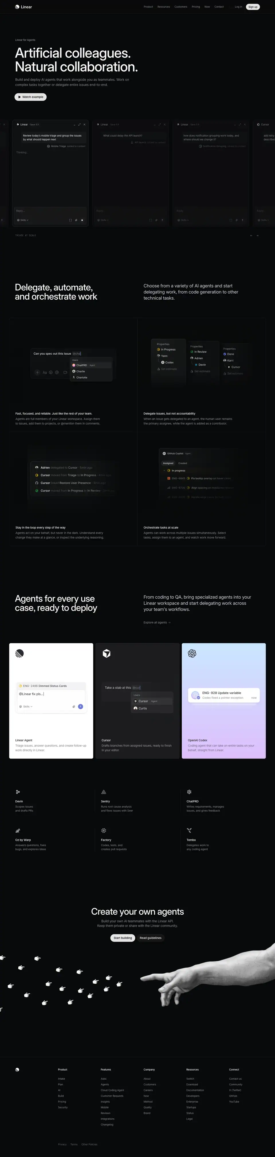
00 · Hero
Layout
- Section crop: y=0–1336.
- Text block, left-aligned:
- Eyebrow at x=80, y=200.
- H1 at x=78, y=240, w=644, h=144 (2 lines as 2 spans at y=240 and y=312).
- Sub-paragraph at x=80, y=404, w=600, 2 lines (h=54). H1 bottom (384) to sub = 20 px.
- Button "Watch example" at x=76, y=488, 168×40. Sub bottom (458) to button = 30 px.
- Carousel strip: full-bleed row of chat windows. Card top and bottom edges detected at y=627 and y=1186 (559 tall). Each card is 400 px wide with a 20 px gap (420 px pitch); visible card left edges at x=64, 484, 904, 1324 (the 4th is cut by the viewport). A 5th card peeks in from the left (right edge at x≈43). Button bottom (528) to strip top = 99 px.
- The DOM holds 35 cards from x=−5773 to x=8507 at 420 px pitch: 7 unique prompts repeated 5 times. This is an infinite-loop carousel.
- Below the strip: a mono caption at x=80, y≈1226, and ← → arrow buttons at the right edge (≈ x=1316 and x=1348) ≈ measured from screenshot.
- Strip bottom (1186) to section end (1336) = 150 px.
Typography
- Eyebrow "Linear for Agents": 13px / 19.5px · 510 · -0.13px · #8a8f98.
- H1: 72px / 72px · 510 · -1.584px (-0.022em) · #f7f8f8. Weight 510, unlike the w500 H1 on /ai and /intake.
- Sub: 17px / 27.2px (1.6) · 400 · normal · #8a8f98.
- Button: 15px / 40px · 510 · #08090a on #e5e5e6, 1 px #e5e5e6 border, radius 9999px, padding 0 16px, leading play-triangle icon.
- Card header agent name: 13px / 20px · 500 · #d0d6e0. Model badge "Opus 5.5": 11px / 14px · 400 · #8a8f98.
- User prompt bubble: 13px / 20px · 400 · -0.039px · #f7f8f8, w=342.
- Context chip: 12px / 14px · 400 · #8a8f98 + "added to context" in #62666d.
- Agent answer: 13px / 20px · 400 · #d0d6e0; issue IDs 13px / 19.5px · #8a8f98; issue titles 13px / 16px · 500 · #d0d6e0; "Worked for 8 sec" 12px / 16px · #8a8f98.
- Composer placeholder "Reply…": 13px / 20px · 400 · #62666d. "Skills" button: 12px / 16px · #8a8f98.
- Caption under the strip: Berkeley Mono 12px / 16.8px · 400 · #62666d, uppercase.
Color
- Card surface #0f1011 (pixel (150, 900)); conversation area slightly darker #0c0c0e; composer area #171718 ≈ measured from screenshot.
- Card borders: rgba(255,255,255,0.08) and rgba(255,255,255,0.12) hairlines (36 borders of .12 on the page; the active card reads brighter).
- No accent color in the hero except the white CTA pill.
Visual / UI illustration
- Each card is a compact agent chat window: header (agent icon + name + model badge, then minimize / expand / close glyphs), the user's prompt as a right-aligned bubble, a context chip ("Mobile Triage added to context"), the agent's reply area, and a composer ("Reply…", Skills, attach, send).
- The 7 prompts cover the use cases: permissions requests → Access Controls project; mobile triage grouping; "What could delay the API launch?"; notification grouping; Cursor "add retry handling for failed image uploads"; ChatPRD "review this issue, draft complete offline mode requirements, and break the work into sub-issues"; Linear "Fix the dimmed ride rows that never reset and open a PR".
- Captured mid-animation. In the screenshot, the front card shows "Thinking…" and the other cards show only the prompt with an empty body. The DOM snapshot, taken at a different moment, shows the first card with a finished answer ("Worked for 8 sec · Three issues ranked by customer impact: ENG-2298 Add granular project permissions, ENG-2647 Let guests access multiple teams, ENG-2352 Create custom roles with scoped access · I've added them to Access Controls"). Replies stream in per card, then the strip advances.
- The caption under the strip also changes per slide: the DOM reads "IDENTIFY URGENT TASKS"; the screenshot reads "TRIAGE AT SCALE".
- Real Linear chat UI, staged data, not a video.
Copy
- Eyebrow: "Linear for Agents" (3 words).
- H1: "Artificial colleagues. Natural collaboration." (4 words). Two parallel "adjective noun." fragments with an antonym pair. The same line is the first H2 on /ai.
- Sub: "Build and deploy AI agents that work alongside you as teammates. Work on complex tasks together or delegate entire issues end-to-end." (22 words). Two imperatives. The second sentence offers two modes: collaborate or delegate.
- Button: "Watch example" (2 words, verb-first).
- Prompts are written in real user voice: lowercase starts, "pls", questions. That makes the windows feel used, not designed.
Why it works
- A slogan H1 needs proof right away. The carousel puts 3+ live agent conversations in the first viewport, so the abstract word "colleagues" gets concrete tasks.
- Streaming answers ("Thinking…" → answer) show the agent working in real time. Motion tells the story; the copy does not need to.
- The strip is full-bleed and cut at both edges. That signals "there are more" and invites the arrow controls.
- A grey 17px sub (not #d0d6e0) keeps the H1 dominant. The single white pill is the only bright control above the fold.
Reuse recipe
- Text block at x=78–80: eyebrow 13px w510 #8a8f98 → 40 px → H1 72/72 w510 → 20 px → sub 17/27.2 #8a8f98 (w≈600) → 30 px → 40 px pill button with icon.
- Full-bleed strip ≈100 px below the button: 400×559 cards, 20 px gap, partial cards at both edges.
- Card anatomy: 13px header with model badge, prompt bubble, context chip, streaming reply, composer.
- Loop 7 real prompts; stream each reply; advance on a timer; show a mono caption + ← → controls under the strip.
01 · Delegate, automate, and orchestrate work
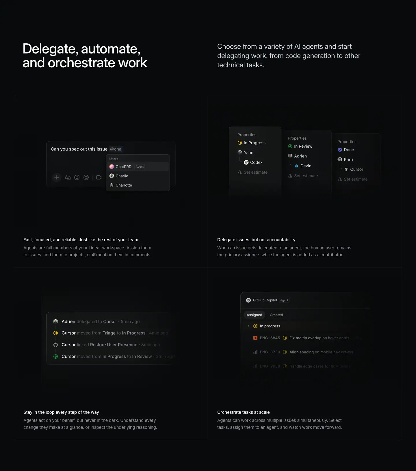
Layout
- Section crop: y=1336–2966.
- Header split: H2 at x=78, y=1486 (150 px from the crop top), w=542, 2 lines. Paragraph at x=752, y=1488, w=566, 3 lines (ends 1569). No link.
- 2×2 grid box: x=48–1392, y=1665–2859 (paragraph bottom to grid = 96 px). Column split x=720. Row split y=2262. Cells 672×597.
- Images in all 4 cells: x=48 and x=720 at y=1698 and y=2295, 672×424.
- Titles at y=2154 and y=2751 (x=81 and x=752). Descriptions 28 px below, 2 lines.
- No feature panel above the grid. This chapter goes straight from header to bento.
Typography
- H2: 48px / 48px · 510 · -1.056px · #f7f8f8.
- Paragraph: 24px / 31.92px · 400 · -0.288px · #d0d6e0.
- Titles: 15px / 24px · 510 · -0.165px · #f7f8f8. Descriptions: 15px / 24px · 400 · -0.165px · #8a8f98.
Color
- Grid: near-black cells with faint white overlay; 1 px hairlines.
- Status icons only: yellow "In Progress", green "In Review", blue "Done", red priority on one row.
Visual / UI illustration
- Cell 1 "Fast, focused, and reliable…": a composer with "Can you spec out this issue @cha" and a mention dropdown. Group "Users": "ChatPRD [Agent]" (highlighted), "Charlie", "Charlotte". Agents and people appear in the same list.
- Cell 2 "Delegate issues, but not accountability": three property panels side by side, each with a status, a human assignee, and an agent nested under the human with a tree line (Yann → Codex; Adrien → Devin; Karri → Cursor). Then "Set estimate". The nesting draws the policy: the human stays primary.
- Cell 3 "Stay in the loop…": an activity log. "Adrien delegated to Cursor · 5min ago", "Cursor moved from Triage to In Progress", "Cursor linked Restore User Presence", "Cursor moved from In Progress to In Review". Timestamps fade to the right.
- Cell 4 "Orchestrate tasks at scale": an agent profile "GitHub Copilot [Agent]" with tabs "Assigned / Created" and an "In progress" group of issues (ENG-6845 "Fix tooltip overlap on hover cards", ENG-6730 "Align spacing on mobile nav drawer", a third faded row).
- All 4 are small, real-UI fragments centered in the 424 px visual area, faded at right and bottom.
Copy
- H2: "Delegate, automate, and orchestrate work" (5 words). A verb tricolon with an Oxford comma. Each verb is a bigger scope than the last.
- Paragraph: "Choose from a variety of AI agents and start delegating work, from code generation to other technical tasks." (18 words). The DOM contains soft hyphens (­) before "delegating" and "technical" to control line breaks.
- "Fast, focused, and reliable. Just like the rest of your team." — "Agents are full members of your Linear workspace. Assign them to issues, add them to projects, or @mention them in comments." (21 words). The title is 2 sentences and the longest title on the page (11 words). It flatters the reader's team.
- "Delegate issues, but not accountability" — "When an issue gets delegated to an agent, the human user remains the primary assignee, while the agent is added as a contributor." (23 words). The title is a contrast ("X, but not Y"). The description states the rule exactly.
- "Stay in the loop every step of the way" — "Agents act on your behalf, but never in the dark. Understand every change they make at a glance, or inspect the underlying reasoning." (23 words). Again "X, but never Y".
- "Orchestrate tasks at scale" — "Agents can work across multiple issues simultaneously. Select tasks, assign them to an agent, and watch work move forward." (19 words). Three imperative steps.
Why it works
- The four cells map the agent lifecycle: mention → delegate → observe → scale. A reader learns the mechanics in reading order.
- Two of four titles use a "but not / but never" contrast. They address the main fear (losing control) directly.
- Skipping the spotlight panel keeps this short page fast. The grid alone carries the chapter.
Reuse recipe
- Header split without a link; grid 96 px below the paragraph.
- 2×2 grid of 672×597 cells; visual 424 tall; 15px title + 15px grey 2-line description.
- Show agents and humans in the same UI controls (mention list, assignee field) to make "teammate" literal.
- Use one "X, but not Y" title to answer the strongest objection.
02 · Agents for every use case, ready to deploy
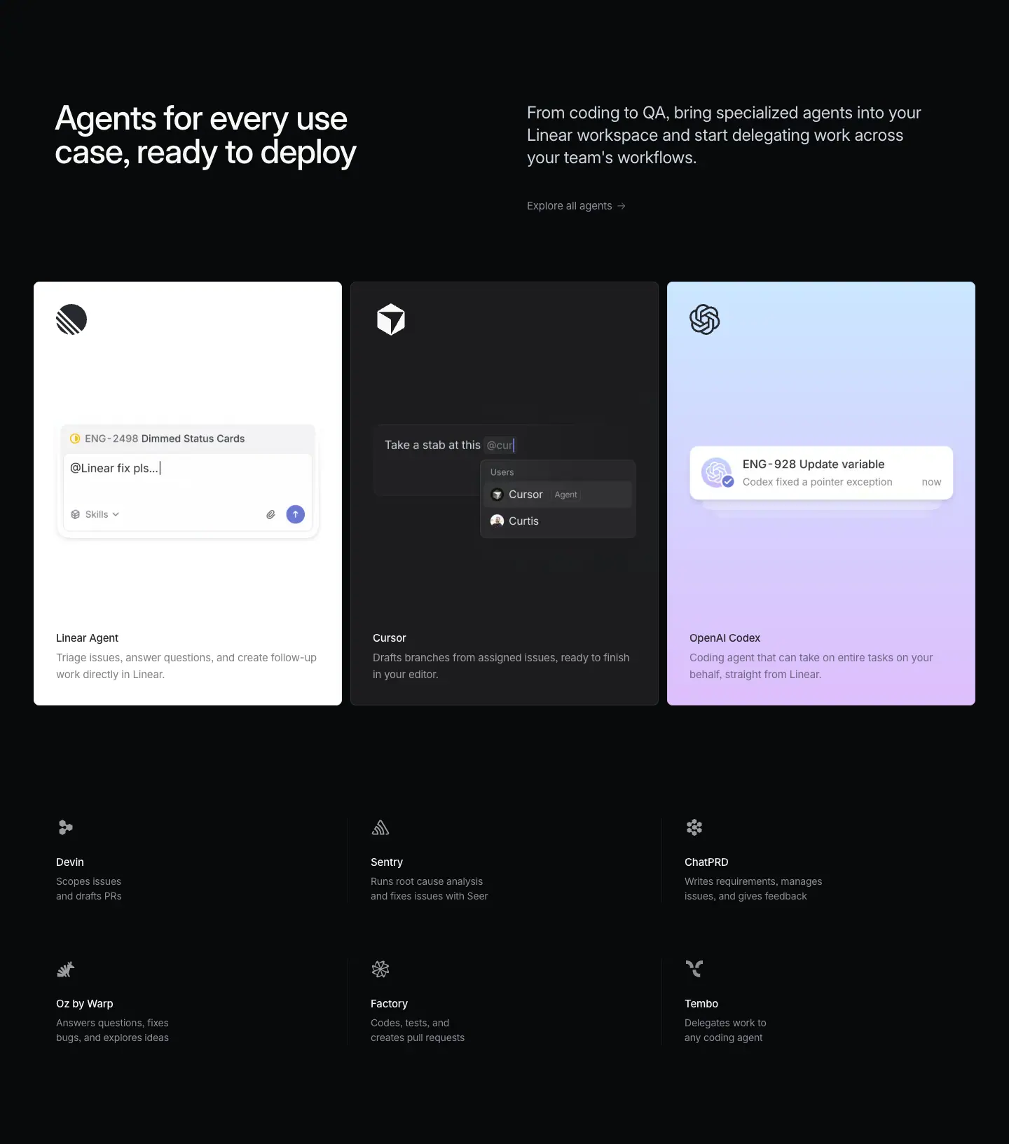
Layout
- Section crop: y=2966–4599.
- Grid bottom (2859) to H2 (3116) = 257 px.
- Header split: H2 x=78, y=3116. Paragraph x=752, y=3117. Link "Explore all agents →" at y=3248.
- 3-up featured cards: x=48–487, 500–939, 952–1391 (440 wide each, 12 px gaps, 1344 total). Top ≈ y=3368, bottom ≈ y=3972 (≈604 tall) ≈ measured from screenshot. Link bottom (3272) to cards ≈ 96 px.
- Logo mark top-left inside each card (≈ 40 px, at ≈ 32 px inset) ≈ measured from screenshot.
- Visual IMG at y=3531, 440×244 (full card width).
- Title at y=3865 (x=80, 532, 984; 32 px inset, w=376). Description at y=3893, 2 lines (ends 3941). Card bottom ≈ 31 px below.
- 6-item partner list: 3 columns × 2 rows. Names at x=80, 529, 977 (≈448 px pitch), y=4185 and y=4387 (202 px row pitch). Descriptions 28 px below names, 2 lines (h=42). A small partner icon (≈ 20 px) sits above each name ≈ measured from screenshot. Thin vertical dividers left of columns 2 and 3 (≈ x=496 and x=944) ≈ measured from screenshot.
- List bottom (≈4457) to crop end (4599) ≈ 142 px.
Typography
- H2, paragraph, link: as §01 (link 15px / 24px · 400 · #8a8f98 with "→").
- Featured card titles: 15px / 24px · 510 · -0.165px. Color #282a30 on the light cards (Linear Agent, OpenAI Codex), #f7f8f8 on the dark card (Cursor).
- Featured card descriptions: 15px / 24px · 400 · -0.165px. #282a30 on light cards; #f7f8f8 per DOM on the Cursor card (it renders lighter grey in the screenshot, so an opacity is likely applied).
- List names: 15px / 24px · 510 · -0.165px · #f7f8f8.
- List descriptions: 14px / 21px · 400 · -0.182px · #8a8f98. A step smaller than card text.
Color
- Card 1 (Linear Agent): solid #ffffff (pixels (70, 3390) and (70, 3950)).
- Card 2 (Cursor): solid #1c1c1f.
- Card 3 (OpenAI Codex): vertical gradient from #cbe5ff (pale sky, top) to #ddbffc (pale lavender, bottom).
- Each card takes its color from the partner's brand mood: Linear white/indigo, Cursor near-black, OpenAI pastel. This is the only place on the page with large color fields.
- Partner list: monochrome icons, grey text, no fills.
Visual / UI illustration
- Linear Agent card: a white composer with issue chip "ENG-2498 Dimmed Status Cards", typed "@Linear fix pls…|", a Skills button and an indigo send button.
- Cursor card: a dark composer "Take a stab at this @cur" with dropdown "Users: Cursor [Agent], Curtis".
- OpenAI Codex card: a white notification card "ENG-928 Update variable · Codex fixed a pointer exception · now" with two ghost cards stacked behind it.
- Each visual shows the same action (invoke an agent on an issue) in that partner's style.
Copy
- H2: "Agents for every use case, ready to deploy" (8 words). Breadth claim + readiness claim.
- Paragraph: "From coding to QA, bring specialized agents into your Linear workspace and start delegating work across your team's workflows." (19 words).
- Link: "Explore all agents →".
- Featured: "Linear Agent — Triage issues, answer questions, and create follow-up work directly in Linear." (12 words, 3 verbs). "Cursor — Drafts branches from assigned issues, ready to finish in your editor." (11 words). "OpenAI Codex — Coding agent that can take on entire tasks on your behalf, straight from Linear." (14 words).
- List: "Devin — Scopes issues and drafts PRs." "Sentry — Runs root cause analysis and fixes issues with Seer." "ChatPRD — Writes requirements, manages issues, and gives feedback." "Oz by Warp — Answers questions, fixes bugs, and explores ideas." "Factory — Codes, tests, and creates pull requests." "Tembo — Delegates work to any coding agent."
- List descriptions are third-person verb phrases with the subject dropped ("Scopes…", "Runs…"). Four of six use 2–3 verbs. Each is 5–9 words.
Why it works
- Two tiers of catalog: 3 big colored cards for the partners that matter most, then a quiet list for the long tail. Visual weight follows importance.
- Colored cards break 3,000 px of near-black. They read as a "marketplace shelf".
- The list's smaller 14px descriptions and missing visuals keep it secondary. Dividers, not boxes, separate the columns.
Reuse recipe
- Header split with an "Explore all →" link.
- 3 cards of 440×≈604, 12 px gaps: logo top-left, 440×244 visual in the middle, 15px title + 2-line description at 32 px inset.
- Give each featured card the partner's color world (white / #1c1c1f / pastel gradient #cbe5ff → #ddbffc), with #282a30 text on light cards.
- Long-tail list: 3 columns at ≈448 px pitch, 202 px rows, small mono-tone icon, 15px w510 name, 14/21 #8a8f98 description, vertical hairline dividers.
03 · Create your own agents (closing CTA)
Layout
- Section crop: y=4599–5502 (903 tall).
- Centered stack:
- H2 at x=477, y=4749, w=485, 1 line (150 px from the crop top).
- Paragraph at x=509, y=4813, w=422, 2 lines (ends ≈4861). H2 bottom (4797) to paragraph = 16 px.
- Buttons at y=4892: "Start building" x=578, 130×40; "Read guidelines" x=716, 146×40. Gap 8 px. Paragraph to buttons ≈ 31 px.
- Illustration below the buttons fills the rest of the section (≈ y=4930–5300): a photographic hand enters from the right edge (≈ x=736–1440); a flock of ≈20 pixel-art pointing-hand cursors flies in from the left edge (≈ x=0–640) toward the extended finger ≈ measured from screenshot.
- Footer hairline at y=5535.
Typography
- H2: 48px / 48px · 510 · -1.056px (-0.022em) · #f7f8f8, centered. The CTA uses the section-H2 size, not the 72px CTA size of product pages.
- Paragraph: 17px / 23.8px (1.4) · 400 · -0.204px (-0.012em) · #8a8f98, centered.
- Buttons: 15px / 40px · 510, padding 0 16px.
Color
- Primary: #e5e5e6 fill, #08090a text, 1 px #e5e5e6 border, radius 9999px.
- Secondary: rgba(255,255,255,0.05) fill, #f7f8f8 text, no border.
- Illustration: pure black and white. The hand is a grainy greyscale photo; the cursors are 1-bit white pixel icons.
Visual / UI illustration
- A direct reference to Michelangelo's Creation of Adam: the human hand reaches left, the software cursors (the "agents") reach right. It recasts "build your own agent" as an act of creation.
- The mix of a real photo and pixel cursors is the only non-UI illustration on the page.
Copy
- H2: "Create your own agents" (4 words). Imperative.
- Paragraph: "Build your own AI teammates with the Linear API. Keep them private or share with the Linear community." (18 words). Two imperatives; the second gives a choice.
- Buttons: "Start building" (primary), "Read guidelines" (secondary). Both are 2-word verb phrases aimed at developers.
Why it works
- The page ends on a developer platform message, which fits the audience that reaches the bottom of an agents page.
- One art-directed image after a page of UI fragments creates a memorable last frame. The metaphor matches "Artificial colleagues" from the hero.
- A 48px H2 and 40px buttons keep the CTA in proportion to a short page.
Reuse recipe
- Centered stack: 48/48 w510 H2 → 16 px → 17/23.8 #8a8f98 paragraph (w≈422) → ≈31 px → two 40 px pills 8 px apart.
- 150 px top padding; ≈900 px total height so the illustration has room.
- One monochrome art image that encodes the page's metaphor, bleeding off the side edges.
04 · Footer
Layout
- Section crop: y=5502–6059 (557 tall). Hairline at y=5535.
- Same 5-column footer as /ai: columns at x=304, 528, 752, 976, 1200 (224 px pitch); headings 13px / 19.5px · 510 · -0.13px · #f7f8f8; links 13px · 400 · #8a8f98 at 30 px row pitch; legal row 13px · #62666d.
Reuse recipe
- See ai.md §09.
Page-level takeaways
- Short page, 4 sections. Concept → mechanics → catalog → platform. Total 6,059 px, about half of
/ai.
- The hero proves the slogan in the first viewport with a live, looping chat carousel (7 prompts × 5 loops, 400×559 cards, 420 px pitch). Replies stream; the carousel advances; a mono caption names the current use case.
- Hero type differs from the product template: 13px grey eyebrow, H1 weight 510, 17px grey sub, a 40 px pill CTA. Product pages use a 16px white eyebrow, H1 weight 500, and no sub or button.
- Body blocks reuse the product template (48px split header, 2×2 bento of 672×597 cells, 150 / 96 / 257 px spacing) but skip the spotlight feature panel.
- Color appears only in the partner cards (
#ffffff, #1c1c1f, #cbe5ff → #ddbffc). Everything else is grey steps on #08090a.
- Copy answers control anxiety with "X, but not Y" lines: "Delegate issues, but not accountability", "on your behalf, but never in the dark".
- Two-tier catalog: big featured cards with visuals, then a quiet 3×2 text list with icons and hairline dividers.
- The ending is art-directed, not templated: a 48px centered CTA over a Creation of Adam image (photo hand + pixel cursors). No testimonials, no 4-up nav, no shared CTA.
- Hero screenshot shows a mid-animation state: most cards show only the prompt or "Thinking…". The DOM snapshot shows a finished reply in the first card.
Section inventory
| # |
Section |
Pattern name |
Key values |
| 00 |
Hero |
Hero-left + Carousel (chat windows) |
Eyebrow 13/19.5 w510 #8a8f98; H1 72/72 w510; sub 17/27.2 #8a8f98; pill 168×40; cards 400×559, 20 gap |
| 01 |
Delegate, automate, and orchestrate work |
Section-header-split + Bento-2x2 |
H2 48/48 w510; P 24/31.92 #d0d6e0; cells 672×597; no link |
| 02 |
Agents for every use case |
Section-header-split + Partner-cards-3up + Logo/integration-list-3x2 |
Cards 440×≈604, 12 gap, #fff / #1c1c1f / #cbe5ff→#ddbffc; list 15/24 + 14/21 |
| 03 |
Create your own agents |
Final-CTA-centered (compact, with illustration) |
H2 48/48 w510; P 17/23.8 #8a8f98; pills 40 tall, 8 gap |
| 04 |
Footer |
Footer-5col |
224 px pitch from x=304; 13px |
Cloud Coding Agent — linear.app/coding-agent
- URL: https://linear.app/coding-agent
<title>: Cloud Coding Agent – Linear- Meta description: Turn requests into merged PRs, all in Linear. Delegate changes to Linear or automate incoming work with Loops.
- Page height: 7,902 px at 1440 px wide
- Body background:
#08090a
- Template: a third, narrative / editorial template. The page has only one H1 and one H2 (the final CTA). Everything between them is one long scrolling story inside a centered reading column: paragraph-headlines (a white lead sentence + grey continuation at 24px), product windows, mono captions, a flow diagram, spec rows, and a carousel. Chapters are separated by full-width hairlines, not by H2s. The H1 uses the older feature-template type (64px / 1.06) but is left-aligned in the narrow column.
Narrative arc. The hero names the product ("A cloud coding agent, built into Linear") and shows it working: a full diff + agent session window. The story then answers four questions in four chapters, each opened by a one-sentence lead. Where does it start? "Start from anywhere." (tabs for Chat, Issues, Reviews, Mobile, Slack, Teams). When does it run? "On demand. Or on repeat." (a Delegate vs. Automate flow diagram + spec rows). How does it fit planned work? "Keep fixes moving alongside planned work." (backlog list + diff). Who can use it? "Give the whole team a way to build." (review carousel + a 4-row spec list). The CTA closes with a strikethrough joke: "Start tracking issues building" — the company repositions itself from issue tracker to builder.
Note on the crops. hero-p1 … hero-p4 are 1712 px height slices of one continuous story, not separate sections. Each slice below describes what it actually contains.

Layout system for the whole story (measured)
- Reading column: paragraph boxes at x=343, w=754 (centered: 343 + 754/2 = 720). Rendered text starts at x=375 (32 px inner inset), so the visible measure is ≈ 690 px.
- Hero column: eyebrow and H1 at x≈322–325 in the DOM. The hero text aligns with the reading column.
- Chapter separators: full-width 1 px hairlines detected at y=1516, 2660, 3860, 5127 (and 6773 above the CTA, 7378 above the footer). Each chapter's lead paragraph starts exactly 161 px below its hairline (1516→1677, 2660→2821, 3860→4021, 5127→5288).
- Media → mono caption: 96 px (2345→2441, 4853→4949; 6123→6224 = 101).
- Two-column spec rows: label at x=375 (w=217), description at x=612 (w=453). The 237 px label column aligns to the reading column's left edge.
- Media blocks are wider than the text column: 924 px (tabs), ≈1094 px (diagram), 926 px (backlog composite), 1107 px (carousel), 1303 px (hero window).
00 · Hero (slice p1, y=0–1712)
Layout
- Eyebrow "Linear Code" at x=325, y=202.
- H1 as two line spans at y=242 and y=309 (67 px line pitch), x=324, widths 648 and 471. The H1 element box is recorded at x=322, y=272, w=652, h=136.
- Sub-paragraph at x=325, y=397. Its box is w=620, but the text wraps after ≈ 370 px into 2 lines ≈ measured from screenshot.
- Eyebrow bottom (221.5) to H1 (242) = 20 px. H1 bottom (377) to sub (397) = 20 px.
- Motion note: in the screenshot the hero text sits ≈30 px right and ≈38 px lower than the DOM spans (eyebrow at ≈354, 240; H1 top ≈280). The H1 box (y=272) and its spans (y=242) also disagree by 30 px. The hero text very likely animates in with a translate. Values above use the DOM spans.
- Product window: edges at x=68 and x=1371 (≈1303 wide), inner pane border at x=80 and x=1358 (12 px inset). Top edge at y≈571 ≈ measured from screenshot. Internal hairlines at y=620, 671, 715 (issue bar, tab bar, file header). The window fades out at ≈ y=1340.
- Issue bar at y=587. Tab row at y=630. File header at y=683. Code lines start at y=721 with a ≈24.6 px pitch.
- Left diff pane: x≈80–860. Right agent pane: x≈871–1358.
- Second file header "RideHistoryPage.tsx" at y=1200.
- Sub bottom (≈445) to window top (≈571) ≈ 126 px.
- Hairline at y=1516 closes the hero. The first chapter lead starts at y=1677 (bottom of this slice).
Typography
- Eyebrow: 13px / 19.5px · 400 · -0.13px · #8a8f98.
- H1: 64px / 67.84px (1.06) · 510 · -1.408px (-0.022em) · #f7f8f8.
- Sub: 15px / 24px · 400 · -0.165px · #8a8f98.
- Window text is fractional: 14.5412px, 13.4227px, 12.3041px, 13.6324px. These equal 13 / 12 / 11 / 12.19 px × 1.1186. The whole window is the /ai §04 UI scaled up ≈1.12× as one unit.
- Issue bar: 14.54px / 17.90px · 500 · #d0d6e0; "+34" #41ba56, "-18" #f34e52.
- Tabs "Activity / Guide / Diff", "Submit review", "Preview": 13.42px · 500 · #d0d6e0.
- File name 13.42px / 20.13px · 400 · #e3e3e6; path #8a8f98; file counts "+21" #41ba56, "-14" #ff6364.
- Code: Berkeley Mono 14.54px / 24.61px · 400.
- Agent pane: "Linear Code" 13.42px · 500 · #ffffff; "Opus 5.5" 12.30px · #949496; "Worked for 32 seconds" 13.42px · 500 · #8a8f98; body 14.54px / 22.37px · 400 · #d0d6e0; inline code chips Berkeley Mono 13.63px · #d0d6e0; placeholder "Tell Linear what to do next…" #62666d.
Color
- Page #08090a. Window surface #0f1011 (pixel (700, 600)).
- Syntax palette (from DOM): keyword #e391cf (pink), identifier #f7bf8b (peach), function/type #83dcdc (cyan), type keyword / number #8fa6ff (blue), string / CSS #ffdf9f (pale yellow), punctuation #d0d6e0, comment and context line numbers #62666d, added line numbers #27a644.
- Diff bands: added rows rgba(39,166,68,0.08), removed rows rgba(243,78,82,0.08); word-level highlights at 0.18 alpha (rgba(39,166,68,0.18), rgba(252,49,66,0.18)).
- The window carries the only color in the hero. The type above is white and grey.
Visual / UI illustration
- The same "Dimmed Status Cards" session as /ai §04, at larger scale and more complete:
- Left: useRideHistory.ts diff (lines 76–89). Comment "// Rides still waiting on a driver, with the status we show for each". dimmedIds lines removed, waitingStatusById lines added.
- Below it, a second file RideHistoryPage.tsx (+2 −1) with a styled-component CSS block, faded.
- Right: agent session. "Conor started the session from ENG-2498", "Worked for 32 seconds", "Pushed and opened a draft PR. Changes:" with two bullets using mono file chips. A reviewer comment "Adrien · now: Do we need both waitingStatusById and dimmedIds here?". Then "Edit client/src/views/RideHistory/useRideHistory.ts ▸" and "Working…".
- Real UI, readable code, staged data. The window is not inside a spotlight panel; it sits directly on the page.
Copy
- Eyebrow: "Linear Code" (2 words) — the product name.
- H1: "A cloud coding agent, built into Linear" (7 words). Identical to the /ai §04 H2. Category first, differentiator after the comma.
- Sub: "Turn requests into merged PRs, all in Linear. Delegate changes to Linear or automate incoming work with Loops." (18 words). Sentence 1 is the outcome ("merged PRs"). Sentence 2 names the two modes the story will explain (Delegate, Loops).
Why it works
- A narrow left-aligned headline over a very wide window gives a clear "headline → evidence" order. The product is the hero image, not an illustration.
- 64px instead of 72px keeps the H1 proportional to the narrow 650 px column.
- Scaling the real UI up by ≈1.12× makes the code readable at a glance. Readable code is the trust signal for engineers.
- A reviewer comment in the agent pane shows human oversight inside the very first frame.
Reuse recipe
- Eyebrow 13px #8a8f98 → 20 px → H1 64/67.84 w510 -0.022em (≈650 px wide, 2 lines) → 20 px → 15/24 #8a8f98 sub, 2 lines at ≈370 px.
- Align the hero text with the story's reading column (x≈325–375).
- ≈125 px below, a ≈1300 px product window with a 12 px inner inset and 1 px hairline rows; scale the UI as one unit (transform/zoom ≈1.12).
- Fade the window bottom into the page; close the hero with a full-width hairline.
01 · Start from anywhere (slice p2, y=1712–3424)
This slice holds the end of chapter 1 ("Start from anywhere") and the start of chapter 2 ("On demand. Or on repeat.").
01a · Chapter 1 — tabbed media
Layout
- Lead paragraph box at x=343, y=1677 (161 px below the hairline at 1516), w=754, 3 lines (h=96). The white lead span starts at x=375.
- Tabbed media: 6 stacked IMGs at the same rectangle x=258, y=1870, 924×475. Only the active one shows. Paragraph bottom (1773) to media = 97 px.
- Mono row at y=2441 (96 px below the media bottom 2345):
- Left label at x=375: "LINEAR AGENT WORKS WHERE YOU WORK".
- Tabs in two columns of three: x=730 ("01. CHAT", "02. ISSUES", "03. REVIEWS") and x=908 ("04. MOBILE", "05. SLACK", "06. TEAMS"), 21 px row pitch.
- A faint full-width hairline at y=2660 separates chapter 1 from chapter 2 (202 px below the tab block).
Typography
- Lead paragraph: 24px / 31.92px · 400 · -0.288px. Lead sentence span #f7f8f8; continuation #8a8f98.
- Mono label and tabs: Berkeley Mono 12px / 16.8px · 400, uppercase. Active tab #d0d6e0; label and inactive tabs #62666d.
Color
- Media frame: dark card with a 1 px hairline border; content mostly grey.
- Indigo appears once, on the send button inside the media.
Visual / UI illustration
- The "01. CHAT" state: a cropped chat thread showing the end of an agent reply ("…RideHistoryPage.tsx: dimmed rows reset to full opacity / This will fix the issue in the ride history view, but the issue might persist in other views. Should I update there also?"), a composer with "ENG-2498 Dimmed Status Cards" chip and "@Linear fix pls…", and an "Ask Linear" button. Left-side rows ("RideHistoryPage.tsx · just now", "…progress · just now") are cut by the frame.
- The 6 images are the 6 tab states (Chat, Issues, Reviews, Mobile, Slack, Teams). The tabs act as a slideshow index.
Copy
- Lead: "Start from anywhere. Kick off a session from an issue, a chat, a comment, or a Slack thread. Linear gathers all relevant context and gets to work." (27 words; lead = 3 words). The 4-item list ("an issue, a chat, a comment, or a Slack thread") is the claim; the tabs below are the proof.
- Mono label: "LINEAR AGENT WORKS WHERE YOU WORK" (6 words).
- Tabs: numbered "01."–"06." + one noun each.
01b · Chapter 2 start — flow diagram
Layout
- Lead paragraph at x=343, y=2821 (161 px below the hairline at 2660), 3 lines.
- Diagram ≈ y=3030–3385, x≈172–1266 ≈ measured from screenshot. Two lanes:
- "DELEGATE" label at x=188, y=3033. One row at y≈3083: issue chip → user node ("USER / @LINEAR FIX THIS") → dashed agent box → PR chip ("DIMMED STATUS CARDS").
- "AUTOMATE" label at x=188, y=3197. Three issue chips at y=3246, 3304, 3362 fan into a "LOOPS" node ("INVESTIGATE BUGS AND DRAFT PRS FOR CLEAR FIXES.") → dashed agent box → fan out to three PR chips at x=1068.
- Input chips start at x≈172 (text at x=213). Middle nodes at x≈555. Agent boxes at x≈806–900. Output chips at x≈1028–1266.
Typography
- Lead paragraph as 01a.
- Diagram: Berkeley Mono 11px / 20px · 400, uppercase. Lane labels #62666d. Active chips (ENG-2498, ENG-2380, ENG-2039, "LOOPS", its instruction) #d0d6e0. Dimmed chips (ENG-2076, the "USER" node, all output PR chips) #62666d.
Color
- Chips: dark fills (rgba(255,255,255,0.03–0.05)) with 1 px borders.
- Small status icons: white open circle (Delegate issue), orange circles (Automate issues), grey PR-merge icons on outputs.
- Agent boxes: dashed 1 px outline around a dark tile with a dot-grid glyph (same motif as /ai §03).
Visual / UI illustration
- A stylized schematic, not a screenshot. It compares the two modes side by side: one human-triggered path, one rule-triggered path that batches three issues.
- The dimmed vs. bright chips suggest a running animation: items light up as the flow passes through them.
Copy
- Lead: "On demand. Or on repeat. Assign a change to Linear, or use Loops to start work automatically as issues arrive. Your team sets the guidance and reviews the results." (29 words; lead = 5 words, two fragments). The two fragments map to the two lanes.
- Node copy: "@LINEAR FIX THIS" and "INVESTIGATE BUGS AND DRAFT PRS FOR CLEAR FIXES." These are example instructions in mono.
Why it works (slice)
- The paragraph-headline replaces an H2. The white lead sentence works as a headline for scanners; the grey rest is the explanation for readers. One element does two jobs.
- Mono tabs give an index without big buttons. They feel like a terminal UI, which fits a coding product.
- The flow diagram turns "on demand vs. on repeat" into a visible fork, without any extra prose.
Reuse recipe
- Chapter start: full-width hairline → 161 px → 24/31.92 paragraph in a 754 px column; first sentence #f7f8f8, rest #8a8f98.
- Tabbed media: N stacked images in one 924×475 frame; 96 px below, a mono row: left label + numbered tabs in 2 columns of 3 (12/16.8, active #d0d6e0, inactive #62666d).
- Flow diagram: two lanes labeled in 11px mono; chips → instruction node → dashed agent box → output chips; fan-in/fan-out arrows; dim the inactive items.
02 · On demand → Keep fixes moving (slice p3, y=3424–5136)
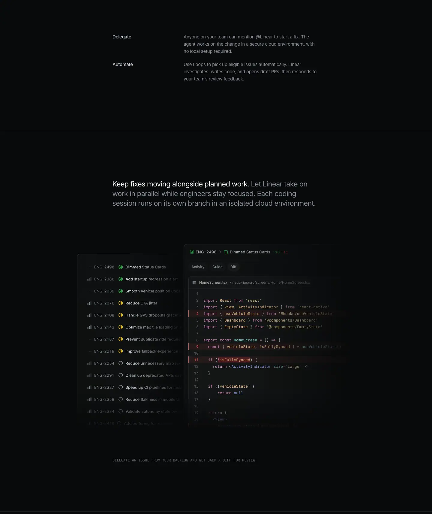
02a · Spec rows for chapter 2
Layout
- Two rows: "Delegate" at y=3535 and "Automate" at y=3627 (92 px pitch). Labels at x=375 (w=217), descriptions at x=612 (w=453), 3 lines each.
- Diagram bottom (≈3385) to the first row ≈ 150 px.
- Hairline at y=3860 closes chapter 2.
Typography
- Labels: 15px / 24px · 510 · -0.165px · #d0d6e0.
- Descriptions: 15px / 24px · 400 · -0.165px · #8a8f98.
Copy
- "Delegate — Anyone on your team can mention @Linear to start a fix. The agent works on the change in a secure cloud environment, with no local setup required." (27 words)
- "Automate — Use Loops to pick up eligible issues automatically. Linear investigates, writes code, and opens draft PRs, then responds to your team's review feedback." (24 words)
02b · Chapter 3 — Keep fixes moving alongside planned work
Layout
- Lead paragraph at x=343, y=4021 (161 px below the hairline at 3860), 3 lines.
- Composite visual: backlog list IMG x=257, y=4269, 355×584 (behind, left); diff window IMG x=612, y=4237, 571×616 (in front, right, 32 px higher). The diff window overlaps the list's right edge.
- Mono caption at x=343, y=4949 (96 px below the visual bottom 4853); rendered at x≈375.
- Hairline at y=5127 closes chapter 3.
Typography
- Lead paragraph as §01.
- Caption: Berkeley Mono 12px / 16.8px · 400 · #62666d, uppercase.
Color
- List: green check (done), yellow half-circle (in progress), grey open circle (backlog) icons; priority bars in grey.
- Diff window: React Native code with a red removed band on lines 4 and 9–11.
Visual / UI illustration
- Backlog list: 14+ rows from "ENG-2498 Dimmed Status Cards" (done) through "Add startup regression alert", "Smooth vehicle position upd…", "Reduce ETA jitter" (in progress) to "Reduce unnecessary map re…", "Clean up deprecated APIs", "Speed up CI pipelines" (backlog). Titles are cut by the diff window; bottom rows fade.
- Diff window: "ENG-2498 Dimmed Status Cards +18 −11", file HomeScreen.tsx (kinetic-ios/src/screens/Home/…), lines 1–20 with React imports and a useVehicleState hook.
- The pairing says: one item from the long backlog becomes a reviewable diff, while the rest of the plan continues.
Copy
- Lead: "Keep fixes moving alongside planned work. Let Linear take on work in parallel while engineers stay focused. Each coding session runs on its own branch in an isolated cloud environment." (30 words; lead = 6 words).
- Caption: "DELEGATE AN ISSUE FROM YOUR BACKLOG AND GET BACK A DIFF FOR REVIEW" (13 words). The caption states the action shown in the image, like a figure caption in a paper.
Why it works
- Spec rows after the diagram give exact definitions to the two lanes. The bold label column lets a reader scan "Delegate / Automate" without reading the prose.
- The composite (long list + one diff) explains "parallel work" visually: many items, one being handled.
- Mono figure captions keep explanations short and separate from the narrative voice.
Reuse recipe
- Spec rows: label 15/24 w510 #d0d6e0 at x=375 (w≈217); description 15/24 #8a8f98 at x=612 (w≈453); 92 px pitch for 3-line rows, 68 px for 2-line rows.
- Composite figure: a list image behind (≈355 wide) and a detail window in front (≈571 wide, 32 px higher, overlapping).
- Figure caption 96 px below in 12px mono uppercase #62666d.
03 · Give the whole team a way to build (slice p4, y=5136–6848)
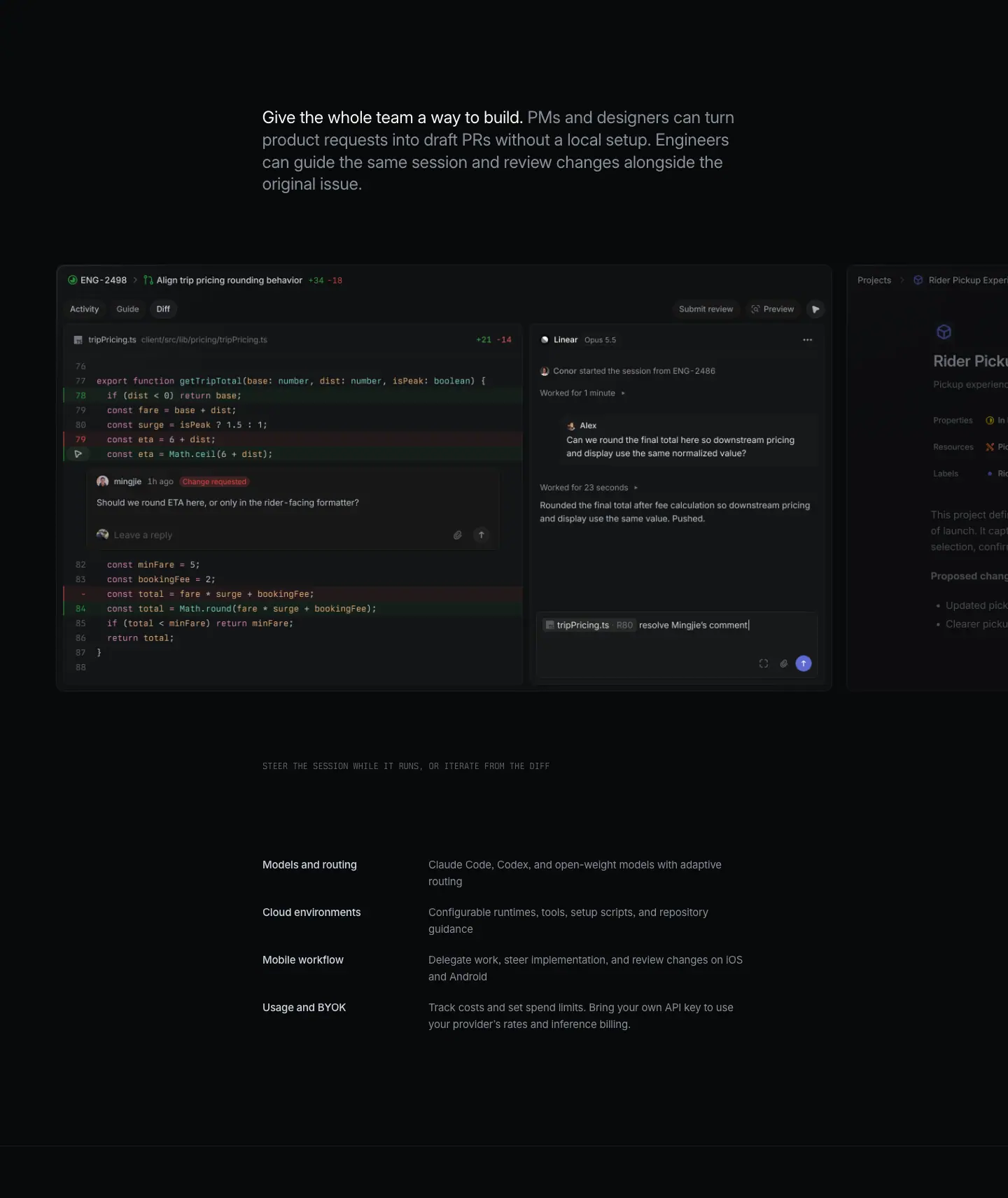
Layout
- Lead paragraph at x=343, y=5288 (161 px below the hairline at 5127), 4 lines (h=128).
- Carousel: 3 IMG slides, 1107×608 each, at x=81, 1210, 2338 (1128 px pitch, 21 px gap), y=5515–6123. Slide 1 is centered-left; slide 2 peeks in at the right edge from x=1210. Paragraph bottom (5416) to carousel = 99 px.
- Mono caption at y=6224 (101 px below the carousel bottom), rendered at x≈375.
- Spec list: 4 rows at y=6360, 6428, 6496, 6564 (68 px pitch). Labels x=375 (w=217); descriptions x=612 (w=453), 2 lines each. Caption to first row = 136 px. Last row ends at 6612.
- Hairline at y=6773 (161 px below the last row) opens the CTA area.
Typography
- Lead paragraph: 24px / 31.92px · 400 · -0.288px; lead span #f7f8f8, rest #8a8f98.
- Caption: Berkeley Mono 12px / 16.8px · 400 · #62666d.
- Spec labels: 15px / 24px · 510 · -0.165px · #d0d6e0. Spec descriptions: 15px / 24px · 400 · -0.165px · #8a8f98.
Color
- Slide 1: dark diff window with green added rows, red removed rows, a red "Change requested" pill, and an indigo send button.
- Slide 2 (peeking): a project page "Rider Pickup Exper…" with a violet project icon and orange/red property icons.
Visual / UI illustration
- Slide 1: "ENG-2498 Align trip pricing rounding behavior +34 −18". Left: tripPricing.ts diff with an inline review thread from "mingjie · 1h ago · Change requested": "Should we round ETA here, or only in the rider-facing formatter?". Right: agent pane "Linear · Opus 5.5": "Conor started the session from ENG-2486", "Worked for 1 minute", a question from "Alex" ("Can we round the final total here so downstream pricing and display use the same normalized value?"), "Worked for 23 seconds", "Rounded the final total after fee calculation so downstream pricing and display use the same value. Pushed." Composer: file chip tripPricing.ts R82 + "resolve Mingjie's comment|" (cursor visible).
- Slide 2: a project document "Rider Pickup Experience" with Properties / Resources / Labels and "Proposed changes" bullets, cut by the viewport.
- Slides are wider than the viewport content area, so the next slide always peeks. This is a horizontal carousel; no visible arrow controls in the screenshot.
Copy
- Lead: "Give the whole team a way to build. PMs and designers can turn product requests into draft PRs without a local setup. Engineers can guide the same session and review changes alongside the original issue." (36 words; lead = 8 words). Names two audiences (PMs and designers; engineers) and gives each a role.
- Caption: "STEER THE SESSION WHILE IT RUNS, OR ITERATE FROM THE DIFF" (11 words).
- Spec list:
- "Models and routing — Claude Code, Codex, and open-weight models with adaptive routing" (12 words)
- "Cloud environments — Configurable runtimes, tools, setup scripts, and repository guidance" (9 words)
- "Mobile workflow — Delegate work, steer implementation, and review changes on iOS and Android" (13 words)
- "Usage and BYOK — Track costs and set spend limits. Bring your own API key to use your provider's rates and inference billing." (22 words)
- Spec labels are 2–3 word noun phrases. Descriptions are fragments or imperatives, no subject. This is reference copy, not narrative copy.
Why it works
- The last chapter widens the audience to non-engineers, which sets up the CTA's "building" claim.
- The spec list at the end answers buyer due-diligence questions (models, runtime, mobile, cost) in 4 scannable rows, after the story has done the persuading.
- A peeking second slide invites interaction without arrows.
Reuse recipe
- Lead paragraph (white lead sentence ≤ 8 words + grey continuation) → ≈100 px → full-bleed carousel of 1107×608 slides with ≈21 px gap; the next slide peeks at the right edge.
- Figure caption ≈100 px below in 12px mono #62666d.
- End the story with a 4-row spec list, 68 px pitch, label 15px w510 #d0d6e0, description 15px #8a8f98.
- Leave 161 px, then a hairline before the CTA.
04 · Start tracking issues building (final CTA)

Layout
- Section crop: y=6848–7345 (497 tall). A CANVAS 1440×604 spans y=6774–7378 behind it.
- H2 centered: x=282, w=876, y=6998 (150 px from the crop top), 1 line (h=72).
- Struck-through segment "tracking issues" at x=447, w=455.
- Buttons at y=7110 (40 px below the H2 bottom 7070): "Get started" x=579, 127×44; "Contact sales" x=718, 144×44; 12 px gap.
- Footer hairline at y=7378 (the canvas bottom).
Typography
- H2: 72px / 72px · 510 · -1.584px (-0.022em) · #f7f8f8, centered.
- <s> "tracking issues": same size and weight, color #8a8f98, with a strikethrough line.
- Buttons: 16px / 44px · 510.
Color
- Primary pill: #e5e5e6 fill, #08090a text, 1 px #e5e5e6 border, radius 9999px, padding 0 20px.
- Secondary pill: rgba(255,255,255,0.05) fill, #f7f8f8 text.
- Canvas: a dot-matrix / dither dome of fine grey dots rising from the bottom center, very low contrast (pixel (700, 7300) = #121314). It continues behind the footer's top edge.
Visual / UI illustration
- The only illustration is the generative dot field. It is likely animated (it is a <canvas>, not an image).
Copy
- "Start tracking issues building" (4 words visible; 2 struck). The strikethrough edits the company's own old category in public. It turns the CTA into the page's thesis: the tool now builds, it does not only track.
- Buttons: "Get started", "Contact sales".
Why it works
- The strikethrough is a visual joke that needs no explanation. Grey + strike makes the old words readable but clearly retired.
- One line at 72px (not two like the product pages) keeps the joke tight.
- The dot canvas adds a soft glow that marks the end of the page without a hard color.
Reuse recipe
- 497 px block, 150 px top padding, 72/72 w510 centered H2 on one line.
- Strike the old category in #8a8f98 with <s>; keep the new verb in #f7f8f8.
- Pills 44 tall, 40 px below, 12 px apart.
- Optional: a low-contrast dot/dither canvas (≈604 px tall) rising from the bottom center behind the CTA.
05 · Footer
Layout
- Section crop: y=7345–7902 (557 tall). Hairline at y=7378; the CTA dot canvas is still faintly visible above it.
- Same 5-column footer as /ai: columns at x=304, 528, 752, 976, 1200 (224 px pitch); headings 13px / 19.5px · 510 · -0.13px · #f7f8f8; links 13px · 400 · #8a8f98 at 30 px row pitch; legal row 13px · #62666d.
Reuse recipe
- See ai.md §09.
Page-level takeaways
- One story, no section headings. Only an H1 and the CTA H2 exist. Chapters are opened by 24px paragraph-headlines: a white lead sentence (3–8 words) followed by grey continuation in the same paragraph.
- A strict vertical rhythm replaces headings: hairline → 161 px → lead paragraph → ≈97 px → media → 96 px → mono caption.
- Narrow column, wide media. Text sits in a centered 754 px column (visible measure ≈690 px). Media breaks out to 924–1303 px, and the carousel to full bleed.
- Mono is the caption voice. Berkeley Mono 11–12px uppercase in
#62666d labels tabs, diagram lanes and figures. Inter carries the narrative.
- Real code at readable scale. The hero window is the
/ai session UI scaled ≈1.12× as one unit (fractional font sizes 14.54 / 13.42 / 12.30 px). The syntax palette is pink, peach, cyan, blue, pale yellow on near-black.
- Reference copy comes last. Spec rows (label 15px w510
#d0d6e0, description 15px #8a8f98) answer due-diligence questions after the story persuades.
- H1 uses the older 64px / 1.06 type, left-aligned in the narrow column, unlike the 72px / 72px product-page H1.
- The CTA carries the thesis with a strikethrough ("Start
tracking issues building") over a generative dot canvas, not the shared "Built for the future" line.
- Motion is present but not captured: hero text offset between DOM and screenshot, 6 stacked tab images, a 3-slide carousel, a dim/bright flow diagram, and a canvas.
Section inventory
| # |
Section |
Pattern name |
Key values |
| 00 |
Hero (p1) |
Hero-left-narrow + Product-window-hero |
Eyebrow 13/19.5 #8a8f98; H1 64/67.84 w510 -0.022em at x≈322; sub 15/24 #8a8f98; window ≈1303 wide, UI ×1.1186 |
| 01 |
Start from anywhere / On demand (p2) |
Story-paragraph-headline + Mono-label-tabs + Flow-diagram |
Lead 24/31.92 (#f7f8f8 lead + #8a8f98); media 924×475 ×6; mono 12/16.8 and 11/20 |
| 02 |
Delegate/Automate specs + Keep fixes moving (p3) |
Spec-list + Story-paragraph-headline + Composite-figure + Mono-caption |
Spec label x=375 w217, desc x=612 w453; list 355×584 behind diff 571×616 |
| 03 |
Give the whole team a way to build (p4) |
Story-paragraph-headline + Carousel + Spec-list |
Slides 1107×608, 1128 pitch; 4 spec rows at 68 px pitch |
| 04 |
Start tracking issues building |
Final-CTA-centered (strikethrough + dot canvas) |
H2 72/72 w510, <s> #8a8f98; canvas 1440×604; pills 44 tall |
| 05 |
Footer |
Footer-5col |
224 px pitch from x=304; 13px |
Linear Asks — /asks
- URL: https://linear.app/asks
<title>: Linear Asks – Manage workplace requests- Meta description: "The easiest way to manage internal requests from Slack and email. Streamline bug reports, feature ideas, IT tickets, and more."
- Page height: 7152 px at a 1440 px viewport width. Body background
rgb(8, 9, 10) = #08090a.
- Template: older centered "feature" template. Centered 64 px H1 in an 832 px hero column (x=304). All body sections sit in a 976 px text column at x=232 (a 1024 px container with 24 px side padding: 208 → 1232). 48 px left-aligned H2s, 20 px feature-cell titles, 17 px intro paragraphs.
Narrative arc. The page sells one feature (request intake) in four acts. (1) The hero names the transformation: workplace requests become issues. A large app-icon tile on a grid of faded Slack and mail glyphs shows "many channels in, one product out". (2) Intake ("Works where your team already is") proves the channels: Slack, email, web forms, notifications, then four small extras, then a dollar-value customer quote. (3) Linear Triage ("A better way to manage requests") moves from capture to handling: a triage inbox, synced threads, private access. (4) Workflows ("Create powerful request workflows") widens the frame to the rest of the product with five cross-sell cards. (5) Use cases ("How teams use Linear Asks") gives six departments a reason to care, then a logo wall supplies social proof. (6) A left-aligned closing CTA and the shared footer end the page. The order is: promise → where requests come from → how you process them → what else connects → who uses it → act.
00 · Hero
Section span: y 0 → 791 (791 px). Nav occupies y 0 → 72 (hairline at y=72, rgb(28,29,29)).
Layout
- Single centered column. Every element is text-align: center.
- Icon tile ≈ 120 × 120 px at x 660 → 780, y ≈ 198 → 318 (≈ measured from screenshot). Corner radius ≈ 28 px (≈ measured).
- Eyebrow "Linear Asks" at y=402, centered (x=682, w=76).
- H1 box x=304, w=832, y=439, h=136 (two lines × 67.84 px). The rendered glyphs span x≈387 → 1054.
- Sub paragraph at y=591, box w=832 (x=304), 2 lines → ends y≈645.
- Button at y=677, x=630, 180 × 40.
- Vertical rhythm: icon bottom → eyebrow ≈ 84 px; eyebrow bottom (423) → H1 = 16 px; H1 bottom (575) → sub = 16 px; sub bottom (645) → button = 32 px; button bottom (717) → section end = 74 px.
- Background: a full-width grid of thin dashed lines (≈ 1 px, ≈ #ffffff at very low alpha) behind the icon. Small 40 px glyph tiles (Slack hash, mail envelope) sit on grid intersections at random spots. They fade out radially from the icon. The grid occupies only the top ≈ 380 px. The text block sits on flat #08090a.
Typography
| Role | Size / LH · weight · tracking · color |
|---|---|
| Eyebrow "Linear Asks" | 14px / 21px · 510 · -0.182px (-0.013em) · #8a8f98 |
| H1 | 64px / 67.84px (1.06) · 510 · -1.408px (-0.022em) · #f7f8f8 |
| Sub | 17px / 27.2px (1.6) · 400 · normal · #8a8f98 |
| Button label | 15px / 40px · 510 · normal · #08090a |
| Nav links | 13px / 19.5px · 400 · normal · #8a8f98 |
| Nav "Sign up" | 13px / 32px · 510 · #08090a on #e5e5e6 pill |
- The H1 breaks by hand into two balanced lines: "Turn workplace requests" / "into actionable issues". The data shows two span elements, so the break is authored, not natural wrap.
- Font: Inter Variable with
"cv01", "ss03" on every node.
Color
- Surface: #08090a only. No panel behind the hero text.
- The only saturated color is the app-icon tile: an indigo gradient (≈ #5e6ad2 at the top to a deeper ≈ #3d47a8 at the bottom, ≈ measured from screenshot) with a white "A" glyph.
- The grid glyphs are grey (≈ #3a3c40, ≈ measured). They never compete with the icon.
- Primary button: bg #e5e5e6 (rgb(229,229,230)), 1 px border same color, text #08090a, radius 9999px, padding 0 16px, and a stacked near-transparent drop shadow (rgba(0,0,0,0) 0 8px 2px, rgba(0,0,0,.01) 0 5px 2px, …).
Visual / UI illustration
- Not product UI. It is a brand illustration: the Asks app icon as the hub, and the input channels (Slack, email) as scattered satellite tiles on a technical grid.
- The grid lines are dashed. The glyph tiles have a dark fill (≈ #141516) and low-contrast glyphs. The radial fade makes the icon read as the only lit object.
- Animation hint: the satellite tiles sit on grid intersections. On the live page they likely drift or pulse toward the center (unverified; static capture).
Copy
- Eyebrow: "Linear Asks" (product name, 2 words).
- H1: "Turn workplace requests into actionable issues" (6 words). Verb-first imperative. It names the input ("workplace requests") and the output ("actionable issues"). The word "actionable" carries the benefit.
- Sub: "Linear Asks is a new take on intake. Submit requests directly from Slack, email, and web forms, and automatically send them to the relevant team in Linear." (27 words). Sentence 1 positions the feature ("a new take on intake"; internal rhyme). Sentence 2 lists the three channels and the routing outcome.
- CTA: "See how it works" with a play-triangle icon. It opens a demo video. There is no sign-up CTA in the hero. The hero asks for attention, not a commitment.
Why it works
- One lit object (the indigo tile) on a near-black field gives the eye one entry point. The headline then reads directly beneath it.
- The grid of Slack and mail glyphs explains the feature before any text is read: many sources, one destination.
- The 16 / 16 / 32 spacing groups eyebrow + H1 + sub as one unit and separates the button as an action.
- Grey sub-copy (#8a8f98 on #08090a, ≈ 6.1:1 contrast) keeps the H1 (#f7f8f8, ≈ 19:1) dominant without hurting legibility.
- A light pill button is the only light surface in the hero. It is unmissable without needing color.
Reuse recipe
- Center column 832 px; H1 64/67.84 · 510 · -0.022em, break manually into two lines of similar length.
- Stack: eyebrow 14 px grey → 16 px → H1 → 16 px → 17 px grey sub → 32 px → 40 px pill button.
- Put a 120 px rounded (≈ 28 px) product icon ≈ 84 px above the eyebrow; give it the only saturated color on the page.
- Draw a dashed 1 px grid behind it with 40 px grey channel glyphs; mask with a radial gradient so it fades to #08090a within ≈ 380 px.
- Primary button: #e5e5e6 bg, #08090a text, 15px 510, height 40, radius 9999, padding 0 16, play icon left.
01 · Works where your team already is (Intake)
Section span: y 791 → 2882 (2091 px). It holds five sub-blocks: header split, 2×2 feature grid, 4-up mini features, quote.
Layout
- Header split (y 877 → 1277). Two columns in the 976 px container: left x=232 w=472, right x=736 w=472. Column gap 32 px.
- Eyebrow "Intake" y=905 (114 px below the section top).
- H2 y=941, w=432, 2 lines (ends y=1037). Eyebrow bottom (926) → H2 = 15 px.
- Paragraph y=1061 (H2 → para = 24 px), w=432, 4 lines (ends ≈ 1170).
- Channel chips row y=1194 (para → chips = 24 px): icon + "Slack", icon + "Email", icon + "Forms". Chip text at x=254 / 332 / 409; each icon is ≈ 14 px at 22 px left of its label.
- Right image x=736, y=877, 472 × 400. It starts 28 px above the eyebrow, so the image top leads the text.
- 2×2 feature grid (y 1379 → 2342).
- Horizontal hairlines at y=1379, 1860, 2342 (rgb(24,25,26) = #18191a, 1 px, 976 px wide). A vertical hairline at x=720 splits the two columns.
- Row height 481 px.
- Left cell text at x=232 (w=472); right cell text at x=760 (w=448). The right column starts 40 px after the divider; the left column starts flush at the container edge.
- Cell order: title (49 px below the hairline) → description (7 px below the 27 px title box) → visual (≈ 96–124 px below the description).
- Visuals: row 1 left 472 × 190 at y=1586; row 1 right 448 × 228 at y=1558; row 2 left 472 × 238 at y=2040; row 2 right is a live HTML notification stack at y≈2111 → 2204.
- 4-up mini features (y 2407 → ≈ 2478). Four columns at x=232 / 484 / 736 / 988, each w=220, gap 32. Title line with a 14 px icon; 2-line description 29 px below (y=2436). No borders, no cards. 65 px below the last hairline.
- Quote (y 2678 → ≈ 2745). Centered, x=345, w=750. A customer wordmark sits ≈ 30 px under the quote (≈ measured). 200 px of empty space separates the 4-up row from the quote.
Typography
| Role | Values |
|---|---|
| Eyebrow "Intake" | 14px / 21px · 510 · -0.182px · #8a8f98 |
| H2 | 48px / 48px (1.0) · 510 · -1.056px (-0.022em) · #f7f8f8 |
| Intro paragraph | 17px / 27.2px · 510 · normal · #8a8f98 |
| Intro lead sentence (<strong>) | 17px / 27.2px · 590 · normal · #f7f8f8 |
| Channel chips | 14px / 21px · 510 · -0.182px · #d0d6e0 |
| Cell title (H2 tag) | 20px / 26.6px (1.33) · 510 · -0.24px (-0.012em) · #f7f8f8 |
| Cell description | 15px / 24px · 400 · -0.165px (-0.011em) · #8a8f98 |
| Mini-feature title | 14px / 21px · 510 · -0.182px · #d0d6e0 |
| Mini-feature description | 14px / 21px · 400 · -0.182px · #8a8f98 |
| Quote | 20px / 26.6px · 510 · -0.24px · #f7f8f8, centered |
| Faux-UI toast title | 15px / 24px · 510 · -0.165px · #f7f8f8 |
| Faux-UI toast body / time | 14px / 21px · 400 · -0.182px · #d0d6e0 |
| Faux-UI email address | 15px / 24px · 400 · #62666d |
- Pairing pattern: bold-lead paragraph. The paragraph opens with a white semibold sentence ("Linear Asks is a new take on intake.") and continues in grey medium weight. The first sentence works as a sub-heading inside the paragraph.
- The intro paragraph uses weight 510, not 400. Body copy in feature cells uses 400. The intro is one step heavier because it sits next to a 48 px H2.
Color
- All surfaces #08090a. Visual panels inside images use #0f1011 → #141516 fills with ≈ 1 px rgba(255,255,255,.05–.08) borders.
- Dividers #18191a (very low contrast: ≈ 1.2:1 against the page). They structure the grid without drawing attention.
- Accent appears only inside the visuals: indigo app glyph in the "Bug report" form header and in the notification toast; indigo-tinted mention chip "@Linear Asks" in the Slack composer.
- White appears as a light pill "Send" button inside the email visual. It repeats the page's primary-button style inside the product illustration.
Visual / UI illustration
- Header right (472 × 400): a faux "Bug report" form (Asks icon, "Support engineering" select, "Description" text area with placeholder copy). The right and bottom edges fade to the page color; the description text dissolves mid-sentence. The form reads as cropped from a larger window.
- Row 1 left: a Slack composer with an "@Linear Asks" mention chip and the text "I found a bug in the iOS app" plus formatting icons. Soft glow behind it.
- Row 1 right: an email compose card: "To it-helpdesk@acme.inc", "Subject I need a new laptop", light "Send" pill.
- Row 2 left: a web form ("Requested for" field, "Laptop model Required" select with an open dropdown listing three laptop models).
- Row 2 right: a live HTML stack of notification toasts. The DOM contains six copies of four toasts at offset y values (2111, 2129, 2146, 2164, 2182). This is an animated, cycling notification stack: one toast in front, others stacked and faded behind. Each toast: Asks icon tile, title "Linear Asks" or "IT Helpdesk it@acme.com" (email in #62666d), time at right (e.g. "15:40"), body such as " created a new Customer Bug Report: ENG-920 "Investigate missing expand control"".
- All visuals are stylized faux UI, not screenshots. They use real product chrome but strip everything except the one control that proves the claim.
Copy
- Eyebrow: "Intake" (1 word, names the product area).
- H2: "Works where your team already is" (6 words). Benefit, not feature. It answers the objection "another tool to adopt?".
- Paragraph: "Linear Asks is a new take on intake. Submit requests directly from Slack, email, and web forms, and automatically send them to the relevant team in Linear." (27 words; repeats the hero sub verbatim).
- Chips: "Slack" · "Email" · "Forms".
- Cells:
1. "Create new requests from Slack" — "Let anyone in your Slack workspace quickly file a request — even if they don't have a Linear account." (18 words)
2. "Turn any email thread into an ask" — "Create new requests by cc'ing or forwarding to designated email addresses." (11 words)
3. "Build custom web forms" — "Create internal request pages with custom forms that turn submissions into structured issues." (13 words)
4. "Get notified about new comments and updates" — "Receive realtime updates on your Asks, delivered to the same channel your request came from." (15 words)
- Mini features: "Private Asks — Create private Asks for sensitive requests." / "Emoji triggers — Turn any Slack message into an Ask simply by using an emoji." / "Auto-create — Every message in a Slack channel becomes an Ask." / "Shared Slack channels — Allow external users, such as customers, to create requests."
- Quote: "We save close to $30,000 per year since moving to Linear Asks" (12 words) + customer wordmark.
- Writing pattern: every cell title starts with a verb (Create, Turn, Build, Get). Descriptions are one sentence, 11–18 words, and repeat the channel name. The mini features are noun-phrase titles (2 words) with a one-line mechanism.
Why it works
- The section mirrors the hero promise: the hero says "Slack, email, and web forms"; the 2×2 grid gives each channel one cell, plus a fourth cell for the return path (notifications). The reader can verify each claim in the order it was made.
- Hairline grid instead of cards keeps density high and the page calm. Content rows are separated by a 1.2:1 line, so the eye groups by whitespace, not by boxes.
- Text-above-visual in each cell lets a scanner read four titles in a Z pattern without looking at images.
- The 4-up row is a lower tier: smaller type (14 px), no visuals, grey-on-grey title color (#d0d6e0). It signals "details" and lets the section list eight capabilities without eight visuals.
- The quote uses a money number. A concrete saving closes the "why switch" question at the end of the capture story.
Reuse recipe
- Header split: left 472 px (eyebrow 14 px → 15 px → H2 48/48 → 24 px → 17 px para with white 590 lead sentence → 24 px → icon chips), right 472 × 400 visual that starts ≈ 28 px above the eyebrow.
- 2×2 grid: 1 px #18191a lines at the top and bottom of each row plus a vertical center line; row height ≈ 480 px; title 49 px below the line; title 20/26.6 · 510; description 15/24 · 400 #8a8f98 max 390 px wide.
- Right-column text inset 40 px from the center divider; left column flush with the container.
- Follow the grid with a 4-up row of 14px title + description (w=220, gap 32), no visuals.
- Close with a centered 20px 510 quote (w=750) and a monochrome wordmark, 200 px below the previous block.
02 · A better way to manage requests (Linear Triage)
Section span: y 2882 → 4009 (1127 px).
Layout
- Header split (y 2968 → 3368). Identical structure to section 01.
- Eyebrow "Linear Triage" y=2996 (114 px below the section top again — a fixed section rhythm).
- H2 y=3032, 2 lines.
- Paragraph y=3152, w=432, 3 lines.
- Single chip "AI duplicate detection" y=3258 with a sparkle icon (text x=254).
- Right visual x=736, y=2968, 472 × 400.
- 2-up cells (y 3482 → 3990). Hairlines at y=3482 and y=3990 (#18191a). Vertical divider at x=720. Row height 508 px.
- Here the visual comes first: images at y=3531 (49 px below the hairline), left 472 × 228 at x=232, right 448 × 228 at x=760.
- Titles at y=3813 (2 lines, 53 px box), descriptions at y=3874/3875 (w=340).
- This inverts section 01's text-then-visual order. The two-line titles are forced by width (left 472, right 350).
Typography
| Role | Values |
|---|---|
| Eyebrow | 14px / 21px · 510 · -0.182px · #8a8f98 |
| H2 | 48px / 48px · 510 · -1.056px · #f7f8f8 |
| Paragraph | 17px / 27.2px · 510 · #8a8f98; lead 590 · #f7f8f8 |
| Chip "AI duplicate detection" | 14px / 21px · 510 · -0.182px · #8a8f98 (grey here, not #d0d6e0) |
| Context menu items (live text) | 14px / 21px · 400 · -0.182px · #d0d6e0 |
| Cell title | 20px / 26.6px · 510 · -0.24px · #f7f8f8 |
| Cell description | 15px / 24px · 400 · -0.165px · #8a8f98 |
Color
- Page #08090a; visual panels ≈ #0f1011–#191a1b.
- Small accents inside the visual: an orange triage icon in the panel header; tiny avatar circles; a red "2" notification badge on the Slack glyph in the sync diagram.
- The lock illustration uses concentric dark rings (≈ #0f1011 → #141516) with no accent at all.
Visual / UI illustration
- Header right: a faux Triage inbox. Header "Triage ☆". Rows: "File uploads failing — Customers are co…", "Export not working", "Bug in signup flow", "Ask from #engineering — It would be av…", "Update API docs". Rows fade progressively toward the bottom. A floating context menu overlaps the right edge of the list: "Accept… 1", "Mark as duplicate… 2", "Decline… 3", "Snooze". The menu labels are live HTML text over the image (x=1040). The menu shows the four triage decisions and their keyboard shortcuts.
- Cell left: a horizontal sync diagram: Slack glyph (with red badge "2") → Asks circle → large Linear logo tile (center, ≈ 46 px, raised) → Asks circle → mail glyph. Connecting dashed lines. It shows bi-directional flow, center-out.
- Cell right: a lock glyph in concentric circles with a soft radial glow. Pure metaphor; no UI.
Copy
- Eyebrow: "Linear Triage" (names the product surface that does the work).
- H2: "A better way to manage requests" (6 words). Comparative claim; implies the reader's current way is worse.
- Paragraph: "Manage incoming requests from a shared triage inbox. Review, prioritize, assign, and update each issue without ever switching back to Slack or Email." (24 words). The second sentence is a 4-verb list followed by a removed pain ("without ever switching back").
- Chip: "AI duplicate detection".
- Cell 1: "Discuss requests with bi-directionally synced threads" — "Comments sync automatically between Linear and the original request channel." (10 words)
- Cell 2: "Control who has access to sensitive requests" — "Limit visibility of sensitive Asks with private teams and scoped access controls." (12 words)
Why it works
- Repeating the exact header structure from section 01 (eyebrow at +114 px, H2, bold-lead paragraph, chip, 472 × 400 visual) makes the page feel systematic. The reader learns the layout once and then only reads the content.
- The context menu with shortcut numbers shows speed without saying "fast". It targets the power-user audience.
- Flipping the cell order (visual on top) breaks monotony after the 2×2 grid while keeping the same grid lines and widths.
- The two cells are abstract diagrams, not UI. These claims (sync, privacy) are about behavior, and a screenshot would not prove them. A diagram is the honest choice.
Reuse recipe
- Re-use the header split exactly; change only eyebrow, H2, lead and the right visual.
- In the right visual, put a list that fades to the page color plus one floating menu rendered as live text over the image.
- 2-up cells: hairline → 49 px → 228 px visual → ≈ 54 px → 20 px title (2 lines) → 8 px → 15 px description (max 340 px).
- Use abstract diagrams (flow line, lock in rings) for behavior claims; keep them monochrome with one small red badge at most.
03 · Create powerful request workflows (Workflows)
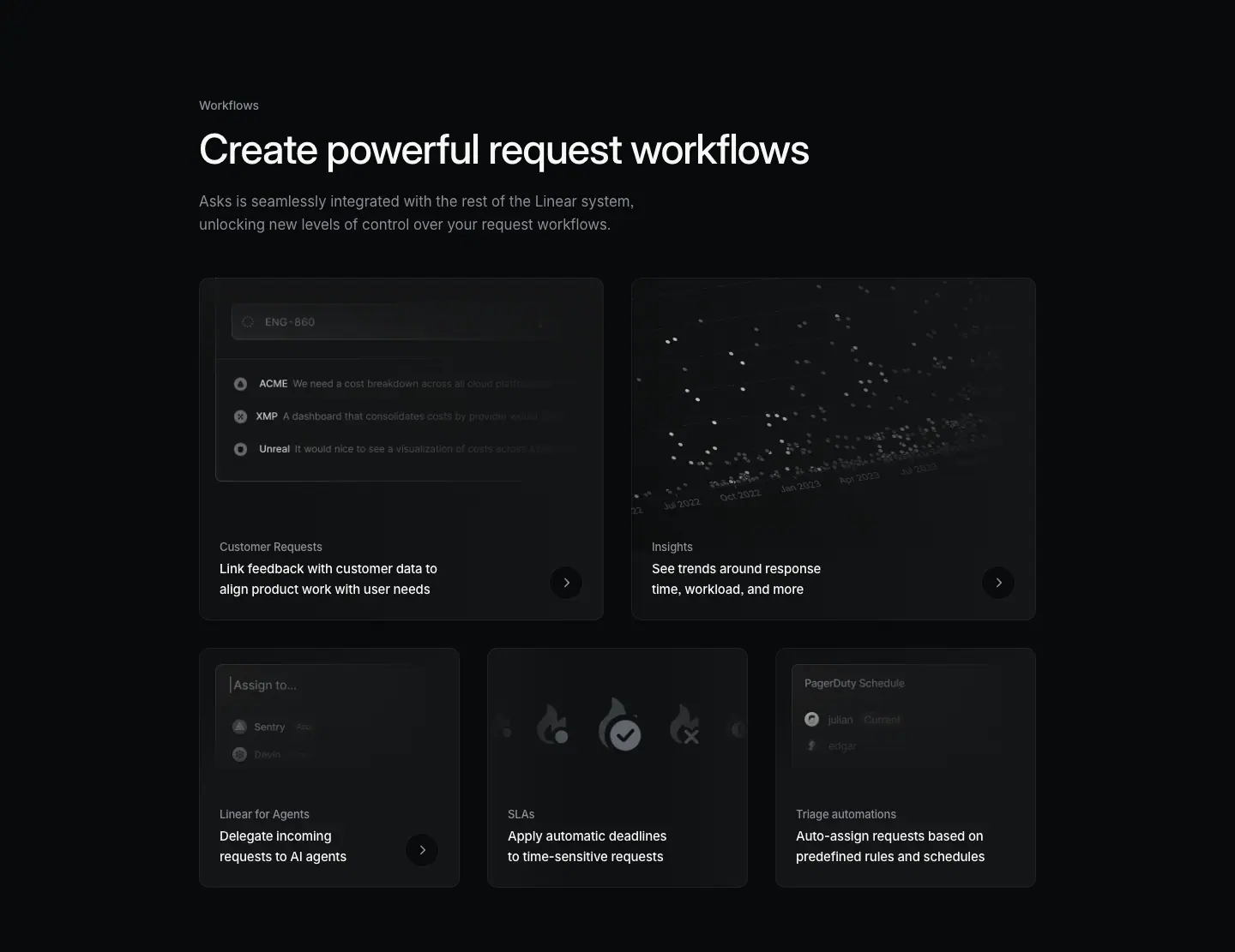
Section span: y 4009 → 5120 (1111 px).
Layout
- Header (stacked, not split). Eyebrow "Workflows" y=4123 (114 px from the section top). H2 y=4159 on one line (w=976, h=48). Sub y=4231 (H2 bottom 4207 → sub = 24 px), w=550, 2 lines (ends ≈ 4285). No right visual.
- Card bento, 2 + 3.
- Row 1 at y=4333 (48 px below the sub): 2 cards, 472 × 400, x=232 and x=736 (gap 32).
- Row 2 at y=4765 (row gap 32): 3 cards, 304 × 280, x=232 / 568 / 904 (gap 32).
- All 5 cards: bg #0f1011, radius 12 px, padding 32px 24px 24px, no border. Each card is a link (button/a element).
- Card anatomy: visual on top (row 1: 472 × 381–400; row 2: 304 × 266) bleeding to the card edges; text block at the bottom-left: label at card-relative y=305 (row 1) / 185 (row 2), title 23 px below; a round chevron button ≈ 28 px (≈ measured from screenshot) at the bottom-right, vertically centered on the title.
- Section bottom: row 2 ends 5045 → section ends 5120 (75 px).
Typography
| Role | Values |
|---|---|
| Eyebrow | 14px / 21px · 510 · -0.182px · #8a8f98 |
| H2 | 48px / 48px · 510 · -1.056px · #f7f8f8 |
| Sub | 17px / 27.2px · 400 · normal · #8a8f98 (400 here, not 510) |
| Card label (H3) | 13px / 19.5px · 510 · -0.13px (-0.01em) · #8a8f98 |
| Card title (P) | 15px / 24px · 510 · -0.165px · #f7f8f8 |
- Pairing: the card label is the product name (grey, small) and the title is the benefit (white, larger). The heading hierarchy is inverted on purpose: the H3 is the quieter element.
Color
- Cards #0f1011 on #08090a. The step is ≈ 1.1:1: cards are visible as soft shapes, not boxes.
- No borders on cards. Inside visuals: white dots of varying opacity (Insights scatter), grey flame icons with one white check badge (SLAs), small grey avatars.
- The chevron button: a dark circle (≈ #191a1b) with a light chevron.
Visual / UI illustration
1. Customer Requests (472 × 381): a faded issue search box "ENG-860" and three request rows with customer names "ACME", "XMP", "Unreal" and truncated quotes. Rows fade right.
2. Insights (472 × 400): a dense scatter plot of white dots with month labels on a tilted (rotated ≈ -10°, ≈ measured) x-axis ("Jul 2023", "Jan 2023"…). The tilt gives depth.
3. Linear for Agents (304 × 266): an "Assign to…" input with two faded agent rows.
4. SLAs (304 × 266): three flame icons; the center one is larger and white with a check badge; side flames grey with clock/x badges. Faded to the left and right edges.
5. Triage automations (304 × 266): a "PagerDuty Schedule" panel with two avatar rows (one with an on-call tag).
- All visuals fade into the card fill at the bottom so the text block sits on plain color.
Copy
- Eyebrow: "Workflows".
- H2: "Create powerful request workflows" (4 words). Verb-first.
- Sub: "Asks is seamlessly integrated with the rest of the Linear system, unlocking new levels of control over your request workflows." (20 words).
- Cards (label — title):
- "Customer Requests" — "Link feedback with customer data to align product work with user needs" (12 words)
- "Insights" — "See trends around response time, workload, and more" (8)
- "Linear for Agents" — "Delegate incoming requests to AI agents" (6)
- "SLAs" — "Apply automatic deadlines to time-sensitive requests" (6)
- "Triage automations" — "Auto-assign requests based on predefined rules and schedules" (8)
- Every card title starts with an imperative verb (Link, See, Delegate, Apply, Auto-assign) and names "requests" when possible. It ties each cross-sell back to the page topic.
Why it works
- The section is a cross-sell hub, but it reads as "what Asks can do" because the titles are phrased in Asks terms ("delegate incoming requests…").
- 2 + 3 bento sizes rank the links: the two larger cards (Customer Requests, Insights) are full product pages; the three smaller ones are feature pages.
- Borderless cards are calm. A 1-step surface lift (#0f1011) is enough because each card has a visual that defines its shape.
- The chevron button signals "this goes somewhere" without a text link, keeping card text to two lines.
Reuse recipe
- Header: eyebrow → 15 px → one-line H2 48 px → 24 px → 17 px/400 grey sub max 550 px → 48 px → cards.
- Row 1: two 472 × 400 cards; row 2: three 304 × 280 cards; gap 32 px both ways.
- Card: #0f1011, radius 12, padding 32px 24px 24px, no border, full-bleed visual on top that fades to the card fill.
- Text: 13 px/510 grey product label, then 15 px/510 white benefit title (≤ 2 lines); round ≈ 28 px chevron button bottom-right.
04 · How teams use Linear Asks (use cases + logo wall)
Section span: y 5120 → 6294 (1174 px).
Layout
- Top hairline at y=5173 (#18191a, 976 px).
- Spec-list split. Left column x=232, w=304: H2 at y=5270 (2 lines, h=72), description y=5354 (H2 bottom 5342 → desc = 12 px), 3 lines. Right column x=652, w=556 (ends at 1208). Gap between columns 116 px.
- Right column: 6 rows on a 109 px pitch (5270, 5379, 5488, 5597, 5706, 5815). Each row: title (24 px line) then description 36 px below the title top (12 px gap), 2 lines. Hairlines between rows (visible in the screenshot, ≈ #18191a).
- The first row title (5270) aligns with the top of the H2 (5270). Both columns start on the same line.
- Logo wall. Hairline y=5995. Caption y=6092 centered (x=256, w=928). Logo row ≈ y 6150 → 6180 (≈ measured), 6 wordmarks with the outer two cut by an edge fade (marquee). A hidden "Meet our customers" link (14 px/510 #f7f8f8, y=6161, x=652) sits on top of the logo row; it is a hover reveal.
- Spacing: hairline → H2 = 97 px; last row ends ≈ 5887 → hairline 5995 = 108 px; hairline → caption = 97 px.
Typography
| Role | Values |
|---|---|
| H2 | 32px / 36px · 510 · -0.704px (-0.022em) · #f7f8f8 |
| Left description | 15px / 24px · 400 · -0.165px · #8a8f98 |
| Row title (H3) | 15px / 24px · 510 · -0.165px · #f7f8f8 |
| Row description | 15px / 24px · 400 · -0.165px · #8a8f98 |
| Logo caption | 14px / 21px · 400 · -0.182px · #8a8f98, centered |
| "Meet our customers" | 14px / 21px · 510 · -0.182px · #f7f8f8 |
- Same size, different weight and color: row title and row description are both 15/24. Hierarchy comes from 510 + white vs 400 + grey only.
- The H2 drops from 48 px to 32 px. This signals a lower-tier, reference-style section.
Color
- No surfaces, no cards. Only #08090a, hairlines, white and grey text.
- Logos are monochrome grey/white wordmarks. The two outer logos fade to transparent.
Visual / UI illustration
- None. The section is pure text. The logo marquee is the only graphic.
Copy
- H2: "How teams use Linear Asks" (5 words).
- Description: "Linear Asks supports all types of workplace requests. From engineering and design to IT, legal, and HR." (17 words; the second sentence is a fragment that lists departments).
- Rows (title — description):
1. "Streamline bug reporting" — "Enable people outside of your engineering org to quickly file bug reports without worrying about complex issue details."
2. "Build an IT help desk" — "Turn any message in your #ask-IT channel into an IT ticket by reacting with an emoji."
3. "Escalate customer conversations" — "Forward emails from customers to create trackable issues when engineering support is needed."
4. "Standardize Ops requests" — "Configure templates with concrete instructions, placeholders, and checkboxes to standardize and streamline intake."
5. "Improve customer success" — "Add Linear Asks to shared Slack channels to enable your most important customers to file bug reports and feature requests."
6. "Manage sensitive HR tickets" — "Create private Asks via DM for sensitive requests that only you and your HR team can access."
- Titles: verb + department noun (3–4 words). Descriptions: one sentence, 13–20 words, each naming a concrete mechanism (emoji reaction, forward email, DM).
- Logo caption: "Trusted by product, GTM, and internal operations teams at leading companies" (11 words). It names the three buyer groups the page targets.
Why it works
- The split puts a short claim on the left and six proofs on the right. The left column stays short so the eye moves right quickly.
- Each row targets a different department. A reader from IT, Ops, HR or CS finds their own row by scanning bold titles only.
- No visuals here is a deliberate rest after the card-heavy Workflows section.
- The logo wall comes after the use cases. The reader first sees what teams do, then who those teams are.
Reuse recipe
- Left column 304 px: H2 32/36 · 510 · -0.022em, 12 px, 15 px grey description.
- Right column 556 px starting 116 px after the left column; rows on a ≈ 109 px pitch with 1 px hairlines between them.
- Row: 15 px/510 white title, 12 px gap, 15 px/400 grey description (≤ 2 lines).
- Logo wall: hairline, ≈ 97 px, centered 14 px grey caption, ≈ 58 px, one row of 6 monochrome wordmarks with edge fades and a hover "Meet our customers" link.
05 · Streamline your internal request workflows (final CTA)
Section span: y 6294 → 6595 (301 px).
Layout
- Two-sided row in the 976 px container. Left: heading x=232, w=640, y=6444, 2 lines (ends 6532). Right: two buttons at y=6468, right-aligned to x=1208.
- Buttons: "Contact sales" x=957, 130 × 40; "Get started" x=1094, 114 × 40. Gap between them ≈ 7 px. The primary button is the rightmost.
- The buttons sit vertically centered on the 88 px heading block (6444 + 24 = 6468).
- Top space 150 px (6294 → 6444). Bottom 63 px to the section end; footer hairline at y=6628.
Typography
| Role | Values |
|---|---|
| Heading (H3) | 40px / 44px · 510 · -0.88px (-0.022em) · #f7f8f8 |
| Buttons | 15px / 40px · 510 · normal |
Color
- "Get started": #e5e5e6 bg, #08090a text, 1 px #e5e5e6 border, radius 9999.
- "Contact sales": rgba(255,255,255,0.05) bg, #f7f8f8 text, no border, an inset ring shadow rgba(255,255,255,.03) 0 0 0 1px inset plus rgba(255,255,255,.04) highlight. Radius 9999.
Visual / UI illustration
- None.
Copy
- Heading: "Streamline your internal request workflows" (5 words). Verb-first. It restates the page in buyer language ("internal", "workflows").
- Buttons: "Contact sales" / "Get started".
Why it works
- A left-aligned CTA continues the left-aligned reading line of every section above. The eye ends where it has been scanning all page.
- Two buttons serve two buyers: self-serve ("Get started") and enterprise ("Contact sales"). The light fill marks the default.
- 150 px of empty space above isolates the CTA without a panel or background change.
Reuse recipe
- Heading 40/44 · 510 · -0.022em, w ≤ 640, two lines.
- Buttons at the right edge of the container, vertically centered on the heading, 8 px apart.
- Primary: #e5e5e6 / #08090a; secondary: rgba(255,255,255,.05) + 1 px inset ring rgba(255,255,255,.03).
- 150 px top padding, ≈ 96 px to the footer hairline, no background change.
06 · Footer
Section span: y 6595 → 7152 (557 px). Shared by all three pages in this set.
Layout
- Top hairline at y=6628, rgb(35,37,42) = #23252a, full width.
- Logo mark ≈ 18 px at x≈80, y≈6690 (≈ measured from screenshot). It aligns to the nav logo, not to the 976 px container.
- 5 link columns at x=304 / 528 / 752 / 976 / 1200, each w=160, pitch 224 px.
- Column heading y=6685 (57 px below the hairline). First link 44 px below the heading top (y=6729). Links on a 30 px pitch.
- Legal row y=7077: "Privacy", "Terms", "Other Policies" at x=304 / 369 / 426.
Typography
| Role | Values |
|---|---|
| Column heading | 13px / 19.5px · 510 · -0.13px · #f7f8f8 |
| Link | 13px / 19.5px · 400 · -0.13px · #8a8f98 |
| Legal link | 13px / 19.5px · 400 · -0.13px · #62666d |
Color
- #08090a surface, #23252a top rule. Three text tiers: white headings, #8a8f98 links, #62666d legal.
Copy
- Product: Intake, Plan, AI, Build, Pricing, Security.
- Features: Asks, Agents, Cloud Coding Agent, Customer Requests, Insights, Mobile, Reviews, Integrations, Changelog.
- Company: About, Customers, Careers, Now, Method, Quality, Brand.
- Resources: Switch, Download, Documentation, Developers, Enterprise, Startups, Status, Legal.
- Connect: Contact us, Community, X (Twitter), GitHub, YouTube.
Why it works
- Small type (13 px) and a single grey tier make 35 links feel light.
- Columns use the full 1440 width (x=304 → 1360), unlike the 976 px body column. The footer reads as site chrome, not page content.
Reuse recipe
- #23252a 1 px top rule, 57 px padding, logo at the far left (x≈80).
- 5 columns × 160 px on a 224 px pitch starting at x=304.
- 13 px headings (510 white), 13 px links (400 #8a8f98) on a 30 px pitch, 44 px heading → first link.
- Legal row in #62666d ≈ 390 px below the column headings.
Page-level takeaways
- One header module, reused three times. Sections 01 and 02 use the identical header split: eyebrow 114 px below the section top, H2 48/48, 24 px gap, bold-lead paragraph, chip row, 472 × 400 visual starting 28 px above the eyebrow. Consistency is the main craft signal.
- The bold-lead paragraph (first sentence
590 #f7f8f8, rest 510 #8a8f98, 17 px) replaces a separate sub-heading. It is the most reusable copy device on the page.
- Hairline grids, not cards, for feature lists.
#18191a lines at ≈ 1.2:1 contrast plus a center vertical divider. Cards (#0f1011, radius 12, no border) appear only for links to other pages.
- Type scale steps: 64 (H1) → 48 (section H2) → 40 (CTA) → 32 (reference H2) → 20 (cell title, quote) → 17 (intro) → 15 (body) → 14 (eyebrow, mini features) → 13 (card labels, footer). All display sizes use -0.022em.
- Color discipline: one saturated object per page (the indigo app icon). All other color lives inside faux UI at small sizes (red badge, orange triage icon, indigo mention chip).
- Faux UI, cropped and faded. Every visual shows one control that proves one claim (composer, compose card, form dropdown, toast stack, context menu). Edges fade into the page so the visual never ends in a hard box.
- Copy: verb-first titles everywhere (Create, Turn, Build, Get, Link, Delegate, Apply). Descriptions are one sentence of 10–20 words with a concrete mechanism (emoji, cc, DM).
- Proof is placed at the end of each story: a $30,000 quote after the capture story; a logo wall after use cases.
- Fixed vertical rhythm: 114 px from section top to eyebrow; 150 px top padding on reference sections and the CTA; 49 px from hairline to cell content.
- No light testimonial cards on this page.
#e5e5e6 appears only on the primary buttons and the "Send" pill inside a visual.
Section inventory
| # |
Section |
Pattern name |
Key values |
| 00 |
Hero |
Hero-centered (icon-on-grid) |
H1 64/67.84 · 510 · -1.408px; column 832 @ x=304; 120 px indigo icon tile; 16/16/32 stack; pill button 180 × 40 #e5e5e6 |
| 01a |
Intake header |
Section-header-split |
eyebrow @ +114; H2 48/48 · 510; bold-lead para 17 px (590 white / 510 grey); visual 472 × 400 @ x=736 |
| 01b |
Channel cells |
Bento-2x2 (hairline grid) |
rows 481 px; #18191a lines; title 20/26.6 · 510; desc 15/24 · 400 #8a8f98; right text x=760 |
| 01c |
Extras |
Feature-4up-text |
4 × 220 px, gap 32; 14/21 title #d0d6e0 + 14/21 grey desc |
| 01d |
Quote |
Testimonial-quote |
20/26.6 · 510 white, w=750 centered, wordmark below |
| 02a |
Triage header |
Section-header-split |
same as 01a; context menu as live text over image |
| 02b |
Sync + access |
Bento-2-up (visual-first) |
rows 508 px; 228 px visuals; 2-line 20 px titles; desc w=340 |
| 03 |
Workflows |
Section-header-stacked + Bento-2+3 cards |
cards #0f1011 r=12 pad 32/24/24; 472 × 400 ×2, 304 × 280 ×3, gap 32; 13 px label + 15 px title + chevron |
| 04a |
Use cases |
Spec-list (split 304 / 556) |
H2 32/36; rows 109 px pitch; 15/24 title 510 + desc 400 |
| 04b |
Logo wall |
Logo-marquee |
caption 14 px grey centered; 6 wordmarks with edge fades; hover "Meet our customers" |
| 05 |
CTA |
Final-CTA-split (left heading, right buttons) |
H3 40/44 · 510; buttons 40 px, secondary then primary; 150 px top pad |
| 06 |
Footer |
Footer-5col |
#23252a rule; columns x=304 + 224n; 13 px; links 30 px pitch |
Linear Insights — /insights
- URL: https://linear.app/insights
<title>: Insights – Linear- Meta description: "Instant analytics and customizable dashboards for product and engineering teams."
- Page height: 6099 px at a 1440 px viewport width. Body background
#08090a.
- Template: older centered "feature" template. Centered 64 px H1 in a 640 px column (x=400) under a full-bleed hero video; body sections in the 976 px column at x=232; one 1024 px wide dashboard image and one 1024 px card row at x=208.
How it differs from the newer "product" template. (1) The hero is centered and starts with a 1440 × 450 background video, not a left-aligned 72 px H1 at x=78. (2) The H1 uses weight 590 (semibold), the only H1 in this set that does. (3) Section H2s are 48 px but sit in a 472 px half-column with an empty right half. (4) Cell descriptions are 14 px (Asks uses 15 px). (5) The quote is 24 px / 590, larger than the 20 px quotes on /asks and /customer-requests. (6) A "Tech specs" accordion closes the page, a pattern the newer template also uses but with different chrome. (7) There are no light testimonial cards.
Narrative arc. The page sells two linked features in one breath: "Instant insights. Durable dashboards." The hero is atmosphere: an out-of-focus animated chart with red and blue bars. Section 01 ("Instant analytics for any stream of work") covers the ad-hoc tool: drill down on a data point, zoom out to a scatter view. A one-line quote confirms the team-level use. Section 02 ("Combine insights into dashboards") covers the durable artifact: a full dashboard, modular widgets, privacy controls, then three question-shaped use cases ("Where are we spending our resources?") and a logo wall. "Tech specs" lists nine capabilities as an accordion for evaluators. The CTA states the plan requirement ("Insights is included with Linear Business, Dashboards with Linear Enterprise") before the buttons. The order is: mood → instant answers → durable dashboards → questions you can answer → spec sheet → plan + act.
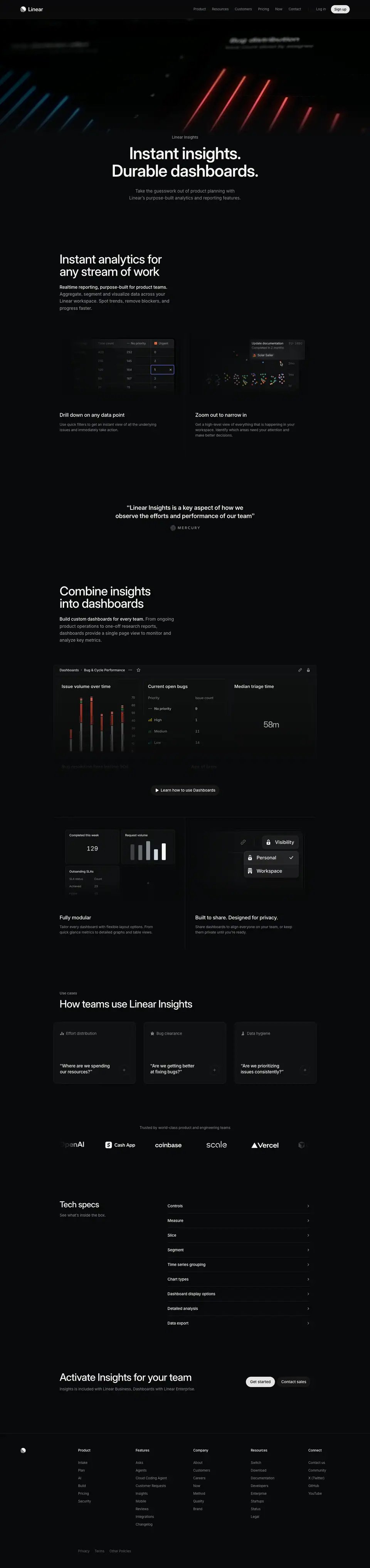
00 · Hero
Section span: y 0 → 834.
Layout
- Full-bleed <video> at y=72 (directly under the nav), x=0, 1440 × 450 (ends y=522). Source: an AV1 MP4 (hero-av1.mp4).
- Text column x=400, w=640, centered.
- Eyebrow y=522, right where the video ends. Eyebrow bottom (546) → H1 (562) = 16 px.
- H1 y=562, h=136 (2 lines, ends 698). H1 → sub = 32 px (sub y=730).
- Sub 2 lines (ends ≈ 784). Section ends at 834 (50 px).
- No button in the hero. It is the only hero in this set without a CTA.
Typography
| Role | Values |
|---|---|
| Eyebrow "Linear Insights" | 15px / 24px · 510 · -0.165px · #8a8f98 |
| H1 | 64px / 67.84px · 590 · -1.408px (-0.022em) · #f7f8f8 |
| Sub | 17px / 27.2px · 400 · normal · #8a8f98 |
- H1 breaks at the sentence boundary: "Instant insights." / "Durable dashboards." Each line is a full sentence.
- The 590 weight makes the two short lines dense and poster-like. A 510 weight at this length would look thin.
Color
- The video carries the only color: saturated red bars (≈ #d03a3a, ≈ measured from screenshot) on the right, blue bars (≈ #2a7fd0, ≈ measured) on the left, both glowing and out of focus, with faint dotted grid lines.
- Text sits on plain #08090a. The video's lower edge fades into the page so the eyebrow has no hard line above it.
Visual / UI illustration
- The video shows a 3D bar chart filmed with shallow depth of field. Chart titles are blurred into texture ("Bug distribution", "Issue count sliced by assignee" are just legible, top right; another title top left is unreadable).
- The bars are diagonal and thin, like light streaks. The camera appears to dolly across the chart (motion is implied by the blur; static capture).
- It is real product chart content, abstracted by blur so it reads as mood, not as information.
Copy
- Eyebrow: "Linear Insights".
- H1: "Instant insights. Durable dashboards." (4 words). Two parallel adjective + noun sentences. The adjectives contrast time: "instant" (now) vs "durable" (lasting). The pair maps to the two page halves.
- Sub: "Take the guesswork out of product planning with Linear's purpose-built analytics and reporting features." (15 words). Pain removal ("guesswork") + category ("analytics and reporting").
Why it works
- The blurred chart signals "data" instantly without asking the reader to parse a chart in the first second.
- Red and blue are the only saturated colors on the whole page, so the hero is unmistakable as the top.
- No button keeps the hero pure. The reader scrolls straight into the product sections; CTAs appear only at the end.
- The two-sentence H1 is a table of contents: section 01 = instant, section 02 = durable.
Reuse recipe
- 1440 × 450 background video under the nav, faded into #08090a at the bottom; blur a real chart with heavy depth of field and keep 1–2 saturated hues.
- Text column 640 px: 15 px/510 grey eyebrow at the video's bottom edge → 16 px → H1 64/67.84 · 590 · -0.022em → 32 px → 17 px grey sub.
- Write the H1 as two parallel two-word sentences, one per line.
- Omit the hero button when the page's job is explanation and the CTA lives at the end.
01 · Instant analytics for any stream of work
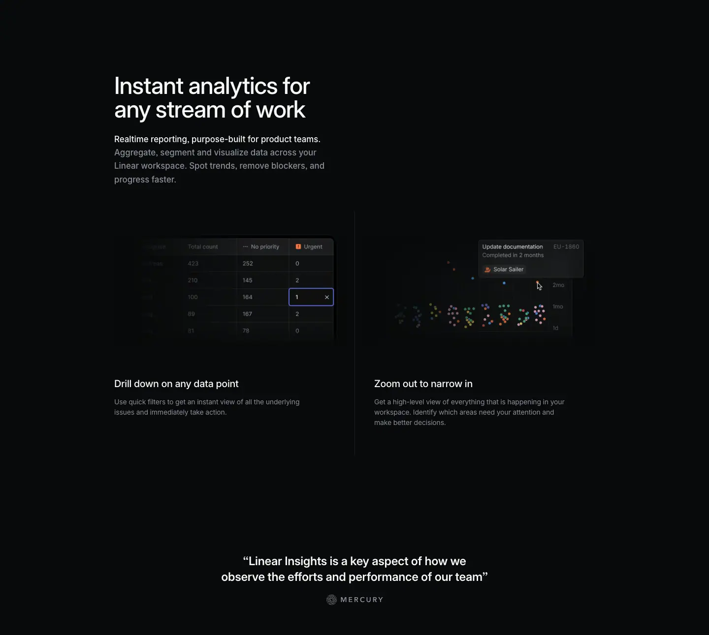
Section span: y 834 → 2125 (1291 px).
Layout
- Header (left half only). H2 y=984 (150 px below the section top), x=232, w=472, 2 lines (ends 1080). Paragraph y=1104 (24 px gap), w=472, 4 lines (ends ≈ 1213). No eyebrow. The right half (x 736 → 1208) is empty. The negative space is deliberate: it gives the H2 weight without a visual.
- 2-up cells. Images at y=1311 (≈ 98 px below the paragraph): left 472 × 228 at x=232, right 472 × 228 at x=736. A vertical divider at x=720 runs ≈ y 1264 → 1754 (≈ measured from screenshot). No horizontal hairlines.
- Titles y=1601 (62 px below the image bottom at 1539). Descriptions y=1640 (12 px below the title box), w=400. Left 2 lines, right 3 lines.
- Text x: left cell at 232, right cell at 760 (40 px from the divider), same as /asks.
- Quote. y=1959, centered, x=400, w=640, 2 lines (ends ≈ 2023). Wordmark ≈ y 2042 → 2058 (≈ measured). ≈ 256 px of space above the quote. Section ends at 2125.
Typography
| Role | Values |
|---|---|
| H2 | 48px / 48px · 510 · -1.056px · #f7f8f8 |
| Paragraph | 17px / 27.2px · 510 · normal · #8a8f98 |
| Paragraph lead (span) | 17px / 27.2px · 510 · #f7f8f8 (white, but 510, not 590 as on /asks) |
| Cell title (H3) | 20px / 26.6px · 510 · -0.24px · #f7f8f8 |
| Cell description | 14px / 21px · 400 · -0.182px · #8a8f98 |
| Quote | 24px / 31.92px (1.33) · 590 · -0.288px (-0.012em) · #f7f8f8 |
- Bold-lead paragraph again, but the lead differs only by color (white vs grey), not by weight.
- The quote is the largest non-heading text on the page (24 px/590). It acts as a mini-headline.
Color
- Page #08090a. Visual panels ≈ #0f1011 with ≈ 1 px #23252a borders.
- Accents inside visuals: an indigo focus ring (≈ #5e6ad2) on the selected table cell; an orange "Urgent" priority glyph; multi-colored scatter dots (green, red, purple, yellow, blue, ≈ 6 px each).
Visual / UI illustration
- Left (472 × 228): a pivot table with columns "Total count", "No priority", "Urgent". Rows of counts (423/252/0, 210/145/2, 100/164/1, 69/187/2, 51/76/0). The cell "1" under Urgent is selected with an indigo outline and an "×" clear icon (a quick filter). The row-label column is faded to near-invisible on the left. It shows "click a number to drill down".
- Right (472 × 228): a scatter plot of issues by completion time with a y-axis ("2mo", "3mo", "1d"). A tooltip card "Update documentation — EU-1880 — Completed in 2 months — Solar Sailer" and a cursor arrow point at one dot. Dots fade on the left.
- Both visuals are faux UI with real chart semantics, cropped at the edges and faded.
Copy
- H2: "Instant analytics for any stream of work" (7 words). Category + scope ("any stream of work").
- Paragraph: "Realtime reporting, purpose-built for product teams. Aggregate, segment and visualize data across your Linear workspace. Spot trends, remove blockers, and progress faster." (22 words). Two triplets of verbs: (aggregate, segment, visualize) and (spot, remove, progress).
- Cell 1: "Drill down on any data point" — "Use quick filters to get an instant view of all the underlying issues and immediately take action." (17 words)
- Cell 2: "Zoom out to narrow in" — "Get a high-level view of everything that is happening in your workspace. Identify which areas need your attention and make better decisions." (23 words). The title is a paradox ("zoom out to narrow in") that pairs with cell 1's "drill down".
- Quote: "Linear Insights is a key aspect of how we observe the efforts and performance of our team" (17 words) + fintech customer wordmark.
Why it works
- The empty right half makes this section feel spacious and editorial. It also makes the two visuals below the first images the reader sees, so they carry the explanation.
- The two cells are a matched pair: zoom in (table cell) vs zoom out (scatter). The vertical divider frames them as opposites.
- The cell visuals are only 228 px tall. Small visuals keep the focus on one interaction each (a selected cell; a tooltip).
- The 24 px quote reads as a pull-quote. Placing it 256 px below the cells isolates it as a section close.
Reuse recipe
- 150 px top padding; H2 48/48 in a 472 px column; 24 px; 17 px/510 grey paragraph with a white lead sentence; leave the right half empty.
- 98 px below: two 472 × 228 visuals with a 1 px vertical divider at the container center (x=720).
- Text under visuals: 62 px → 20/26.6 · 510 white title → 12 px → 14/21 · 400 grey description (w ≤ 400). Right column text at divider + 40 px.
- Pull-quote: 24/31.92 · 590 · -0.012em white, w=640, centered, wordmark ≈ 20 px below, ≈ 250 px space above.
02 · Combine insights into dashboards
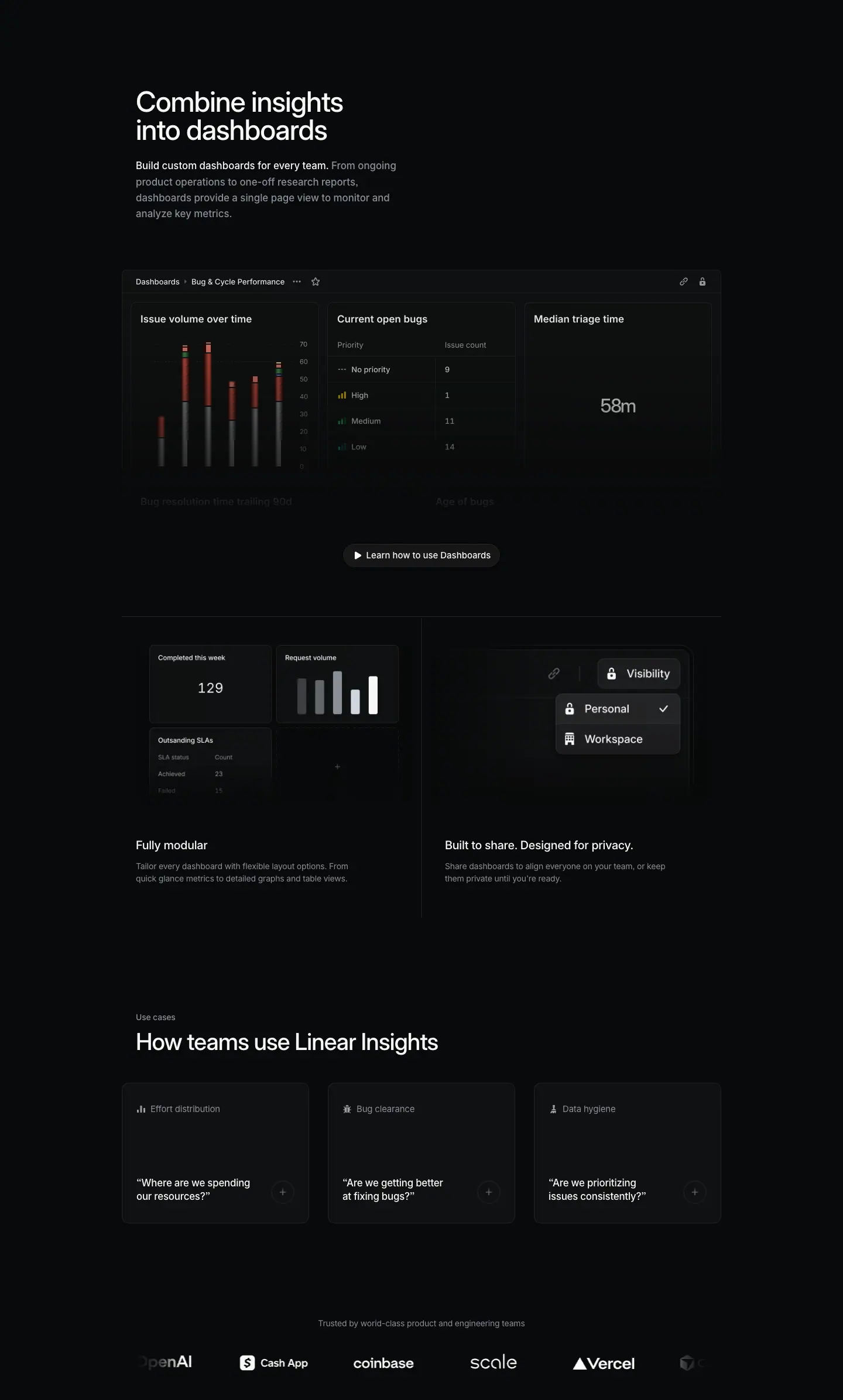
Section span: y 2125 → 4517 (2392 px). It holds: header, full dashboard visual with an overlay button, 2-up cells, use-case cards, logo wall.
Layout
- Header (left half). H2 y=2275 (150 px top), w=472, 2 lines (ends 2371). Paragraph y=2395 (24 px), 4 lines (ends ≈ 2504). Right half empty again.
- Dashboard visual. y=2586 (82 px below the paragraph), x=208, 1024 × 566 (ends 3152). It is wider than the text column by 24 px on each side. A header bar runs y 2586 → 2625 (39 px; hairlines detected at both edges).
- Widgets: three cards in a row (≈ 320 px each, gap ≈ 16 px, ≈ measured), then a second row whose titles are faded to ≈ 10 % opacity.
- Overlay button "Learn how to use Dashboards" at y=3054, x=586, 269 × 40, centered on the image's faded lower part (98 px above its bottom edge).
- 2-up cells. Hairline y=3178 (#23252a, 26 px under the dashboard). Vertical divider at x=720. Images at y=3227 (49 px below the hairline), 472 × 266, x=232 and x=736. Titles y=3556 (63 px below images); descriptions y=3594 (≈ 11 px gap), w=400, 2 lines.
- Use cases. Eyebrow "Use cases" y=3852 (≈ 216 px after the cells). Heading y=3883 (10 px below the eyebrow), one line (ends 3927).
- Three cards at y=3975 (48 px below the heading), each 320 × 240, x=208 / 560 / 912 (gap 32, spanning 1024 px).
- Card: bg #0f1011, border 1 px rgb(32,33,34) = #202122, radius 12, padding 32px 24px.
- Card content: icon + label at the top (y=4008, 33 px from the card top); a question in quotes at the bottom (y=4135, 2 lines, ends ≈ 4183, 32 px from the card bottom at 4215); a ≈ 24 px "+" circle at the bottom-right.
- Logo wall. Caption y=4375 (160 px below the cards), centered. Logo row ≈ y 4440 → 4462 (6 wordmarks, outer two faded). Hover link "Meet our customers" at y=4444, x=652. Section ends 4517.
Typography
| Role | Values |
|---|---|
| H2 | 48px / 48px · 510 · -1.056px · #f7f8f8 |
| Paragraph | 17px / 27.2px · 510 · #8a8f98; lead 510 · #f7f8f8 |
| Overlay button | 15px / 40px · 510 · #f7f8f8 on rgba(255,255,255,.05), radius 9999, padding 0 16, play icon |
| Cell title | 20px / 26.6px · 510 · -0.24px · #f7f8f8 |
| Cell description | 14px / 21px · 400 · -0.182px · #8a8f98 |
| Use-case eyebrow (H2 tag) | 14px / 21px · 510 · -0.182px · #8a8f98 |
| Use-case heading (P tag) | 40px / 44px · 510 · -0.88px · #f7f8f8 |
| Card label (H3) | 15px / 24px · 400 · -0.165px · #8a8f98 |
| Card question | 17px / 23.8px (1.4) · 510 · -0.204px (-0.012em) · #f7f8f8 |
| Logo caption | 14px / 21px · 400 · -0.182px · #8a8f98 |
- Semantic tags are inverted for SEO: the small eyebrow "Use cases" is the
<h2>; the 40 px "How teams use Linear Insights" is a <p>.
- Card questions use 17 px with a tight 1.4 line-height and negative tracking: a "spoken" voice, larger than body copy.
Color
- Dashboard: panel ≈ #0f1011, widgets ≈ #141516 with ≈ 1 px #23252a borders.
- Data colors in the dashboard: stacked bars in dark red (≈ #8b2a2a) and grey, with thin green, orange, blue and yellow top segments; priority glyphs in orange (High), green (Medium), teal (Low). The "58m" metric is large grey text, not white.
- Use-case cards add a visible 1 px border (#202122). The /asks cards have none. These cards have no visual, so the border defines their shape.
Visual / UI illustration
- Dashboard (1024 × 566). Breadcrumb "Dashboards › Bug & Cycle Performance" with "…" and star icons; link and lock icons at the right. Widgets: "Issue volume over time" (stacked bar chart, y-axis 0–70), "Current open bugs" (table: Priority / Issue count — No priority 9, High 1, Medium 11, Low 14), "Median triage time" (single metric "58m"). Second-row widgets "Bug resolution time trailing 90d" and "Age of bugs" are faded ghosts. The fade gives the overlay button a quiet background.
- Cell left (472 × 266) "Fully modular". A small widget grid: "Completed this week 129", "Request volume" (five bars, the last one white), "Outstanding SLAs" table (Achieved 23, Failed 15), and an empty slot with "+". It shows layout composition.
- Cell right (472 × 266) "Built to share". A toolbar with a link icon and a "Visibility" button with a lock; an open menu "Personal ✓" / "Workspace". Large type (≈ 15 px) for a small control: the control is zoomed in.
- Use-case cards. No visual; only a small icon next to the label (bar chart, bug, broom/brush glyph).
Copy
- H2: "Combine insights into dashboards" (4 words). Verb-first.
- Paragraph: "Build custom dashboards for every team. From ongoing product operations to one-off research reports, dashboards provide a single page view to monitor and analyze key metrics." (27 words). "From X to Y" range construction.
- Overlay button: "Learn how to use Dashboards" (a docs/video link, not a sign-up).
- Cell 1: "Fully modular" — "Tailor every dashboard with flexible layout options. From quick glance metrics to detailed graphs and table views." (17 words)
- Cell 2: "Built to share. Designed for privacy." — "Share dashboards to align everyone on your team, or keep them private until you're ready." (15 words). The title repeats the H1's two-sentence parallel form.
- Use cases eyebrow: "Use cases". Heading: "How teams use Linear Insights" (5 words).
- Cards (label — question):
- "Effort distribution" — "“Where are we spending our resources?”"
- "Bug clearance" — "“Are we getting better at fixing bugs?”"
- "Data hygiene" — "“Are we prioritizing issues consistently?”"
- Logo caption: "Trusted by world-class product and engineering teams" (7 words).
Why it works
- The dashboard is the one big "money shot" of the page, so it alone breaks out to 1024 px. Every other visual stays within 472 px.
- Fading the dashboard's second row and putting a button there converts dead space into a CTA spot without adding a new block.
- Use cases written as questions in the reader's voice: a manager recognizes their own question before reading any feature claim. The label names the report; the question names the need.
- The use-case cards carry no images, so they cost nothing to produce and keep the page fast. The border keeps them from dissolving into the page.
Reuse recipe
- Header 472 px with empty right half; 82 px; one 1024 × ≈ 566 product visual at x=208 whose lower third fades out.
- Put a secondary pill button (rgba(255,255,255,.05), 15 px/510, play icon, 40 px) centered on the faded area, ≈ 98 px above the image bottom.
- 2-up cells: #23252a hairline → 49 px → 472 × 266 visuals → 63 px → 20 px title → 11 px → 14 px description.
- Use-case cards: 3 × 320 × 240, #0f1011, 1 px #202122, r=12, padding 32/24; 15 px grey label with icon at top, 17/23.8 · 510 white question in curly quotes at bottom, "+" circle right.
- Logo wall 160 px below: 14 px grey centered caption, 6 monochrome wordmarks with edge fades.
03 · Tech specs
Section span: y 4517 → 5185 (668 px).
Layout
- Split: left x=232 w=304; right x=652 w=556 (ends 1208). Same split as the /asks use-case list.
- Left: H2 y=4667 (150 px top), one line (ends 4703); sub y=4715 (12 px gap).
- Right: 9 accordion rows on a 57 px pitch (row labels at y=4679, 4736, 4793, 4850, 4907, 4964, 5021, 5078, 5135). 1 px hairlines between rows (≈ #18191a, visible in the screenshot). A chevron "›" at the right edge (x≈1198) of every row.
- The first row label (4679) sits 12 px below the H2 top. The H2 and the list start on almost the same line.
- The page DOM holds 8+ hidden images at x=652, w=544 (heights 294 / 452 / 498). These are the collapsed accordion panels: each row expands to a 544 px wide illustration.
Typography
| Role | Values |
|---|---|
| H2 | 32px / 36px · 510 · -0.704px · #f7f8f8 |
| Sub | 15px / 24px · 400 · -0.165px · #8a8f98 |
| Row label (H3) | 15px / 24px · 510 · -0.165px · #f7f8f8 |
Color
- No surfaces. White labels, grey chevrons (≈ #8a8f98), faint hairlines.
Visual / UI illustration
- None visible in the collapsed state. Each row hides an illustration (544 px wide) that appears on expand.
Copy
- H2: "Tech specs" (2 words). Borrowed from hardware spec sheets.
- Sub: "See what's inside the box." (5 words). Continues the hardware metaphor.
- Rows: "Controls", "Measure", "Slice", "Segment", "Time series grouping", "Chart types", "Dashboard display options", "Detailed analysis", "Data export". Mostly 1–2 word nouns or verbs; no descriptions in the collapsed state.
Why it works
- Evaluators who need a feature checklist get one without the page showing nine more visuals. The accordion keeps the section to 668 px.
- The hardware metaphor ("inside the box") frames software as a finished, engineered product.
- Labels only, no sentences: the list scans in two seconds.
Reuse recipe
- Split 304 / 556 with a 116 px gutter; 150 px top padding.
- Left: 32/36 · 510 H2 + 12 px + 15 px grey sub.
- Right: rows on a 57 px pitch, 15 px/510 white label, chevron at the right edge, 1 px hairline between rows.
- Each row expands to a 544 px wide illustration; keep everything collapsed by default.
04 · Activate Insights for your team (final CTA)
Section span: y 5185 → 5542 (357 px).
Layout
- Left: heading y=5335 (150 px top), x=232, w=640, one line (ends 5379). Sub y=5391 (12 px gap), one line (ends 5415).
- Right: buttons at y=5355, vertically centered on the 80 px heading + sub block. "Get started" x=957, 114 × 40 (primary, left); "Contact sales" x=1078, 130 × 40 (secondary, right). Gap 7–8 px.
- Section ends at 5542 (127 px below the sub). Footer hairline at y=5575.
Typography
| Role | Values |
|---|---|
| Heading | 40px / 44px · 510 · -0.88px · #f7f8f8 |
| Sub | 15px / 24px · 400 · -0.165px · #8a8f98 |
| Buttons | 15px / 40px · 510 |
Color
- Primary #e5e5e6 / #08090a; secondary rgba(255,255,255,.05) / #f7f8f8 with an inset 1 px rgba(255,255,255,.03) ring.
Visual / UI illustration
- None.
Copy
- Heading: "Activate Insights for your team" (5 words). Verb-first; "activate" assumes an existing workspace.
- Sub: "Insights is included with Linear Business, Dashboards with Linear Enterprise." (10 words). A plan disclosure, written as one sentence with ellipsis of the verb in the second clause.
- Buttons: "Get started" / "Contact sales".
Why it works
- Stating the plan tier right above the button removes a later surprise. It also routes Enterprise-interested readers to "Contact sales".
- A one-line heading with a one-line grey sub is the shortest CTA in this set; it fits the factual tone of the preceding spec list.
Reuse recipe
- 150 px top padding; 40/44 heading (1 line) + 12 px + 15 px grey sub that names the plan requirement.
- Buttons right-aligned, vertically centered on the text block; primary first.
- No background change; ≈ 160 px to the footer hairline.
05 · Footer
Section span: y 5542 → 6099 (557 px). Identical to the /asks and /customer-requests footers.
Layout / Typography / Color
- #23252a hairline at y=5575. Logo mark at x≈80. Columns at x=304 / 528 / 752 / 976 / 1200 (w=160). Headings y=5632, 13px / 19.5px · 510 · -0.13px · #f7f8f8. Links 13px / 19.5px · 400 · #8a8f98, 30 px pitch. Legal row in #62666d.
Copy
- Product / Features / Company / Resources / Connect, 35 links.
Why it works / Reuse recipe
- See /asks section 06.
Page-level takeaways
- Two-feature page with a two-sentence H1. "Instant insights. Durable dashboards." sets up section 01 (instant) and section 02 (durable). The structure follows the headline exactly.
- Atmospheric hero video, no hero CTA. A blurred real chart in red and blue is the only saturated color on the page. The first button appears 3000 px down (overlay on the dashboard), the first sign-up button at the end.
- Half-width headers with empty right halves. Both main sections place the H2 + paragraph in 472 px and leave 472 px empty. It is calmer than the
/asks header split with a visual.
- One break-out visual. Only the dashboard (1024 × 566) and the use-case card row use the 1024 px container. Everything else stays in 976 px.
- Smaller cell descriptions (14/21) than
/asks (15/24). Cell titles stay 20/26.6 · 510.
- Questions as use cases. Card copy in the reader's voice ("Are we getting better at fixing bugs?") at 17 px/510 with 1.4 line-height.
- Quote as pull-quote: 24/31.92 · 590, the largest quote style in this set.
- Spec accordion with a hardware metaphor ("Tech specs", "See what's inside the box") closes the product story for evaluators.
- Plan disclosure in the CTA sub removes pricing doubt before the button.
- Consistent 150 px top padding before every H2 (sections 01, 02, tech specs, CTA). No eyebrows except "Use cases".
Section inventory
| # |
Section |
Pattern name |
Key values |
| 00 |
Hero |
Hero-centered (video background, no CTA) |
video 1440 × 450; eyebrow 15 px; H1 64/67.84 · 590; column 640 @ x=400; 16/32 px stack |
| 01a |
Instant analytics header |
Section-header-left-half (empty right) |
H2 48/48 · 510 w=472; para 17/27.2 · 510 with white lead; 150 px top |
| 01b |
Drill / zoom cells |
Bento-2-up (divider only) |
visuals 472 × 228; title 20/26.6; desc 14/21 w=400; divider x=720 |
| 01c |
Quote |
Testimonial-quote (pull-quote) |
24/31.92 · 590 white, w=640 centered + wordmark |
| 02a |
Dashboards header |
Section-header-left-half |
same as 01a |
| 02b |
Dashboard visual |
Wide-visual-1024 with overlay button |
1024 × 566 @ x=208; faded 2nd row; secondary pill 269 × 40 centered |
| 02c |
Modular / privacy cells |
Bento-2-up (hairline + divider) |
#23252a line; visuals 472 × 266; 20 px title; 14 px desc |
| 02d |
Use cases |
Use-case-cards-3up (question cards) |
eyebrow 14 px; heading 40/44; cards 320 × 240 #0f1011 + 1 px #202122, r=12, pad 32/24; question 17/23.8 · 510 |
| 02e |
Logo wall |
Logo-marquee |
14 px grey caption; 6 wordmarks with edge fades; hover "Meet our customers" |
| 03 |
Tech specs |
Spec-list (accordion, split 304 / 556) |
H2 32/36; rows 57 px pitch; 15 px/510 labels; chevrons; hidden 544 px panels |
| 04 |
CTA |
Final-CTA-split (with plan sub) |
heading 40/44 one line; sub 15 px grey; primary "Get started" left, "Contact sales" right |
| 05 |
Footer |
Footer-5col |
same as /asks |
Customer Requests — /customer-requests
- URL: https://linear.app/customer-requests
<title>: Customer Requests – Linear- Meta description: "Bring the voice of the customer into product development. Capture feedback, understand user needs, and build what customers actually want."
- Page height: 6459 px at a 1440 px viewport width. Body background
#08090a.
- Template: older centered "feature" template, in its most narrative variant. Centered 64 px H1 (shrink-wrapped box w=597 at x=422), a full-width 976 × 474 product image under the hero, then one long section (y 961 → 5601) that tells a single story in four chapters. Text column 976 px at x=232; cards and two images widen to the 1024 px container (x=208).
How it differs from the newer "product" template. (1) Centered hero with text first and the product image below it, not a left-aligned 72 px H1 at x=78. (2) Every container is 976/1024 px wide, centered, not a wide 1280+ layout. (3) Chapter headings are 40 px, not 48 px, and they are <span>s inside one section, not separate <h2> sections. (4) Intro paragraphs are 17 px / 400. (5) Feature-cell titles are 20 px / 510 in one place and 16 px / 590 in the 2×2 grid. (6) The page has no eyebrows on its chapters. (7) One diagram uses Berkeley Mono 11 px uppercase labels. (8) There are no light testimonial cards; quotes are white text on the dark page between two #23252a hairlines.
Narrative arc. The page is a single argument about the customer's voice. The hero states the outcome ("Build what customers actually want") and shows the end state: a project with customer requests attached and a customer record synced from a CRM. Chapter 1 ("Make customer feedback accessible") shows the input: eight support and CRM tools feed one line into Linear. A quote from a customer's product leader confirms that sales and success now feed engineering. Chapter 2 ("Connect product instincts with customer insights") shows prioritization: filter the roadmap by revenue and tier, enrich with CRM data, see context, get notified, auto-prioritize. Chapter 3 ("Bring customer focus to all your teams") turns to the org: product, engineering and sales each get a card. A row of related products closes the chapter. The CTA restates the H2 ("Bring the voice of your customers into Linear") with an activation button. The order is: outcome → input → prioritization → organization → act.
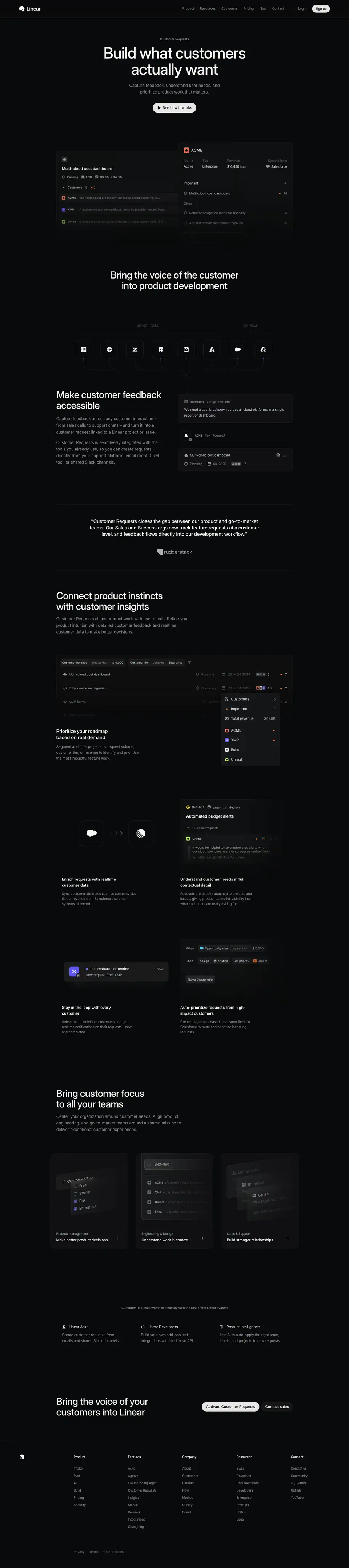
00 · Hero
Section span (crop): y 0 → 961. The hero image runs to y=1058, so the crop cuts it ≈ 97 px before its faded end.
Layout
- Centered column. Nav bottom (72) → eyebrow (152) = 80 px of empty space. No illustration above the text.
- Eyebrow y=152, x=660, w=120.
- H1 y=184, box x=422, w=597, h=136 (2 lines). Eyebrow bottom (171.5) → H1 = 12.5 px.
- Sub y=339, x=510, w=420 (narrow), 2 lines (ends ≈ 393). H1 bottom (320) → sub = 19 px.
- Button y=424, x=630, 180 × 40. Sub → button = 31 px.
- Product image y=584, x=232, 976 × 474. Button bottom (464) → image = 120 px.
- Image composition: two overlapping panels. Left panel (project) starts ≈ x 232, top ≈ y 645; right panel (customer record) starts ≈ x 735, top ≈ y 585 and overlaps the left panel's right edge by ≈ 30 px (≈ measured from screenshot). Both fade to the page color toward the bottom.
Typography
| Role | Values |
|---|---|
| Eyebrow "Customer Requests" | 13px / 19.5px · 510 · -0.13px · #8a8f98 (13 px here; Asks uses 14 px, Insights 15 px) |
| H1 | 64px / 67.84px · 510 · -1.408px (-0.022em) · #f7f8f8 |
| Sub | 17px / 27.2px · 400 · normal · #8a8f98 |
| Button | 15px / 40px · 510 · #08090a |
- The H1 wraps naturally at w=597: "Build what customers" / "actually want".
- The sub is held to 420 px so it breaks into two short lines of ≈ 5–6 words. A narrow measure under a wide H1 forms an inverted pyramid.
Color
- Page #08090a. Image panels ≈ #0f1011 (left) and a slightly lighter, bordered ≈ #141516 (right), ≈ measured.
- Small color only inside the image: customer avatar tiles (ACME orange-red ≈ #e5654a, XMP indigo, Unreal green), an orange "▲ 2" priority marker, a cloud icon for the CRM.
- Primary button #e5e5e6 / #08090a, radius 9999.
Visual / UI illustration
- Faux product UI at real scale (≈ 1:1 type sizes).
- Left panel: project "Multi-cloud cost dashboard"; property chips "Planning", "ENG", "Q3 '25 → Q4 '25"; a "Customers 13 ▲ 2" group; three request rows: "ACME — We need a cost breakdown across all cloud platforms in…", "XMP — A dashboard that consolidates costs by provider would. Dash…", "Unreal — It would nice to see a visualization of costs across AWS, GCP…". Rows truncate with ellipses.
- Right panel: customer record "ACME" with a 4-column stat row (Status Active · Tier Enterprise · Revenue $16,450 /mo · Synced from Salesforce), an "Important" group ("Multi-cloud cost dashboard ▲ 1d") and an "Other" group ("Refactor navigation menu for usability 2d", "Add automated deployment pipeline 2d"). Lower rows fade.
- The right panel sits higher and in front. It reads as the "zoom-in" on one customer named in the left panel.
Copy
- Eyebrow: "Customer Requests".
- H1: "Build what customers actually want" (5 words). Outcome-first. "Actually" implies the reader currently builds on guesses.
- Sub: "Capture feedback, understand user needs, and prioritize product work that matters." (11 words). Three verb phrases in sequence = the product loop (capture → understand → prioritize).
- CTA: "See how it works" (play icon).
- Note: the meta description joins the page's H2 and H1 into one sentence pair ("Bring the voice of the customer into product development. … build what customers actually want."). The SEO copy is assembled from on-page headlines.
Why it works
- Text-first hero with the real product immediately below: the reader gets the claim and the proof in one viewport (the image starts at y=584, inside a 900 px viewport).
- The two panels show both sides of the feature: work item → its customers, and customer → its work items. This is the core data model, explained without words.
- Real-looking numbers ($16,450 /mo, 13 customers, 1d) make the illustration credible.
- 120 px between button and image keeps the hero text block self-contained.
Reuse recipe
- 80 px below the nav: 13 px grey eyebrow → 12 px → H1 64/67.84 (shrink to ≈ 600 px so it wraps into two lines) → 19 px → 17 px grey sub at w=420 → 31 px → 40 px pill button.
- 120 px below the button, place a 976 px wide product image made of two overlapping panels; raise the front panel ≈ 60 px and overlap ≈ 30 px.
- Fade both panels to #08090a over their bottom ≈ 30 %.
- Use small saturated avatar tiles for entities; keep all chrome grey.
01 · Bring the voice of the customer into product development — slice 1 of 3
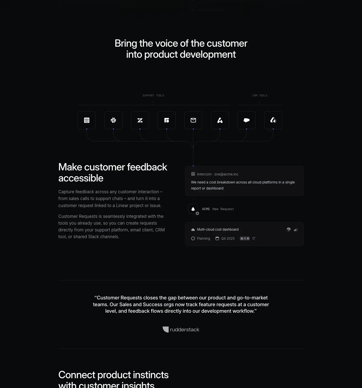
Slice span: y 961 → 2507. Contents: the section's centered H2, the tool-sources diagram, chapter 1 ("Make customer feedback accessible") with its feedback-flow visual, a quote between two hairlines, and the start of chapter 2's heading.
Layout
- Centered H2. y=1111, x=370, w=700, 2 lines (ends 1199). Hero image bottom (1058) → H2 = 53 px.
- Sources diagram (y ≈ 1334 → 1600).
- Mono group labels at y=1334: "SUPPORT TOOLS" centered at x≈610 and "CRM TOOLS" at x≈1033.
- Under each label: a short vertical tick, then a horizontal bracket line at y≈1380 spanning its group (support group ≈ x 309 → 911, CRM group ≈ x 944 → 1123).
- 8 icon tiles, each ≈ 72 × 72 px with radius ≈ 14 px and a 1 px ≈ #23252a border (≈ measured from screenshot), at y ≈ 1404 → 1476, x from 309 to 1123 on a 106 px pitch.
- Each tile has a small indigo dot (#5e6ad2) at its bottom-center. From each dot a 1 px grey connector curves down and in. All 8 connectors merge into one trunk at x≈768 that drops straight down into the right column of chapter 1 (the Intercom card at x=760).
- Chapter 1 split (y 1601 → ≈ 1940).
- Left x=232: heading y=1601, w=433, 2 lines (ends 1689); paragraph 1 y=1712 (23 px gap), w=424, 3 lines; paragraph 2 y=1810 (≈ 16 px paragraph gap), 4 lines (ends ≈ 1919).
- Right x=760 → 1208: a vertical flow: message card (≈ y 1623 → 1741) → node "ACME New Request" (y=1784) → created-issue card (≈ y 1846 → 1940). The trunk line from the diagram continues through this column.
- Quote block. Hairline y=2077 (#23252a, 976 px). Quote y=2134 (57 px below), centered x=345 w=750, 3 lines (ends ≈ 2214). Wordmark ≈ y 2262 → 2286. Hairline y=2350.
- Chapter 2 heading starts at y=2432 (82 px below the hairline) and continues into slice 2.
Typography
| Role | Values |
|---|---|
| Section H2 (centered) | 40px / 44px · 510 · -0.88px (-0.022em) · #f7f8f8 |
| Mono group labels | Berkeley Mono · 11px / 14px · 400 · normal · #62666d, uppercase |
| Chapter heading (span) | 40px / 44px · 510 · -0.88px · #f7f8f8 |
| Chapter paragraphs | 17px / 27.2px · 400 · normal · #8a8f98 |
| Message card meta "Intercom · zoe@acme.inc" | 14px / 21px · 400 · -0.182px · #8a8f98 |
| Message card body | 14px / 21px · 400 · -0.182px · #d0d6e0 |
| Node label "ACME" / "New Request" | Berkeley Mono · 13px / 19.5px · 400 · #d0d6e0 / #8a8f98 |
| Issue card title | 13px / 19.5px · 400 · -0.169px · #d0d6e0 |
| Issue card properties | 13px / 19.5px · 400 · -0.13px · #8a8f98 |
| Quote | 20px / 26.6px · 510 · -0.24px · #f7f8f8, centered |
- The section H2 and the chapter headings share one size (40 px). Rank comes from position: centered = section, left-aligned = chapter.
- Mono type appears only as diagram annotation. It marks "system label", never prose.
Color
- Page #08090a. Tiles and cards ≈ #0f1011 with 1 px ≈ #23252a borders.
- Indigo #5e6ad2 used as signal: the 8 connector dots (the page's bg data counts 9 indigo fills). It is the only accent in the section and marks "data enters here".
- Tool glyphs are white on dark tiles (monochrome brand marks).
- Quote hairlines use #23252a (rgb(35,37,42)), visibly brighter than the grid hairlines used later (#151616).
Visual / UI illustration
- Sources diagram: a schematic, not UI. 8 monochrome brand glyphs (Intercom, Slack, Zendesk, a fourth support tool, email, Linear Asks, Salesforce, a second CRM). Grouped by mono labels with bracket lines, like a circuit or org chart.
- Feedback flow (right column): 1) a message card from "Intercom · zoe@acme.inc" with the text "We need a cost breakdown across all cloud platforms in a single report or dashboard"; 2) a small node with a customer avatar and the mono label "ACME New Request"; 3) an issue card "Multi-cloud cost dashboard" with properties "Planning", "Q4 2025", an avatar stack, "17". This reads top-to-bottom as raw feedback → request → linked issue.
- The diagram trunk physically connects the tool row to the flow. The page draws one continuous line from "where feedback lives" to "where it lands".
Copy
- H2: "Bring the voice of the customer into product development" (9 words). Imperative; uses the industry phrase "voice of the customer".
- Mono labels: "SUPPORT TOOLS", "CRM TOOLS".
- Chapter 1 heading: "Make customer feedback accessible" (4 words). Verb-first.
- Paragraph 1: "Capture feedback across any customer interaction – from sales calls to support chats – and turn it into a customer request linked to a Linear project or issue." (28 words). An en-dash aside gives two concrete examples.
- Paragraph 2: "Customer Requests is seamlessly integrated with the tools you already use, so you can create requests directly from your support platform, email client, CRM tool, or shared Slack channels." (30 words). It names four source types that match the diagram.
- Quote: "Customer Requests closes the gap between our product and go-to-market teams. Our Sales and Success orgs now track feature requests at a customer level, and feedback flows directly into our development workflow." (33 words) + customer wordmark. It repeats the page's thesis in a buyer's voice.
Why it works
- The centered 40 px H2 is a "chapter title page" for the long section. Everything after it is left-aligned, so the reader sees one switch from "announcement" to "explanation".
- The diagram turns a list of integrations into an argument: many tools, one line, one destination. The single converging trunk is the visual thesis.
- Indigo dots are tiny but they are the only color in ≈ 900 px of scroll. They pull the eye along the connection points.
- The quote is framed by hairlines and sits between chapters. It acts as a breath and as proof at the same time.
Reuse recipe
- Centered 40/44 H2 (w ≈ 700) 53 px below the hero image; 135 px to the diagram.
- Diagram: Berkeley Mono 11 px uppercase #62666d group labels → 1 px bracket lines → 72 px tiles (#0f1011, 1 px #23252a, r ≈ 14) on a 106 px pitch → 4–6 px #5e6ad2 dots → 1 px curved connectors that merge into one trunk.
- Drop the trunk into the right column of the next split so the line ends on the first card of a vertical flow (message → node → issue).
- Left text: 40/44 heading → 23 px → 17 px/400 grey paragraphs at w ≈ 424, 16 px paragraph gap.
- Quote: #23252a hairline → 57 px → 20 px/510 white centered quote (w=750) → ≈ 48 px → wordmark → hairline.
02 · Bring the voice of the customer into product development — slice 2 of 3
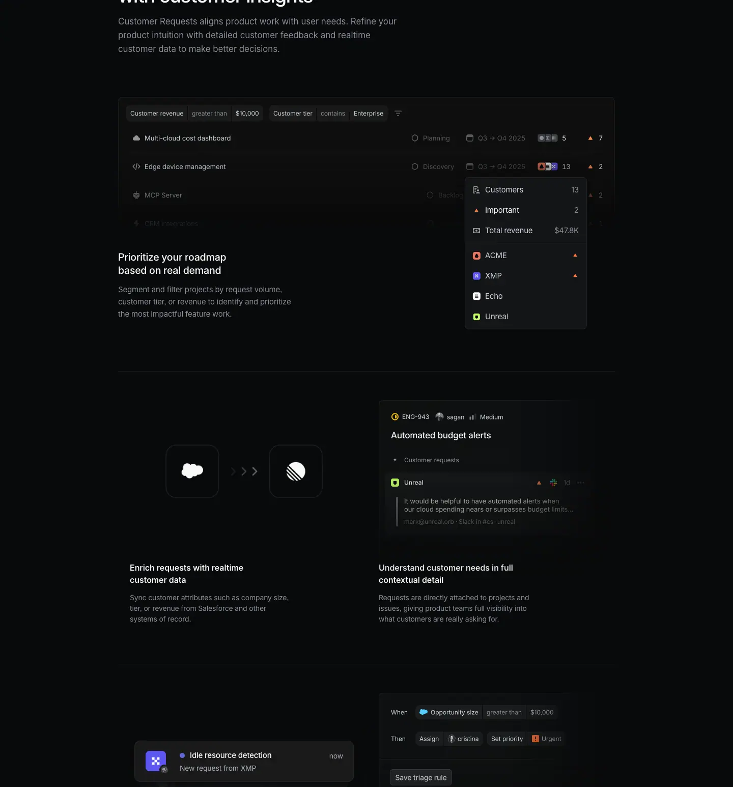
Slice span: y 2507 → 4053. Contents: chapter 2 intro paragraph, the "Prioritize your roadmap" wide visual with an overlapping popover, the first row of a 2×2 grid, and the top of the second row.
Layout
- Chapter 2 header. Heading "Connect product instincts with customer insights" y=2432 (in slice 1), w=560, 2 lines (ends 2520). Paragraph y=2536 (16 px gap), w=560, 3 lines (ends ≈ 2618).
- Wide visual. y=2698 (80 px below the paragraph), x=232, 976 × 295 (ends 2993). It is a projects table with three internal row lines (y 2698, 2805, 2861 detected).
- Overhanging popover. A customer-summary popover (live HTML text at x=953) sits over the right side of the table at ≈ x 912 → 1152, y ≈ 2857 → 3153 (≈ measured). It hangs ≈ 160 px below the image bottom.
- Text under the visual, left only. Title H3 y=2999 (6 px below the image box; the image's faded bottom makes it read as ≈ 40 px), x=232, w=360, 2 lines; description y=3064, w=360, 3 lines (ends ≈ 3136). The popover occupies the right side of the same band. Text and visual interlock like a magazine layout.
- 2×2 grid.
- Hairlines y=3236, 3811, 4385 (rgb(21,22,22) = #151616, very faint) plus a vertical divider at x≈720.
- Row height 575 px.
- Row 1 visuals at y=3293 (57 px below the hairline): left 449 × 281 at x=255, right 464 × 343 at x=744.
- Row 1 titles y=3610, 2 lines; descriptions y=3670 (12 px gap), 3 lines (ends ≈ 3733).
- Cell text is inset: left at x=255 (23 px inside the container), right at x=744 (24 px right of the divider). Asks used flush/40 px; this grid uses 24 px on both sides.
- Row 2 visuals: right image 464 × 296 at y=3868; left is a live HTML notification stack at y ≈ 3962 → 4075.
Typography
| Role | Values |
|---|---|
| Chapter heading | 40px / 44px · 510 · -0.88px · #f7f8f8 |
| Chapter paragraph | 17px / 27.2px · 400 · #8a8f98 |
| Wide-visual title (H3) | 20px / 26.6px · 510 · -0.24px · #f7f8f8 |
| Wide-visual description | 15px / 24px · 400 · -0.165px · #8a8f98 |
| Popover rows (live) | 15px / 24px · 400 · -0.165px; labels #d0d6e0, "Important" #f7f8f8, values #8a8f98 |
| 2×2 cell title (H3) | 16px / 24px · 590 · normal · #f7f8f8 |
| 2×2 cell description | 14px / 21px · 400 · -0.182px · #8a8f98 |
| Toast title (live) | 15px / 24px · 510 · -0.165px · #f7f8f8 |
| Toast body / time | 14px / 21px · 400 · -0.182px · #d0d6e0 |
- Two cell-title styles on one page: 20 px/510 for the wide feature and 16 px/590 for the grid. The grid is a lower tier: smaller, but bolder to hold its weight.
- Cell titles are forced to 2 lines by a narrow box (w=250 / 280) even though the column is 449–464 px wide.
Color
- Grid hairlines #151616 are fainter than the quote hairlines (#23252a). The page uses two line strengths: strong for "chapter boundary", faint for "cell boundary".
- Inside visuals: filter chips on ≈ #191a1b; orange "▲" priority counts; avatar stacks; a cloud glyph for Salesforce; a green customer tile ("Unreal") in the issue view; an indigo dot in the toast.
- The row-2 left toast uses a purple-indigo app tile with a white glyph.
Visual / UI illustration
- Projects table (976 × 295). Filter bar: "Customer revenue greater than $10,000" and "Customer tier contains Enterprise" chips plus a filter icon. Rows: "Multi-cloud cost dashboard — Planning — Q3 → Q4 2025 — avatar stack 5 — ▲ 7", "Edge device management — Discovery — … 13 — ▲ 2", "MCP Server", a fourth faded row. Rows fade top-to-bottom and right-to-left.
- Popover (live HTML). "Customers 13", "Important 2", "Total revenue $47.8K", then four customer rows "ACME ▲", "XMP ▲", "Echo", "Unreal" with colored tiles. It shows the per-project customer roll-up that drives prioritization.
- Row 1 left (449 × 281). Two large dark app tiles (≈ 76 px, Salesforce cloud and the Linear mark) with ">>" chevrons between them. Sync metaphor, no UI.
- Row 1 right (464 × 343). Issue view: "ENG-943", assignee "", "Medium" priority; title "Automated budget alerts"; "Customer requests" group; an "Unreal" request with a quoted customer message ("It would be helpful to have automated alerts when our cloud spending nears or surpasses budget limits…") and a source line ("… Slack in #cs-unreal").
- Row 2 left (live stack). Animated notification toasts cycling through: "Idle resource detection — New request from XMP — now", "Multi-cloud cost dashboard — Requested project completed — now", "ENG-943 Budget alerts — 25th customer requesting issue — now", "IOS-396 Alerts on mobile — Requested issue completed — now". The DOM holds 8 toast copies at offsets y 3962 → 4031, a stacked-cards animation.
- Row 2 right (464 × 296). Triage rule builder: "When [Opportunity size] [greater than] [$10,000]" / "Then [Assign] [] [Set priority] [Urgent]" / "Save triage rule" button.
Copy
- Chapter 2 heading: "Connect product instincts with customer insights" (6 words). Balanced pair: "instincts" (gut) + "insights" (data).
- Paragraph: "Customer Requests aligns product work with user needs. Refine your product intuition with detailed customer feedback and realtime customer data to make better decisions." (24 words).
- Wide feature: "Prioritize your roadmap based on real demand" — "Segment and filter projects by request volume, customer tier, or revenue to identify and prioritize the most impactful feature work." (20 words).
- Grid row 1: "Enrich requests with realtime customer data" — "Sync customer attributes such as company size, tier, or revenue from Salesforce and other systems of record." / "Understand customer needs in full contextual detail" — "Requests are directly attached to projects and issues, giving product teams full visibility into what customers are really asking for."
- Pattern: verb-first titles (Prioritize, Enrich, Understand). Descriptions name the concrete attributes (size, tier, revenue) three times across the chapter. Repetition makes "revenue-weighted prioritization" the takeaway.
Why it works
- The wide table is the most important visual of the chapter, so it gets the full 976 px. The popover overhang breaks the box and pulls the eye down into the title below.
- Placing the text under the visual on the left and the popover on the right fills the band without a second column of copy.
- The 2×2 grid drops to 16/14 px type and faint lines. It reads as "supporting details" after the hero feature of the chapter.
- Each grid visual shows one verb: sync (tiles + chevrons), attach (issue with request), notify (toast stack), route (rule builder).
Reuse recipe
- Chapter header: 40/44 heading (w=560) → 16 px → 17 px/400 grey paragraph (w=560) → 80 px → 976 px wide visual.
- Let one live HTML popover overhang the wide visual by ≈ 160 px on the right; put the feature title + description (w=360) on the left of the same band.
- 2×2 grid with #151616 lines, 575 px rows, visuals 57 px below the line, text inset 24 px from each column edge.
- Grid cell: 16/24 · 590 white title in a ≤ 280 px box (2 lines) → 12 px → 14/21 · 400 grey description (≤ 320 px).
- Animate a stack of 3–4 notification toasts in one cell; keep the others static.
03 · Bring the voice of the customer into product development — slice 3 of 3
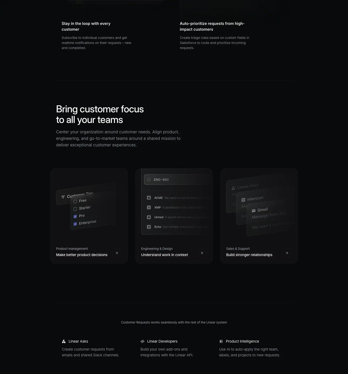
Slice span: y 4053 → 5601. Contents: the text of grid row 2, chapter 3 ("Bring customer focus to all your teams") with three role cards, and the related-products row.
Layout
- Grid row 2 text. Titles y=4138, descriptions y=4198 (3 lines, ends ≈ 4261). Hairline y=4385 closes the grid.
- Chapter 3 header. Heading y=4482 (97 px below the hairline), w=560, 2 lines (ends 4570). Paragraph y=4586 (16 px gap), w=560, 3 lines (ends ≈ 4668).
- Role cards (Carousel-like 3-up). y=4750 (82 px below the paragraph). Three cards, each 320 × 394, at x=208 / 560 / 912 (gap 32). They span 1024 px (x 208 → 1232), 24 px wider than the text column on each side.
- Card: bg rgb(16,16,18) = #101012, radius 20 px, padding 0, no border visible (≈ 1 px lighter edge in the screenshot).
- Visual area 320 × 306 at the card top.
- Label at y=5073 (card-relative 323), x=232 (24 px inset). Title y=5098 (25 px below the label top). Card bottom 5144 (22 px below the title).
- A round "+" button ≈ 24 px (≈ measured) at the bottom-right, vertically centered on the label+title block. The "+" means "expand", not "navigate".
- Related-products row. Hairline y=5307 (163 px below the cards). Caption y=5378, centered, w=976. Three columns at y=5454 on a ≈ 325 px pitch (x=256 / 581 / 907, w=277): icon (16 px) + title (text 28 px right of the icon), description 33 px below the title top (y=5487), 2 lines (ends ≈ 5535).
Typography
| Role | Values |
|---|---|
| Grid cell title | 16px / 24px · 590 · #f7f8f8 |
| Grid cell description | 14px / 21px · 400 · -0.182px · #8a8f98 |
| Chapter heading | 40px / 44px · 510 · -0.88px · #f7f8f8 |
| Chapter paragraph | 17px / 27.2px · 400 · #8a8f98 |
| Role card label | 13px / 19.5px · 510 · -0.13px · #8a8f98 |
| Role card title | 15px / 24px · 510 · -0.165px · #f7f8f8 |
| Related caption | 13px / 19.5px · 510 · -0.13px · #8a8f98, centered |
| Related title | 15px / 24px · 400 · -0.165px · #f7f8f8 (400, not 510) |
| Related description | 15px / 24px · 400 · -0.165px · #8a8f98 |
Color
- Role cards #101012 (a cooler, slightly different step from #0f1011). Radius 20 px vs 12 px on the Asks cards. These are the only rounded surfaces on the page.
- Inside cards: indigo checkboxes (Pro, Enterprise checked) in the filter visual; otherwise grey.
- Related row: monochrome line icons, no surfaces.
Visual / UI illustration
- Role-card visuals are tilted 3D faux UI (perspective rotation ≈ 10–15°, ≈ measured from screenshot):
1. Product management: a "Customer Tier" filter dropdown with checkboxes "Free", "Starter", "Pro" (checked), "Enterprise" (checked), rotated in 3D.
2. Engineering & Design: an issue search "ENG-860" with four request rows (ACME, XMP, Unreal, Echo) and truncated quotes; flat, cropped by the card's right edge.
3. Sales & Support: three stacked message cards "Linear Asks", "Intercom", "Gmail" ("Message from Zoe…", "We need a cost per…"), receding in perspective.
- Visuals fill the top 306 px and fade to the card fill above the label.
- Grid row 2 visuals (from slice 2) end at the top of this slice.
Copy
- Grid row 2: "Stay in the loop with every customer" — "Subscribe to individual customers and get realtime notifications on their requests – new and completed." / "Auto-prioritize requests from high-impact customers" — "Create triage rules based on custom fields in Salesforce to route and prioritize incoming requests."
- Chapter 3 heading: "Bring customer focus to all your teams" (7 words).
- Paragraph: "Center your organization around customer needs. Align product, engineering, and go-to-market teams around a shared mission to deliver exceptional customer experiences." (21 words).
- Role cards (label — title): "Product management — Make better product decisions", "Engineering & Design — Understand work in context", "Sales & Support — Build stronger relationships". Each title is 4 words, verb-first.
- Related caption: "Customer Requests works seamlessly with the rest of the Linear system".
- Related items: "Linear Asks — Create customer requests from emails and shared Slack channels." / "Linear Developers — Build your own add-ons and integrations with the Linear API." / "Product Intelligence — Use AI to auto-apply the right team, labels, and projects to new requests."
Why it works
- Chapter 3 changes the axis from "features" to "roles". The cards let each team find itself by label in one glance.
- Wider cards (1024 px) and a bigger radius (20 px) make this the most "designed" block of the long section, which marks the story's climax before the CTA.
- 3D tilt adds depth only where the content is generic (filters, messages). The flat middle card keeps the trio from feeling gimmicky.
- The related-products row is text-only and quiet. It cross-sells without competing with the CTA that follows.
Reuse recipe
- Three cards 320 × 394, gap 32, spanning 1024 px (24 px wider than the text column each side); bg #101012, radius 20, no padding on the visual.
- Visual 320 × 306 on top, tilted 3D faux UI, faded into the card; label 13 px grey + title 15 px white at 24 px inset; 24 px "+" circle at the right.
- 82 px between the chapter paragraph and the cards; 163 px from cards to the next hairline.
- Related row: centered 13 px grey caption, then three 325 px columns with a 16 px icon + 15 px/400 white title and a 15 px grey description.
04 · Bring the voice of your customers into Linear (final CTA)
Section span: y 5601 → 5902 (301 px).
Layout
- Left heading x=232, w=640, y=5751 (150 px top padding), 2 lines (ends 5839).
- Buttons at y=5775 (vertically centered on the heading), right-aligned to x=1208.
- Primary first: "Activate Customer Requests" button x=833, 237 × 40; then "Contact sales" x=1078, 130 × 40. Gap 8 px. Asks puts the primary on the right; this page puts it on the left.
- Footer hairline at y=5935.
Typography
| Role | Values |
|---|---|
| Heading | 40px / 44px · 510 · -0.88px · #f7f8f8 |
| Buttons | 15px / 40px · 510 |
Color
- Primary #e5e5e6 / #08090a; secondary rgba(255,255,255,.05) / #f7f8f8 with a 1 px inset ring rgba(255,255,255,.03).
Visual / UI illustration
- None.
Copy
- Heading: "Bring the voice of your customers into Linear" (8 words). It echoes the section H2 ("Bring the voice of the customer into product development") and swaps the destination for the brand name. The page opens and closes the long section with the same phrase.
- Primary: "Activate Customer Requests" (feature activation, not account sign-up; the reader is likely already a user).
- Secondary: "Contact sales".
Why it works
- "Activate" assumes an existing workspace. This page targets current users who have not turned the feature on, so the CTA names the exact action.
- Echoing the H2 closes the loop and makes the CTA feel like the conclusion of the argument.
Reuse recipe
- 150 px top padding, heading 40/44 left (w ≤ 640, 2 lines), buttons right, centered on the heading.
- Name the primary button after the feature activation ("Activate ") when the audience is existing users.
- Primary left, secondary right, 8 px gap.
05 · Footer
Section span: y 5902 → 6459 (557 px). Identical to the Asks footer.
Layout / Typography / Color
- #23252a top hairline at y=5935. Logo mark at x≈80. 5 columns at x=304 / 528 / 752 / 976 / 1200 (w=160). Headings y=5992 (57 px below the hairline), 13px / 19.5px · 510 · -0.13px · #f7f8f8. Links 13px / 19.5px · 400 · #8a8f98 on a 30 px pitch. Legal row #62666d at y≈6384.
Copy
- Product / Features / Company / Resources / Connect, same 35 links as on /asks.
Why it works / Reuse recipe
- See /asks section 06: wide 5-column grid that ignores the 976 px body column; 3 text tiers (white, #8a8f98, #62666d).
Page-level takeaways
- One long section, four chapters. Instead of separate
<section>s with eyebrows, the page runs one argument under one centered H2. Chapters are left-aligned 40 px headings with 17 px/400 paragraphs. This is the most editorial page of the three.
- Two hairline strengths.
#23252a frames the quote and the footer (chapter boundaries). #151616 draws the 2×2 grid (cell boundaries). The weaker line keeps the grid from boxing in the visuals.
- Visual continuity through a drawn line. The sources diagram's trunk descends into the feedback flow. Few pages connect two blocks physically; it makes the integration story literal.
- Mono labels for system annotations. Berkeley Mono 11 px uppercase
#62666d ("SUPPORT TOOLS", "CRM TOOLS") and 13 px mono for the node "ACME New Request". Prose never uses mono.
- Indigo as a data signal.
#5e6ad2 appears on connector dots and checked checkboxes only. It never colors text or buttons.
- Overhang compositions. A live popover hangs ≈ 160 px below the wide table; the hero's front panel overlaps the back panel. Breaking the box edge creates depth without shadows.
- Type tiers in cells: 20/26.6 · 510 for a chapter's lead feature, 16/24 · 590 for grid cells, 15/24 · 510 for card titles, 13 px labels. Smaller tiers get heavier weights.
- Copy loop: the meta description, the H2 and the CTA all reuse "voice of the customer". The H1 "Build what customers actually want" reappears in the meta. One phrase set, repeated at entry, middle and exit.
- Numbers make faux UI credible: $16,450 /mo, $47.8K, 13 customers, "25th customer requesting issue", "$10,000" thresholds.
- No light testimonial cards. The single quote is dark: 20 px/510 white text on
#08090a between two hairlines, with a monochrome wordmark.
Section inventory
| # |
Section |
Pattern name |
Key values |
| 00 |
Hero |
Hero-centered (text-first + product image) |
eyebrow 13 px; H1 64/67.84 · 510, box 597; sub w=420; 12.5/19/31 px stack; image 976 × 474 at +120 px |
| 01a |
Section intro |
Section-header-centered |
H2 40/44 · 510, w=700, centered |
| 01b |
Sources diagram |
Integration-diagram (mono-labeled tiles + converging connectors) |
8 tiles ≈ 72 px, 106 px pitch; Berkeley Mono 11 px #62666d; #5e6ad2 dots; trunk at x≈768 |
| 01c |
Chapter 1 |
Split-text-left + flow-visual-right |
heading 40/44; paras 17/27.2 · 400 w=424; flow cards at x=760 |
| 01d |
Quote |
Testimonial-quote (hairline-framed) |
#23252a lines at ±57 px; 20/26.6 · 510 white, w=750 |
| 02a |
Chapter 2 |
Chapter-header-left + Wide-visual-with-overhang |
heading w=560; para 16 px below; 976 × 295 table; popover overhang ≈ 160 px; title 20 px |
| 02b |
Grid |
Bento-2x2 (faint hairline grid) |
#151616 lines; 575 px rows; title 16/24 · 590; desc 14/21; text inset 24 px |
| 03a |
Chapter 3 |
Chapter-header-left + Role-cards-3up |
cards 320 × 394, r=20, #101012, span 1024; 3D-tilted visuals; label 13 px + title 15 px + "+" |
| 03b |
Related products |
Logo/integration-cards-3up (text-only) |
centered 13 px caption; 3 × 325 px columns; icon + 15 px/400 title + 15 px grey desc |
| 04 |
CTA |
Final-CTA-split |
H3 40/44; "Activate Customer Requests" 237 × 40 primary left; "Contact sales" right |
| 05 |
Footer |
Footer-5col |
same as /asks |
Mobile — https://linear.app/mobile
| Field |
Value |
| URL |
https://linear.app/mobile |
<title> |
Linear Mobile – Available for iOS and Android |
| Meta description |
Move product work forward, no matter where you are. Available for iOS and Android. |
| Page height |
9767px (at 1440px width) |
| Template |
Older "feature" template. Content container 976px at x=232 (x=232–1208). Media cards bleed 24px outside it (1024px at x=208). Product-launch variant: the H1 is 48px / 590, left-aligned, not the 64px centered H1 of the standard feature template. |
| Page background |
#010102 (--color-bg-marketing). Darker than the default #08090a. Every pixel sample in empty areas reads rgb(1,1,2). |
| Sections |
6 crops (hero, 3 feature sections, final CTA + credits, footer) |
Shared header and footer: see _shared-header-footer.md.
Narrative arc
The page is a product launch film told in stills. The hero is a black-and-white photo of a hand
holding a phone, with a plain claim ("The portable companion to the Linear system") and the
download options right beside it. Download is offered before any feature is explained. Next, three
proof cards answer "why a native app": built for away-from-keyboard work, ultraportable, fully native.
Then the page walks through the three verbs of mobile use. Stay on top (the inbox: react,
snooze). Move work forward (compose: create issues, screenshot to triage, project updates,
PRDs). Be reachable on your terms (notifications and a schedule). The page then repeats the
download block as the final CTA ("Ready wherever you are"). It closes with a film-style credits
roll ("Linear Orbit Inc. Department of Portable Device Applications", producers, designers,
engineers). That ending reframes the app as a crafted object made by named people. The
arc runs claim → download → why native → triage → create → notify → download again → credits.

00 · Hero
Crop: y=0, h=2069. It holds the photo hero, the title block with download cards, and the 3-card proof bento.
Layout
Part A — photographic header (y=0–≈900)
- Full-bleed
<img> 1440 × 968 at x=0, y=0 (static.linear.app/assets/web/mobile/hero.…jpg).
- A
<canvas> 1440 × 900 at x=0, y=0 sits on top of it. It is likely a grain/noise or
WebGL light layer. The screenshot shows fine film grain over the photo.
- The photo fades to the page color
#010102 at its bottom. The title block sits on that fade.
Part B — title row (y=592–800)
Two columns inside the 976px container:
| Element |
x |
y |
w × h |
| Eyebrow "Introducing Linear Mobile" |
232 |
599 |
720 × 20 |
| H1 (2 lines) |
232 |
635 |
720 × 96 |
| Sub (2 lines) |
232 |
747 |
720 × 53 |
| QR card "Scan to download" |
968 |
592 |
240 × 98 |
| "Open App Store" card |
968 |
702 |
114 × 98 |
| "Open Play Store" card |
1094 |
702 |
114 × 98 |
- Vertical rhythm in the text column: eyebrow → H1 = 16px gap (599+20 → 635). H1 → sub = 16px gap (731 → 747).
- The text block spans y=599–800. The card stack spans y=592–800. The two columns are the same height (≈208px). The bottom edges match exactly at y=800.
- Card stack: 1 wide card (240) over 2 half cards (114 + 12 gap + 114 = 240). Row gap 12px (690 → 702).
- The right column ends at x=1208, the container edge.
Part C — proof bento (y=944–2059)
| Cell |
x |
y |
w × h |
Content |
| Large media card |
208 |
944 |
1024 × 645 |
Phone close-up, play button, copy bottom-left |
| Small card left |
208 |
1621 |
584 × 438 |
Phone tilted, copy bottom-left |
| Small card right |
824 |
1621 |
408 × 438 |
Swift + Kotlin logo tiles, copy bottom-left |
- Bento: 1 full-width cell on top, 2 cells below at ≈59/41 split (584 : 408). Gap 32px both ways (1589 → 1621; 792 → 824).
- Cards are 1024px wide at x=208. They bleed 24px past the 976px text container on each side. Copy inside each card starts at x=232, so the copy still aligns with the H1 above.
- Gap from title block to bento: 144px (800 → 944).
- Copy sits at the bottom-left of every card. Large card: button at y=1405, text at y=1469–1565 (bottom ≈24px above the card edge at 1589). Small cards: text at y=1972–2035 (card ends 2059, ≈24px padding).
- No visible border on the media cards. The
bd list has 6 × rgba(255,255,255,.05) borders. Those belong to the 6 download cards (2 stacks × 3). The media cards are images with dark edges that dissolve into the page.
Typography
| Role |
Spec |
Text |
| Eyebrow |
13px / 19.5px · 510 · -0.13px (-0.01em) · #828fff |
Introducing Linear Mobile |
| H1 |
48px / 48px · 590 · -1.056px (-0.022em) · #f7f8f8 |
The portable companion to the Linear system |
| Sub |
20px / 26.6px · 510 · -0.24px (-0.012em) · rgba(255,255,255,.7) |
Complex workflows in compact form. Available for iOS and Android. |
| Download card label |
14px / 21px · 510 · -0.182px (-0.013em) · #d0d6e0 |
Scan to download / Open App Store / Open Play Store |
| Button |
15px / 40px · 510 · normal · #010102 on #e5e5e6 |
See how it works |
| Card body lead-in |
15px / 24px · 510 · -0.165px · #f7f8f8 |
Built for "away from keyboard" activities. |
| Card body |
15px / 24px · 510 · -0.165px · #8a8f98 (w=420) |
Linear Mobile is purpose-designed … |
| Small card lead-in |
14px / 21px · 510 · -0.182px · #f7f8f8 |
Ultraportable. / Fully native. |
| Small card body |
14px / 21px · 510 · -0.182px · #8a8f98 (w=409 / 286) |
… |
Notes:
- The H1 uses weight 590 (semibold). Every other display heading on this page uses 510. The launch headline gets one extra step of weight.
- H1 line-height = font size (48/48, ratio 1.0). Two lines fill exactly 96px.
- The sub is white at 70% opacity, not a gray token. It picks up a trace of the photo behind it.
- The eyebrow is the only indigo text in the hero. It is the link color
#828fff, not the brand fill.
- Body copy in cards uses the "lead-in" pattern: a white first sentence, then gray continuation in the same paragraph, same size and weight.
Color
- Page:
#010102. Photo: grayscale. The whole hero is monochrome.
- Download cards:
background rgba(255,255,255,.05), border 1px rgba(255,255,255,.05), radius 12px, padding 12px.
- One accent: eyebrow text
#828fff.
- One light surface: the "See how it works" pill (
#e5e5e6).
- The photographs are desaturated. The only colors in the hero are the indigo eyebrow and the blue/orange Swift/Kotlin glyphs, which are rendered white on gray tiles.
Visual / UI illustration
- Hero photo: a real photograph, black-and-white, of a hand holding a phone in a dim room. The phone screen shows the real Linear inbox ("Inbox", issue rows with avatars). Shallow depth of field and a bright window blur in the background. Film grain overlay (the canvas).
- Large card: a macro photo of a phone at an angle, showing the issue composer ("Refactor trip routing logic", "Need to accommodate new features coming in the future", a code block). Strong blur falloff. The "See how it works" pill with a ▶ icon implies a video plays in place.
- Small left card: extreme close-up of the bottom of the phone screen (comment field, toolbar icons). Cropped hard: the phone runs off the top and left edges.
- Small right card: two app-icon-style tiles, ≈96px with ≈24px radius ≈ measured from screenshot. Swift logo and Kotlin logo, white glyphs on graphite gradient. The background has a soft radial gradient.
- No device frame mockups here. These are product photos, styled like a hardware launch.
Copy
- Eyebrow: "Introducing Linear Mobile" (3 words).
- H1: "The portable companion to the Linear system" (7 words). It positions mobile as subordinate to the desktop "system", not as a standalone app.
- Sub: "Complex workflows in compact form. Available for iOS and Android." (10 words, 2 sentences). Sentence one is a claim built on contrast (complex / compact). Sentence two is a plain fact that answers "where do I get it".
- Download cards: "Scan to download", "Open App Store", "Open Play Store". Verb-first.
- Large card: "Built for “away from keyboard” activities. Linear Mobile is purpose-designed for on-demand workflows that complement the desktop experience. A powerful sidekick, always available in your pocket." (29 words). Note the quoted jargon "away from keyboard": developer voice.
- Small left: "Ultraportable. A from-the-ground-up redesigned user interface makes Linear Mobile both light in weight and strong in performance." (19 words). Hardware vocabulary ("light in weight") applied to software.
- Small right: "Fully native. Linear Mobile is built with native Swift and Kotlin code to guarantee a fast and fluid user experience." (20 words).
- Button: "See how it works" (4 words).
Voice: calm, factual, product-launch. Each card starts with a 1–2 word label that ends in a period ("Ultraportable.", "Fully native."). It reads like a spec sheet.
Why it works
- Download is in the first viewport. A user who arrived to install the app can scan the QR code without scrolling. The rest of the page is for people who need convincing.
- The QR card is the widest card. On desktop, scanning with the phone is the fastest path. The two store links are secondary and half-width.
- The title column and card stack share top and bottom edges (y≈592–800). The two columns lock into one rectangle, so the row reads as a single unit.
- Monochrome photography sells hardware-grade craft. The style borrows from phone-maker launch pages. It signals that the app is a physical-feeling object.
- The bento bleeds 24px past the text column. Images feel larger than the text grid while the copy inside stays aligned with the H1.
- Proof cards use a lead-in label. The white first words are scannable as a list ("Built for away from keyboard", "Ultraportable", "Fully native"). The gray rest is optional reading.
Reuse recipe
- Page bg
#010102. Full-bleed grayscale photo 1440 × ≈968 with a bottom fade to the page color. Add a grain layer.
- Title block at x=232, w=720: eyebrow
13px 510 #828fff → 16px → H1 48/48 590 -0.022em → 16px → sub 20/26.6 510 rgba(255,255,255,.7).
- Right column at x=968, w=240: QR card 240 × 98, then 2 cards 114 × 98 with 12px gaps. All cards
rgba(255,255,255,.05) fill and border, radius 12, padding 12, label 14px 510 #d0d6e0 bottom-left, icon top-left, ↗ top-right.
- 144px below: a 1024px bento (x=208). Row 1: one card 1024 × 645. Row 2: 584 + 408 cards, 438 tall, 32px gaps.
- Card copy bottom-left at 24px inset,
15px/24 510, white lead-in sentence + #8a8f98 continuation, max-width ≈420px.
- Put one pill button (
#e5e5e6, 40px, radius 9999, padding 0 16px, 15px 510, ▶ icon) above the copy in the large card.
01 · Stay on top of your most important streams of work
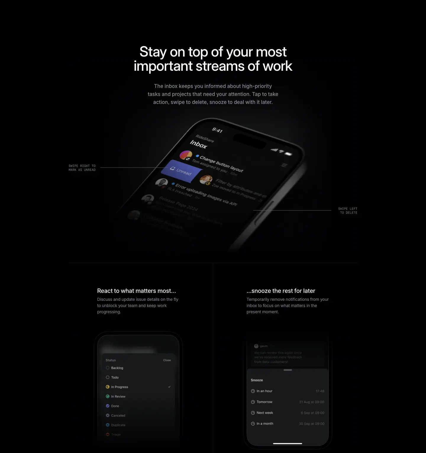
Crop: y=2069, h=1530.
Layout
- Centered section header: H2 at x=400, w=640 (centered: 400 + 320 = 720). Sub at x=484, w=472 (484 + 236 = 720).
- H2 top at y=2219: 150px below the crop start, 160px below the hero bento end (2059).
- H2 → sub: 32px (H2 ends 2315, sub starts 2347).
- Hero image:
<img> 1024 × 656 at x=208, y=2269 (InboxImage@1x.jpg). The box overlaps the H2 and sub. The top part of the image is pure black, so the header text sits on empty image area. The phone itself appears at ≈y=2470–2900 ≈ measured from screenshot.
- 2-up row below, with hairline borders:
- Horizontal rule at y≈2956, from x≈232 to 1208 ≈ measured from screenshot.
- Vertical rule at x=720 from y≈2956 to the next section's top rule at y≈3667. One
bg entry is linear-gradient(rgba(97,106,115,0) 0%, rgba(97,106,115,.1) 20%, rgba(97,106,115,.1) 80%, rgba(97,106,115,0) 100%). This is a hairline that fades out at both ends.
- Rule color renders as rgb(14,14,15) on
#010102 ≈ measured from screenshot.
- 2-up cells: each half is 488px wide (232–720, 720–1208).
- Left H3 x=329, right H3 x=834. Text column w=278. Text columns are roughly centered in each cell.
- H3 at y=3038: 82px below the rule.
- H3 → description: 4px (H3 ends 3065, description 3069).
- Images: 471 × 399 at x=232 and x=737, y=3188. Description → image: 56px (3132 → 3188).
- Cell height ≈711px (2956 → 3667).
Typography
| Role |
Spec |
Text |
| H2 |
48px / 48px · 510 · -1.056px (-0.022em) · #f7f8f8, centered, 2 lines |
Stay on top of your most important streams of work |
| Sub |
17px / 27.2px · 510 · normal · #8a8f98, centered, 3 lines |
The inbox keeps you informed … |
| H3 |
20px / 26.6px · 510 · -0.24px (-0.012em) · #f7f8f8 |
React to what matters most… / …snooze the rest for later |
| H3 description |
14px / 21px · 400 · -0.182px · #8a8f98 |
… |
| Mono callouts (in image) |
Berkeley Mono-style uppercase, ≈10px, gray, right/left aligned with a 1px leader line ≈ measured from screenshot |
SWIPE RIGHT TO MARK AS UNREAD · SWIPE LEFT TO DELETE |
- The sub has line-height 1.6 (27.2 / 17), much looser than the 1.0 heading. Heading is tight, sub is airy.
- Sub weight 510, not 400. On this page the large gray body copy is medium weight, so it holds up on the darker
#010102 page.
- H3 descriptions use weight 400. They are the only regular-weight body text in the section.
Color
- Background:
#010102. A soft radial glow (lighter graphite) sits behind the phone in the image ≈ measured from screenshot.
- Hairlines: white ≈5% / gray-blue 10% fading gradient.
- Color appears only inside the UI: avatar photos, the indigo "Unread" swipe action (≈ #5e6ad2 tone), the yellow/green status icons in the status picker. Text and chrome stay gray.
Visual / UI illustration
- Main image: a rendered phone (3D, angled ≈30°, dark titanium frame) showing the real inbox UI. One row is mid-swipe: an indigo "Unread" action revealed on the left. Lower rows fade into shadow. The render is cropped so the phone's lower half falls off into black.
- Mono callouts: "SWIPE RIGHT TO / MARK AS UNREAD" on the left and "SWIPE LEFT / TO DELETE" on the right. Each has a thin horizontal leader line pointing at the gesture. They are baked into the raster (no matching DOM text). They read like annotations on a technical drawing.
- 2-up images: flat, front-on phone screens (no tilt), cropped at the top and dissolved at the bottom with a gradient to black. Left: the Status picker (Backlog, Todo, In Progress, In Review, Done, Canceled, Duplicate, Triage) with a check on "In Progress". Right: the Snooze sheet (In an hour, Tomorrow, Next week, In a month, each with a time on the right). Both are real app UI.
- The phone frame in the 2-up images is a thin dark outline with large corner radius, no buttons or notch detail. It is a minimal device frame.
Copy
- H2: "Stay on top of your most important streams of work" (10 words).
- Sub: "The inbox keeps you informed about high-priority tasks and projects that need your attention. Tap to take action, swipe to delete, snooze to deal with it later." (28 words). Sentence 2 is a rhythm of three gestures: tap / swipe / snooze. Each gesture maps to a visual on the page.
- H3 pair: "React to what matters most…" + "…snooze the rest for later". One sentence split across two cells with ellipses. The reader reads left to right and gets one complete thought.
- H3 descriptions: "Discuss and update issue details on the fly to unblock your team and keep work progressing." (16 words). "Temporarily remove notifications from your inbox to focus on what matters in the present moment." (15 words).
Why it works
- The ellipsis split turns a 2-up grid into one sentence. Two cells normally read as two separate features. The "…" makes them a cause and effect: react to this, snooze that.
- Callouts teach the gestures without a tutorial. The mono labels name the interaction at the exact place it happens on the screen.
- The tilted render and flat screens play different roles. The tilted hero sells the object. The flat crops show specific UI states that the H3s describe.
- Fading hairlines. The grid lines fade at their ends, so the grid frames the content without boxing it in.
Reuse recipe
- Centered H2
48/48 510 -0.022em, max-width 640px; sub 17/27.2 510 #8a8f98, max-width 472px, 32px below.
- Put a 1024 × 656 dark product render under the header. Leave the top ≈200px of the image empty so the header can overlap it.
- Add 2–3 mono uppercase callouts (≈10px, gray, letter-spaced) with 1px leader lines to name gestures.
- 2-up row: 1px top rule, 1px center vertical rule with
linear-gradient(transparent, rgba(97,106,115,.1) 20% 80%, transparent).
- Cell content: H3
20/26.6 510 at 82px below the rule → 4px → description 14/21 400 #8a8f98 (w 278) → 56px → 471 × 399 flat phone crop that fades out at the bottom.
- Write the two H3s as one sentence split with "…".
02 · Move product work forward. No matter where you are.
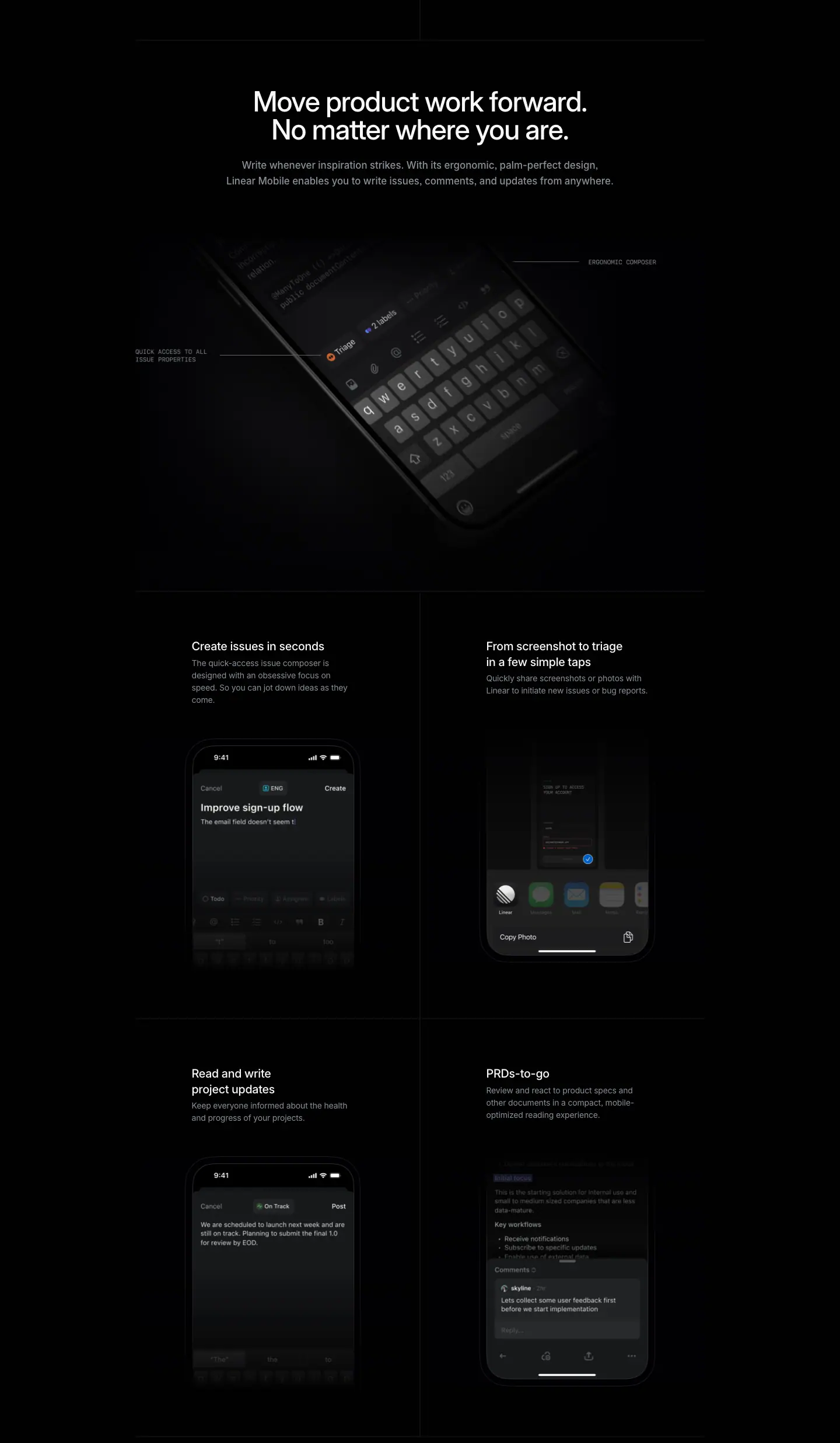
Crop: y=3599, h=2472.
Layout
- Top rule at y≈3667 (closes the previous 2-up grid) ≈ measured from screenshot.
- H2 at y=3749, x=232, w=976, centered (2 lines). 82px below the rule.
- H2 → sub: 24px (3845 → 3869). Sub at x=232, w=976, centered, 2 lines (ends 3923).
- Hero image: 1024 × 656 at x=208, y=4003 (
ComposerImage@1x.jpg). Sub → image: 80px.
- 2 × 2 grid below, same cell system as section 01:
| Row |
Rule (≈) |
H3 y |
Images y |
Images |
| 1 |
4611 |
4693 |
4864 (left), 4848 (right) |
471 × 399 at x=232 / 737 |
| 2 |
5343 |
5425 |
5580 (left), 5575 (right) |
471 × 399 at x=232 / 737 |
| end |
6059 |
— |
— |
— |
- Row height 732px (4611 → 5343). H3 always sits 82px below its row's rule.
- When an H3 wraps to 2 lines ("From screenshot to triage in a few simple taps", "Read and write project updates"), its description starts 26px lower (4750 vs 4724). The images then start ≈16px lower or higher to compensate (4848 vs 4864). The image tops are adjusted per cell, not locked to one baseline.
- Vertical center rule at x=720 runs through both rows.
Typography
| Role |
Spec |
Text |
| H2 |
48px / 48px · 510 · -1.056px · #f7f8f8, centered |
Move product work forward. No matter where you are. |
| Sub |
17px / 27.2px · 510 · normal · #8a8f98, centered, w=976 |
Write whenever inspiration strikes. … |
| H3 |
20px / 26.6px · 510 · -0.24px · #f7f8f8, w=278 |
Create issues in seconds · From screenshot to triage in a few simple taps · Read and write project updates · PRDs-to-go |
| H3 description |
14px / 21px · 400 · -0.182px · #8a8f98, w=278 |
… |
| Mono callouts (in image) |
uppercase mono ≈10px gray with leader lines ≈ measured from screenshot |
QUICK ACCESS TO ALL ISSUE PROPERTIES · ERGONOMIC COMPOSER |
- The H2 breaks after the first sentence: "Move product work forward." / "No matter where you are." Each line is one sentence.
- The 278px text column forces H3 wraps such as "Read and write / project updates". The wraps are deliberate: they keep the H3 short per line.
Color
- Page
#010102. Hairlines as in section 01.
- In-UI color only: the orange Triage chip, the blue "ENG" team chip, the green "On Track" badge, the iOS share sheet app icons (colorful, the only multicolor area of the page). All color sits inside the screenshots.
Visual / UI illustration
- Main image: a tilted phone render, keyboard up, showing the composer toolbar ("Triage" chip, "2 labels" chip, property icons). Cropped hard: the phone runs off the top-left. Two mono callouts point at the property chips ("QUICK ACCESS TO ALL ISSUE PROPERTIES") and at the composer ("ERGONOMIC COMPOSER").
- Cell images (flat phone screens, top-cropped, bottom-faded):
- Create issues in seconds → composer with "Improve sign-up flow", "The email field doesn't seem t|", property row and keyboard faded.
- From screenshot to triage → iOS share sheet with the Linear app icon first, "Copy Photo" below. A screenshot thumbnail sits at the top.
- Read and write project updates → project update composer with an "On Track" status chip and "Post" button.
- PRDs-to-go → document view ("Key workflows" list) with a comment sheet ("Lets collect some user feedback first before we start implementation").
- All screens are real UI with realistic content (a "RideShare"-style sample workspace). No lorem ipsum.
Copy
- H2: "Move product work forward. No matter where you are." (9 words, 2 sentences). The second sentence is a fragment. It adds the "mobile" angle to a general claim. It also echoes the meta description.
- Sub: "Write whenever inspiration strikes. With its ergonomic, palm-perfect design, Linear Mobile enables you to write issues, comments, and updates from anywhere." (22 words). "Palm-perfect" continues the hardware vocabulary.
- H3s (4): "Create issues in seconds" (4), "From screenshot to triage in a few simple taps" (9), "Read and write project updates" (5), "PRDs-to-go" (1 compound, a pun on "to-go").
- Descriptions:
- "The quick-access issue composer is designed with an obsessive focus on speed. So you can jot down ideas as they come." (21)
- "Quickly share screenshots or photos with Linear to initiate new issues or bug reports." (14)
- "Keep everyone informed about the health and progress of your projects." (11)
- "Review and react to product specs and other documents in a compact, mobile-optimized reading experience." (15)
- Pattern: H3 names the job; description names the mechanism. Each description is 11–21 words.
Why it works
- The same cell grammar repeats. Section 01 has 1 row, section 02 has 2 rows, both with identical spacing (82px to H3, 4px to description, 56px to image). The reader learns the pattern once and then scans fast.
- One hero render per section, then flat proofs. Each section opens with one dramatic 3D phone and follows with plain, legible screens. Drama and evidence stay separate.
- Short H3s in a narrow column. At 278px wide, every H3 is 1–2 short lines. This keeps the grid calm even with 4 features.
- Copy carries a pun and a tone shift ("PRDs-to-go"). One playful title among four plain ones adds personality without breaking the spec-sheet voice.
Reuse recipe
- Section top rule → 82px → centered H2 (w 976) → 24px → centered sub
17/27.2 510 #8a8f98 → 80px → 1024 × 656 render.
- 2 × 2 grid, 488px cells, 1px rules (horizontal full width, vertical fading gradient at x=center). Row height ≈732px.
- In each cell: H3
20/26.6 510 (w 278) → 4px → description 14/21 400 #8a8f98 → ≈56px → 471 × 399 phone screen, top-cropped, bottom faded to the page color.
- Use real product content inside every phone screen. Keep color inside the screens only.
- Name each feature by the job ("Create issues in seconds"). Describe the mechanism in ≤ 21 words.
03 · Available 24/7. Or just 9-5.
Crop: y=6071, h=780.
Layout
- Split layout. Media left, text right.
- One
<img> 976 × 624 at x=232, y=6221 (NotificationsImageDesktop@1x.jpg). It contains the phone on the left half. The right half of the image is dark and empty. The text sits on that empty half.
- Text column at x=736, w=472 (736 + 472 = 1208, the container edge):
| Element |
y |
x |
w |
| H2 (2 lines) |
6221 |
736 |
472 |
| Sub (2 lines) |
6341 |
736 |
472 |
| Feature icon tiles |
≈6461–6515 ≈ measured from screenshot |
736 / 988 |
≈48px |
| Feature 1 text |
6540 |
736 |
220 |
| Feature 2 text |
6540 |
988 |
220 |
- H2 top = image top (6221). The heading aligns to the top of the media.
- H2 → sub: 24px (6317 → 6341). Sub → features: ≈145px including the icon tiles.
- Feature columns: 220px each with 32px gap (736 + 220 + 32 = 988).
- H2 top is 150px below the crop start and 162px below the previous grid's bottom rule (6059).
- No rules or cards in this section.
Typography
| Role |
Spec |
Text |
| H2 |
48px / 48px · 510 · -1.056px · #f7f8f8, left-aligned |
Available 24/7. Or just 9-5. |
| Sub |
17px / 27.2px · 510 · normal · #8a8f98 |
Receive push notifications about important updates in realtime (but not all the time). |
| Feature lead-in |
14px / 21px · 510 · -0.182px · #f7f8f8 |
Realtime notifications. / Notification schedule. |
| Feature body |
14px / 21px · 510 · -0.182px · #8a8f98 |
… |
- The H2 is left-aligned here. Sections 01 and 02 are centered. The alignment switch marks the change from "grid of features" to "split with one story".
Color
- Background
#010102 with a soft diagonal graphite gradient across the right half ≈ measured from screenshot.
- The lock-screen wallpaper in the phone has faint teal/blue light streaks. That is the only color.
- Icon tiles are dark graphite squares with a light gray glyph (a stacked-notification icon and a clock face).
Visual / UI illustration
- A front-on phone, cropped at the top (status bar visible, no notch top), showing the lock screen with one notification card: avatar, "leela", "Brazil launch", "We will start roll-out in two hours!", "now". Flashlight and camera buttons at the bottom.
- The phone has a thin outline frame, dark glass, home indicator. Minimal device frame, consistent with section 01–02 crops.
- Icon tiles look like miniature app icons (rounded square, inner bevel) ≈ measured from screenshot.
Copy
- H2: "Available 24/7. Or just 9-5." (6 words incl. numbers). Two sentences. The second undercuts the first. It reassures the reader that the app respects working hours.
- Sub: "Receive push notifications about important updates in realtime (but not all the time)." (13 words). The parenthetical repeats the H2's twist in body copy.
- Feature 1: "Realtime notifications. Stay up-to-date on important work streams and instantly take action wherever and whenever necessary." (17 words).
- Feature 2: "Notification schedule. Configure your own notification schedule to only stay in touch with your work during certain time periods." (19 words).
- The two features map 1:1 to the two halves of the H2: "24/7" → realtime; "9-5" → schedule.
Why it works
- The headline contains its own counter-argument. Users fear that a work app on the phone means always-on. The H2 names the fear and resolves it in 6 words.
- The features answer the headline halves in order. Reading H2 → features is a closed loop.
- One image holds both the phone and the text field. Because the text sits on the image's empty half, phone and text share one lighting environment. There is no seam between media and copy.
- Short section (780px). After two long grid sections, a compact split gives the reader a rest before the final CTA.
Reuse recipe
- One 976 × 624 image at x=232. Phone in the left half, right half dark and empty.
- Text column at x=736, w=472, top-aligned with the image: H2
48/48 510 left-aligned → 24px → sub 17/27.2 510 #8a8f98.
- ≈64px below the sub: two 220px feature columns, 32px gap. Each has a ≈48px icon tile, then a
14/21 510 paragraph with a white lead-in sentence.
- Write a 2-part headline where part 2 qualifies part 1. Map each feature to one part.
04 · Ready wherever you are (final CTA + credits)
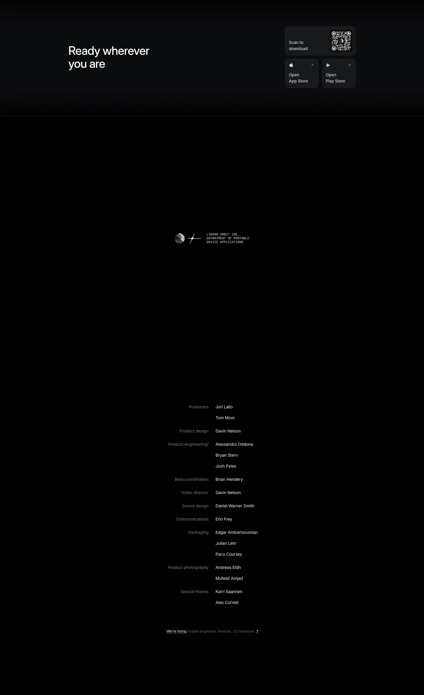
Crop: y=6851, h=2359. It holds the CTA band, an empty spacer with the "Linear Orbit" lockup, and the credits roll.
Layout
Part A — CTA band (y=6851–≈7245)
- Background: a vertical gradient from graphite at the top (rgb(6,6,8) at y=7200) to
#010102 by y≈7240 ≈ measured from screenshot. The bg list has linear-gradient(to top, rgb(1,1,2), rgba(0,0,0,0)).
- H3 "Ready wherever you are" at x=232, y=7001, w=640, h=88 (2 lines: "Ready wherever / you are").
- Download stack at x=968: QR card 240 × 98 at y=6941; store cards 114 × 98 at y=7051 (x=968, 1094). Identical to the hero stack.
- Vertical centering: card stack spans 6941–7149 (center 7045). H3 spans 7001–7089 (center 7045). The heading is centered on the stack.
Part B — spacer with lockup (y≈7245–8221)
- ≈980px of black space.
- A centered lockup at y=7640: two marks (a striped sphere and a starburst-like glyph) at ≈x=596–680, then mono text at x=701, w=145, 3 lines. ≈ measured from screenshot.
Part C — credits roll (y=8221–≈9003)
- Two columns meeting at a center gutter:
- Role labels right-aligned, box x=565, w=143 (right edge 708).
- Names left-aligned at x=732, w=143.
- Gutter between columns: 24px (708 → 732).
- Name rows 37px apart (8221 → 8258). Groups 45px apart (8258 → 8303).
- 10 roles, 17 names (one name, "Gavin Nelson", appears twice).
- Footnote at y=8986, x=561, w=319, centered under the list.
Typography
| Role |
Spec |
Text |
| CTA heading (H3) |
40px / 44px · 510 · -0.88px (-0.022em) · #f7f8f8 |
Ready wherever you are |
| Download card label |
14px / 21px · 510 · -0.182px · #d0d6e0 |
Scan to download / Open App Store / Open Play Store |
| Lockup |
11px / 12.9px · 400 · normal · #f7f8f8 · "Berkeley Mono", uppercase |
LINEAR ORBIT INC. / DEPARTMENT OF PORTABLE / DEVICE APPLICATIONS |
| Credit role |
14px / 21px · 510 · -0.182px · #62666d, right-aligned |
Producers, Product design, … |
| Credit name |
14px / 21px · 400 · -0.182px · #f7f8f8 |
(person names) |
| Footnote |
12px / 16.8px · 400 · normal · #62666d; link "We're hiring" #f7f8f8, underlined |
1 We're hiring mobile engineers. Remote, US timezone. ⤴ |
- The CTA heading is 40px (one step below the 48px section H2s). This matches the 40px "Plan the present" CTA on other pages.
- The credits invert the usual weight logic. Role labels are medium (510) but dark (#62666d). Names are regular (400) but bright (#f7f8f8). The people are the focus.
- The superscript "1" after "Product engineering" links to the hiring footnote.
Color
- CTA band: graphite-to-black gradient. Cards as in the hero (
rgba(255,255,255,.05) fill + border, radius 12).
- Credits: pure
#010102 background, white and quaternary gray text only.
- Lockup: white mono text and white line-art marks. No accent color anywhere in this section.
Visual / UI illustration
- The QR code is real and scannable, with the Linear mark in its center.
- Store cards: Apple logo / Play triangle top-left, ↗ arrow top-right (#d0d6e0 at low opacity), label bottom-left in 2 lines ("Open / App Store").
- The lockup is a fictional corporate imprint ("Linear Orbit Inc."), like the back of a hardware box or the end of a film.
Copy
- CTA heading: "Ready wherever you are" (4 words). It turns the page's recurring theme ("wherever", "no matter where") into a closing line.
- Lockup: "LINEAR ORBIT INC. DEPARTMENT OF PORTABLE DEVICE APPLICATIONS" (8 words). A playful bureaucratic name that frames the app as a product of a hardware division.
- Credit roles: Producers, Product design, Product engineering, Beta coordination, Video director, Sound design, Communications, Packaging, Product photography, Special thanks. "Packaging" and "Sound design" are hardware/film roles applied to an app launch.
- Footnote: "We're hiring mobile engineers. Remote, US timezone." (7 words). It turns the credits into a recruiting hook.
Why it works
- The CTA repeats the hero's exact component. The reader has seen the download stack once. Seeing it again needs no learning. The final action is the same as the first.
- Centering the heading on the stack makes the CTA one balanced row, not a heading with an afterthought.
- The long black spacer is a deliberate pause. Like the black frames before end credits in a film. It separates selling from signing.
- Credits humanize the product. Naming the team signals craft and accountability. It also differentiates the page from every other app landing page.
- Mono type marks "meta" content. Berkeley Mono appears only in the lockup and the image callouts. Mono means "annotation" on this page, never "body".
Reuse recipe
- CTA band:
background: linear-gradient(to top, <page bg>, rgba(255,255,255,.02)) ≈ 390px tall. H3 40/44 510 -0.022em (max-width ≈ 300px to force 2 lines) left at x=232; download stack right at x=968; center them vertically.
- Spacer ≈ 900–1000px of empty page color, with one small centered mono lockup (
11px/12.9 Berkeley Mono uppercase #f7f8f8) next to a line-art mark.
- Credits: two columns meeting at a 24px center gutter. Roles right-aligned
14px 510 #62666d; names left-aligned 14px 400 #f7f8f8; 37px row pitch, +8px between groups.
- End with a 12px
#62666d footnote that links to hiring.
05 · Footer
Crop: y=9210, h=557.
- Standard footer. See
_shared-header-footer.md.
- Column headings at y=9300 (x=304 / 528 / 752 / 976 / 1200). Links start at y=9343, 30px apart. Legal row at y=9691.
- Difference from other pages: the footer background is
#010102 (the page's marketing black), not #08090a. The Sign up text in the header is also #010102.
Page-level takeaways
- Launch the app like hardware. Grayscale photography, macro shots, 3D renders, a "Packaging" credit and a corporate imprint lockup. The page borrows the visual grammar of a phone launch to make software feel physical.
- Put the conversion in the first viewport and repeat it at the end. The same download stack (QR 240 × 98 + two 114 × 98 store cards) appears at y=592 and y=6941.
- One page black, darker than the site default.
#010102 instead of #08090a. Photos and renders with black edges merge into the page with no visible frame.
- Three heading sizes only. 48px (H1 at 590, H2s at 510), 40px (final CTA), 20px (cell titles). Body is 17px (section subs), 15px (hero card), 14px (cells).
- Medium-weight gray body. Section subs and card bodies use 510 in
#8a8f98. Only the 14px cell descriptions use 400.
- A repeating cell grammar. Rule → 82px → H3 → 4px → description → 56px → image. Used in 6 cells across 3 rows.
- Mono = annotation. Uppercase mono callouts with leader lines name gestures on renders. Mono appears nowhere else except the lockup.
- Copy uses tension pairs. "Complex / compact", "React… / …snooze", "24/7 / 9-5", "realtime (but not all the time)". Each pair is a small argument resolved inside one headline.
- Color lives only inside the product UI. Outside the screenshots, the only accent is the
#828fff eyebrow.
- End with people. The credits roll replaces the usual testimonial wall.
Section inventory
| # |
Section |
Pattern name |
Key values |
| 00 |
Hero |
Hero-left-split (photo header + title left / download stack right) + Bento-feature-large+2-small |
Photo 1440 × 968; H1 48/48 590 −0.022em at x=232 w=720; sub 20/26.6 510 white 70%; cards 240 × 98 + 2 × 114 × 98, radius 12, rgba(255,255,255,.05); bento 1024 × 645 then 584 + 408 × 438, gap 32 |
| 01 |
Stay on top of your most important streams of work |
Hero-centered section header + Device-showcase + 2-up cells |
H2 48/48 510 centered w=640; sub 17/27.2 510 #8a8f98 w=472; render 1024 × 656 with mono callouts; cells 488 wide, H3 20/26.6 510, desc 14/21 400, images 471 × 399 |
| 02 |
Move product work forward. No matter where you are. |
Section-header-centered + Device-showcase + Bento-2x2 (hairline grid) |
H2 w=976 centered; sub → image 80px; 2 rows × 732px; vertical rule at x=720 with fading gradient |
| 03 |
Available 24/7. Or just 9-5. |
Device-showcase split (media left / text right) |
Image 976 × 624 at x=232; text x=736 w=472; H2 left-aligned 48/48; 2 feature columns 220px, gap 32 |
| 04 |
Ready wherever you are |
Final-CTA-split (heading left / download stack right) + Credits-roll |
H3 40/44 510; stack at x=968; mono lockup 11px Berkeley Mono; credits roles right #62666d / names left #f7f8f8, 24px gutter, 37px pitch |
| 05 |
Footer |
Footer-5col |
Columns x=304/528/752/976/1200; 13px; bg #010102 |
Security — https://linear.app/security
| Field |
Value |
| URL |
https://linear.app/security |
<title> |
Security – Linear |
| Meta description |
Everything in Linear is designed to keep your work safe and secure. Because your business is nobody else's business. |
| Page height |
3261px (at 1440px width) |
| Template |
Older "feature" template. Centered 64px / 1.06 H1 (x=424, w=592, centered on x=720). Content container 976px at x=232 (x=232–1208). No product screenshots. |
| Page background |
#08090a (--color-bg-level-0). Sampled rgb(8,9,10). |
| Accent |
--color-linear-security: #7a7fad (muted lavender-gray). Used only on the 3 spec-block labels. |
| Sections |
3 crops: 00-hero (y=0–2447: hero + 3 spec blocks + start of the logo row), 01-plan-the-present-build-the-future (y=2447–2704: end of the logo row + final CTA), 02-footer. The crop boundary at y=2447 cuts through the logo row. |
Shared header and footer: see _shared-header-footer.md.
Narrative arc
The page is a trust document dressed as a landing page. It opens with a 4-word promise ("Safe,
secure, and private.") and a one-line joke that sets the tone ("Because your business is nobody
else's business."). It then presents three spec blocks in order of buyer concern. Enterprise-grade
security comes first: certifications (SOC 2, GDPR, HIPAA, ISO 27001) and admin controls, which is
what procurement checks first. Identity management is second: SSO, SAML, SCIM, passkeys and login
restrictions, which is what IT configures. Privacy is third: private teams, guests, encryption
and data residency, which is what end users and legal ask about. Each block has a human headline on the
left and a dense 2-column spec grid on the right. Social proof follows ("Trusted by more than 50,000
product teams"). The page ends with the standard sales CTA ("Plan the present. Build the future."
with "Contact sales" and "Get started"). The arc runs promise → compliance → identity → privacy → proof → sales.
There is no product imagery. The words and the order carry the argument.
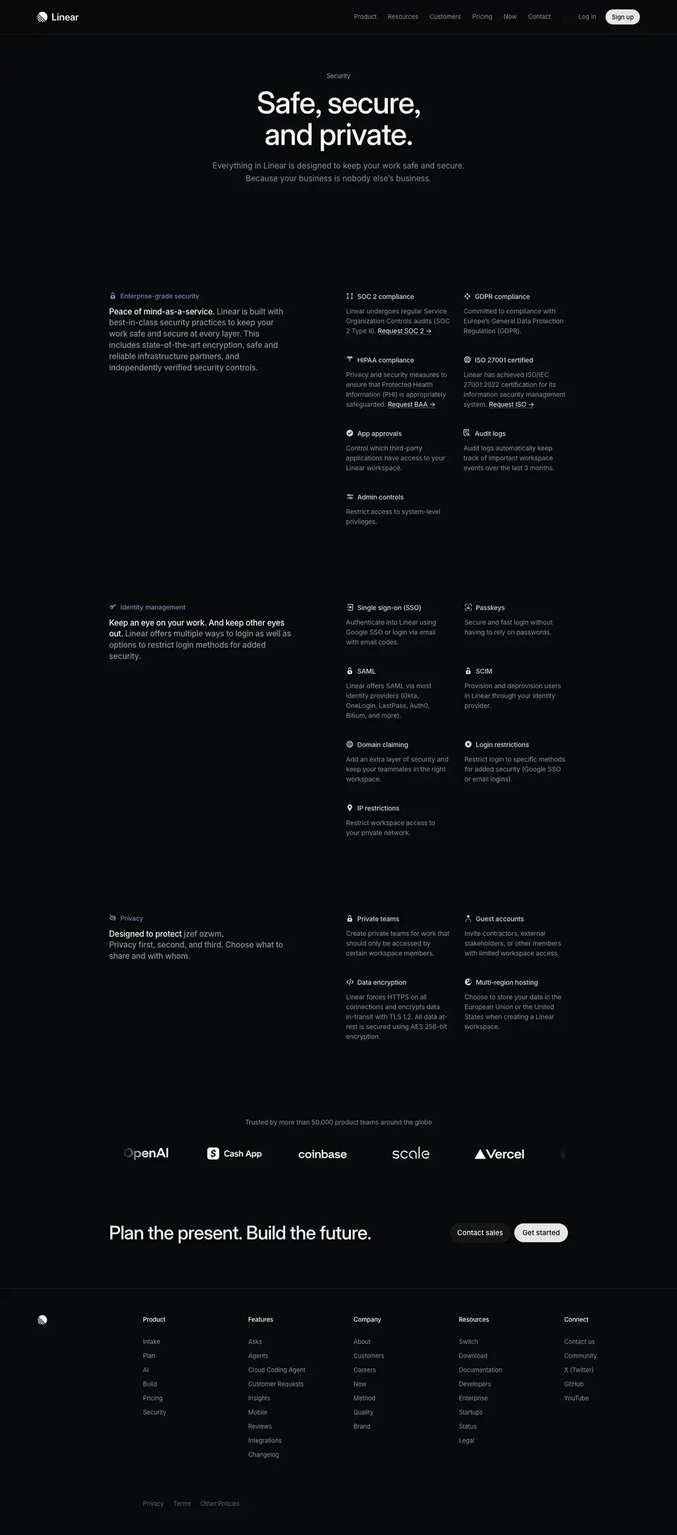
00 · Hero + spec list
Crop: y=0, h=2447. This crop holds five blocks. Each is analyzed below as 00a–00e.
00a · Title block
Layout
| Element |
x |
y |
w × h |
Align |
| Eyebrow "Security" |
695 |
152 |
51 × 20 |
center |
| H1 (2 lines) |
424 |
184 |
592 × 136 |
center |
| Sub (2 lines) |
424 |
339 |
592 × 54 |
center |
- All three elements center on x=720. H1 and sub share a 592px measure.
- Header border (72) → eyebrow: 80px. Eyebrow → H1: 12px (172 → 184). H1 → sub: 19px (320 → 339).
- Sub → first spec block (y=618): 225px of empty space. The hero has no visual. The empty band does the job of a hero image: it isolates the promise.
Typography
| Role |
Spec |
Text |
| Eyebrow |
13px / 19.5px · 510 · -0.13px (-0.01em) · #8a8f98 |
Security |
| H1 |
64px / 67.84px · 510 · -1.408px (-0.022em) · #f7f8f8 |
Safe, secure, and private. |
| Sub |
17px / 27.2px · 400 · normal · #8a8f98 |
Everything in Linear is designed to keep your work safe and secure. Because your business is nobody else's business. |
- H1 line-height 1.06 (67.84 / 64). The two lines "Safe, secure, / and private." sit tight as one block.
- The eyebrow is gray, not accent-colored. On the Mobile page the eyebrow is
#828fff. Here the color is saved for the spec labels.
- Sub line-height 1.6. The heading-to-body ratio is 64 : 17 ≈ 3.8.
Color
- Background
#08090a. White H1, gray eyebrow and sub. No accent, no gradient, no image in the hero.
Visual / UI illustration
- None. A text-only hero. This is the only hero among the documented pages without a product visual.
Copy
- Eyebrow: "Security" (1 word). It names the page, like a section tab.
- H1: "Safe, secure, and private." (4 words). A tricolon of adjectives. Each adjective maps loosely to one of the three spec blocks below (secure → enterprise-grade security, safe → identity management, private → privacy).
- Sub: "Everything in Linear is designed to keep your work safe and secure. Because your business is nobody else's business." (20 words, 2 sentences). Sentence 1 states scope ("Everything"). Sentence 2 is a fragment and a wordplay on "business". It gives a dry topic a human voice.
Why it works
- Short, symmetric promise. A 3-adjective H1 is easy to remember and easy to quote in a security review.
- No imagery = no theater. Security buyers distrust decoration. A text-only hero signals "this page is documentation".
- Wit in the sub, not the H1. The H1 stays formal enough for procurement. The sub adds personality for the human reader.
Reuse recipe
- Center a 592px column on the page. Eyebrow
13px 510 #8a8f98 → 12px → H1 64/67.84 510 -0.022em → ≈19px → sub 17/27.2 400 #8a8f98.
- Start the eyebrow ≈80px below the header.
- Leave ≈225px of empty space below the sub before the first content block.
- Write the H1 as three adjectives that preview the three content blocks.
00b · Spec block 1: Enterprise-grade security
Layout
Two-column "label-left / grid-right" layout inside the 976px container.
| Column |
x |
w |
Content |
| Left |
232 |
388 |
Label (icon + H2) at y=618; lead paragraph at y=651 |
| Right col 1 |
736 |
222 |
Spec items |
| Right col 2 |
986 |
222 |
Spec items |
- Left column 232–620. Empty gap 620–736 (116px). Right grid 736–1208, 2 columns, 28px gap (958 → 986).
- The right grid starts at x=736, which is ≈ the page center + 16px. The grid takes the right half of the container.
- Label row and first spec row share the top line y=618.
- Label → lead paragraph: 33px (618 → 651). The label sits 12px above the paragraph top (618 + 21 = 639 → 651).
Spec grid rows (H4 top y):
| Row |
Col 1 (x=736) |
Col 2 (x=986) |
Row top |
Next row gap |
| 1 |
SOC 2 compliance |
GDPR compliance |
618 |
753 − (650 + 63) = 40 |
| 2 |
HIPAA compliance |
ISO 27001 certified |
753 |
909 − (785 + 84) = 40 |
| 3 |
App approvals |
Audit logs |
909 |
1044 − (941 + 63) = 40 |
| 4 |
Admin controls |
— |
1044 |
ends 1118 |
- Spec item anatomy: H4 (24px tall) → 8px → description. Description starts at H4 top + 32.
- Row gap is a constant 40px. Row height follows the taller description in the row (63 or 84px = 3 or 4 lines).
- 7 items → 4 rows, the last row has 1 item. The grid does not stretch to fill.
- An icon ≈14px sits left of each H4 label. The text starts ≈24px right of the icon's left edge (≈x=760) ≈ measured from screenshot.
- Block end (1118) → divider (1198): 80px. Divider → next block label (1279): 81px.
Typography
| Role |
Spec |
Text |
| Block label (H2) |
14px / 21px · 510 · -0.182px (-0.013em) · #7a7fad |
Enterprise-grade security |
| Lead paragraph |
17px / 23.8px · 510 · -0.204px (-0.012em); lead-in #f7f8f8, rest #8a8f98; w=388 |
Peace of mind-as-a-service. Linear is built with … |
| Spec title (H4) |
14px / 24px · 510 · -0.182px · #d0d6e0 |
SOC 2 compliance |
| Spec description |
14px / 21px · 400 · -0.182px · #8a8f98; w=222 |
Linear undergoes regular … |
| Inline link |
14px / 21px · 400 · -0.182px · #f7f8f8, underlined |
Request SOC 2 → · Request BAA → · Request ISO → |
Notes:
- The section heading (H2) is the smallest heading on the page: 14px. It works as a colored label, not a headline. The headline job goes to the 17px lead-in sentence below it.
- Spec titles use
#d0d6e0 (secondary), not #f7f8f8. The only pure-white text in the block is the lead-in sentence and the "Request …" links. White marks "read this" and "click this".
- Lead paragraph line-height 1.4 (23.8 / 17). Tighter than the hero sub (1.6). It reads as a dense statement.
Color
- Accent
#7a7fad on the label text and its icon (a lock). It is muted and desaturated, close to the gray text. It identifies the block without shouting.
- Spec icons:
#d0d6e0-ish line glyphs ≈ measured from screenshot.
- No cards, no fills, no borders around items. Only 1px dividers between blocks:
rgba(255,255,255,.05) (renders rgb(21,22,22) ≈ measured from screenshot), x=232–1207.
Visual / UI illustration
- Icons only: a lock (label), "II" glyph (SOC 2), sparkle cluster (GDPR), caduceus (HIPAA), globe (ISO 27001), check-badge (App approvals), document-list (Audit logs), sliders (Admin controls) ≈ measured from screenshot. Each ≈14px, monochrome.
Copy
- Label: "Enterprise-grade security" (2 words).
- Lead: "Peace of mind-as-a-service. Linear is built with best-in-class security practices to keep your work safe and secure at every layer. This includes state-of-the-art encryption, safe and reliable infrastructure partners, and independently verified security controls." (37 words). The lead-in is a pun on "-as-a-service". The rest is a plain summary.
- Specs (title + description):
- SOC 2 compliance — "Linear undergoes regular Service Organization Controls audits (SOC 2 Type II). Request SOC 2 →"
- GDPR compliance — "Committed to compliance with Europe's General Data Protection Regulation (GDPR)."
- HIPAA compliance — "Privacy and security measures to ensure that Protected Health Information (PHI) is appropriately safeguarded. Request BAA →"
- ISO 27001 certified — "Linear has achieved ISO/IEC 27001:2022 certification for its information security management system. Request ISO →"
- App approvals — "Control which third-party applications have access to your Linear workspace."
- Audit logs — "Audit logs automatically keep track of important workspace events over the last 3 months."
- Admin controls — "Restrict access to system-level privileges."
- Spec descriptions are 6–17 words. Titles are 2–3 words, noun phrases.
- Each certification that has a document ends with a "Request X →" link. The link is the conversion action for the security reviewer.
Why it works
- Two reading speeds in one block. The left column is for a skim reader (one bold sentence). The right grid is for a reviewer with a checklist.
- Small colored label, large plain sentence. The real headline is the white lead-in sentence. The colored 14px label only tells you which category you are in. This avoids three giant H2s on a page that has only text.
- Inline "Request" links turn specs into actions. The page shortens a procurement step: a reviewer can request the SOC 2 report from the line that mentions it.
- No boxes. 7 items in cards would look like a feature grid. Plain text with icons looks like a spec sheet, which is the right register for compliance.
Reuse recipe
- Container 976px. Left column 388px (label + lead). Right grid starts at x=container+504, 2 columns × 222px with 28px gap.
- Label: ≈14px icon +
14px/21 510 text in a muted accent color.
- Lead paragraph
17/23.8 510 -0.012em: white lead-in sentence, then #8a8f98 continuation in the same paragraph.
- Spec item: icon + title
14/24 510 #d0d6e0, 8px, description 14/21 400 #8a8f98. Row gap 40px.
- Put an underlined white "Request →" link at the end of any description with a downloadable document.
- 80px padding → 1px
rgba(255,255,255,.05) rule → 80px padding between blocks.
00c · Spec block 2: Identity management
Layout
- Label at y=1279, lead paragraph at y=1312 (w=388, 4 lines, ends ≈1407).
- Right grid: col 1 x=736 w=220, col 2 x=988 w=220 (32px gap; block 1 used 222/28).
| Row |
Col 1 |
Col 2 |
Row top |
| 1 |
Single sign-on (SSO) |
Passkeys |
1279 |
| 2 |
SAML |
SCIM |
1414 |
| 3 |
Domain claiming |
Login restrictions |
1570 |
| 4 |
IP restrictions |
— |
1705 |
- Same 40px row gaps (1311 + 63 + 40 = 1414; 1446 + 84 + 40 = 1570; 1602 + 63 + 40 = 1705).
- Block end 1779 → divider 1859 (80) → next label 1940 (81).
- Block stride label-to-label: 661px (1279 → 1940), same as block 1 → 2 (618 → 1279). Both blocks have 4 rows.
Typography
- Same roles and values as block 1.
- Label
14px / 21px · 510 · #7a7fad: "Identity management".
- Lead-in
#f7f8f8: "Keep an eye on your work. And keep other eyes out." (11 words, 2 sentences). It runs 2 lines (h=44) before the gray text begins.
Color
- Same as block 1. Label icon: a key ≈ measured from screenshot.
Visual / UI illustration
- Icons: arrow-into-box (SSO), face-scan (Passkeys), lock (SAML), lock (SCIM), globe (Domain claiming), circle-slash (Login restrictions), map pin (IP restrictions) ≈ measured from screenshot.
Copy
- Lead: "Keep an eye on your work. And keep other eyes out. Linear offers multiple ways to login as well as options to restrict login methods for added security." (28 words). The lead-in is a chiasmus-like pair ("keep an eye" / "keep other eyes out").
- Specs:
- Single sign-on (SSO) — "Authenticate into Linear using Google SSO or login via email with email codes."
- Passkeys — "Secure and fast login without having to rely on passwords."
- SAML — "Linear offers SAML via most identity providers (Okta, OneLogin, LastPass, Auth0, Bitium, and more)."
- SCIM — "Provision and deprovision users in Linear through your identity provider."
- Domain claiming — "Add an extra layer of security and keep your teammates in the right workspace."
- Login restrictions — "Restrict login to specific methods for added security (Google SSO or email logins)."
- IP restrictions — "Restrict workspace access to your private network."
- Acronym titles (SAML, SCIM) have no expansion. The audience is IT. The descriptions explain the outcome instead.
Why it works
- The wordplay lead-in keeps a dry list human. Each block opens with a crafted line ("Peace of mind-as-a-service", "Keep other eyes out"). The reader gets a reason to read the left column even when scanning.
- Equal block heights. Both 7-item blocks produce a 661px stride. The page feels systematic.
Reuse recipe
- Repeat the 00b block exactly. Change only the label, icon set, lead sentence and items.
- Write each lead-in as a 2-sentence or 1-sentence phrase with a twist on a common idiom.
00d · Spec block 3: Privacy
Layout
- Label at y=1940, lead paragraph at y=1973 (3 lines, ends ≈2044).
| Row |
Col 1 (x=736) |
Col 2 (x=988) |
Row top |
| 1 |
Private teams |
Guest accounts |
1940 |
| 2 |
Data encryption |
Multi-region hosting |
2075 |
- 4 items, 2 full rows. Row gap 40 (1972 + 63 + 40 = 2075).
- Block end 2212 → divider 2292 (80) → logo-row caption 2373 (81).
Typography
- Same roles and values as block 1.
- Label
#7a7fad: "Privacy".
- Lead-in: "Designed to protect your work." The words "your work" render as scrambled characters in
#8a8f98 (see Visual).
Color
- Same as block 1. The scrambled span is gray
#8a8f98 inside the white lead-in.
Visual / UI illustration
- Text-scramble effect. The DOM has a 1px, visually hidden node "your work" at x=390, y=1972 (the accessible text). The visible span shows random lowercase alphanumerics. The JSON capture shows "65a3 f6cm". The screenshot shows "jzef ozwm". Two different strings in two captures mean the span re-randomizes, on load or continuously. It visualizes encryption: "your work" is literally unreadable to the viewer.
- Icons: eye-slash (label), lock (Private teams), person (Guest accounts), code brackets
</> (Data encryption), half-globe (Multi-region hosting) ≈ measured from screenshot.
Copy
- Lead: "Designed to protect your work. Privacy first, second, and third. Choose what to share and with whom." (17 words). "Privacy first, second, and third" escalates a common phrase.
- Specs:
- Private teams — "Create private teams for work that should only be accessed by certain workspace members."
- Guest accounts — "Invite contractors, external stakeholders, or other members with limited workspace access."
- Data encryption — "Linear forces HTTPS on all connections and encrypts data in-transit with TLS 1.2. All data at-rest is secured using AES 256-bit encryption."
- Multi-region hosting — "Choose to store your data in the European Union or the United States when creating a Linear workspace."
- Data encryption is the only description with exact technical values (TLS 1.2, AES 256-bit).
Why it works
- One micro-interaction on a static page. The scramble is the only motion. It shows "encryption" instead of claiming it, and it keeps the accessible text intact.
- The shortest block comes last. 4 items after 7 + 7. The page speeds up as it nears the CTA.
Reuse recipe
- Render the protected noun twice: a visually hidden real string for screen readers and a visible span that cycles random
[a-z0-9] characters, same length and word breaks, color #8a8f98.
- Respect
prefers-reduced-motion by showing static scrambled text.
- Put exact technical values (protocol versions, key sizes) in at least one spec description.
00e · Logo wall (first half; continues in crop 01)
Layout
- Caption at y=2373, x=232, w=976, centered (one line, ends 2394).
- Logo row ≈ y=2430–2465 ≈ measured from screenshot, spanning ≈x=260–1210. The crop boundary at y=2447 cuts it in half.
- Visible logos: OpenAI, Cash App, coinbase, scale, Vercel, plus a sixth logo cut off at the right edge.
- Edge fade: the leftmost logo (OpenAI) is partly transparent, and the rightmost logo is cropped and faded. This indicates a horizontal marquee with a gradient mask on both ends.
- A hidden text node "Meet our customers" (
14px/21 510 #f7f8f8, x=652, y=2441, w=125) sits centered over the row. It is not visible in the screenshot. It is likely a hover-reveal label over the paused marquee (inferred).
Typography
| Role |
Spec |
Text |
| Caption |
14px / 21px · 400 · -0.182px · #8a8f98, centered |
Trusted by more than 50,000 product teams around the globe |
| Hover label (hidden) |
14px / 21px · 510 · -0.182px · #f7f8f8 |
Meet our customers |
Color
- Logos in white/near-white monochrome. No brand colors. Caption gray.
Visual / UI illustration
- Monochrome wordmarks, ≈30–35px tall ≈ measured from screenshot, evenly spaced (≈180px pitch).
Copy
- "Trusted by more than 50,000 product teams around the globe" (10 words). A specific number.
Why it works
- Proof after specs. The reader has seen the claims. The logos answer "who else trusts this?". Placing proof after the checklist suits a security review.
- Monochrome logos keep the page's no-color discipline. The brands are recognizable by shape.
Reuse recipe
- Caption
14px 400 #8a8f98 centered → ≈36px → a marquee of white wordmarks, ≈30–35px tall, with mask-image: linear-gradient(90deg, transparent, #000 10%, #000 90%, transparent).
- Optional: on hover, pause and show a centered "Meet our customers" label in
14px 510 #f7f8f8.
01 · Plan the present. Build the future. (final CTA)

Crop: y=2447, h=257. The top ≈20px shows the lower half of the logo row.
Layout
| Element |
x |
y |
w × h |
| H3 |
232 |
2597 |
557 (text) / 640 (box) × 44 |
| "Contact sales" button |
957 |
2599 |
130 × 40 |
| "Get started" button |
1094 |
2599 |
114 × 40 |
- Split row: heading left at the container start, buttons right ending at x=1208 (the container edge).
- Vertical centers match: H3 2597 + 22 = 2619; buttons 2599 + 20 = 2619.
- Button gap: 7px (957 + 130 = 1087 → 1094) ≈ 8px.
- Logo row (≈2465) → H3: ≈130px. Buttons end 2639 → footer border 2737: 98px.
Typography
| Role |
Spec |
Text |
| H3 |
40px / 44px · 510 · -0.88px (-0.022em) · #f7f8f8, one line |
Plan the present. Build the future. |
| Secondary button |
15px / 40px · 510 · normal · #f7f8f8 |
Contact sales |
| Primary button |
15px / 40px · 510 · normal · #08090a |
Get started |
Color
- Secondary button:
background rgba(255,255,255,.05), no border, box-shadow: rgba(255,255,255,.03) 0 0 0 1px inset, rgba(255,255,255,.04) 0 1… (truncated), radius 9999px, padding 0 16px.
- Primary button:
background #e5e5e6, border 1px solid #e5e5e6, radius 9999px, padding 0 16px, near-invisible drop-shadow stack.
- No accent color. The page ends in pure grayscale.
Visual / UI illustration
- None. Text and two pills.
Copy
- H3: "Plan the present. Build the future." (6 words, 2 parallel sentences). It is the site-wide closing line. It references the product's "Plan" and "Build" pillars (also the footer "Product" column items).
- Buttons: "Contact sales" (2 words) and "Get started" (2 words). Sales first, self-serve second (rightmost, filled).
- The CTA does not mention security. It returns the reader to the general product story.
Why it works
- Two paths for two buyers. A security reviewer usually belongs to a larger company, so "Contact sales" sits first. A self-serve buyer gets the brighter "Get started" in the end position, where the eye lands last.
- Filled vs ghost. The primary pill is the only light surface on the page besides the header Sign up pill. Contrast marks the default action.
- A shared closing block. The same CTA closes other marketing pages. Users recognize it as "end of page".
Reuse recipe
- Split row in the 976px container: H3
40/44 510 -0.022em left (one line), button pair right, vertically centered.
- Ghost pill: 40px,
rgba(255,255,255,.05) fill, 1px inset white-3% ring, 15px 510 #f7f8f8, padding 0 16px.
- Primary pill: 40px,
#e5e5e6, text = page bg, 15px 510, padding 0 16px. 8px gap between pills.
- ≈130px above (from the last content), ≈100px below to the footer rule.
02 · Footer
Crop: y=2704, h=557.
- Standard footer. See
_shared-header-footer.md.
- Top border y=2737 (
#23252a, full bleed). Logo mark x=80, y=2794. Headings y=2794. Links from y=2837, 30px apart. Legal row y=3185.
- Background
#08090a.
Page-level takeaways
- A text-only page can still be a landing page. No screenshot, no illustration. The layout (centered promise → label/grid blocks → proof → CTA) carries the design.
- Use the section accent sparingly.
#7a7fad appears on 3 labels and their icons only. It ties the page to the "Security" pillar color without tinting anything else.
- Headline duty moves to the lead-in sentence. H2s are 14px colored labels. The 17px white lead-in sentence is the real section headline.
- Spec grid = plain text + icons, no cards.
14/24 510 #d0d6e0 titles, 14/21 400 #8a8f98 descriptions, 40px row gaps, 2 columns of ≈220px.
- 80 / 1 / 80 block separation. 80px space, a 1px white-5% rule, 80px space. Repeated 3 times.
- Conversion inside the content. "Request SOC 2 →", "Request BAA →", "Request ISO →" are underlined white links inside spec descriptions.
- One meaningful animation. The scrambled "your work" shows encryption and keeps the real text for assistive tech.
- Tone: formal headline, witty sub. "Safe, secure, and private." + "Because your business is nobody else's business." Each block lead-in plays on an idiom.
- Order blocks by buyer concern. Compliance → identity → privacy follows a procurement review's order.
- Short page (3261px). Security pages win on scan speed, not on storytelling length.
Section inventory
| # |
Section |
Pattern name |
Key values |
| 00a |
Title block |
Hero-centered (text-only) |
Eyebrow 13px 510 #8a8f98; H1 64/67.84 510 −0.022em, w=592 centered; sub 17/27.2 400 #8a8f98; 225px to first block |
| 00b |
Enterprise-grade security |
Spec-list (label-left / 2-col grid-right) |
Left 388px at x=232; grid x=736/986, 222px cols, 28px gap; label 14px 510 #7a7fad; lead 17/23.8 510; spec 14/24 510 #d0d6e0 + 14/21 400 #8a8f98; 40px row gap; "Request X →" links |
| 00c |
Identity management |
Spec-list |
Grid x=736/988, 220px cols, 32px gap; 7 items / 4 rows; block stride 661px |
| 00d |
Privacy |
Spec-list + text-scramble |
4 items / 2 rows; scrambled "your work" in #8a8f98 with hidden accessible text |
| 00e |
Logo wall |
Logo-marquee |
Caption 14px 400 #8a8f98 centered; white wordmarks ≈30–35px; edge-fade mask; hidden "Meet our customers" hover label |
| 01 |
Plan the present. Build the future. |
Final-CTA-split |
H3 40/44 510 left; ghost pill rgba(255,255,255,.05) + primary pill #e5e5e6, 40px, radius 9999 |
| 02 |
Footer |
Footer-5col |
Border y=2737; columns x=304/528/752/976/1200; 13px |
Integrations — https://linear.app/integrations
| Field |
Value |
| URL |
https://linear.app/integrations |
<title> |
Integrations – Linear |
| Meta description |
Enhance your Linear workspace with hand-picked integrations. |
| Page height |
11121px (at 1440px width) |
| Template |
Directory template. It belongs to neither marketing template: no hero visual, no display headline. Container 976px at x=232 (x=232–1208), same as the feature template. H1 is 40px, left-aligned. Left category sidebar (x=232) + 2-column card grid (x=568–1208). |
| Page background |
#08090a (--color-bg-level-0). Sampled rgb(8,9,10). |
| Sections |
8 crops. Crops 00–05 (hero-p1 … hero-p6) are 1684px height slices of one continuous directory. 06 is the "Build your own integration" CTA. 07 is the footer. |
Shared header and footer: see _shared-header-footer.md.
Narrative arc
This page is a catalog, not a pitch. It opens with a one-word title and a search field, so the user
can act right away. It then lists 12 curated shelves of 6 cards each, from the most general to the
most specific. Essentials (the big six: GitHub, Origin, Slack, GitLab, Figma, Intercom) comes
first. Agents and AI clients come next, which puts the AI story at the top of the scroll.
Engineering, Linear crafted, Bug Reporting, Automations, Customer Experience,
Security & Compliance, Analytics, Collaboration and Media & Design follow. Each
shelf ends with "Browse all →". The page closes with one centered developer CTA: "Build your own
integration". The arc runs find → browse curated shelves → extend the platform yourself. The
shelves repeat popular integrations (GitHub appears in 3 shelves). The page acts like an app-store
front page, not an exhaustive index.

00 · Directory, part 1 (title row, sidebar, Essentials, start of Agents)
Crop: y=0, h=1684.
Layout
Title row
| Element |
x |
y |
w × h |
| H1 "Integrations" |
232 |
130 |
200 × 44 |
| Search pill |
984 |
132 |
224 × 40 |
| Divider |
232–1207 |
230 |
1px |
- H1 top is 58px below the header border (72 → 130).
- H1 and search pill share a row. Their vertical centers match (130 + 22 = 152; 132 + 20 = 152).
- The search pill's right edge is x=1208, the container edge.
- Divider: 1px, color rgb(24,25,26) ≈
#18191a (≈ --color-bg-level-3 #191a1b), full container width ≈ measured from screenshot. 56px below the H1 (174 → 230).
Two-column body
- Left: sticky category sidebar at x=232. Right: card column at x=568, w=640 (568–1208).
- Gutter between sidebar column and cards: the sidebar column is 336px wide (232 → 568). Its longest label ("Security & Compliance") ends at ≈x=419. So ≈150px of empty space separates the sidebar text from the cards.
- The first sidebar item and the first category heading share one line, y≈297–308 ≈ measured from screenshot.
- Divider → first category heading: 67px (230 → 297).
Sidebar
- 12 items, 44px pitch (613, 657, 701 … 1097 in the data).
- Icon ≈12px glyph at x≈235–246, label at x=262 ≈ measured from screenshot.
- Sticky:
data/integrations.json was captured with the page scrolled ≈507px (the fixed header reads y=527). The sidebar reads y=613 for its first item, not ≈297. So the sidebar moved with the viewport. Its sticky top offset is ≈106px (613 − 507). Inference from data, not observed live.
- Scroll-spy: in that same capture, "Agents" is
#eff0f1 (active) and "Essentials" is #92969f (fading). The active category follows the scroll position. In the static screenshot (scroll 0), "Essentials" is the bright item.
Category block (repeats 12 times)
| Element |
Offset from block top (H3 top) |
x |
Size |
| Category H3 |
0 |
588 |
w 600 |
| Category sub |
+25 (text node +27) |
588 |
1 line |
| Card row 1 |
+97 |
568 / 904 |
304 × 168 each |
| Card row 2 |
+297 |
568 / 904 |
304 × 168 |
| Card row 3 |
+497 |
568 / 904 |
304 × 168 |
| "Browse all →" |
+691 |
588 |
90 × 19 |
| Divider |
+753 |
568–1207 |
1px #18191a |
| Next H3 |
+810 |
588 |
— |
- Block stride: exactly 810px. Every category has 6 cards in 3 rows, so every block is the same height. Category H3s sit at y=297, 1107, 1917, 2727, 3537, 4347, 5157, 5967, 6777, 7587, 8397, 9207.
- Card grid: 2 columns × 3 rows. Column gap 32px (872 → 904). Row gap 32px (562 → 594).
- The category heading is inset 20px (x=588) from the card column (x=568). That equals the card padding. The heading's left edge aligns with the text inside the cards (x=589).
- Dividers between categories span only the card column (568–1207). The divider under the title row and the final divider (y=9960) span the full container (232–1207). Full-width rules frame the directory; short rules separate shelves.
Card anatomy (GitHub card: x=568, y=394)
| Element |
Position |
Notes |
| Card box |
304 × 168 |
padding: 20px, border-radius: 12px |
| Logo tile |
x≈588, y≈414, ≈40 × 40 |
rounded ≈6–8px ≈ measured from screenshot |
| Name |
x=641, y=417 |
13px right of the tile |
| By-line |
x=641, y=440 |
23px below name; verified badge after "By Linear" |
| Description |
x=589, y=493, w=262, h=48 |
2-line clamp with ellipsis, bottom-aligned |
- The description sits at the card bottom: 493 + 48 = 541, card ends 562 (21px = 20 padding + 1 border).
- When a description is 1 line, it moves down to y=+123 (for example "Smoothly transition from Jira to Linear" at 5577 vs 5553). The description is bottom-anchored, not top-anchored. The gap between by-line and description changes. The bottom edge stays fixed.
Typography
| Role |
Spec |
Text |
| H1 |
40px / 44px · 510 · -0.88px (-0.022em) · #f7f8f8 |
Integrations |
| Search placeholder |
14px / 40px · 400 · normal · #8a8f98 |
Search… |
| Search shortcut |
14px / normal · 510 · normal · #62666d |
⌘K |
| Sidebar item (idle) |
15px / 24px · 400 · -0.165px (-0.011em) · #8a8f98 |
AI clients, Engineering … |
| Sidebar item (active) |
15px / 24px · 400 · -0.165px · #eff0f1 |
Agents (at capture time) |
| Category H3 |
15px / 24px · 510 · -0.165px · #f7f8f8 |
Essentials |
| Category sub |
15px / 24px · 400 · -0.165px · #8a8f98 |
Key integrations to enhance your Linear experience |
| Card name |
15px / 15px · 510 · -0.165px · #f7f8f8 |
GitHub |
| Card by-line |
12px / 12px · 400 · normal · #8a8f98 |
By Linear |
| Card description |
14px / 23.8px · 400 · normal · #8a8f98 |
Connect GitHub to automate PR workflows, … |
| Browse link |
15px / 24px · 510 · -0.165px · #828fff |
Browse all → |
Notes:
- Category headings are 15px, the same size as body text. Hierarchy comes from weight (510 vs 400) and color (
#f7f8f8 vs #8a8f98), not size. This is the "H3 15px" pattern of the product template.
- Card name and by-line use line-height = font size (15/15, 12/12). The two lines stack tight as one label unit beside the logo.
- Card descriptions use a loose 1.7 line-height (23.8 / 14). Two lines fill 48px. The loose leading gives the bottom of each card air.
- Only two sizes carry the whole directory: 15px and 14px (plus 12px by-lines).
Color
- Page
#08090a. Cards #0f1011 (--color-bg-level-1, 72 instances in bg). Card border 1px solid rgba(255,255,255,.05) (72 instances in bd). The border renders as rgb(27,28,29) ≈ measured from screenshot.
- Search pill:
#141516 (--color-bg-level-2), border-radius: 100px, no border, inset ring box-shadow: rgba(255,255,255,.03) 0 0 0 1px inset, rgba(255,255,255,.04) 0 1… (truncated in the data).
- Dividers
#18191a.
- 13
bg entries of rgb(24,25,26) = the 13 dividers (1 under the title + 11 between categories + 1 final).
- Accent: only "Browse all →" in
#828fff. 12 instances, one per category.
- All other color comes from the partner logos inside their 40px tiles (GitHub black on white, GitLab orange, Figma multicolor, Slack multicolor). The logos are the only saturated color on the page.
Visual / UI illustration
- No product screenshot. The visuals are partner logos in 40px rounded tiles. Each tile uses the partner's own brand background (white, black, orange, purple).
- A small verified-seal icon (≈12px,
#8a8f98) follows "By Linear" on first-party cards. Third-party cards ("By OpenAI", "By Cursor") have no seal.
- Sidebar icons are monochrome line glyphs at ≈12px, same color as the label: star (Essentials), robot (Agents), sparkle (AI clients), terminal (Engineering), Linear mark (Linear crafted), bug (Bug Reporting), loop arrows (Automations), chat bubble (Customer Experience), lock (Security & Compliance), chart (Analytics), speech bubble (Collaboration), pen nib (Media & Design) ≈ measured from screenshot.
- No animation hints in the static capture, besides the scroll-spy state change.
Copy
- H1: "Integrations" (1 word). No subhead on the page. The meta description carries the pitch ("hand-picked integrations").
- Search: "Search…" + "⌘K". The shortcut hint matches the product's command-menu convention.
- Essentials sub: "Key integrations to enhance your Linear experience" (7 words).
- Essentials cards:
- GitHub — "Connect GitHub to automate PR workflows, review code in Linear, sync issues and understand your codebase with Linear Agent" (19 words, clamped to 2 lines).
- Origin — "Sync Linear issue status with your Origin pull requests" (9).
- Slack — "Create issues from Slack messages and sync threads" (8).
- GitLab — "Automate your Merge Request workflow" (5).
- Figma — "Connect Figma and Linear across design and development" (8).
- Intercom — "Keep a tight feedback loop with customers and streamline bug reports" (11).
- Agents sub: "Deploy AI teammates inside Linear" (5). Cards: Codex (By OpenAI), Cursor (By Cursor), GitHub Copilot (By GitHub), Factory (By Factory), Sentry Agent (By Sentry), Devin (By Cognition).
- Link: "Browse all →".
- Card descriptions start with a verb in most cases ("Connect", "Sync", "Create", "Automate", "Delegate", "Turn"). They describe the outcome inside Linear, not the partner product.
Why it works
- Search before scroll. The search pill sits in the title row at the same height as the H1. A user who knows what they want never needs the shelves.
- Fixed-height blocks. Every category has exactly 6 cards and every card is 168px with a 2-line clamp. The page has a perfect 810px rhythm. It reads like a printed catalog.
- Size does not change; weight and color do. With only 15px and 14px in play, the eye scans the white 510 names and skips the gray 400 descriptions. This is very fast to skim.
- Inset alignment. Category headings (x=588) align with card content (x=589), not with the card edges (x=568). The text forms one clean left edge from heading to description.
- Logos supply the color. The UI is fully neutral, so 72 partner logos read as a colorful mosaic without any styling effort.
- Sticky sidebar with scroll-spy. The user always sees where they are among 12 shelves and can jump.
Reuse recipe
- Title row: H1
40/44 510 -0.022em left at x=232; search pill right (224 × 40, #141516, radius 100, inset 1px white-3% ring, 14px #8a8f98 placeholder, ⌘K in #62666d). 56px below: 1px #18191a rule.
- Body grid:
grid-template-columns: 336px 640px inside a 976px container. Sidebar position: sticky; top: ≈106px, items 15px/24 400 #8a8f98 at 44px pitch with ≈12px line icons; active item #f7f8f8.
- Category block: H3
15/24 510 #f7f8f8 + sub 15/24 400 #8a8f98, both inset 20px; 2-col card grid with 32px gaps; "Browse all →" 15px 510 #828fff; then a 1px rule over the card column only. Keep the block 810px tall.
- Card: 304 × 168,
#0f1011, 1px solid rgba(255,255,255,.05), radius 12, padding 20. 40px logo tile + 13px gap + name 15/15 510 / by-line 12/12 400 #8a8f98. Description 14/23.8 400 #8a8f98, -webkit-line-clamp: 2, anchored to the card bottom.
- Add a verified seal after "By " for first-party entries.
01 · Directory, part 2 (end of Agents, AI clients, Engineering)
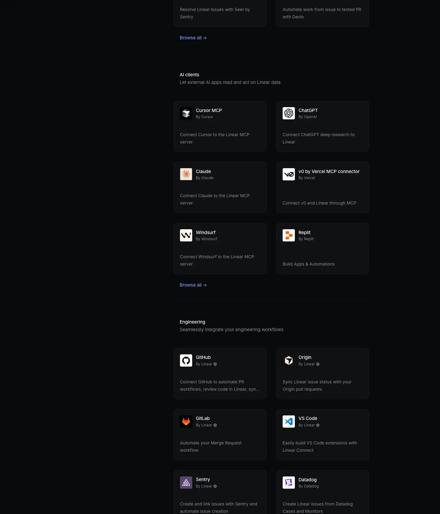
Crop: y=1684, h=1684.
Layout
- Same block system as part 1. Agents block ends: last row at y=1604, "Browse all →" at 1798, divider at 1860.
- AI clients: H3 1917, sub 1944, cards 2014 / 2214 / 2414, browse 2608, divider 2670.
- Engineering: H3 2727, sub 2754, cards 2824 / 3024 / 3224, browse 3418, divider 3480.
- Sidebar is not visible in this crop. In the static screenshot the sidebar renders only at the top (the full-page capture does not replay sticky positioning). The left 336px column is empty in parts 2–6.
- Cards with one-line descriptions ("Connect v0 and Linear through MCP", "Build Apps & Automations") are bottom-anchored: the description moves down to y=+123 in the card, leaving a larger gap under the by-line.
Typography
- Identical to part 1. Names
15/15 510 #f7f8f8, by-lines 12/12 400 #8a8f98, descriptions 14/23.8 400 #8a8f98, H3 15/24 510, sub 15/24 400.
- The longest card name here, "v0 by Vercel MCP connector", is 200px wide at 15px. It still fits in one line (card text area is 304 − 40 − 53 = ≈211px).
Color
- Same tokens. Logo tiles bring the color: Claude's orange starburst, Replit orange, Windsurf black on white, VS Code blue, GitLab orange, Datadog purple, Sentry purple-gray.
Visual / UI illustration
- Logos only. AI clients mix logo styles (black glyph on white, white glyph on black, colored glyph on white). Every logo sits in the same 40px tile with the same radius, which normalizes them.
Copy
- AI clients sub: "Let external AI apps read and act on Linear data" (10 words). Cards: Cursor MCP, ChatGPT, Claude, v0 by Vercel MCP connector, Windsurf, Replit.
- Four of six AI-client descriptions use the same frame: "Connect to the Linear MCP server". Repetition makes the category's mechanism (MCP) obvious.
- Engineering sub: "Seamlessly integrate your engineering workflows" (5 words). Cards: GitHub, Origin, GitLab, VS Code, Sentry, Datadog.
- GitHub, Origin and GitLab repeat from Essentials. The shelves are curated views, not exclusive buckets.
Why it works
- AI shelves come second and third. The scroll order is the product strategy. Agents and AI clients appear before Engineering, the historic core.
- Formulaic descriptions inside a shelf. "Connect X to the Linear MCP server" ×4 tells the user that the category is one capability with many clients.
- Repeated items reduce search effort. A user who jumps to Engineering from the sidebar sees GitHub again without needing Essentials.
Reuse recipe
- Order shelves by strategic priority, not alphabetically.
- Use one sentence template per shelf when the mechanism is shared ("Connect to MCP server").
- Allow the same item in several shelves.
- Anchor 1-line descriptions to the card bottom so every card bottom edge aligns.
02 · Directory, part 3 (Linear crafted, Bug Reporting)
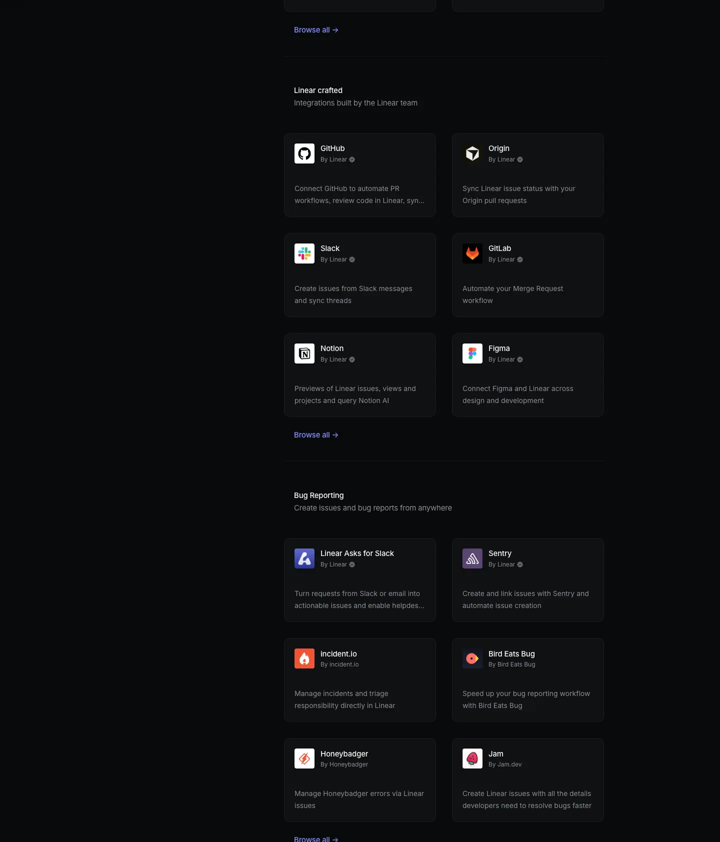
Crop: y=3368, h=1684.
Layout
- Linear crafted: H3 3537, sub 3564, cards 3634 / 3834 / 4034, browse 4228, divider 4290.
- Bug Reporting: H3 4347, sub 4374, cards 4444 / 4644 / 4844, browse 5038.
- Same 810px stride. Same card sizes.
Typography
- Same as part 1. The longest name in this crop, "Linear Asks for Slack", is 147px wide.
- Description clamp shows its ellipsis: "Turn requests from Slack or email into actionable issues and enable helpdes…".
Color
- Same tokens. Logo tiles: Notion black on white, Linear Asks indigo tile (≈
#5e6ad2), Sentry purple-gray, incident.io red-orange, Bird Eats Bug coral on dark, Honeybadger red on white, Jam pink-red.
- The Linear Asks tile is the only place the brand indigo appears as a fill in the directory.
Visual / UI illustration
- Logos only. All six "Linear crafted" cards carry the verified seal ("By Linear ✓").
Copy
- Linear crafted sub: "Integrations built by the Linear team" (6 words). Cards: GitHub, Origin, Slack, GitLab, Notion, Figma.
- Bug Reporting sub: "Create issues and bug reports from anywhere" (7 words). Cards: Linear Asks for Slack, Sentry, incident.io, Bird Eats Bug, Honeybadger, Jam.
- Descriptions:
- "Turn requests from Slack or email into actionable issues and enable helpdesk workflows" (13).
- "Manage incidents and triage responsibility directly in Linear" (8).
- "Speed up your bug reporting workflow with Bird Eats Bug" (10).
- "Manage Honeybadger errors via Linear issues" (6).
- "Create Linear issues with all the details developers need to resolve bugs faster" (13).
Why it works
- A first-party shelf builds trust. "Linear crafted" tells the user which integrations the vendor maintains. The verified seal repeats that promise on every card.
- The clamp keeps the grid honest. Long descriptions get cut, not allowed to grow the card. The grid rhythm wins over completeness.
Reuse recipe
- Add one "built by us" shelf. Mark first-party cards with a small seal next to the by-line.
- Clamp descriptions to 2 lines with an ellipsis. Never let text change card height.
03 · Directory, part 4 (Automations, Customer Experience)
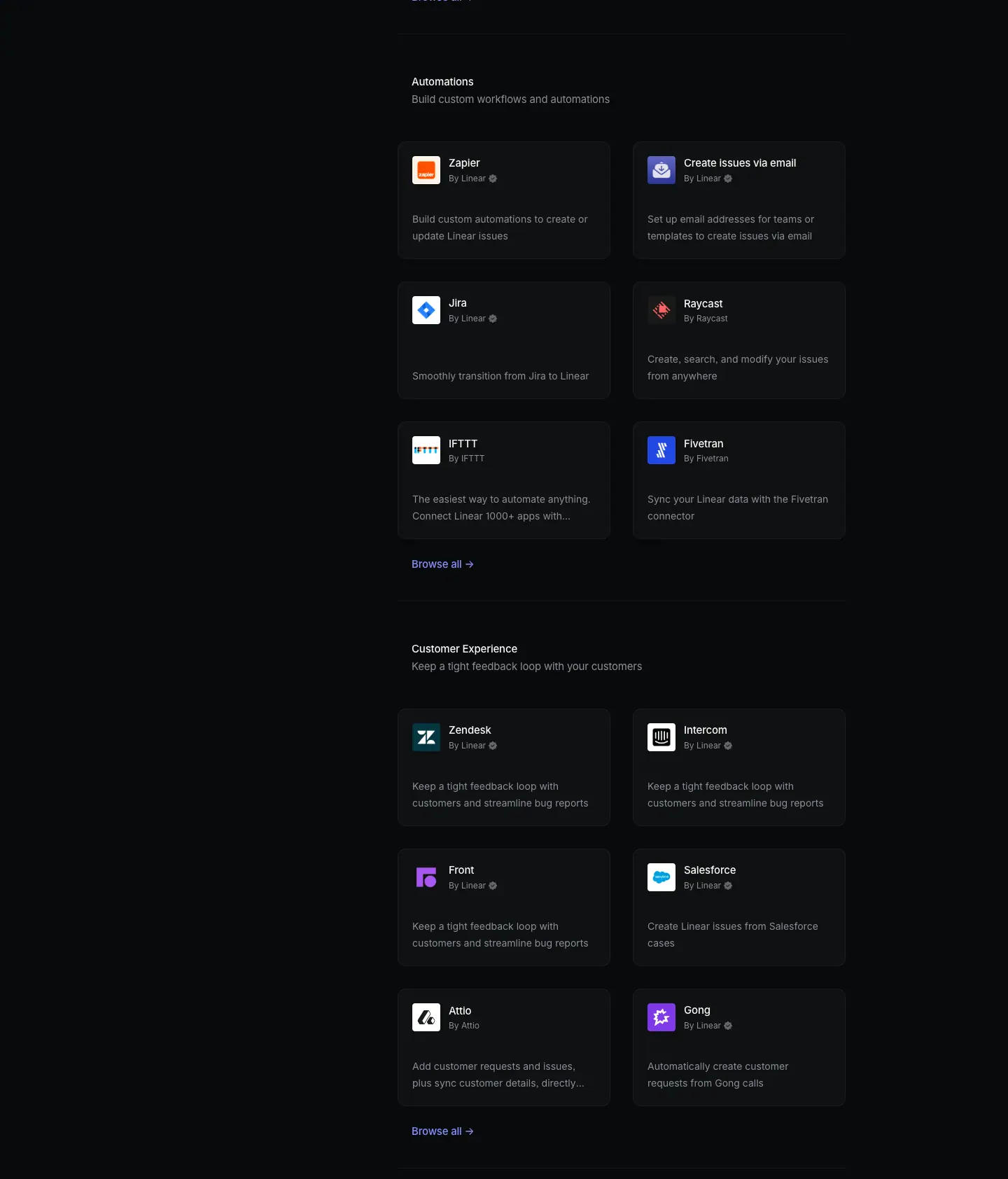
Crop: y=5052, h=1684.
Layout
- Automations: H3 5157, sub 5184, cards 5254 / 5454 / 5654, browse 5848, divider 5910.
- Customer Experience: H3 5967, sub 5994, cards 6064 / 6264 / 6464, browse 6658, divider 6720.
- Bottom-anchoring is visible on "Jira": the 1-line description "Smoothly transition from Jira to Linear" sits at y=5577, 24px lower than its 2-line neighbor (5553).
Typography
- Same as part 1. "Create issues via email" (160px) is a feature name, not a partner name. It uses the same card style.
Color
- Same tokens. Logo tiles: Zapier orange, email tile indigo, Jira blue diamond on white, Raycast red on dark, IFTTT black on white, Fivetran blue, Zendesk dark teal, Intercom black on white, Front purple, Salesforce blue cloud on white, Attio black on white, Gong purple.
Visual / UI illustration
Copy
- Automations sub: "Build custom workflows and automations" (5). Cards: Zapier, Create issues via email, Jira, Raycast, IFTTT, Fivetran.
- Customer Experience sub: "Keep a tight feedback loop with your customers" (8). Cards: Zendesk, Intercom, Front, Salesforce, Attio, Gong.
- Weak spot: Zendesk, Intercom and Front share the identical description "Keep a tight feedback loop with customers and streamline bug reports". It also nearly repeats the category sub. Three identical lines in one shelf read as filler. Do not copy this.
- "IFTTT" description is marketing copy from the partner: "The easiest way to automate anything. Connect Linear 1000+ apps with powerful AI tools." It breaks the house voice (superlative, grammar slip "Connect Linear 1000+ apps").
Why it works
- Features sit next to partners. "Create issues via email" is a built-in capability shown as a card. Users looking for "how to get issues in" find it in the same place as Zapier.
- The template forgives uneven copy. Even with duplicate or off-voice descriptions, the gray 14px text recedes and the white names carry the scan.
Reuse recipe
- Treat built-in capabilities as cards inside the directory when they solve the shelf's job.
- Write a unique description per card. If three partners do the same thing, say what differs (channel, data, direction).
- Keep partner-supplied copy to the house rules: verb first, no superlatives, ≤ 15 words.
04 · Directory, part 5 (Security & Compliance, Analytics, start of Collaboration)
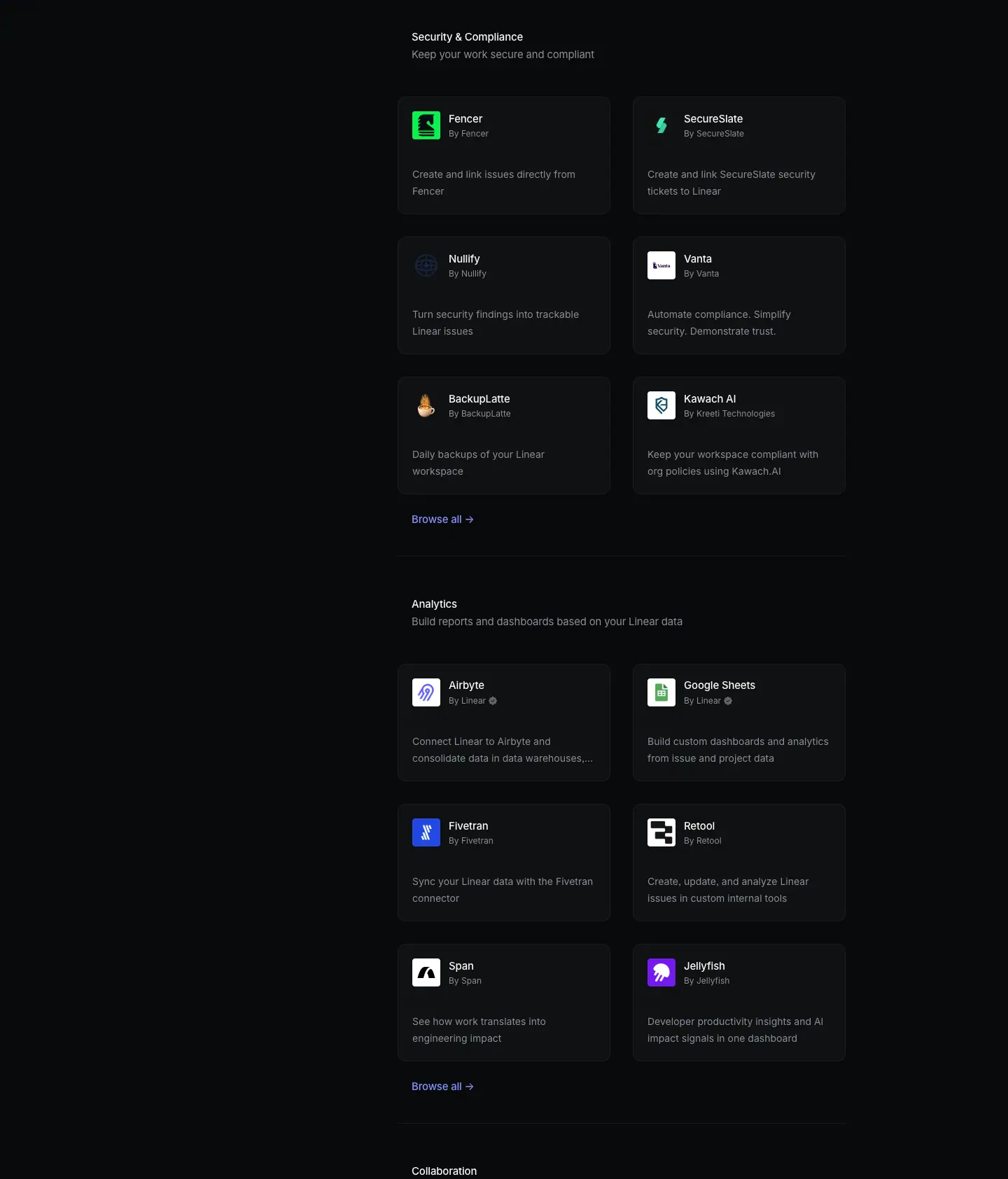
Crop: y=6736, h=1684.
Layout
- Security & Compliance: H3 6777, sub 6804, cards 6874 / 7074 / 7274, browse 7468, divider 7530.
- Analytics: H3 7587, sub 7614, cards 7684 / 7884 / 8084, browse 8278, divider 8340.
- Collaboration H3 at 8397 (the crop ends right after it, at 8420).
Typography
- Same as part 1. Longest by-line: "By Kreeti Technologies" (130px at 12px).
Color
- Same tokens. Logo tiles: Fencer green, SecureSlate green bolt on dark, Nullify dark-blue line glyph (nearly invisible on the dark tile), Vanta white, BackupLatte flame on dark, Kawach AI teal on white, Airbyte blue on white, Google Sheets green, Fivetran blue, Retool black on white, Span black on white, Jellyfish purple.
- The Nullify logo shows a risk of letting partners supply tiles: a dark glyph on a dark tile almost disappears.
Visual / UI illustration
Copy
- Security & Compliance sub: "Keep your work secure and compliant" (6). Cards: Fencer, SecureSlate, Nullify, Vanta, BackupLatte, Kawach AI.
- Analytics sub: "Build reports and dashboards based on your Linear data" (9). Cards: Airbyte, Google Sheets, Fivetran, Retool, Span, Jellyfish.
- Descriptions are short and functional: "Daily backups of your Linear workspace" (6), "See how work translates into engineering impact" (7), "Developer productivity insights and AI impact signals in one dashboard" (10).
Why it works
- Long-tail shelves stay as calm as the top shelves. Lesser-known partners get exactly the same card as GitHub. The directory looks complete and trustworthy, not like a sponsor page.
Reuse recipe
- Give every logo tile a light or brand-colored background, or a 1px inner ring, so dark logos stay visible on dark cards.
- Keep the same card for big and small partners. Rank by shelf order, not by card size.
05 · Directory, part 6 (Collaboration, Media & Design, end of directory)
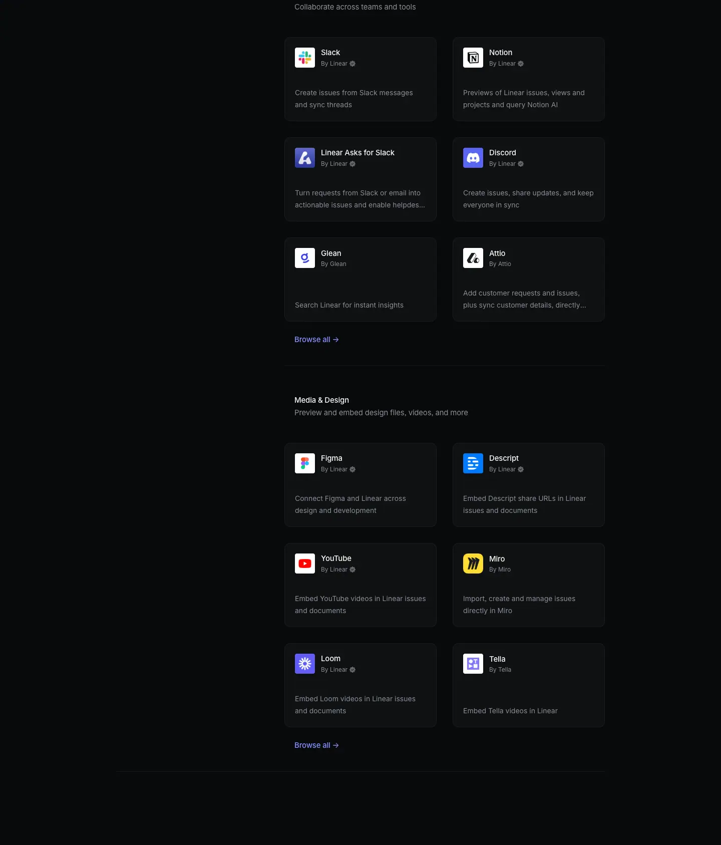
Crop: y=8420, h=1687.
Layout
- Collaboration: cards 8494 / 8694 / 8894, browse 9088, divider 9150.
- Media & Design: H3 9207, sub 9234, cards 9304 / 9504 / 9704, browse 9898.
- Final divider at y=9960 spans the full container (232–1207), like the divider under the title row. It closes the directory.
- Space after the final divider: ≈177px of empty page before the CTA icon tile (9960 → ≈10137).
Typography
Color
- Same tokens. Logo tiles: Slack multicolor, Notion, Linear Asks indigo, Discord blurple, Glean blue on white, Attio, Figma, Descript blue, YouTube red, Miro yellow, Loom indigo, Tella blue on white.
Visual / UI illustration
Copy
- Collaboration sub: "Collaborate across teams and tools" (5). Cards: Slack, Notion, Linear Asks for Slack, Discord, Glean, Attio.
- Media & Design sub: "Preview and embed design files, videos, and more" (8). Cards: Figma, Descript, YouTube, Miro, Loom, Tella.
- Embed cards share a frame: "Embed videos in Linear issues and documents" (YouTube, Loom), "Embed Descript share URLs in Linear issues and documents", "Embed Tella videos in Linear".
Why it works
- Closing rule = end of catalog. The full-width rule at 9960 mirrors the one at 230. The directory is bracketed by two identical lines, so the CTA below reads as outside the catalog.
Reuse recipe
- Bracket a long list with two full-width rules (top under the title, bottom after the last shelf). Use shorter rules between shelves.
- Leave ≈150–180px empty space between the catalog and the closing CTA.
06 · Build your own integration

Crop: y=10107, h=457.
Layout
- Centered single column on x=720.
| Element |
x |
y |
w × h |
| Icon tile |
≈672 |
≈10137 |
≈96 × 96 ≈ measured from screenshot |
| H2 |
501 |
10257 |
439 × 44 |
| Sub (2 lines) |
560 |
10313 |
320 × 40 |
| Button "Start building" |
655 |
10377 |
130 × 40 |
- Tile → H2: ≈24px. H2 → sub: 12px (10301 → 10313). Sub → button: 24px (10353 → 10377).
- Sub max-width 320px forces a 2-line break: "Create your own integration with Linear's API / and submit it to the directory."
- The section ends at 10564. The footer border sits at 10597.
- The H2 and sub each appear twice in the DOM at the same position (one
ta: start, one ta: center). Likely one copy is visual and one is for screen readers or an animation layer.
Typography
| Role |
Spec |
Text |
| H2 |
40px / 44px · 510 · -0.88px (-0.022em) · #f7f8f8, centered |
Build your own integration |
| Sub |
15px / 19.95px · 400 · -0.165px · #8a8f98, centered |
Create your own integration with Linear's API and submit it to the directory. |
| Button |
15px / 40px · 510 · normal · #08090a on #e5e5e6 |
Start building |
- The H2 matches the H1 size (40px). The CTA has the same weight as the page title.
- The sub line-height is tight (1.33). It reads as a caption, not a paragraph.
Color
- Page
#08090a. Icon tile: graphite (≈ #141516–#191a1b) rounded square, radius ≈20px, with a white ≈48px circle and a black "+" ≈ measured from screenshot.
- Button: inverted pill
#e5e5e6, radius 9999px, 40px tall, padding 0 16px (same as the "Get started" button on other pages).
- No accent color.
Visual / UI illustration
- One icon: "+" in a circle in an app-icon tile. It shares the look of the 40px partner tiles at 2.4× scale. It reads as "an empty slot for your logo".
Copy
- H2: "Build your own integration" (4 words). Imperative.
- Sub: "Create your own integration with Linear's API and submit it to the directory." (13 words). It explains the 2 steps: build with the API, then submit.
- Button: "Start building" (2 words). It repeats the H2 verb.
Why it works
- The CTA continues the catalog's logic. After 72 tiles, a "+" tile invites the reader to add the 73rd.
- One verb from heading to button. "Build" → "Start building". The action is unambiguous.
- Small and centered. After a dense left-aligned grid, a short centered block reads clearly as "end of page".
Reuse recipe
- 96px app-icon tile (graphite, radius ≈20) with a "+" glyph → 24px → H2
40/44 510 centered → 12px → sub 15/20 400 #8a8f98, max-width 320 → 24px → pill button #e5e5e6, 40px, 15px 510.
- Use the same verb in heading and button.
07 · Footer
Crop: y=10564, h=557.
- Standard footer. See
_shared-header-footer.md.
- Top border at y=10597 (
#23252a, full bleed). Headings at y=10654. Links from y=10697, 30px apart. Legal row at y=11045.
- Background
#08090a.
Page-level takeaways
- A directory page needs no hero. One-word H1 + search pill + rule. The first card is visible at y=394, inside the first viewport.
- Fix the block size and the page becomes a rhythm. 12 shelves × 6 cards × 168px cards = an exact 810px stride from y=297 to 9207.
- Two type sizes run the catalog. 15px (headings, names, sidebar, links) and 14px (descriptions), plus 12px by-lines. Hierarchy is weight and color.
- Align text, not boxes. Category headings at x=588 align to text inside cards (x=589), not to card edges (x=568).
- Neutral UI, colorful logos.
#0f1011 cards with a 5% white border let 72 partner logos provide every bit of color.
- One accent use, repeated 12 times. "Browse all →" in
#828fff is the only accent-colored text.
- Sticky sidebar + scroll-spy (inferred from the scrolled data capture) keeps orientation across an 11,000px page.
- Curated shelves can repeat items. GitHub is in Essentials, Engineering and Linear crafted.
- Watch the copy at scale. Duplicate descriptions (3× in Customer Experience) and partner-supplied superlatives (IFTTT) are the page's weak points.
- Close with an invitation to extend. "Build your own integration" turns the catalog into a platform.
Section inventory
| # |
Section |
Pattern name |
Key values |
| 00 |
Directory part 1: title, sidebar, Essentials, Agents |
Directory-sidebar+grid (title row with search) |
H1 40/44 510 at x=232; search 224 × 40 #141516 radius 100; sidebar x=232, 15px, 44px pitch, sticky ≈106px; cards 304 × 168, #0f1011, 1px white 5%, radius 12, pad 20; block stride 810 |
| 01 |
Directory part 2: AI clients, Engineering |
Directory-sidebar+grid |
MCP description template; 1-line descriptions bottom-anchored |
| 02 |
Directory part 3: Linear crafted, Bug Reporting |
Directory-sidebar+grid |
Verified seal after "By Linear"; 2-line clamp |
| 03 |
Directory part 4: Automations, Customer Experience |
Directory-sidebar+grid |
Built-in feature as a card; duplicate descriptions (anti-pattern) |
| 04 |
Directory part 5: Security & Compliance, Analytics |
Directory-sidebar+grid |
Logo-tile contrast risk on dark tiles |
| 05 |
Directory part 6: Collaboration, Media & Design |
Directory-sidebar+grid |
Full-width closing rule at y=9960 (232–1207) |
| 06 |
Build your own integration |
Final-CTA-centered (icon tile) |
Tile ≈96px; H2 40/44 510; sub 15/20 400 w=320; pill 130 × 40 #e5e5e6 |
| 07 |
Footer |
Footer-5col |
Border y=10597; columns x=304/528/752/976/1200; 13px |